Forum Replies Created
-
AuthorPosts
-
Look to your example page of thedive.com – its footer is exactly the burger content ;)
so maybe styling a footer-page and redeclare the hamburger icon with a different event that brings that footer to fullscreen and to fixed position ( left: 0 ; top: var(–enfold-header-height) ) is a possible solution. ( no automatic menü – but that way you like to have it)if you like to bing those arrows to the center of the gallery height:
#top div .avia-gallery { position: relative; } .avia-gallery.av-slideshow-ui .avia-slideshow-arrows { width: 100%; height: 60px; top: calc(50% - 30px); } #top .avia-slideshow-arrows a { top: 0; }have you refreshed all cachings (maybe you got a caching/optimization plugin) – did you “Delete Old CSS And JS Files?” on Enfold – Performance?
Next Hint:
These settings are nearly the last that are loaded – even after quick css – so if you got a mistake on quick css ( missing closing brackets , komma instead of semicolon etc. they will be not loaded. So check your quick css.If you got a link to that page – we can check what happens.
maybe put each of those elements in a separate 1/1 container. The icon-box and the gallery.
or try in quick css:
#top div .avia-gallery { position: relative; }or – more flexible in styling for complete control over the whole screensize ranges – working with grid layout:
#top #wrap_all .avia-custom-gallery .avia-gallery-thumb {
  display: grid;
  grid-template-columns: repeat(auto-fit, minmax(180px, 1fr));
  grid-auto-flow: row;
  gap: 20px;   /*** if you like to have a space between the images ***/
}

#top #wrap_all .avia-custom-gallery .avia-gallery-thumb a {
  width: unset !important;
}
when images are less than 180px – a new row will be created
on 6 items besides each other the setting vor less than 767px is allready set to 33% – and this looks nice to me.
Maybe you only like to influence the range inbetween:
@media only screen and (min-width: 768px) and (max-width: 989px) { #top .avia-custom-gallery .avia-gallery-thumb a { width: 25% !important; } }best would be to have a custom class on that element f.e. bg-colored-sub-menu
#top .av-submenu-container.bg-colored-sub-menu {
  background-color: lightblue;
}
this will only have an effect on the submenu – if you like to have the same bg-color for the list items:
#top .av-submenu-container.bg-colored-sub-menu a { background-color: lightblue; color: #000; border-color: darkblue }is it a gallery or a masonry gallery?
Rikard’s code should do the job – but the specificity is the same as the original rule. So you need to be more specific in your selector or override it with !important.
@media only screen and (max-width: 767px) {
   #top .avia-gallery .avia-gallery-thumb a {
     width: 50% !important;
   }
}
or
@media only screen and (max-width: 767px) {
  #top #wrap_all .avia-gallery .avia-gallery-thumb a {
    width: 50% ;
  }
}
if you do like to have it only on that gallery – use a custom class to that element.
That was exactly my impression, which is why I provided the code above.
__________________________
for masonry it is not that complicated because inside the helper : class-avia-masonry.php there is only one instance of that filter. And no extra_args are needed:function my_masonry_customize_heading_settings( array $args, $context){ if( $context == 'avia_masonry' ){ $args['heading'] = 'h2'; } return $args; } add_filter( 'avf_customize_heading_settings', 'my_masonry_customize_heading_settings', 10, 2 );Eventuell wird es dir auf dieser Seite deutlicher. https://webers-testseite.de/sticky-sidebar/
Das unmittelbare Elternelement zu dem Sticky Element ( bei Columns in einer Color-Section ist es der entry-content-wrapper ) muss der Flex-Container sein. Und auf deiner Seite muss gelten:
.responsive #top {
    overflow-x: visible;
}

 #top #wrap_all {
    overflow: visible;
}
Da es nur Sinn macht, wenn die Columns nebeneinander liegen, setzt man die Flex Bedingung am besten nur für diesen Fall ein; also für screens die größer sind als der Umbruchpunkt (768px oder 990px)
i guess you are talking about the usage of the filter on line: 1156 – the other lines ( 3times that filter is set inside portfolio.php) allready do have h2 as default.
Can you show us that page it belongs too? You are definitly using the portfolio element to show those portfolios? Because there are many ways to show them even as masonry with portfolio-entries.these filters are used on a different context (see line 698) too – maybe try:
function my_portfolio_heading_settings( array $args, $context, array $extra_args = array() ){ if( $context == 'avia_post_grid' && is_array( $extra_args ) && in_array( 'not_one_column_template_special', $extra_args )){ $args['heading'] = 'h2'; } return $args; } add_filter( 'avf_customize_heading_settings', 'my_portfolio_heading_settings', 10, 3 );but you do not belong to the up and down of “Kia Ora!” section?
This comes from the slider above – that has 3 Groups and the last only got 4 items. So it’s height is less than the others.
June 19, 2025 at 8:47 am in reply to: Fullwidth Easy Slider only works in smartphone and tablet, not desktop #1485664what do you mean by “only works” is it present but does not show prev. next slides ? or is there no slider at all?
the element itself got an option on Advance Tab to show/hide the slider for responsive cases:

are there any checkmarks checked inside your slider?
June 18, 2025 at 7:54 am in reply to: Can you please consider adjusting the Quick CSS section? #1485619Did it solve your problem, or did you find it to be less important than you thought?
ok – then a link to a page to which the question refers would have been helpful.
http://wordpress.p691093.webspaceconfig.de/portfolio_entries/harfen-treppen/I had understood him differently. For example, if he opens the page : Link via the menu, then it should open directly in the opened ajax style.
Versuch doch mal das in der child-theme functions.php:
function trigger_click_on_ajax_categories(){
?>
<script>
(function($){
    $(window).on('load', function(){
        // Prüfen, ob das Element mit der Klasse 'grid-links-ajax' auf der Seite existiert
        if ($('.grid-links-ajax').length > 0) {
            setTimeout(function() {
                // Sicherstellen, dass das erste Element vorhanden ist, bevor der Klick ausgelöst wird
                const firstGridItem = $(".grid-links-ajax .grid-entry.first");
                if (firstGridItem.length) {
                    firstGridItem.find('.grid-image').trigger('click');
                }
            }, 300);
        }
    });
})(jQuery);
</script>
<?php
}
add_action('wp_footer', 'trigger_click_on_ajax_categories');
eventuell musst du das timing etwas erhöhen.
#menu-item-2351 {
  margin-left: 5px;
}
#av-burger-menu-ul .menu-item-2351 {
  margin-top: 10px !important;
}
if you like to have more distance in hamburger menue too.
you mean when hamburger is visible.
put that rule of ismael inside a media-query:
@media only screen and (min-width: 989px) { #top .av_header_transparency .header_bg { opacity:1; background:linear-gradient(to bottom,#132444,rgba(17,18,53,0)) } }try this:
#top .avia-slideshow .avia-slideshow-arrows a::before {
  background: rgba(0,0,0,0.7) !important;
}

#top .avia-slideshow .avia-slideshow-arrows svg {
  height: 2em;
  margin-top: 0 !important;
  line-height: 0 !important;
  position: absolute;
  top: 50%;
  transform: translate(-50%, -50%);
  left: 50%;
}

#top .avia-slideshow .avia-slideshow-arrows a:hover svg {
  fill: yellow;
  transition: all 0.7s ease;
}

#top .avia-slideshow .avia-slideshow-arrows a:hover svg path {
  stroke-width: 1;
  stroke: yellow;
  stroke-linecap: round;
}
because now i guess these icons are svg files allready. so to make them thicker use stroke-width on the path.
To prevent this from happening with logos, you could also switch to setting the classes (usually only fill information) as inline information directly on the vector f.e. :
<path fill="#197889" d=" . . . "></path>
Try here to get rid of classes: https://jakearchibald.github.io/svgomg/check “inline styles” and “styles to attributes”
by the way – it is nice to have an embedded tab navigation now on Enfold – but to prevent that mouse events do show the focus setting – it might be better to go to the focus-visible or focus-within setting. These rulesets do not influence the click or hover states of links / buttons etc.
f.e. :
#menu-item-search a.avia-svg-icon:focus {
  outline: none !important;
}
#menu-item-search a.avia-svg-icon:focus-visible > svg {
  outline: 3px solid red !important;
  outline-offset: 5px;
}
now we got the ugly outline by navigation with mouse !
you can see here a manually set tab navigation with only focus-visible settings. Click a link to see that the states are not influenced.
https://guenterweber.com/btw. ismael – I have no success with the filter either:

see a similar Problem with an inline svg in the content. https://kriesi.at/support/topic/svg-transparent/#post-1469552
both svg logos are present in the DOM only opacity rules the visibility. The transparency logo is after the normal logo:
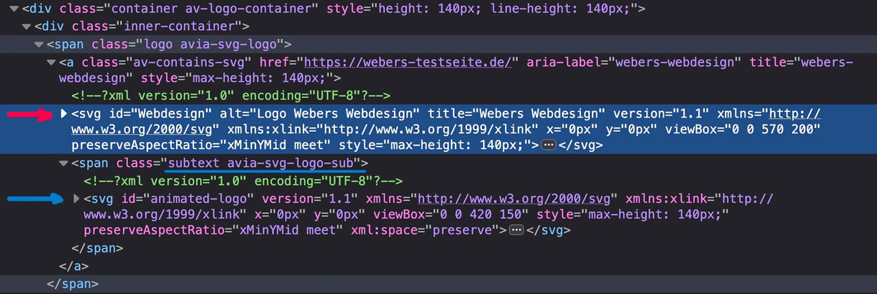
if there are same classes defined inside the inline svg files the last one (transparency logo inside the subtext) will win the css race ;)
Look with a good text editor to your svg files to see the culprit.
If you can make the link to your page public – i can give you better advice.
i use for title attributes on links, images etc. this function in my child-theme functions.php:
function temporary_removal_title_tags(){
?>
<script>
  window.onload = function() {
    var elementsWithTitle = document.querySelectorAll('a, img, *[title]');
    for (var i = 0; i < elementsWithTitle.length; i++) {
        var element = elementsWithTitle[i];

        element.setAttribute("data-original-title", element.title);

        element.addEventListener("mouseenter", function() {
            this.title = "";
        });

        element.addEventListener("mouseleave", function() {
            this.title = this.getAttribute("data-original-title");
        });

        element.addEventListener("mousedown", function() {
            this.title = this.getAttribute("data-original-title");
        });
    }
  };
</script>
<?php
}
add_action('wp_footer', 'temporary_removal_title_tags');
BUT this will not influence the <title> inside the xml code of a svg file!
you can get rid of those <title> but i do not know a way to get them back by mouseleave or mousedown event:
the code above with a little addon – so use instead:function temporary_removal_title_tags_and_get_rid_of_svg_titles(){ ?> <script> window.onload = function() { var elementsWithTitle = document.querySelectorAll('a, img, *[title]'); for (var i = 0; i < elementsWithTitle.length; i++) { var element = elementsWithTitle[i]; element.addEventListener("mouseenter", function() { if (this.title) { this.setAttribute("data-original-title", this.title); this.title = ""; } }); element.addEventListener("mouseleave", function() { var storedTooltip = this.getAttribute("data-original-title"); if (storedTooltip !== null) { // Prüfen, ob ein Originaltitel gespeichert wurde this.title = storedTooltip; this.removeAttribute("data-original-title"); // Aufräumen } }); element.addEventListener("mousedown", function() { var storedTooltip = this.getAttribute("data-original-title"); if (storedTooltip !== null) { this.title = storedTooltip; this.removeAttribute("data-original-title"); } }); } var allSvgs = document.querySelectorAll('svg'); allSvgs.forEach(function(svg) { var svgTitles = svg.querySelectorAll('title'); svgTitles.forEach(function(svgTitleElement) { if (svgTitleElement.textContent.trim() !== '') { svgTitleElement.setAttribute("data-original-svg-title", svgTitleElement.textContent); svgTitleElement.textContent = ""; // Leeren des SVG-Titels } }); }); }; </script> <?php } add_action('wp_footer', 'temporary_removal_title_tags_and_get_rid_of_svg_titles');why not delete all title tags: sometimes these are needed for lightbox bottom bar
maybe you get rid of that top border by:
#after_full_slider_1.container_wrap { border-top-width: 0; }check this page with your iPhone: https://webers-testseite.de/sam/
if you have convinced yourself that it works on mobile devices – I will take my site down again.on my iPhone i got this message from your page: “Please set a mobile device fallback imgage for this video in your wordpress backend.”
so now i recognise that you use the fullwidth-slider.i used for the video a color-section with video background. And set on
“Section Minimum Height – …(responsive section) to 56% (9/16*100)”. ( on a 16/9 video)First : i’m talking about a custom class : hide-on-smallscreens – not an ID
and maybe put your two columns inside a color-section.with my solution you can then remove all other trials to hide the column.
PS: you are still on Enfold 6.0.2 my testpage is on 7.1.1 – i only mention that because i can not reproduce a negative margin-top value on the img tag itself.
-
This reply was modified 10 months, 2 weeks ago by
Guenni007.
Why do you have that text as double content?
Lets try if a css only solution will do the job:
Do not create that extra text section. This means: your 1/3 column on the left – the 2/3 column with your text on the right. As probably before, move the line column upwards (-200px) using the setting via Advanced – Position relative in the Row Settings – Row Screen Options setting and let the columns wrap at 989px. Give the column with the image its own meaningful class, e.g.: hide-on-smallscreens.
Now insert it into the Quick CSS:
@media only screen and (max-width: 989px) {
 #top .flex_column.hide-on-smallscreens {
    display: none !important;
  }
  #top .flex_column.hide-on-smallscreens + .flex_column {
    width: 100%;
  }
}
maybe it is better to shift the image via position relative.
maybe it is because the ID is set twice ID=samhide
remove it from the imageor because the image is inside a column why not using the options inside the column element to hide the column?
so it is not your own page? Its for a different page?
-
This reply was modified 10 months, 2 weeks ago by
-
AuthorPosts