Forum Replies Created
-
AuthorPosts
-
Enfold uses the lightbox of Magnific Popup from : Dmitry Semenov
on its api you can see how to get some animation on it: https://dimsemenov.com/plugins/magnific-popup/documentation.html#animation
in general the animations are set there via custom-class.
Here you have some examples on animation: https://codepen.io/dimsemenov/pen/GAIktthe only thing is that you had to transform the given css rules of a animation to your quick.css
f.e. i like the mfp-3d-unfold:/* ====== 3d unfold ====== */ .mfp-3d-unfold { /* start state */ /* animate in */ /* animate out */ } .mfp-3d-unfold .mfp-content { perspective: 2000px; } .mfp-3d-unfold .mfp-with-anim { opacity: 0; transition: all 0.3s ease-in-out; transform-style: preserve-3d; transform: rotateY(-60deg); } .mfp-3d-unfold.mfp-bg { opacity: 0; transition: all 0.5s; } .mfp-3d-unfold.mfp-ready .mfp-with-anim { opacity: 1; transform: rotateY(0deg); } .mfp-3d-unfold.mfp-ready.mfp-bg { opacity: 0.8; } .mfp-3d-unfold.mfp-removing .mfp-with-anim { transform: rotateY(60deg); opacity: 0; } .mfp-3d-unfold.mfp-removing.mfp-bg { opacity: 0; }And is set via child-theme functions.php by:
function add_lightbox_effect() {
?>
<script type="text/javascript">
(function($) {
$(window).load(function(){
  $('.inline-popups').magnificPopup({
    delegate: 'a',
    removalDelay: 500,
    mainClass: 'mfp-3d-unfold',
    type:'inline',
    midClick: true,
  });
  $(document).on('click', '.popup-modal-dismiss', function (e) {
    $.magnificPopup.close();
  });
});
})(jQuery);
</script>
<?php }
add_action('wp_footer', 'add_lightbox_effect');
the popup-modal-dismiss thing is not needed for that – but if there is a button to go to f.e. an anchor link on the page – it closes the popup with that class.
you see that for that code a custom-class is set to a parent of the anchor link : inline-popups
but change it to whatever you like.See here an example : https://webers-testseite.de/pureinstall/info/
yes – so i use it this way:
function custom_burger_menu_active( $active, $context ){
	if( is_page(3) ) {
		return true;
	}
	return $active;
}
add_filter('avf_burger_menu_active', 'custom_burger_menu_active', 10, 2 );
can be closed
i am afraid that your plan to replace the logo with a pixel gif and display a background image instead ( with fake input fields ) will not be successful.
There is something conceptually wrong!Hm or is it a different page you like to edit?
https://tbwp.hostworks.com/You have to come clean with yourself somehow, where you would like to have what information.
So what about your search fields? Is there any chance the top header is a position you could live with.In principle, you could also place a widget in the place where these fields are planned now.
And have the burger for the main navigation on the left.
You should clarify this for you beforehand.This will solve the double Hamburger for your setting – but the hamburger on the right top is then over the “fake-search-fields”
.av-burger-menu-main.menu-item-avia-special {
  background: #3a5f93;
}
@media only screen and (max-width: 1200px) {
  .container.av-logo-container .avia-menu {
    display: none !important;
  }
}
@media only screen and (max-width: 989px) {
  #top #header #header_main_alternate {
    display: block !important;
  }
}
@media only screen and (max-width: 767px) {
  #top #header #header_main_alternate {
    display: none !important;
  }
  .container.av-logo-container .avia-menu {
    display: block !important;
  }
}
April 19, 2020 at 12:36 pm in reply to: Position: fixed div to become position: "unfixed" & rest at point on page scroll #1205198next way : https://webers-testseite.de/pureinstall/brodes/
maybe this is an option too?First of all – you gave the box-shadow to the text-block section? Why don’t you use the option on column – there is allready an option for that.
here is my setting: https://webers-testseite.de/pureinstall/nsgcouk/
put only these 1/3 columns in one color-section
give a custom class or ID to the color-section ( i did with ID: flex-section )
do not choose the equal height option ! ( we make that via flex modell )
on the right column the text-block : i put the text in a span with custom-classthen the css for quick css is:
#flex-section .entry-content-wrapper {
  display: flex;
  flex-flow: row wrap;
  justify-content: space-around;
  align-items: stretch;
}
#flex-section .entry-content-wrapper::before,
#flex-section .entry-content-wrapper::after {
  display: none;
}
#flex-section .entry-content-wrapper .flex_column {
  flex: 1 1 auto;
  min-width: 280px;
  margin-bottom: 50px;
}
#flex-section .avia_textblock span {
    display: flex;
}
@media only screen and (max-width: 1054px ) {
  #flex-section .entry-content-wrapper .flex_column:nth-of-type(1) {order: 1;}
  #flex-section .entry-content-wrapper .flex_column:nth-of-type(2) {order: 3;}
  #flex-section .entry-content-wrapper .flex_column:nth-of-type(3) {order: 2;}
}
the flex: 1 1 auto; only makes sence if you reorder like in my example the columns.
if you do not like to have the second under the two other columns in responsive case change it to: flex: 0 1 auto;-
This reply was modified 5 years, 11 months ago by
Guenni007.
April 18, 2020 at 7:04 pm in reply to: Position: fixed div to become position: "unfixed" & rest at point on page scroll #1205082But as i said the other way to add this in additon to have a nice startpoint for the fixed element:
Edit No the other way is much better – test on your Phone what happens.`@media only screen and (max-width: 767px) {
.page-id-1048 #av_section_1 .flex_column:nth-of-type(2) {
margin-top: 60px !important;
}
.fixed-heading {
width: 85%;
text-align:center
}
}`with your momentan solution is nice too !
April 18, 2020 at 7:02 pm in reply to: Position: fixed div to become position: "unfixed" & rest at point on page scroll #1205081this is only display block/none
i inserted on the text-block an additional entry:
@media only screen and (min-width: 768px) {
  .replaced-slogan {
      display: none;
  }
}

@media only screen and (max-width: 767px) {
  .fixed-heading {
    display: none;
  }

  .replaced-slogan {
  padding: 20px 20px 10px;
  background-color: #96c451;
  margin-bottom: 20px
  }
}
April 18, 2020 at 2:37 pm in reply to: Position: fixed div to become position: "unfixed" & rest at point on page scroll #1204930I completely agree with your wife. That preference should always come first.
My children are both grown up, so I have a little more time for such activities today.
Nevertheless, I too would prefer to go out now for a good wine and some music. ;)The ul.social_bookmarks is there – and the list items are there – but there are no :before ( which contains the icons for the medias )
there is a css rule definition that makes no sense#top #wrap_all .social_bookmarks, #top #wrap_all .social_bookmarks a, #top #wrap_all .social_bookmarks li { background: 0 0; }so guess there is something confused in your setting – what if you switch off the autoptimise plugin ( refresh all cachings – and maybe enfold merging )
April 18, 2020 at 1:59 pm in reply to: Position: fixed div to become position: "unfixed" & rest at point on page scroll #1204913The waypoints script is a mighty tool – and as mentioned above it is integrated in Enfold with its main parts.
In Combination with animate.css we can create scrollbased animations like Enfold offers when elements comes into viewport.I change for now the animation on my test page to bounceOutRight
The code in functions.php only get then instead of vanished : bounceOutRight. Thats all – but these animate.css are not part of Enfold.
The opacity change from 0 to 1 and viceversa is ok too.April 18, 2020 at 1:42 pm in reply to: Position: fixed div to become position: "unfixed" & rest at point on page scroll #1204904First : did you try that: https://kriesi.at/support/topic/position-fixed-div-to-become-position-unfixed-rest-at-point-on-page-scroll/#post-1204832
what i just mentioned above is that with a custom class it would be easier to address this element.
Now in the code there is as selector:#av_section_1 .avia_textblock div[style*="fixed"]with your setup and the code above and f.e:
in addition :@media only screen and (max-width: 767px) { .page-id-1048 #av_section_1 .flex_column:nth-of-type(2) { margin-top: 60px !important; } }the responsivie case could be ok too!
The more often I look at it, the more I can live with the fact that this fixed element slides under the texts.-
This reply was modified 5 years, 11 months ago by
April 18, 2020 at 9:43 am in reply to: Logo oben, Navigation darunter links und Social Icons rechts #1204870hast du ein Child-Theme installiert? Macht die Sache einfacher und “update resistent”
Also : aktiviere bitte im Footer die Social Media Icons ( Enfold – Footer – Social Icons)
Diese werden jetzt als Grundlage dafür genommen – diese in das Hauptmenu einzusetzen und in das Hamburger Menu auch.
Siehe meine Testseite im responsiven Fall.jetzt der Code für die child-theme functions.php
/************* verschieben der #socket social buttons in das Haupt-Menu und in das mobile (hamburger) menu ************/
function ava_main_menu_social(){
?>
<script>
(function($){
	$('#socket .social_bookmarks').css({ 'display': 'none' });

	$('#header').one('click', '.av-main-nav-wrap', function() {
    var isMobile  = $('.av-burger-menu-main').css('display'),
    social    = $('#socket .social_bookmarks').clone(true).addClass('sub-menu'),
    mobileMenu  = $('.av-burger-overlay');
    mobileMenu.find('#av-burger-menu-ul').append('<li class="only-burger menu-item-social av-active-burger-items"><a itemprop="url" alt="Social Bookmarks" style="" href="#"><span class="avia-bullet"></span><span class="avia-menu-text">Social Bookmarks</span><span class="avia-menu-fx"><span class="avia-arrow-wrap"><span class="avia-arrow"></span></span></span></a></li>');

    if( social.length ){
      mobileMenu.find('.only-burger.menu-item-social').append(social);
    }
	});

  var htmlString   = $('#socket .social_bookmarks').clone().find('li a'),
  socialString = [];

  htmlString.each(function() {
    var socialClass = $(this).parent('li').attr('class'),
        socialItems = $(this).wrap('<li class="'+ socialClass + ' menu-item menu-item-avia-special menu-social"></li>').parent().unwrap();
    socialString.push(socialItems);
  });

 	var socials = socialString.reverse();
  $(socials).each(function() {
        $(this).appendTo('#avia-menu');
  });
	$('#avia-menu .menu-social').css('float', 'right');
})(jQuery);
</script>
<?php
}
add_action('wp_footer', 'ava_main_menu_social');
( wenn ich mal den Code erklären soll sag bescheid * )
damit das im responsiven Fall auch hover states hat im Hamburger Menu müssen da einige css Sachen erneut gesetzt werden.
das also in das quick css
.responsive #top #avia-menu-0 .menu-social { display: none }

#av-burger-menu-ul .menu-item-social > a {
  pointer-events: none;
}

@media only screen and (max-width: 768px) {
  .main_menu .social_bookmarks {
    display: none !important;
  }
  .avia-menu.av_menu_icon_beside {
      padding-right: 0;
      margin-right: 0;
      border-right: none !important;
  }
}

@media only screen and (min-width: 769px) {
.main_menu .social_bookmarks:not(.sub-menu) {
  overflow: visible !important;
  display: flex !important;
  flex-flow: row wrap;
  justify-content: space-between;
  align-content: center;
}

.main_menu .social_bookmarks:not(.sub-menu) li {
  flex: 0 1 30%;
  line-height: unset !important;
  margin: 2px 0;
}

  .only-burger.menu-item-social {
    display: none
  }
}

#av-burger-menu-ul .menu-item-social a .avia-menu-text {
  font-style: italic;
}

#av-burger-menu-ul .only-burger.menu-item-social {
    border-top: 1px dashed gray;
    border-bottom: none !important;
}

.html_av-overlay-side-classic #top .av-burger-overlay li.menu-item-social a {
border : none !important
}

.responsive #top #av-burger-menu-ul .social_bookmarks.sub-menu {
  margin-left: 30px;
  overflow: visible;
  float: left !important;
  display: block !important;
  height: auto
}

#av-burger-menu-ul .social_bookmarks.sub-menu li {
    display: block;
    margin: 3px 10px;
    float: left;
}

#av-burger-menu-ul .social_bookmarks.sub-menu li a {
  padding: 10px !important;
  display: table-cell !important;
  float: none !important;
border-radius: 0 !important
}

#top #wrap_all #av-burger-menu-ul .av-social-link-facebook a { padding: 10px 13px !important;}
#top #wrap_all #av-burger-menu-ul .av-social-link-rss:hover a{color:#fff; background-color:#ffa133!important; }
#top #wrap_all #av-burger-menu-ul .av-social-link-facebook:hover a{color:#fff; background-color:#37589b!important; }
#top #wrap_all #av-burger-menu-ul .av-social-link-twitter:hover a{color:#fff; background-color:#46d4fe!important; }
#top #wrap_all #av-burger-menu-ul .av-social-link-whatsapp:hover a{color:#fff; background-color:#00e676!important; }
#top #wrap_all #av-burger-menu-ul .av-social-link-mail:hover a{color:#fff; background-color:#9fae37!important; }
#top #wrap_all #av-burger-menu-ul .av-social-link-dribbble:hover a{color:#fff; background-color:#e44885!important; }
#top #wrap_all #av-burger-menu-ul .av-social-link-linkedin:hover a{color:#fff; background-color:#419cca!important; }
#top #wrap_all #av-burger-menu-ul .av-social-link-search:hover a{color:#fff; background-color:#222222!important; }
#top #wrap_all #av-burger-menu-ul .av-social-link-gplus:hover a{color:#fff; background-color:#de5a49!important; }
#top #wrap_all #av-burger-menu-ul .av-social-link-behance:hover a{color:#fff; background-color:#008cfa!important; }
#top #wrap_all #av-burger-menu-ul .av-social-link-flickr:hover a{color:#fff; background-color:#ff0086!important; }
#top #wrap_all #av-burger-menu-ul .av-social-link-forrst:hover a{color:#fff; background-color:#234317!important; }
#top #wrap_all #av-burger-menu-ul .av-social-link-myspace:hover a{color:#fff; background-color:#000000!important; }
#top #wrap_all #av-burger-menu-ul .av-social-link-tumblr:hover a{color:#fff; background-color:#345574!important; }
#top #wrap_all #av-burger-menu-ul .av-social-link-vimeo:hover a{color:#fff; background-color:#31baff!important; }
#top #wrap_all #av-burger-menu-ul .av-social-link-youtube:hover a{color:#fff; background-color:#a72b1d!important; }
#top #wrap_all #av-burger-menu-ul .av-social-link-pinterest:hover a{color:#fff; background-color:#cb2027!important; }
#top #wrap_all #av-burger-menu-ul .av-social-link-skype:hover a{color:#fff; background-color:#12a5f4!important; }
#top #wrap_all #av-burger-menu-ul .av-social-link-instagram:hover a{color:#fff; background-color:#a67658!important; }
#top #wrap_all #av-burger-menu-ul .av-social-link-five_100_px:hover a{color:#fff; background-color:#222222!important; }
#top #wrap_all #av-burger-menu-ul .av-social-link-soundcloud:hover a{color:#fff; background-color:#F76700!important; }
#top #wrap_all #av-burger-menu-ul .av-social-link-xing:hover a{color:#fff; background-color:#006567!important; }
#top #wrap_all #av-burger-menu-ul .av-social-link-vk:hover a{color:#fff; background-color:#597BA5!important; }
#top #wrap_all #av-burger-menu-ul .av-social-link-reddit:hover a{color:#fff; background-color:#FF4500!important; }
#top #wrap_all #av-burger-menu-ul .av-social-link-yelp:hover a{color:#fff; background-color:#d32323!important; }
#top #wrap_all #av-burger-menu-ul .av-social-link-kununu:hover a{color:#fff; background-color:#2fb313!important; }
April 18, 2020 at 8:15 am in reply to: Position: fixed div to become position: "unfixed" & rest at point on page scroll #1204841just for info – you can combine the waypoints script with the animate css: https://daneden.github.io/animate.css/
you can download the css form daneden – put it in your child-theme folder css ( if not existent – create one ) – load the css via child-theme functions.php:// Einbinden von Animate.css add_action( 'wp_enqueue_scripts', 'wp_load_animate', 20 ); function wp_load_animate() { wp_enqueue_style( 'animate', get_stylesheet_directory_uri().'/css/animate.css' ); }see my test page from above with hinge class added
__________________________________( if you don’t like to load the whole css – you can pick out the keyframes you like to have f.e: the hinge )
@-webkit-keyframes hinge { 0% { -webkit-transform-origin: top left; transform-origin: top left; -webkit-animation-timing-function: ease-in-out; animation-timing-function: ease-in-out; } 20%, 60% { -webkit-transform: rotate3d(0, 0, 1, 80deg); transform: rotate3d(0, 0, 1, 80deg); -webkit-transform-origin: top left; transform-origin: top left; -webkit-animation-timing-function: ease-in-out; animation-timing-function: ease-in-out; } 40%, 80% { -webkit-transform: rotate3d(0, 0, 1, 60deg); transform: rotate3d(0, 0, 1, 60deg); -webkit-transform-origin: top left; transform-origin: top left; -webkit-animation-timing-function: ease-in-out; animation-timing-function: ease-in-out; opacity: 1; } to { -webkit-transform: translate3d(0, 700px, 0); transform: translate3d(0, 700px, 0); opacity: 0; } } @keyframes hinge { 0% { -webkit-transform-origin: top left; transform-origin: top left; -webkit-animation-timing-function: ease-in-out; animation-timing-function: ease-in-out; } 20%, 60% { -webkit-transform: rotate3d(0, 0, 1, 80deg); transform: rotate3d(0, 0, 1, 80deg); -webkit-transform-origin: top left; transform-origin: top left; -webkit-animation-timing-function: ease-in-out; animation-timing-function: ease-in-out; } 40%, 80% { -webkit-transform: rotate3d(0, 0, 1, 60deg); transform: rotate3d(0, 0, 1, 60deg); -webkit-transform-origin: top left; transform-origin: top left; -webkit-animation-timing-function: ease-in-out; animation-timing-function: ease-in-out; opacity: 1; } to { -webkit-transform: translate3d(0, 700px, 0); transform: translate3d(0, 700px, 0); opacity: 0; } } .hinge { -webkit-animation-duration: 2s; animation-duration: 2s; -webkit-animation-name: hinge; animation-name: hinge; }-
This reply was modified 5 years, 11 months ago by
April 18, 2020 at 7:50 am in reply to: Position: fixed div to become position: "unfixed" & rest at point on page scroll #1204832this would do the job for you – for ipad etc it is better to have z-index positiv values.
for quick css:
.fixed-heading {
    opacity: 1;
    transition: opacity 0.3s ease;
}

.fixed-heading.vanished {
    opacity: 0;
    transition: opacity 0.3s ease;
}
for child-theme functions.php
function scroll_up_down_change() {
if(is_page(1048)){
?>
<script>
(function($) {
var element_to_observe = $('#emergency');
var	fixedElement = $('#av_section_1 .avia_textblock div[style*="fixed"]').addClass('fixed-heading').css('z-index' , '5');

    element_to_observe.waypoint(function(direction) {
        if (direction == 'up') {
          fixedElement.addClass('vanished');
        }
        else {
          fixedElement.removeClass('vanished');
        }
        fixedElement.toggleClass('vanished');
    }, { offset: '80%' });
})(jQuery);
</script>
<?php
}
}
add_action('wp_footer', 'scroll_up_down_change', 30);
waypoint looks for the position of the observed element ( #emergency ) – when it is at 80% of the viewport it will add a class.
April 18, 2020 at 12:45 am in reply to: Position: fixed div to become position: "unfixed" & rest at point on page scroll #1204796Next question : on all these pages – will the recurring content be placed at the end using “page as footer” ?
Once again edit: it would be nice to have a custom-class to that fixed div:
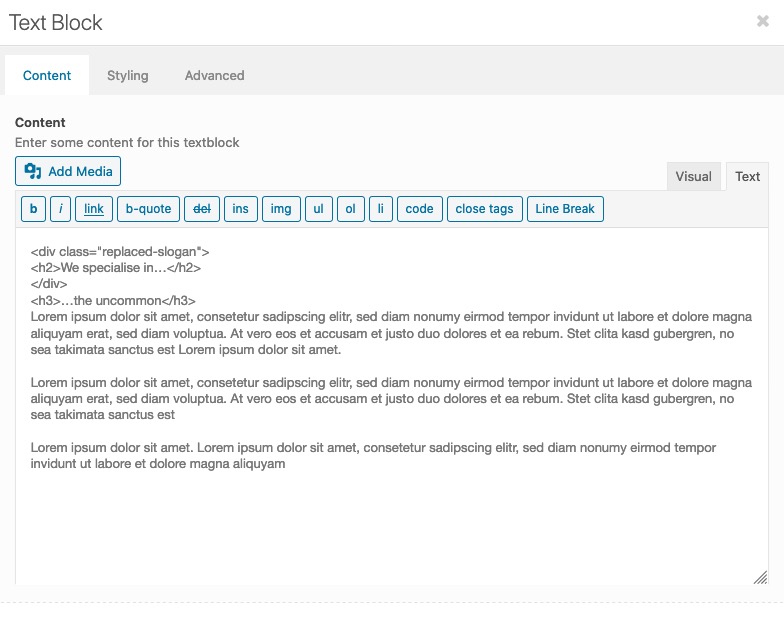
f.e.:<div class="fixed-heading" style="position: fixed; z-index: -5;"> <h2 style="padding: 20px; background: #96c451; color: #fff;">We specialise in…</h2> </div>This is better to select for any css or script.
Because Enfold has allready implemented the waypoints script – it is easy to use this. You can have that last but one color-section ( #emergency ) as a trigger. When it comes to viewport you can let things happen. ( Add classes f.e. to that fixed div )April 17, 2020 at 11:40 pm in reply to: Position: fixed div to become position: "unfixed" & rest at point on page scroll #1204787first: i am surprised that the negative z-index should work in all browsers!
Is this something you could live with? : https://webers-testseite.de/pureinstall/alb-testseite/
Look to the responsvie case on narrower screens.
-
This reply was modified 5 years, 11 months ago by
April 17, 2020 at 11:13 pm in reply to: Logo oben, Navigation darunter links und Social Icons rechts #1204785Also die Option von Enfold : logo links menu darunter bietet doch schon einmal genau das was du wolltest oder?
Oder wolltest du das Logo mittig oben?@media only screen and (min-width: 768px) { div .logo { left: 50%; transform: translate(-50%); } }Das was nicht in Enfold vorgesehen ist, dass die Social Media Icons mit in diesem Menu ( header_main_alternate menu ) sind.
Die Einstellung bei Header – Extra Elements : “Display in Main Header Area” hast du gesehen? – Die sind dann aber rechts vom Logo !Was möglich ist, ist die socket social media icons ( Enfold – Footer – Social icons ) zu nutzen, um diese als Kopie oben in das Hauptmenu einzufügen.
siehe: https://webers-testseite.de/pureinstall/
Wenn es das ist was du willst, dann kommt die Erklärung hiernach.This is one of those topics I particularly hate.
Someone ( in this case Mike ) is trying hard to find a solution and nobody knows what for; if it could be useful for you – or me.
Is it really so difficult to have a page on which one shows an example of what is meant.
Is it really always necessary to hold the page in question secret?I checked the answers here, but could’t fid the right one.
Where do you check ( no link ) etc. pp.
That’s something I notice from time to time, but unfortunately it doesn’t get any attention: the demo import links are all still based on the old non https links. Furthermore many of them are also based on www basis: http://kriesi.at
Although they are actually redirected to the https page in the browser:
http://kriesi.at/themes/enfold-visual-artist/files/2015/07/sketch1a.jpg
These are still not included in the import.
So someone should check the xml demo files and update the links.on that page – have you inserted the p-tags again. – this code does not bring back removed p-tags.
now i’m working on that – so it might be not working for a while . It seems to be better if i change the dots to be before the avia-menu-text when they are at the left side.
Edit: so – if you only want some dots without text ( only on hovering) you can change yourself to your needed css.
The most important thing here is to have the active state of the menu list points.-
This reply was modified 5 years, 11 months ago by
put this to your child-theme functions.php:
remove_filter('the_content', 'wpautop' );
remove_filter('the_excerpt', 'wpautop' );
refresh merging and delete all cachings if used.
https://webers-testseite.de/pureinstall/dot-navigation-with-colored-sections/
you can manage that with Enfold Tools.
- create a page where you have color-sections – set to 100% height.
- each of the color-sections got a unique ID.
- on top place a fullwidth submenu ( you can even use here an existing one ! But do not fix it here )
- the targets are the unique ID’s of the color-sections.
the rest is a bit of jQuery ( if you like to have an active state on those items)
and quick css.All Instructions are on that page – with all code to be placed.
I placed the class of the active state to the li element and named it : inview
PS: you do not need to have this on the left side. Thats just a bit css more. I think it will not disturb the scroll bars here on the left-
This reply was modified 5 years, 11 months ago by
April 14, 2020 at 11:28 am in reply to: Is there a way to show Masonry Gallery 'sort options' down the side? #1203526each button got his unique class as f.e. : landscape_sort_button etc. pp
so you can select them very specific to insert f.e. a top-border – but a hierarchical structure would be hard to get here
_________by the way, I would recommend you not to use any merging or caching tools while you are working on the styling.
You don’t always see immediately if something is effective – besides that it’s hard to give the right hints even as an advisor.April 14, 2020 at 11:18 am in reply to: Is there a way to show Masonry Gallery 'sort options' down the side? #1203524you had to find a solution for small screens on that – maybe you put the whole code only for a min width:
@media only screen and (min-width: 768px) {
  …
}
April 14, 2020 at 11:15 am in reply to: Is there a way to show Masonry Gallery 'sort options' down the side? #1203523#top div.container .av-masonry.sort-left .av-masonry-sort { width: 18%; float: left; overflow: visible; margin: 5px !important; } .av-masonry.sort-left .av-masonry-container { width: 80%; float: left; clear: none; margin-top: 50px; } #top .av-masonry.sort-left .av-sort-by-term { float: none !important; padding-top: 40px !important; } #top .av-masonry.sort-left .av-sort-by-term a { display: block; text-align: left; float: none !important; clear: both; } #top .av-masonry.sort-left .av-sort-by-term .text-sep { display: none; } #top .av-masonry.sort-left .av-current-sort-title { text-align: left; white-space: nowrap }April 14, 2020 at 11:06 am in reply to: Is there a way to show Masonry Gallery 'sort options' down the side? #1203519if the titles are a bit too long – maybe a different styling could be better.
#top div.container .av-masonry.sort-left .av-masonry-sort {
  width: 18%;
  float: left;
  overflow: visible;
}

.av-masonry.sort-left .av-masonry-container {
  width: 80%;
  float: left;
  clear: none;
  margin-top: 50px;
}

#top .av-masonry.sort-left .av-sort-by-term {
  float: none !important;
  padding-top: 40px !important;
}

#top .av-masonry.sort-left .av-sort-by-term a {
    display: block;
    text-align: left;
    float: none !important;
    clear: both;
}

#top .av-masonry.sort-left .av-sort-by-term .text-sep {
    display: none;
}

#top .av-masonry.sort-left .av-current-sort-title {
	text-align: left
}
April 14, 2020 at 10:53 am in reply to: Is there a way to show Masonry Gallery 'sort options' down the side? #1203515on your page : https://stevenduncanart.com/fine-art-prints-shop/?v=6cc98ba2045f#
please try in quick css:
(if it is only for that masonry – better give a custom class to the masonry f.e.: sort-left )#top div.container .av-masonry.sort-left .av-masonry-sort { width: 18%; float: left; } .av-masonry.sort-left .av-masonry-container { width: 80%; float: left; clear: none; } #top .av-masonry.sort-left .av-sort-by-term { float: none !important; } #top .av-masonry.sort-left .av-sort-by-term a { display: block; text-align: left; float: none !important; clear: both; } #top .av-masonry.sort-left .av-sort-by-term .text-sep { display: none; }you are using the alb element : video to place the video?
If so did you see under Advanced Tab of the Video ALB the option: “Lazy Load videos”
Choose the option: “show in lightbox …”on my ipad the video starts then in a lightbox – at the first moment as described a bit small of the lightbox dimension but after few ms it is then big.
look at: https://webers-testseite.de/selfhosted-video-in-lightbox/
one thing i recognized is that the loop does not work here.Thanks last solution fits well and i think it is usefull to have.
-
This reply was modified 5 years, 11 months ago by
-
AuthorPosts