Forum Replies Created
-
AuthorPosts
-
Can you show your link to that page?
But the initial open setting on behavior is set to “0” ?
And the link to that page does not go to with including toggle-id like : /boligforeninger/#toggle-id-1But you have seen the styles tab on each layer ?

And by the way : on the right side of that Styles Tab there is an input field for custom css as well – for all settings that couldn’t be done by options.
info from layerslider tooltip : “If you want to set style settings other then above, you can use here any CSS codes. Please make sure to write valid markup.”May 30, 2020 at 10:13 am in reply to: Color text white for label form in check box only on dark background #1217931And why two times opening a new post on similar thing: https://kriesi.at/support/topic/change-color-text-input_checkbox_label-form-with-background/
my answer is there
May 30, 2020 at 10:04 am in reply to: Change color text input_checkbox_label form with background #1217930or you decide to give that field a background instead:
#top.page-id-519 #element_avia_8_1 {
  background:#fff;
  padding:10px;
  border: 1px solid #e1e1e1
}
May 30, 2020 at 9:59 am in reply to: Change color text input_checkbox_label form with background #1217929since the existing rule is also set to important – we must then do the same with even more selectivity
The Link inside had to be influenced too.#top.page-id-519 .input_checkbox_label { color: #fff !important; } #top.page-id-519 .input_checkbox_label a { color: #f1c20c !important; }May 30, 2020 at 9:43 am in reply to: Change background color of "head telephone number extra info"-area in the top #1217926phone info has its own class – so why not use it:
.phone-info {
    background-color: blue;
    padding: 5px 10px;
}
Depends on your settings you had to set for transparency header too:
#top .av_header_transparency .phone-info {
    background-color: blue;
    padding: 5px 10px;
}
The font color is set via:
.header_color .phone-info a {
    color: red;
}
May 29, 2020 at 1:26 pm in reply to: "Einfacher Slider" – Folie 2 rutscht nach unten und wird versteckt #1217691And you love me too? ;) – because i’m not part of that team.
these ALB do have that filter :

i do not see your page – but you can use the filter in this case: avf_customize_heading_settings
This filter exists in a lot of ALB Elements to change the heading tag: Link
on time line there are two possibilites to influence the date and the title
And you can even add an additional Class to these tags:
Put this to your child-theme functions.phpfunction my_avf_customize_heading_settings( array $args, $context, array $extra_args = array()){ // this is for the date if( $context == 'avia_sc_timeline' && is_array( $extra_args ) && in_array( 'date', $extra_args ) ) { $args['heading'] = 'h3'; $args['extra_class'] = 'custom-date-class'; } // this is for the title if( $context == 'avia_sc_timeline' && is_array( $extra_args ) && in_array( 'title', $extra_args ) ) { $args['heading'] = 'h2'; $args['extra_class'] = 'custom-title-class'; } return $args; } add_filter( 'avf_customize_heading_settings', 'my_avf_customize_heading_settings', 10, 3 );May 29, 2020 at 9:55 am in reply to: "Einfacher Slider" – Folie 2 rutscht nach unten und wird versteckt #1217634Pay attention : you got that rule Twice in your code:
Ich kann dir leider nicht sagen wo du das gespeichert hast, weil du dein Merging in Enfold schon an hast.
May 29, 2020 at 7:12 am in reply to: Gallery with four thumbnails above and one big image below #1217592add this to the whole code:
.flex4on1::before,
.flex4on1::after {
    display: none !important;
}
i had to see your site ! – no images
are your images the same size! if they got different aspect ratio it will be nearly impossible to get that result.
You can see my testpage that it works on all screen width.
otherwise look for a modYou always come in bits and pieces with your demands. You should have said directly that you wanted the header at the bottom
May 28, 2020 at 3:04 pm in reply to: Gallery with four thumbnails above and one big image below #1217376Next Question: these are only images ( with maybe a link to lightbox or other pages) ?
It must be a masonry effect? ( Masonry Gallery ALB Element ) ?This is a different approach.
The Masonry Containers are a list of anchor elements.
Anchors are always block-level element.
https://webers-testseite.de/4on1-flexbox-model/May 28, 2020 at 2:52 pm in reply to: Gallery with four thumbnails above and one big image below #1217366Without seeing your site my support ends here.
Every Enfold Installation is a bit different with different css ( quick css etc. pp)
Even every Browser will render it differently. For some browsers a border f.e. is part of the width for some are not (thats a min 2px difference)You must think of the masonry has a calculation of the width ( somewhere in a js file ) and the left positioning of each Masonry Item with rounded approximations.
Here, too, one will only be able to achieve the closest possible approximation to the ideal.May 28, 2020 at 2:03 pm in reply to: Blog Posts ALB with Portfolio – do not work as expected #1217354My assumptions:
on the compact list of blog posts : only one entry of the older Portfolio Entries is shown + the newly added – and you see on the testpage above the readmore link is wrong! The link of the title is ok!
See DOM : the new entry got on articles a class: portfolio_entries-webdesign
the other from the older Portfolios Not
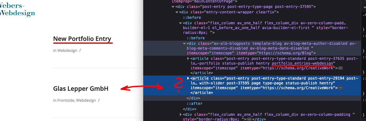
Every newly made Portfolio is shown in that compact list view!
The page where it works as it should ( https://webers-testseite.de/pureinstall/portfolio-list/ ) has never had an Enfold Version older than 4.7.4 !
i tried to repair / optimize Database of the older installations – but it does not show any effect.
I tried to open the older portfolios and save them again. But no influence.I always update via ftp and a full upload of the new enfold. so there are no remnants of the old Enfold versions.
-
This reply was modified 5 years, 10 months ago by
Guenni007.
May 28, 2020 at 12:06 pm in reply to: Blog Posts ALB with Portfolio – do not work as expected #1217319Please excuse the storm in a teacup, but it seems to be only on my mega-site.
With more than 3000 lines of child-theme functions.php something else might be disturbing.
I am looking for – on another test page it runs!
BUT i now deleted all entries in child-theme functions.php – deactivated all plugins – cleared all cache and switched off merging – but it is still on that page the issue.
The only thing now – i do upload via ftp again all files – maybe there is gone something wrong on first upload.EDIT: I’m desperate. See page now : left side List Compact View – right side Grid-view.
Both the same ( Webdesign Taxonomie – view all – offset deactivated etc. pp )
the compact view only show two portfolios .May 28, 2020 at 11:28 am in reply to: "Einfacher Slider" – Folie 2 rutscht nach unten und wird versteckt #1217314PS: Du kannst natürlich auch jedem slide einen Link geben!
May 28, 2020 at 11:06 am in reply to: "Einfacher Slider" – Folie 2 rutscht nach unten und wird versteckt #1217307here is the css code for stretching the caption background as you have before on the other slider:
if you do only like to have it on that slider : give a custom class to the slider in my example: stretch-caption.avia-slideshow.stretch-caption { box-shadow: 0 0 25px -5px #000; background: #fff !important; } .stretch-caption .caption_framed .slideshow_caption .avia-caption-content p, .stretch-caption .caption_framed .slideshow_caption .avia-caption-title, .stretch-caption .avia-caption .avia-caption-content p, .stretch-caption .avia-caption .avia-caption-title { background: transparent; color: #fff !important } .stretch-caption .avia-caption { bottom: 0; left: 0; width: 100%; background-color: rgba(0,0,0,0.6); }May 28, 2020 at 10:57 am in reply to: "Einfacher Slider" – Folie 2 rutscht nach unten und wird versteckt #1217303you have set on your css :
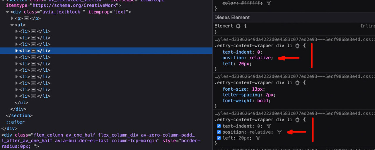
.entry-content-wrapper div li {
    text-indent: 0;
    position: relative;
    left: 20px;
}
this influences the slideshow li’s too. because the images are in li containers the whole slideshow is an unordered list !
but on the slideshow they had to be in an absolute positioning
so get rid of that code – and style your list with :
.avia_textblock li {
    padding-left: 20px;
    list-style: inside;
}
that shifts your list on the left a bit more to the right.
i guess there must be changed something with the this._stopSlideshow(); in slider.js.
see f.e. line 347ff in slider.jsIt seems that the slideshow – allthough it is set to ininite loop stops and then starts again.
You see this on the caption titles best. Inbetween the slideshow the captions are faded very smooth – but from last to first they look like they started a new slideshow.
but I can’t figure out why sliding works with these settings and fading doesn’tMay 28, 2020 at 9:04 am in reply to: "Einfacher Slider" – Folie 2 rutscht nach unten und wird versteckt #1217276well first it is not the enfold silder : soliloquy-slider
guess it is hard to say from the team here.why don’t you use the Enfold Simple Slider instead?
You can have a very similiar Outlook of that
I wouldn’t make such a long list as in slider 1 but you can style it like slider 2 on my example:
https://webers-testseite.de/simple-slider/____________
Die Anpassung für den Caption Hintergrund sage ich dir dann wenn du es übernehmen möchtest.
ich nehme mir mal kurz deine Bilder raus und setze Sie ein. Dann kannst du vergleichen.
du sparst dir dadurch das laden eines zusätzlichen Plugins, welches überhaupt nicht nötig ist. Das bringt auch Performance Vorteile.
Die Bilder ersetze ich dann sobald du es gesehen hast.-
This reply was modified 5 years, 10 months ago by
May 26, 2020 at 11:20 pm in reply to: Changing the link for the main logo for logged out users #1216712hm :
have you tried that on top:
add_filter('avf_logo_link','av_change_logo_link');
function av_change_logo_link($link){
  if ( is_user_logged_in() ) {
      $link = "https://yousio.com/activity";
  }
  if ( !is_user_logged_in() ) {
      $link = "https://yousio.com/";
  }
    return $link;
}
maybe you set the wordpress setup wrong – because i do not see any difference on the homepage and the activity page ( yes i’m not logged in)
when klicking on the activity button in your menu. If there is a difference there migth be two different pages ! ?what did you declare as frontpage ( if it is the activity page then it is clear )
Yes i can see that there is different pages ( different page-ids ) but the content seems to me identical.
I see only different sidebars. But they do change on reload too.just a bit like this on both:
#top .social_bookmarks { margin: 0; } .fallback_menu + .social_bookmarks { padding-left: 9px; } #header_main::before { content: ''; position: absolute; left: auto; top: 50%; transform: translateY(-50%); background-color: #fff; border: 14px solid #d1b1a7; } #header_main::before { width: 145px; height: 40px; right: 5px; } @media only screen and (max-width:767px) { #header_main::before { width: 140px; height: 30px; right: 20px; } } @media only screen and (max-width:479px) { #header_main::before { width: 50px; height: 30px; right: 5px; } }have a look what happens if we add a pseudo container to header_main:
#header_main::before {
    content: '';
    position: absolute;
    width: 150px;
    height: 40px;
    right: 14px;
    left: auto;
    top: 50%;
    transform: translateY(-50%);
    background-color: #fff;
    border: 14px solid #d1b1a7;
}
you had to adjust this in media querries to your needs ( the social bookmarks are gone if the screen is narrow )
on middle wide screen a height of 30px is enough and on small mobile screens you had to make the width smaller just to surround the burger.-
This reply was modified 5 years, 10 months ago by
first: the burger button is covered by the social bookmarks and because it has a z-index of 150 and your burger has 100
the active click area of the burger is less than it should. ( only left side is active )let the margin left be on default and set the padding lower:
#top .social_bookmarks { margin: 0; } .fallback_menu + .social_bookmarks { padding-left: 9px; }Jordan is right – but i would take a color of the shirt as background like: #223256
or the something of the cap color: #541a26May 26, 2020 at 9:55 pm in reply to: Changing the link for the main logo for logged out users #1216697And that is really hard to understand?
is_user_logged_in is if the user is logged in.the ! is a not logic
add_filter('avf_logo_link','av_change_logo_link');
function av_change_logo_link($link){
  if ( is_user_logged_in() ) {
      $link = "https://yousio.com/activity";
  }
  if ( !is_user_logged_in() ) {
      $link = "https://yousio.com/";
  }
    return $link;
}
but for not logged in users this is normal behavior so you might get rid of the default setting:
add_filter('avf_logo_link','av_change_logo_link');
function av_change_logo_link($link){
  if ( is_user_logged_in() ) {
      $link = "https://yousio.com/activity";
  }
    return $link;
}
try yourself.
-
This reply was modified 5 years, 10 months ago by
May 26, 2020 at 9:26 pm in reply to: Changing the link for the main logo for logged out users #1216689Try this:
add_filter('avf_logo_link','av_change_logo_link'); function av_change_logo_link($link){ if ( is_user_logged_in() ) { $link = "url1"; } if ( !is_user_logged_in() ) { $link = "url2"; } return $link; }The css code comes to quick css – but read carefully – there is a custom-class to set for a parent-element of the images.
If you like every image in a color-section with a link to have that hover style – give the class to the color-section.
If you only want it for some images give the class to the image alb itself.If you like to have that style for Masonry Entries – we had to change the code.
It was important for me that you understand the procedure and then transfer it yourself.
So you’ve got two containers, so to speak, lying on top of each other.
One has a height of 0 and grows in the Y-direction – the other one has a width of 0 and grows in the X-direction.If you are not able to transfer it to other containers – tell me – i will help you then –
it is easier to do it on a live site – so if you can make the page public tell me. -
This reply was modified 5 years, 10 months ago by
-
AuthorPosts