Forum Replies Created
-
AuthorPosts
-
and you inserted that video with code-block element as described.
Please send me the link to your page. ( contact under my avatar )___________
Solution for color-section and background-video:
First – you had to know what aspect ratio is your selfhosted video!
you had to insert this to the color-section when you fill out the elements options:
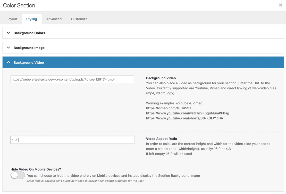
in most cases it will be a 16/9 video aspect ratio. – if not you can insert there a different value.
then have a look to: https://webers-testseite.de/html5-video-ben/
but you have read the instruction:
this is the content of my code-block element inside a color-section
custom class on that color-section is: html5-videothe css code isn’t all needed if you do not want to have an overlay over the video ( other enfold elements )
this is then sufficient:#top .html5-video .responsive-video { width: 100%; height: auto; display: block; } .responsive #top #wrap_all .html5-video .container { max-width: 100% !important; width: 100%; padding: 0; } #top .html5-video .content { padding: 0; }But i will make a color-section solution with background video and the needed css for you now
See what happens – when i switch off these height / min-heigt settings in dev-tools :
any height and min-height is not necessary here – remove everything that is noted in your CSS regarding this slider; or is set in the element itself!
This setting only exists because the background must fulfill the height of the content. See the comment next to the min-height setting:Slider minimum height in pixel
This is helpful on smaller screens if you got a lot of text in your sliderHowever, this is not the case here, which is why you can drive responsively up to very small screens.
you got still in – i guess quick css:
@media only screen and (max-width: 479px) {
  .home #full_slider_1,
  .home #full_slider_1 .avia-slideshow,
  .home #full_slider_1 .avia-slideshow-inner,
  .home #full_slider_1 .avia-slide-wrap {
    min-height: 300px;
  }
}
and an inline svg for that element:
is setting it to :Element { padding: 0px; height: 300px; transition: none; transform: translateZ(0px); }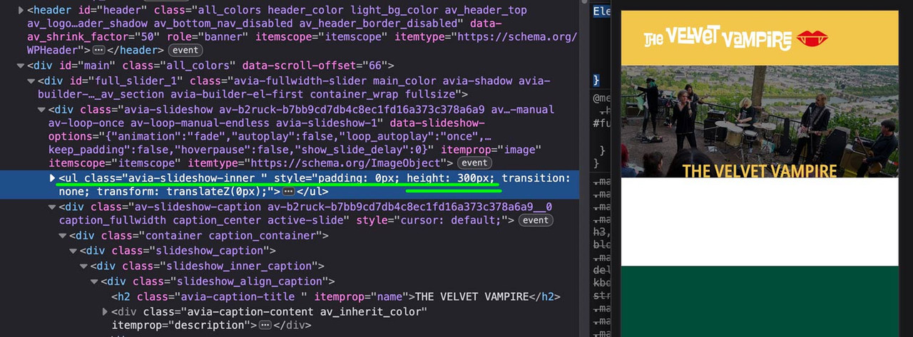 July 10, 2025 at 8:05 am in reply to: Header widget showing above logo on mobile and tablet – how to reposition #1486573
btw. i optimized those rules a little – and you do not need to shrink the menu items font-size – because it breaks to burger menu earlier.
So : better remove all the code from above – and insert instead:
#top #header .av-main-nav > li > a { font-size: 16px !important; padding: 0 12px !important; } @media only screen and (min-width: 1430px) { #header #header_main { width: 1430px; margin: 0 auto; } } @media only screen and (min-width: 990px) { #header #header_main { display: flex; flex-flow: row wrap; justify-content: space-around; } #header #header_main > * { flex: 1 1 auto; align-self: center; width: unset; } #header #header_main .av-logo-container { flex-basis: calc(100% - 170px); flex-grow: 1; order: 1; max-width: unset; } #header #header_main .widget { margin-right: 50px; flex-grow: 0; flex-basis: 120px !important; order: 2; display: flex; justify-content: center; } #header #header_main #header_main_alternate { flex-basis: 100%; order: 3; border-top: none; } } @media only screen and (max-width: 989px) { #header #header_main { display: flex; flex-flow: wrap column-reverse; } #header #header_main .widget { margin-top: 0px; padding: 10px 0 !important; } #header_main .av-logo-container { height: 150px !important; } #header_main .inner-container { display: flex; justify-content: space-between; align-items: center; height: 150px; } #header_main .inner-container > * { align-self: center; } #header_main .inner-container .main_menu { display: flex !important; align-items: center; } #header_main .inner-container .avia-standard-logo { width: 215px } #header_main .inner-container .main_menu .social_bookmarks { top: 0; margin-top: 0 !important; } } @media only screen and (max-width: 767px) { .responsive #top #wrap_all .main_menu { position: relative !important; } }so your video is inside media library ? and should be placed as html5 video!
you can force even background-videos inside color-sections to be that way – or video element inside a color-section – but my prefered way is to use codeblock element. – if you do not like that solution- tell me how you like to do it.
see here example and code to use:
https://webers-testseite.de/html5-video-embed/
or
https://webers-testseite.de/html5-video-bhe/and after doing that – try:
@media only screen and (max-width: 479px) { .html_header_transparency #top .avia-builder-el-0 .container, .html_header_transparency #top .avia-builder-el-0 .slideshow_caption { padding-top: 25px; } @media only screen and (max-width: 476px) { #top .avia-caption-content { display: none!important } } }All you need is to get rid of the min-height option – the fullwidth slider is a responsive slider !
for the caption it might be neccessary to have for very small screens smaller font-sizes – or to set a part (f.e. the avia-caption-content to display:none )
you got a rule :
@media only screen and (max-width: 489px) {
  .avia-slideshow li img {
    width: 100%;
    background-size: cover;
    height: 200px;
    object-fit: cover;
    left: 30px !important;
    position: relative;
    overflow: visible;
  }
}
Remove the rules given to you by ismael first because …
remove the left position – and height – otherwise you will have a gray bar on the left ;)
then there are some min-height properties:
inline-styles
@media only screen and (max-width: 489px) {
  .home #full_slider_1, .home #full_slider_1 .avia-slideshow,
  .home #full_slider_1 .avia-slideshow-inner, .home #full_slider_1 .avia-slide-wrap {
    min-height: 200px;
    height: 200px !important;
  }
}
and enfold css:@media only screen and (max-width: 479px) { .home #full_slider_1, .home #full_slider_1 .avia-slideshow, .home #full_slider_1 .avia-slideshow-inner, .home #full_slider_1 .avia-slide-wrap { min-height: 300px; } }don’t know where they come from. But if you like to see the full width of the image – these settings are suboptimal.
July 9, 2025 at 1:16 pm in reply to: Header widget showing above logo on mobile and tablet – how to reposition #1486512my solution – a little adjust of css from ismael – but easiest way is to remove it – and remove please the rule:
#header_main .widget {
  display: flex;
  align-items: center;
  margin-left: 85%;
  margin-top: 2%;
  position: absolute;
}
now try:
@media only screen and (min-width: 1430px) {
  #header #header_main {
    width: 1430px;
    margin: 0 auto;
  }
}

@media only screen and (min-width: 990px) {
  #header #header_main {
    display: flex;
    flex-flow: row wrap;
    justify-content: space-around;
  }
  #header #header_main > * {
    flex: 1 1 auto;
    align-self: center;
    width: unset;
  }
  #header #header_main .av-logo-container {
    flex-basis: calc(100% - 170px);
    flex-grow: 1;
    order: 1;
    max-width: unset;
  }
  #header #header_main .widget {
    margin-right: 50px;
    flex-grow: 0;
    flex-basis: 120px !important;
    order: 2;
    display: flex;
    justify-content: center;
  }
  #header #header_main #header_main_alternate {
    flex-basis: 100%;
    order: 3;
    border-top: none;
  }
}

@media only screen and (max-width: 989px) {
  #header #header_main {
    display: flex;
    flex-flow: wrap column-reverse;
  }
  #header #header_main .widget {
    margin-top: 0px;
    padding: 10px 0 !important;
  }
}
sadly we loose with this the border-top of #header_main_alternate – or you can live with it that the border-top does not have the full screen-width.
then remove that border-top: none line.July 9, 2025 at 11:15 am in reply to: Header widget showing above logo on mobile and tablet – how to reposition #1486506which hook do you use to have that widget?
____________
next hint: header_main_alternate is an ID so use as selector #header_main_alternate
and you do not need to put it in account because in responsive case it is at display: noneso you do not need to set order!
it is enough if you go and set flex-direction to column-reverse to bring the button below logo container.@media only screen and (max-width: 989px) { #header #header_main { display: flex; flex-wrap: wrap; flex-direction: column-reverse; } }btw. it is a good practice if you choose even values for min-width and odd values for max-width.
if you follow that little link on enfold options:
(these two cards icon)
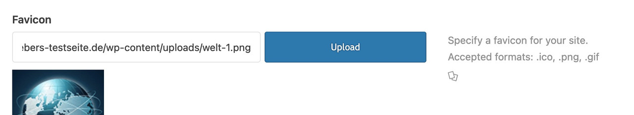
you will see on that wiki page a good overview; and in detail a browser support. Best Format seems to be png.
a svg has a bad support.you can manually add them if you put this to your child-theme functions.php:
function add_icons_to_head(){
?>
  <link rel="icon" type="image/png" href="/wp-content/uploads/icons/your-favicon-image.png">
  <link rel="apple-touch-icon" type="image/png" href="/wp-content/uploads/icons/your-apple-touch-icon.png">
<?php
}
add_action('wp_head', 'add_icons_to_head');
You are free to select the names and paths of your PNGs.
After reviewing my spam submissions, I found that a significant portion of these messages — about 90% — originate from email addresses ending with gmail.com and yahoo.com (I didn’t even suspect that this still exists).
On the extended Version – shure on free version see – here : https://wordpress.org/plugins/honeypot/
Automatic anti spam protection for following forms (Available in Free Version) . No setup required.
WP Comments
WP Registraton
BBPress Forum (bbpress.org)
Contact Form 7 (wordpress.org/plugins/contact-form-7)
Gravity Forms (For Non Ajax and Single Page/Step Form – gravityforms.com)
WPForms (wpforms.com)
Formidable Forms (formidableforms.com)
Caldera Forms (calderaforms.com)
Toolset Forms (toolset.com)
Elementor Forms (elementor.com)
Fluent Forms (fluentforms.com)
Divi Theme Contact Form (elegantthemes.com)
Theme My Login ( https://wordpress.org/plugins/theme-my-login/ )
WooCommerce Reviews Pro
GDPR compliant. No tracking, cookie storage or external server calls.Sadly the enfold form isn’t supported in the free version – but i think contact form 7 is a better alternative – not only because of the addon: Conditional Fields for Contact Form 7
on default the fullwidth-slider is responsive. I am not aware that this behavior should not apply to mobile devices.
I guess you have entered a min-height option on styling tab: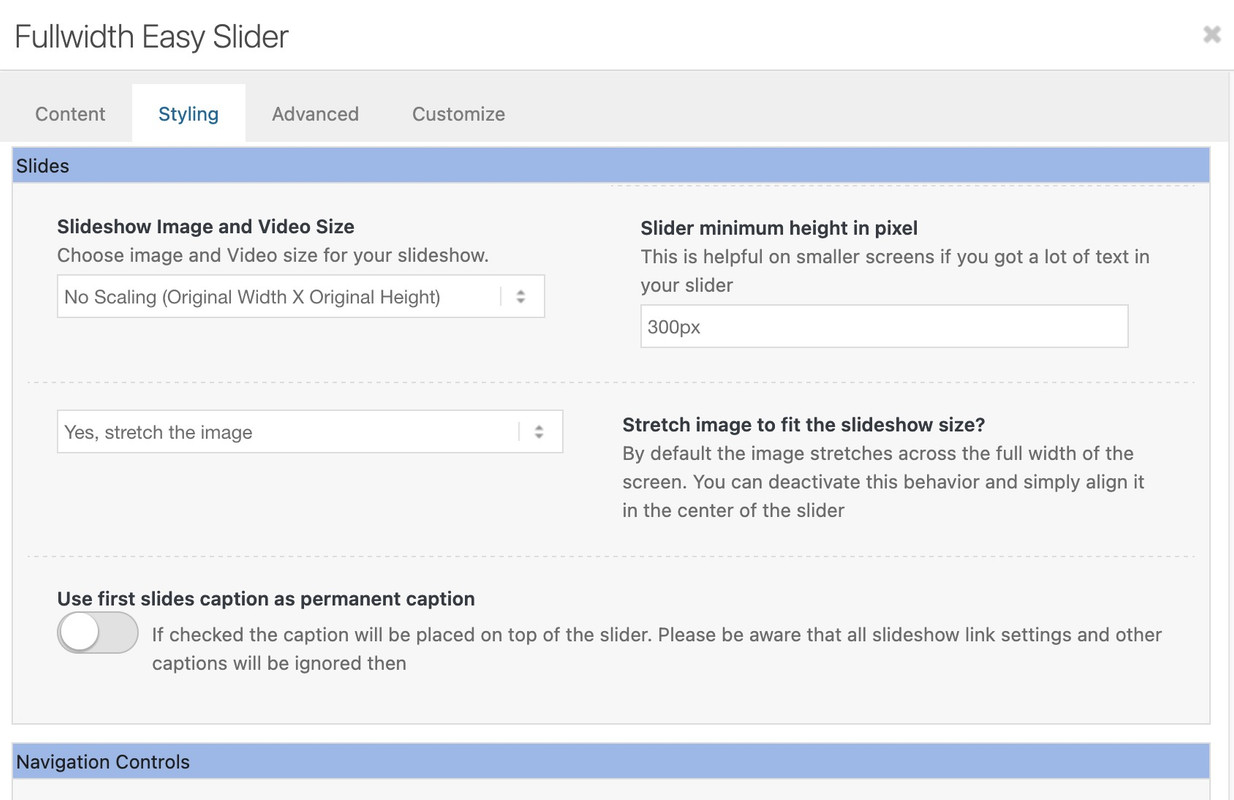
You have already ensured that the font is hidden on very small screens. But you could just as easily make them smaller.
If you write in the text block element without inserting special tags, your text will be output as a p tag in the front end.
The p tag is subject to the body font that you set in your settings under: Enfold (Child) > General Styling > Font > Font for Your Body Text.Edit: One minute too late. You can’t sleep either?
OK – it is solved – because i transfered the enfold shortcodes from an existing former enfold version to a newer one. A gallery shortcode was transformed that breaks the output. I deleted the gallery element (that does not fit with enfold 7.1.1 ) and created a new one inside that post. Now on the page with the blog posts element – everything is as wanted. The whole content is shown.
Can be closed – or deleted ;)
So – either you remove this setting with the margin-right: 15px again – and we live with the fact that when the lightbox is open, the background is shifted by 15px due to the disappearance of the scrollbar. Or you define another rule for this case and the fixed header.
At framed or boxed layout you had to adjust that value you substract.
July 5, 2025 at 6:10 am in reply to: Reservierungsseite – Datumsfeld den auszuwählenden Zeitraum einschränken #1486333By the way, if you have two date pickers, one for the start date and one for the end date, you can restrict the second date picker so that it only allows dates that are later. For example, we can also remove weekends from the selection.
here in my example the minDate/maxDate are relative Values by +7 Days and +12 Month:
function my_datepicker_limits() {
?>
<script type="text/javascript">
window.addEventListener("DOMContentLoaded", function () {
(function($) {
    setTimeout(function() {
        var $allDatepickers = $('.avia_datepicker');

        // Let's assume that the first avia_datepicker found is the start date
        var $startDateField = $allDatepickers.eq(0);
        // and the second avia_datepicker found the end date
        var $endDateField = $allDatepickers.eq(1);

        // Check whether we have found at least two datepicker fields
        if ($startDateField.length === 0 || $endDateField.length === 0) {
            console.warn('Could not find both Start and End datepicker fields. Ensure they are the first two .avia_datepicker elements.');
            return; // Exit script if not enough fields are found
        }

        // Find the container of the end date field (the <p> element in your structure)
        // This is the parent tag of the input field that also contains the label.
        var $endDateFieldContainer = $endDateField.parent('p.form_element');

        // Fallback if the container is not the <p> tag or is not found
        if (!$endDateFieldContainer.length) {
            $endDateFieldContainer = $endDateField; // Then we only hide the input field itself
        }

        function updateEndDatepickerState() {
            var selectedStartDate = $startDateField.datepicker('getDate');


            if (selectedStartDate) {
                // Optional: Add one day to ensure that the end date is at least one day after the start date.
                // then remove the backslashes of the next line
                // selectedStartDate.setDate(selectedStartDate.getDate() + 1);

                // If a start date is selected, display the end date field
                $endDateFieldContainer.css('display', 'block'); // Verwendet 'block', da <p> ein Block-Element ist

                $endDateField.datepicker('option', 'minDate', selectedStartDate);

                // Optional: Make sure that the end date is not before the start date.
                var currentEndDate = $endDateField.datepicker('getDate');
                if (currentEndDate && currentEndDate < selectedStartDate) {
                    $endDateField.datepicker('setDate', selectedStartDate);
                }

            } else {
                // If no start date is selected, hide the end date field
                $endDateFieldContainer.css('display', 'none');

                // Reset minDate of the end date date picker (e.g. to “today”)
                $endDateField.datepicker('option', 'minDate', 0);
            }
        }

        if ($startDateField.data('datepicker')) {
            $startDateField.datepicker('option', {
                beforeShowDay: $.datepicker.noWeekends,
                minDate: "+7d",
                maxDate: "+12m",
                onSelect: function(dateText, inst) {
                    // Update the state when a date is selected
                    updateEndDatepickerState();
                },
                onClose: function(dateText, inst) {
                    // Update the state even when closing the data picker (for robustness)
                    updateEndDatepickerState();
                }
            });
        }

        if ($endDateField.data('datepicker')) {
            $endDateField.datepicker('option', {
                // beforeShowDay: $.datepicker.noWeekends,
                minDate: 0,
                maxDate: "+12m"
            });
        }

        // Execute the function once when loading the page to set the initial state
        updateEndDatepickerState();

    }, 500);
}(jQuery));
});
</script>
<?php
}
add_action('wp_footer', 'my_datepicker_limits', 20);
see: https://webers-testseite.de/datepicker/
Edit here – because topic is closed:
This was also only intended as additional information. It is in case someone lands here via the search. They may have exactly this request.you can see how focus-visible status leads to a Tab Navigation: https://guenterweber.com/
but all css is manually set !this is the whole css for transparency fixed header on small screens ( if header_meta is present some height values had to be corrected ) from my testpage above:
@media only screen and (max-width:989px) { .responsive #top #wrap_all #header .container { width:95%; max-width:95% } #header { position:fixed !important; height:80px !important; max-height:80px !important } .responsive #top .av-logo-container , .responsive #top .logo a, .responsive #top .logo img, .responsive #top .logo svg { height:80px !important; max-height:80px !important; line-height:80px !important } .responsive #top .av-main-nav .menu-item-avia-special a { height:80px !important; line-height:80px !important } #top .header_bg, .responsive.html_mobile_menu_tablet #top #wrap_all .av_header_transparency { background-color:transparent !important } .responsive.html_mobile_menu_tablet #top #wrap_all #header:not(.av_header_transparency) { background-color:#FFF !important } #top #header.header-scrolled .header_bg { background-color:#FFF !important } .responsive.html_mobile_menu_tablet #top .av_header_transparency .logo img.alternate, .responsive.html_mobile_menu_tablet #top .av_header_transparency .logo .subtext.avia-svg-logo-sub { display:block !important } .responsive.html_mobile_menu_tablet #top .av_header_transparency.av_alternate_logo_active .logo a > img, .responsive.html_mobile_menu_tablet #top .av_header_transparency.av_alternate_logo_active .logo a > svg { opacity:0 } html:not(.html_header_transparency) #top .header_bg { background-color:#FFF !important } .responsive:not(.html_header_transparency).html_mobile_menu_tablet.html_header_top #top #main { padding-top:80px !important } }try:
@media only screen and (max-width:989px) {
  .responsive.html_mobile_menu_tablet #top .av_header_transparency .logo img.alternate,
  .responsive.html_mobile_menu_tablet #top .av_header_transparency .logo .subtext.avia-svg-logo-sub {
    display:block !important
  }
  .responsive.html_mobile_menu_tablet #top .av_header_transparency.av_alternate_logo_active .logo a > img,
  .responsive.html_mobile_menu_tablet #top .av_header_transparency.av_alternate_logo_active .logo a > svg {
    opacity:0
  }
}
_______________
in layout.css there is that rule – this has to be overwritten – if you set your header to fixed position:
@media only screen and (max-width: 989px) { .responsive.html_mobile_menu_tablet #top .av_header_transparency .logo .subtext.avia-svg-logo-sub, .responsive.html_mobile_menu_tablet #top .av_header_transparency .logo img.alternate { display: none; } } @media only screen and (max-width: 767px) { .responsive #top .av_header_transparency .logo .subtext.avia-svg-logo-sub, .responsive #top .av_header_transparency .logo img.alternate { display: none; } }you can test it in dev tools by just make a copy of the jQuery script and put it in the console.
see: https://vimeo.com/1098726318/6ae8a411b5take a look at the rules for the hover state and apply them to the focus-visible state.
f.e.: on that page here – the first button on top: https://kriesi.at/themes/enfold-overview/
Add inside dev tools the css to see what i mean..avia-button.avia-color-light:focus-visible { opacity: 0.7; transition: all 0.4s ease-in-out; } .av-icon-on-hover:focus-visible .avia_button_icon { width: 1.5em; opacity: 1; }the focus-visible state ( or focus-within too ) do not influence a clicked or hover state.
This means that normal navigation is not affected, contrary to the focus state.but that comes from layout.css – no custom css at all:
#top .logo img.alternate { opacity: 0; } #top .av_header_transparency .logo a > img { opacity: 0; } #top .av_header_transparency .logo img.alternate { opacity: 1; }ok – sorry i only tested the code on my webers-testseite.de
this is a playground for all things i try to show for other participants. ( That has a child-theme functions.php with over 4800 lines ) maybe there is something that disturbs that snippet.here on a nearly untouched installation it works on mobile too! ( at least in DevTools for mobile emulation )
by the way: that snippet from your first post – does not work on my testinstallation ( Enfold 7.1.1). I do allways have inline svg.
As far as i know the avia-snippet-sticky-header does only rule the shrink amount , header height. (Two classes are toggled on scrolling)
On mobile devices the shrinking is set to off by that line i mentioned.Apart from that, why don’t you want an inline SVG for the logo?
You just have to make sure that the classes with same selector used within the SVG have the same declarations, and that different CSS declarations have different classnames.
To be on the safe side, I would use completely different class names.
This is important because the alternate logo is listed in the DOM after the standard logo. Therefore, a selector inside the alternate logo would always prevail. (e.g. if in both logos there are classes like st1 or cls1 ( as used by illustrator) the fill color for cls1 of the alternate-logo will win the race )try :
@media only screen and (max-width: 1319px) {
    #top #header .av-main-nav > li.menu-item  {
        display: none!important;
    }
    #top #header .av-burger-menu-main {
        cursor: pointer;
        display: block!important;
    }
}
PS : why “Connection denied by IP2Location Country Blocker” for Germany ?
you only changed that line?
if( shrinking && ! isMobile ) -
AuthorPosts