Forum Replies Created
-
AuthorPosts
-
so you have no comment-count nor author behind that?
.text-sep.text-sep-date { display: none !important; }i guess a mod should look into your installation – because even the default container width is not there ( 1310px ) it falls back to the 1010px value ( of grid.css).
there must be other inconsistencies.I’m at my last words of knowledge now. Actually, the code is correct as on my site, for some reason even the simple prepend is not executed.
________
besides that:
Edit: on quick css there is a curly bracket missing :.custom-phone { position: absolute; top: -33px; right: 0; }-
This reply was modified 5 years, 8 months ago by
Guenni007.
on that add_action line can you please do this :
add_action('wp_footer', 'unmute_mute_background_video', 999);so that there is:
function unmute_mute_background_video_in_slider(){
?>
<script type="text/javascript">
(function($) {
    $('.mute-button .avia_video').closest('.avia-slide-wrap').prepend('<div class="custom-mute"></div>');
    $('.mute-button .avia_video').on('av-mediajs-loaded', function() {
      var video = $(this).mediaelementplayer();
      video[0].setMuted(true);
      $('.avia-slide-wrap').on('click', '.custom-mute', function() {
        if(video[0].muted === true) {
          video[0].setMuted(false);
          video[0].setVolume(0.5);
        } else {
          video[0].setMuted(true);
        }
      });
    });

    $('.avia-slide-wrap').on('click', '.custom-mute', function() {
      $(this).toggleClass("icon-sound-on");
    });
})(jQuery);
</script>
<?php
}
add_action('wp_footer', 'unmute_mute_background_video_in_slider', 999);
now without function ready
next question – did you set to load jQuery in the footer ?
Please goto Enfold-Child – Performance Settings and uncheck that to verify that. After that you can try to place the function later on setting parameters to it.
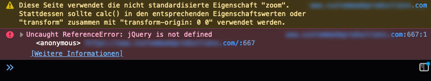
i have on your page the following error : because the script ( it is a jQuery script) does not find the reference.
i answered you per mail – i do not know why.
it seems that everything is done on your site. But the div.custom-mute isn’t inserted.
You can see on the test-page link i send you via e-mail that even with your video ( but downsized to 26MB) it works.
( it works on my side here even without document ready or window load function. )
And even if i got two videos on the slider – i do not need to have the custom-mute div generated on an each function. – it works the way above – all video slides will have that buttons.But even if we can manage that ( you can try window load too ) – i think we had to find a solution with vimeo! (Guess the over 50mb video is to much to handle it as self-hosted video.
there is a possibility to do it with advanced layerslider – and that reacts much better in responsive case. Tomorrow i send you a link and instructions.
Even the div.custom-mute isn’t inserted – so please try with document ready function:
( i can create the div via developer tools console – so the selectors are correct )function unmute_mute_background_video(){ ?> <script type="text/javascript"> (function($) { $(document).ready(function(){ $('.mute-button .avia_video').closest('.avia-slide-wrap').prepend('<div class="custom-mute"></div>'); $('.mute-button .avia_video').on('av-mediajs-loaded', function() { var video = $(this).mediaelementplayer(); video[0].setMuted(true); $('.avia-slide-wrap').on('click', '.custom-mute', function() { if(video[0].muted === true) { video[0].setMuted(false); video[0].setVolume(0.5); } else { video[0].setMuted(true); } }); }); $('.avia-slide-wrap').on('click', '.custom-mute', function() { $(this).toggleClass("icon-sound-on"); }); }); })(jQuery); </script> <?php } add_action('wp_footer', 'unmute_mute_background_video');no – what i like to say is that this is a common question – a standard question on postslider : so if you got a post-slider in a single post – to show other posts – or related post – but you do not want to have the same post in the slider – add this to your child-theme functions.php:
function ava_exclude_current_post($query) { if (is_singular('post')) { $exclude = avia_get_the_ID(); $query->set( 'post__not_in', array($exclude) ); } } add_action('pre_get_posts', 'ava_exclude_current_post');-
This reply was modified 5 years, 8 months ago by
Among the faq’s is on default : how to exclude the current post from post slider when you show a post slider on a single post. But this is not the thing you like to know?
under my nick there are my contact infos.
may i see that page please.
an edited section.php in child-themes folder ?
andGive a custom class to the Full Slider: mute-button
or rename it – f.e. diamond_sponsors, platinum_sponsors, gold_sponsors etc.
Well for self-hosted videos this will work:
https://webers-testseite.de/mute-unmute-video-slide/In the code you see that line:
video[0].setVolume(0.8);set for your needs to 0.5
Go to your Dashboard – Enfold ( or Enfold Child if you working with it ) – Header : 2nd Tab “Header behavior”
uncheck “Shrinking Header”On Header Layout you can set up a custom pixel value on header size.
is a more specific question available? ;)
The ID sponsors is not unique ! There are two sections same ID
What would a postman do if he found two mailboxes with the same name? : Nothing
you can have diamond_sponsors, platinum_sponsors, gold_sponsors etc.
and be aware of that IDs and their anchor-link is case-sensitive and spaces are not allowedthe copy of the header.php is only needed if you got changings on that file. The reason why this is mentioned in older posts is that there are some changings in Enfold History on that header.php concerning this lightbox issue – and those who had older copies of the versions of the header.php need to think of updating that header.php. ( Guess it was from 4.6.3 on ).
If you do not have changings in the header.php you can erase the child-theme file.Is the modal checkbox is set on: Dashboard – Enfold Child – Theme Options: “Lightbox Modal Window”
by the way – nice sideeffect is that you can group images in different color-sections with that method.
if you have images inside a text-block element – you can edit those images. Insert then into the link css class field – your group-x you like

by this case you had to add on the code above one line – because the class: group-x goes directly to the lightbox-added class – so there is no space between the classes – both are on the same anchor.
( on the image alb the group class is on the parent element )$('.lightbox-added').each(function(index, element){ $('.group-'+index+' .lightbox-added').attr('data-group', index); $('.group-'+index+'.lightbox-added').attr('data-group', index); });see again on the bottom of the test-page: https://webers-testseite.de/lightbox-grouping/
Wenn du ein Grid-Row nutzt, dann wird per Default Wert dir zunächst immer die 1/2 1/2 Variante angeboten.
Standard Werte sind aber auch für die Zellen ein Padding von 30px – das kannst du auch innerhalb des ALB selbst ändern.
Hintergrundbilder sind davon natürlich nicht betroffen, die füllen die Zelle aus.but your video is not a self hosted one?
what you are inserting here is what the link should be opend:
add_filter('avf_logo_link','av_change_logo_link');
function av_change_logo_link($link){
    $link = "https://kriesi.at";
    return $link;
}
except you have different entries on your installation or in htaccess file. Then it will redirect to that url style.
even in wp-config can be different settings.
What about your : Dashboard – Settings – General : WordPress Address (Url) and Site Address (Url)your search results on google link to the non-www version ( you can enter that on Googel Search Console )
all those alb element do have names – it is easy to mention that? Fullwidth Sub Menu
And no – you didn’t explain it not well – you did explain it wrong : because
My menu is a mega menu and to make it multiple columns, I checked “This column should start a new row” checkbox on one of my menu items
As described above not that mark in “start a new row” checkbox indicates a new column. A column is a column – and a row a row.
But sorry to say that – then you have to wait for the mods to look in here – because as a participant I can’t see the private content.
New Columns are sublevel of a mega menu! ( simple drag and drop menu points to a shifted position on menu dialog )
( always click to enlarge the images here )

New rows ( yes rows is the correct term ) start a second line in mega menu.
f.e. : on the test page of enfold : https://kriesi.at/themes/enfold-2017/ the pages menu got 4 columns ( first level sub menu points with a lot of second level submenu entries ) if you go to slider menu list point and set to ( this column should start a new row ) you will have this result:

________
So Example Pages, Example Pages, Slider and Blank Pages are the first level subdomains of the mega menu – and build columns
if a column is set to “start a new row” it will be the first column in a new row.Well it will be best to see the page it concerns.
If the other images have no link to the lightbox – they are not in the gallery – see here – only the one on the left bottom corner has lightbox link.
https://webers-testseite.de/images-with-no-link/but if you have more links to lightbox – you only can state lightbox groups for the lightbox gallery.
( or put them in different color-sections will do the jop too)
you can put this to your child-theme functions.php:
( pay attention the code is site specific set to page ID: 123456 – you had to input your page-id on that )// group images for lightbox galleries with custom-class: (group-1, group-2 etc) function handle_lightbox_groups_in_gallery(){ if(is_page(123456)){ ?> <script> (function($){ $(window).load(function() { $('.lightbox-added').each(function(index, element){ $('.group-'+index+' .lightbox-added').attr('data-group', index); }); var groups = {}; $('.lightbox-added').each(function() { var id = parseInt($(this).attr('data-group'), 10); if(!groups[id]) { groups[id] = []; } groups[id].push( this ); }); $.each(groups, function() { $(this).magnificPopup({ type: 'image', mainClass: 'avia-popup mfp-zoom-in mfp-image-loaded', closeOnContentClick: false, closeBtnInside: false, gallery: { enabled:true } }) }); }); })(jQuery); </script> <?php } } add_action('wp_footer', 'handle_lightbox_groups_in_gallery');to prepare your groups then – you have to give to each image alb element the custom-Class: group-1, group-2 etc.
see here – allthough these images are in the same color-section – they open in two seperated galleries.:
https://webers-testseite.de/lightbox-grouping/No You don’t have to have a child theme because of this, but I actually recommend to use one in principle.
You keep a good overview of the changed settings and in case of an update they will be kept.
It was sometimes necessary to rethink some code if there were major changes in the parent theme.These snippets would be placed in the parent theme at the bottom of functions.php just before:
require_once( 'functions-enfold.php');
on that place where the comment is :/* * register custom functions that are not related to the framework but necessary for the theme to run */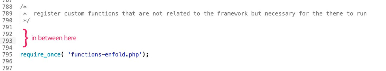 July 18, 2020 at 7:44 am in reply to: Targeting Phone section in header only on desktop – not working #1231455
PS : i would take for min-width on enfold always the even numbers
and: for max-width the odd numbers.
All definitions on Enfold css follow that setting – especially those on 768 and 990
so maybe better to use that switch point for your setting too.@media only screen and (min-width: 768px) { div.phone-info a {color: #fff !important; } #header.header-scrolled div.phone-info a { color: #000 !important } }Obviously, I guess that’s what it was.
You can do it with jQuery in child-theme functions.php – if you like to do that on some pages only
if you like to insert on all single post something it might be better to edit the alb it concerns ( f.e. the index-loop.php) file and have then a child-theme alb element.Yes – I use borlabs cookie – and the point of the imprint and the data protection page you mentioned which are released via the CookiePlugin is implemented there.
As mentioned above, I believe so indeed:If you don’t use cookies or other relevant objects on this site – there is no need for the privacy page
If you have contact information on that maintenance page – there had to be an imprint info.
If such scripts are used – then yes – they must not be active on the corresponding pages.
By the way, many people also make mistakes with the Borlabs cookie when you enable these pages ( imprint / privacy ) , and then e.g. Analytics is active. You can put a foot in it yourself.Most of my pages – and especially those that have to be clean – look like this:
-
This reply was modified 5 years, 8 months ago by
-
AuthorPosts