Forum Replies Created
-
AuthorPosts
-
Yes that is that bug mentioned above – Update to 4.7.6.1 or download the file responsible for that and replace it in your theme:
LinkJuly 27, 2020 at 9:30 am in reply to: Modify "Proceed with PayPal" button text on WooCommerce #1233460Try this:
function my_text_strings( $translated_text, $text, $domain ){
switch ( $translated_text ){
    case 'Proceed to PayPal':  $translated_text = __( 'Payerthgy', $domain );
    break;
  }
  return $translated_text;
}
add_filter('gettext', 'my_text_strings', 20, 3);
PS: the position of add_filter is not important – i notice it always this way in my child-theme functions.php because it provides a clearer conclusion to the above function
PPS: if you have to translate more than one string – it always have to be case 1 …; break; case 2 , break;
after each string translation there had to be a break.-
This reply was modified 5 years, 8 months ago by
Guenni007.
have you a site or screenshot on that problem?
but it isn’t that little bug : https://kriesi.at/support/topic/4-7-6-update-adding-quotations-under-slider/#post-1232550
That is fixed on 4.7.6.1may i ask you what was the point to change – my description works on my end
so what was the reason that the script has no effect on your page.
Because not even this little addition Div was created for the buttons in the DOM. My assumption that jQuery was not loaded before this custom script – was that confirmed? – and why ? – and how did you manage that ?By the way – if you do it this way for that signs- you will have a square in red – and an arrow to the right in green:
.custom-mute { display: block; position: absolute; bottom: 9%; right: 5%; z-index: 50; width: 140px; height: 140px; background: red; } .custom-mute:hover { opacity: 0.5; } .custom-mute.icon-sound-on { width: 0; height: 0; border-left: 140px solid green; border-top: 70px solid transparent; border-bottom: 70px solid transparent; background: transparent !important }@barefeetstudios : did you solve your problem? I don’t see the picture being cropped!
try this approach:
https://kriesi.at/support/topic/search-icon-on-left-menu/#post-1185825if that menu item is on top of your menu list – it will be – yes on top
If you like to have a little bit different look – give to that menu-item a custom class: f.e. searchfield.
( If you do not know how to have custom-class on menu-items see here: Link )and f.e. :
.html_header_sidebar #header .av-main-nav > li.searchfield {
  margin: 0 15px;
  border-bottom: 2px solid #ddd
}
one thing to mention – after inserting the individual link – empty the url field for that menu item ( you can not add individual link if url input is not filled out) – otherwise you can fill in text but not activate it – f.e. to erase some text.
And if you do not want to have on logo bottom a border and less distance to the searchfield:
.html_header_sidebar .logo {
  border-bottom: none;
  padding: 30px 15px 0;
}
( try always first without the !important setting)
-
This reply was modified 5 years, 8 months ago by
July 25, 2020 at 11:41 pm in reply to: 4.7.6. – added: alt attribute to fixed size masonry background image container #1233246ja Du hast recht – sorry dafür. Die habe ich übersehen, und im Standard Masonry auch fixed geht es jetzt.
In meinem custom magnific script hatte ich titleSrc auf false gesetzt – was deiner Lösung den Gar ausmachte.
Es ist aber so, dass die Kombination deiner beiden Austausch Dateien mit dem custom script so nicht dazu führt das alt am mfp-img zu haben.
Ich für mich werde dann wohl beide lösungen anstreben müssen.Kann geschlossen werden –
PS wird das im nächsten Update integriert?-
This reply was modified 5 years, 8 months ago by
July 25, 2020 at 4:29 pm in reply to: 4.7.6. – added: alt attribute to fixed size masonry background image container #1233212Vielen Lieben Dank für dein Bemühen, aber leider klappt es so nicht.
Wobei ich nicht sehe, warum es so nicht geht.
In meinem custom magnific popup script benutze ich nun auch den fakt , dass am item selbst immer das alt attribut sitzt. Das hattest du ja schon geändert. Deshalb kann man auch hier link bei allen Masonries das Alt-Attribute im Markup als Text sehen. Aber am lightbox image selber ist das Alt-Attribut nicht zu sehen.
Damit ich ausschließen konnte, dass es an meinem Custom Script (Seitenspezifisch) liegt habe ich hier eine Seite wo das standard Enfold Verhalten ist: Link
mit den Veränderungen oben von mir im jquery.magnific-popup.js war es sofort da.if you use f.e. WPML – this will be the case – the frontside language decides the output of those settings.
These plugins then set exactly the frontend language. The Lang files (Enfold / Lang ) are primarily responsible for such translations. As in this case, there are some filters that allow you to redefine these without editing the Lang files.
-
This reply was modified 5 years, 8 months ago by
July 25, 2020 at 11:54 am in reply to: 4.7.6. – added: alt attribute to fixed size masonry background image container #1233188no – I thought I had found a solution for this, but it was not the right approach
Edit : the approach was right – but trying to transfer the code to the minified version was bad:
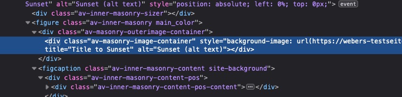
i added an else if to the code:var el = template.find('.mfp-img'); if(el.length) { var img = document.createElement('img'); img.className = 'mfp-img'; if(item.el && item.el.find('img').length) { img.alt = item.el.find('img').attr('alt'); } else if(item.el && item.el.find('.av-masonry-image-container').length) { img.alt = item.el.find('.av-masonry-image-container').attr('alt'); } item.img = $(img).on('load.mfploader', onLoadComplete).on('error.mfploader', onLoadError); img.src = item.src;that works ( i used a different minifier on that ): https://webers-testseite.de/pureinstall/masonry-gallery/
By the way: what kind of minifier do you use for enfold
July 25, 2020 at 11:15 am in reply to: 4.7.6. – added: alt attribute to fixed size masonry background image container #1233172Hallo Günter – danke für deine Antwort und Mühe – ich muss mich jetzt da einarbeiten, was sich verändert hat.
(Edit: also jetzt ist das alt attribut auch an dem anchor ( da wo lightbox-added klasse sitzt) )Was ich allerdings meinte war,
Du hast ja jetzt den Wunsch realisiert bei fixed size Masonry das alt-Attribut an das div gemacht welches das Bild als Hintergrundbild hat ( div.av-masonry-image-container). Was sicherlich ungewöhnlich ist, aber viele wollten das ja so ( beim flexiblen Masonry haben wir ja Bilder und das sind die alt-Attribute gesetzt):
beim Öffnen dann der lightbox wird das aber nicht an das Bild mfp-img übergeben. Dort wäre es aber auch sinnvoll oder?
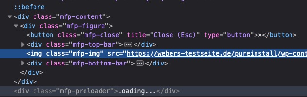
das müsste meiner Meinung nach in dem Script: jquery.magnific-popup.js stattfinden – die stelle wo das mfp-img sein alt erhält, ist ab 1304. Da wird aber nur das img für das alt herangezogen.
img.alt = item.el.find('img').attr('alt');
and where does your jQuery load : in the footer?
Try to load your script above asadd_action('wp_footer', 'enfold_customization_add_magnific_handler');and what should the popup script do?
maybe a midclick : true can do the trick:add_action( 'wp_footer', 'enfold_customization_add_magnific_handler' ); function enfold_customization_add_magnific_handler() { ?> <script type = "text/javascript"> jQuery(document).ready(function() { jQuery('a[rel="magnific"]').magnificPopup({ type: 'inline', midClick: true, preloader: false, }); }); </script> <?php }give to your button-row element a unique ID
put this to child-theme functions.phpfunction id_to_button_row_buttons(){ ?> <script> (function($) { var ButtonRowID = $('.avia-buttonrow-wrap').attr('id'); $('#'+ButtonRowID+' .avia-button').each(function(i) { $(this).attr('id', ButtonRowID+'-button'+(i+1)); }); })(jQuery); </script> <?php } add_action( 'wp_footer', 'id_to_button_row_buttons');it will make the ID’s to your buttons as #ID-button1, #ID-button2, #ID-button3 etc the ID is the id you put on the button-row
see here: https://webers-testseite.de/buttonrow/
but maybe a different method could be a good alternative.
Browser support is well ( only IE11 and Opera Mini did not support clip-path )this – ( and some posititioning css ) – will work too
.iconbox_icon.heading-color {
-webkit-clip-path: polygon(50% 0, 93.3% 25%, 93.3% 75%, 50% 100%, 6.7% 75%, 6.7% 25%);
        clip-path: polygon(50% 0, 93.3% 25%, 93.3% 75%, 50% 100%, 6.7% 75%, 6.7% 25%);
}
______
mathematically you have to describe a hexagon into the square, and then calculate the coordinate points.you can see here some calculations – ( buf first – that hexagone is different – and second not well calculated ;) )
https://bennettfeely.com/clippy/this is for hexagone different orientation:
.iconbox_icon.heading-color { -webkit-clip-path: polygon(25% 6.7%, 75% 6.7%, 100% 50%, 75% 93.3%, 25% 93.3%, 0% 50%); clip-path: polygon(25% 6.7%, 75% 6.7%, 100% 50%, 75% 93.3%, 25% 93.3%, 0% 50%); }First, you can change the language of the website as you like – in this case English – and that makes sense because it is in English in the frontend.
Second: If you want a different dashboard language, go to your user account and switch to Dutch – from this moment on, all dashboard translations are in Dutch when you are logged in ( other users may prefer different language setting )._______
besides that and i believe the above is the easiest way to solve the problem – i think the filter : avf_google_recaptcha_badge_content may help here:
add_filter('avf_google_recaptcha_badge_content','avf_google_recaptcha_badge_content_mod');
function avf_google_recaptcha_badge_content_mod($badge){
	$badge =	'<div class="av-google-badge-message hidden">';
	$badge .=	__( 'This site is protected by reCAPTCHA and the Google <a href="https://policies.google.com/privacy" target="_blank">Privacy Policy</a> and <a href="https://policies.google.com/terms" taget="_blank">Terms of Service</a> apply.', 'avia_framework' );
	$badge .=	'</div>';
return $badge;
}
you can change then the Text and f.e. the links to the language specific privacy page of google – or the link target options – or you like to link to your privacy page with the content of google recaptcha info f.e: to
https://your-domain/privacy/#google-recaptcha-info-
This reply was modified 5 years, 8 months ago by
you can use the layerslider on that.
Slider should be responsive – and the video is in a layer not as background
there is a mute / unmute button and on hovering the video the controls are shown with a fullwidth button on the right.
https://webers-testseite.de/pureinstall/fullscreen-slider/July 23, 2020 at 7:40 pm in reply to: Is it possible to disable quotation marks in the track name of a playlist? #1232763It’s not dramatically bad, but sometimes it takes a lot of effort to answer, and then you have to see that the question may already have been answered sufficiently.
July 23, 2020 at 6:03 pm in reply to: Musical playlists: how to disable automatic quotation marks in the track names #1232720July 23, 2020 at 5:33 pm in reply to: Is it possible to disable quotation marks in the track name of a playlist? #1232704by the way : it is not a good netiquette to ask similar questions in more then one topic. ;)
also makes it harder for you to keep on track.And i see that boardsoft changes my code automatically to the wrong signs:
Sorry on that – you had to type in those little snippets:
Or – you can copy&paste it from here: pastebin
just for info: it is in WordPress: media.php : lines 2091ff
and on : line 2105:
printf( _x( …
and because that string is used hundred of times the context is important on that translation.July 23, 2020 at 5:31 pm in reply to: Is it possible to disable quotation marks in the track name of a playlist? #1232702Go to your dashboard – appearance – theme editor : on the right side there is a list of existing child-theme files:
On default there are only : style.css and functions.php
That is the file we need : click on the functions.php
On default there is only :<?php /* * Add your own functions here. You can also copy some of the theme functions into this file. * WordPress will use those functions instead of the original functions then. */Under this you can insert ( copy&paste) my code above. Save it.
But Sometimes the php files are secured by some security plugins or via wp-config.php etc. pp – then you can not edit this way or more : you do not see the theme editor.
If there is activated Merging ( Enfold-Child – Performance – css and js merging.) or you use caching plugins. you had to refresh all these things first ( even the browser cache shows an own version of the frontend.
that is the reason why i always deactivate those settings or plugins till you go on public with your page. First the layout and styling – afterwards we can optimize performance things
Result Page: https://webers-testseite.de/pureinstall/hexagones/
I gave to the icon-box itself a custom-class: hexagone-icons
The trick is to place a div ( div.icon-container) between the before and after container – and to tranfer from the icon-box to that new container a lot of enfold settings. You can now set different colors on the icon-box as before – the will be transfered to the hexagone borders. Even a different icon-set is possible.
this comes to child-theme functions.php :
function add_icon_box_container(){
?>
<script type="text/javascript">
(function($) {
	$('.iconbox.iconbox_top.hexagone-icons .iconbox_icon').each(function(){
		var DataIcon 		= $(this).data('av_icon'),
			DataFont		= $(this).data('av_iconfont'),
			IconColor		= $(this).css('color'),
			IconBgColor 	= $(this).css('background-color'),
			IconBorder 		= $(this).css('border');
		$(this).append('<div class="icon-container"></div>');
		$(this).css('color', IconBgColor);
		$(this).find('.icon-container').attr({
			'data-av_icon': DataIcon,
			'data-av_iconfont': DataFont,
		}).css({
			'background-color': IconBgColor,
			'color': IconColor,
		});
	});
})(jQuery);
</script>
<?php
}
add_action('wp_footer', 'add_icon_box_container');
this to quick css
.hexagone-icons .iconbox_icon{
  width: 100px;
  height: 57.735px;
  background: currentColor;
  position: absolute;
  left: 45% !important;
  border: 1px solid currentColor
}
.hexagone-icons .iconbox_icon::before {
  content: "";
  position: absolute;
  top: -28.8675px;
  left: 0;
  width: 0;
  height: 0;
  border-left: 50px solid transparent;
  border-right: 50px solid transparent;
  border-bottom: 28.8675px solid currentColor;
}
.hexagone-icons .iconbox_icon::after {
  content: "";
  position: absolute;
  bottom: -28.8675px;
  left: 0;
  width: 0;
  height: 0;
  border-left: 50px solid transparent;
  border-right: 50px solid transparent;
  border-top: 28.8675px solid currentColor;
}

.hexagone-icons .iconbox_icon {border-radius: 0px !important; height: 30px !important; width: 68px !important;}

.hexagone-icons .iconbox_content_title {margin-top: 50px !important;}

.hexagone-icons .icon-container {
    width: 100%;
    height: 100%;
    position: relative;
}

.hexagone-icons .icon-container:before {
    color: currentColor;
    content: attr(data-av_icon);
    font-size: 40px;
}
You had to adopt the dimensions of some things! Are there formulars on
This will be difficult because the icons are placed in the pseudo container : “:before”
July 23, 2020 at 2:22 pm in reply to: Is it possible to disable quotation marks in the track name of a playlist? #1232601you can place it in functions.php of your parent theme – but then it will be lost on updating:
see here the place where it is best placed:https://kriesi.at/support/topic/edit-the-logo-link/#post-1231456
July 23, 2020 at 1:32 pm in reply to: Is it possible to disable quotation marks in the track name of a playlist? #1232590can you try this in your child-theme functions.php:
`add_filter(‘gettext_with_context’, function($translated, $text, $context, $domain){
if($context = ‘playlist item title’ && $text == ‘“%s”’) $translated = “%s”;
return $translated;
}, 10, 4);`that was transfered to bad signs – please copy&paste from here:
https://kriesi.at/support/topic/is-it-possible-to-disable-quotation-marks-in-the-track-name-of-a-playlist/#post-1232704Or – you use an own child-theme shrinking script : avia-snippet-sticky-header.js
put the copy to your child-theme/js folder ( on default there will be no one – then create that subfolder in your child-theme folder )Edit that child-theme copy by commenting out that following line ( on actual 4.7.5 enfold it is line 91) so that there is:
//elements.css({'height': newH + 'px', 'lineHeight': newH + 'px'});load the child-theme script by deregister the parent-theme file and load the new one:
(this to functions.php of your child-theme:)add_action( 'wp_enqueue_scripts', 'wp_change_sticky_header_script', 100 ); function wp_change_sticky_header_script() { wp_deregister_script( 'avia-sticky-header' ); wp_enqueue_script( 'avia-sticky-header-child', get_stylesheet_directory_uri().'/js/avia-snippet-sticky-header.js', array('avia-default'), $vn, true); }and use the shrinking header option then on Enfold Options. – Now only the logo will shrink on scroll –
Everything is like on a shrinking header – except the header height will not be changed . -
This reply was modified 5 years, 8 months ago by
-
AuthorPosts