Forum Replies Created
-
AuthorPosts
-
but if you can make it happen in the next few hours I will be super grateful!
How much does your gratitude look like?
If you want to do me a big favor, don’t vote for Trump ;)
Best whishes to you all from Germany.Edit : this must be done by a mod – because as a participant like you – I don’t see the private content messages. But I guess everything is so easily explained that you can do it yourself.
The background color does not shine through with full intensity, because the png’s in the spaces between were not fully transparent.
You could change this by increasing the contrast of the pngs before uploadin the ai doc there are some vector datas – but the most patterns are embedded images.
So here we go with png files: https://webers-testseite.de/tagood.zip- Give a custom class to your icon-list : tagood-icons
- upload all the png files to your media library
- put this to your quick css: ( if you like to colorize the icons as i do )
- adjust the file path to yours
.tagood-icons .avia-icon-list li .iconlist-char:before {
  content: "";
  background-size: contain;
  background-repeat: no-repeat;
  background-position: center ;
  left:0;
  top: 0;
  width: 100%;
  height: 100%;
  position: absolute;
  border-radius: 50%
}

.tagood-icons .avia-icon-list li:nth-of-type(1) .iconlist-char:before {
  background-image: url(/wp-content/uploads/art01.png);
  background-color: red;
}
.tagood-icons .avia-icon-list li:nth-of-type(2) .iconlist-char:before {
  background-image: url(/wp-content/uploads/art02.png);
  background-color: blue;
}
.tagood-icons .avia-icon-list li:nth-of-type(3) .iconlist-char:before {
  background-image: url(/wp-content/uploads/art03.png);
  background-color: green;
}
.tagood-icons .avia-icon-list li:nth-of-type(4) .iconlist-char:before {
  background-image: url(/wp-content/uploads/art04.png);
  background-color: yellow;
}
.tagood-icons .avia-icon-list li:nth-of-type(5) .iconlist-char:before {
  background-image: url(/wp-content/uploads/art05.png);
  background-color: darkmagenta;
}
you see how this works : the first settings are the same for all icons – and then you count to your list items 1, 2, 3 etc
if you colorize you had to set a border-radius for them too
in the zip there are 6 files – but you can have more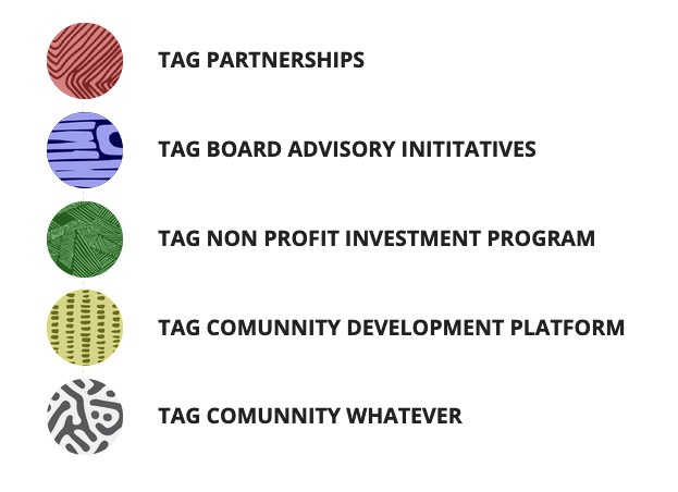
i will see – and no panic it will work with png’s too:
https://webers-testseite.de/tagood/i see that the source of the png was an ai ( Adobe Illustrator) File – that would be best – if it is a vector based file ( sometimes images are embedded in ai docs)
In this case we could make an icon-font like entypo-fontello on : http://fontello.com/First : is there a better – bigger – sharper Image of that?
And what does this mean:Hi I would like to create a custom icon or custom pattern to be more specific on one of the icons in your list
Aren’t there round source patterns on that? best would be svg
July 31, 2020 at 6:57 pm in reply to: Changing the outline of the active tab in the accordion #1234412try this in quick css:
.tab.active_tab, :focus { outline: none !important; }Thanks – but i’m Participant as you – so the other request has some infos in private content – which i do not see.
or do ask how those extra settings can be done to the head section ( not the header ) ;)
Ok – Danke
If you want to change the switch point to a diffent one you had to adjust the value in the script above – and to have some additional quick css entries:
/****** Settings to change the tab switch point if it is different to 768px *********/
@media only screen and (max-width: 989px) {
	.responsive .tabcontainer.mobile-tabs-closed .tab_content {
	    border-bottom: none;
	    padding: 15px 30px;
	    clear: both;
	}
	.responsive .tabcontainer.mobile-tabs-closed .tab_content, .responsive .tabcontainer .tab {
	    width: 100%;
	    max-width: 100%;
	    border-left: none;
	    border-right: 0;
	    left: 0;
	    top: 0;
	    min-height: 0!important;
	}
	.responsive .tabcontainer.mobile-tabs-closed {
	    border-width: 1px;
	    border-style: solid;
	    border-top: none;
	    overflow: hidden;
	}
	.responsive .tabcontainer.mobile-tabs-closed .tab_titles {
	    display: none;
	}
	.responsive .tabcontainer.top_tab.mobile-tabs-closed .tab.fullsize-tab {
	    margin-bottom: 0px;
	}
	.responsive .tabcontainer.mobile-tabs-closed .tab.fullsize-tab {
	    display: block;
	    margin-bottom: -1px;
	}
}
you can see now on the testpage that i have switched to 989px – to illustrate the effect and settings better.
As long as you do not open a tab on “mobile” – you can resize the screen ( or tilt the device )However, these settings alone would have the effect that the tabs can no longer be opened in the “mobile” case. Since the switch case has removed this exactly. Therefore a click solution is needed to correct this.
you see above in the css code there is an additional class i set for that decision ( mobile-tab)
this to child-theme functions.phpfunction mobile_tabs_open_onclick(){ ?> <script type="text/javascript"> (function($) { $('.responsive #top .tabcontainer.mobile-tabs-closed .av_tab_section .tab').click(function() { $(this).next('.tab_content').toggleClass('mobile-tab'); $(this).closest('.av_tab_section').siblings().find('.tab_content').removeClass('mobile-tab'); }); })(jQuery); </script> <?php } add_action('wp_footer', 'mobile_tabs_open_onclick');If the mods see a much simpler solution, don’t be afraid to announce it.
Demo Page: https://webers-testseite.de/pureinstall/tabs-on-mobile/
(this is for the class on body – you decide when the switch is set)to child-theme functions.php
function add_class_for_tab_switch(){
?>
<script type="text/javascript">
(function($) {
	function my_tab_switch() {
		setTimeout( function() {
	        if ($(window).width() <= 767) {
			  $("#top").addClass("tab_switch");
			}
			else {
			  $("#top").removeClass("tab_switch");
			}
        }, 150)
    }
	$(window).on('load resize', function() {
		my_tab_switch();
	});
})(jQuery);
</script>
<?php
}
add_action('wp_footer', 'add_class_for_tab_switch');
after that you can use these classes on quick css
/***** Settings for closed Tabcontainers on tab switch setting ************/ .js_active .tab_switch .tabcontainer.mobile-tabs-closed .active_tab_content { display: none; visibility: hidden; } .responsive #top .main_color .tabcontainer.mobile-tabs-closed .tab_content.mobile-tab { display: block; visibility: visible; } .responsive #top.tab_switch .main_color .tabcontainer.mobile-tabs-closed .active_tab { background-color: unset; color: inherit; } .js_active #top.tab_switch .tabcontainer.mobile-tabs-closed .active_tab { font-weight: normal; } #top.tab_switch .main_color .tabcontainer.mobile-tabs-closed .tab.active_tab:hover { color: #666666; }Those for whom it is too much text to get a solution may skip this answer. ;)
When I began to deal with the subject, I encountered various obstacles.
In general, there is no easy solution to these. And my first attempt to redefine the two classes responsible for the appearance ( active_tab and active_tab_container ) only by css and the class set to html if it is a mobile device (avia_mobile) would not make sense. Because then all tablets – even the Ipad Pro with its 12.9 inch size – would initially display the closed tabs.So when the page is loaded, it should be decided whether the tabs are open or not. When tilting the mobile device, however, it should be decided again whether the tabs are open or not.
For example the Iphone XS: 375×812
i.e. normally in landscape mode the tabs would be in normal view, in portrait mode the tabs would be arranged below each other.So I thought I would link this decision to the presence of the Hamburg Icon. Unfortunately the default setting of the tabs causes me some problems, because they usually change their appearance when resized to 768px. So there would be a discrepancy in the setting depending on the burger menu if it changes already at 990px. – But there is a Quick CSS solution.
But there are participants here who always show the burger, so this would not be the solution.So I decided to create a class that I can fall back to if the screen width falls below a certain value without changing the behavior of the above mentioned classes ( active_tab and active_tab_container ).
With this first script I set a class to body, which offers me a switch with which I can make this decision ( tab_switch ).Additionally I give the Tabs ALB element a custom class to decide if I want the effect or not. ( mobile-tabs-closed )
I have never found it particularly difficult to drag and drop the separator into a color section as the last or first element.
The separator needs the surrounding container so that it has the width it needs to take up.
If you put the separator in a 1/2 container, it will have a different width than in a 1/1 container.
But if it has no surrounding container – it lacks this information. Therefore one is set.
So this only happens if you put the separator between two full-width elements.what exactly do you like to obtain? the behaviour on mobile devices or on narrow screen width? The first one is easier to reach.
you see on your frontend that line?
–
this is a separator – you can easily overlook this, because it is only a thin grey line in the layout.
–
hover on your advanced layout a gray line then you will see that this is an extra element.
–If this separator is not placed in the color-section but between two elements ( like two color-sections) there will be an extra container for it:
after_section_x
and as a normal container it will have that padding-top/padding-bottom of 50px.
To avoid this extra container for the separator you can put it in the color-section.on the second page you have allready activated the merging of css and javascript files: So i think it is only a caching reason for that.
Go to dashboard – enfold – performance : and on the bottom of that page there is: “Delete old CSS and JS files?”
mark that – and save all changes.______
Dashboard – Enfold – Leistung : “Alte CSS- und JS-Dateien löschen?”
Das Feld markieren und alle Änderungen speichern.first: because of the search-results list – it might be better to have the vertical-align on top!
#top #av-burger-menu-ul {
    vertical-align: top;
    padding: 125px 0 !important;
}
second:
but what we can do on the search input field to have no href on that menu-item ( to have the opportunity to activate text in that input field by mouse activation) – see description above – we do not have the possibility to do that on hamburger search menu item
there is:
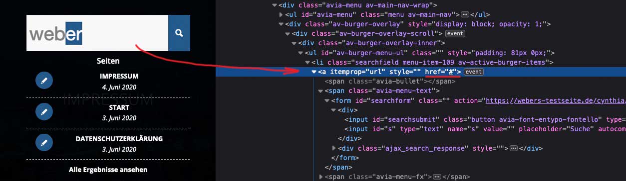
so if the href attribut remains you can not activate text like above to get rid of “er” in weber f.e.this to child-theme functions.php :
function remove_href_from_hamburger_search_input(){
?>
<script type="text/javascript">
(function($) {
	$('#header').on('click', '.av-main-nav-wrap', function() {
		$('#av-burger-menu-ul .searchfield > a:first-of-type').removeAttr("href");
	});
})(jQuery);
</script>
<?php
}
add_action('wp_footer', 'remove_href_from_hamburger_search_input');
Resultpage for your test: https://webers-testseite.de/cynthia/
try this – and to have searchform results font in a color:
(on my testpage there is a dark background on fullwidth burger overlay)#av-burger-menu-ul #searchform > div { left: 50%; -webkit-transform: translateX(-50%); transform: translateX(-50%); } #av-burger-menu-ul #searchform .ajax_search_response * { color: #FFF }ah – ok – thanks for the info
see above Private Data
i see that you are using wp-rocket – maybe disable it and then update all caches (including the browser cache) and see if the problem persists
where does that entry come from?

how is this inserted on that place – via child-theme functions.php
<font style="vertical-align: inherit;></font>
in between you have your “extra sign”PS: there must be more to correct : it is very unusual to have all these entries in the body tag and on top:
style sheets , googlebot , opengraph entries etc. pp. that is something for the head area or – just before closing body tag.July 28, 2020 at 7:31 am in reply to: Menü seitenweise abschalten ? // switch off the menu page by page #1233670maybe this topic here is helpfull: https://kriesi.at/support/topic/assigning-menus-for-one-page-and-portfolio-pages/
I don’t know it it still works on actual Enfold and WordPress – but you can try.Please update to Enfold 4.7.6.1
there was a little bug in av-helper-slideshow.php on 4.7.6 : Link
The fix is in the above Version of Enfold. –
Or if you do not want to update replace in your parent theme av-helper-slideshow.php with this one: DL-Link
The file is in : enfold – config-templatebuilder – avia-shotcodesJuly 28, 2020 at 7:19 am in reply to: Modify "Proceed with PayPal" button text on WooCommerce #1233668and if it is the woocommerce you use the part where it is handled is:
woocommerce – includes – gateways – paypal: “class-wc-gateway-paypal.php” about line 44:
$this->order_button_text = __( 'Proceed to PayPal', 'woocommerce' );but try first the above! it is more specific on paypal – this below changes the order_button_text on all instances)
so this could be ok too : –
function my_order_button_text() {
    return __( 'Payerthgy', 'woocommerce' );
}
add_filter( 'woocommerce_order_button_text', 'my_order_button_text' );
July 28, 2020 at 6:39 am in reply to: Modify "Proceed with PayPal" button text on WooCommerce #1233666The above code has been tested on many strings and should work; of course, the first string “Proceed to PayPal” may not be in your source code. It would be enough if the spaces were represented by characters, or e.g. there is Paypal instead of PayPal.
Which plugin do you use for your payment systems.Try this:
function my_text_strings( $translated_text, $text, $domain ) {
	switch ( $translated_text ) {
		case 'Proceed to PayPal' :
			$translated_text = __( 'Payerthgy', 'woocommerce' );
			break;
	}
	return $translated_text;
}
add_filter( 'gettext', 'my_text_strings', 20, 3 );
On woocommerce there are some filter for different buttons ( woocommerce_order_button_text or woocommerce_order_button_html)
is it the checkout button ?
Best would be if i can see the page it concerns.this is an Easy Slider of Enfold placed with hook on top of a page ( only surrounded by an extra div to better address it )
https://webers-testseite.de/pureinstall/slider-on-top/add_action('ava_main_header', function() { if(is_page(1061)){ echo '<div class="topslider">'; echo do_shortcode("[your_shortcode]"); echo '</div>'; } });this is page specific – change to your needs. Pay attention that in your shortcodes the Quotation Marks are correct ( in this case single QM ))
second – you have to find a solution for the menu and for your logo then – and for main top padding
by the way: do you have an older child-theme header.php ? The lightbox setting on that has changed – so if you got – actualize this with the newest one.
________
On Enfold ( i do not know it this is default setting ) there is a setting to load jQuery in the footer – so that was the reason for my question.
If you load that script in the head area.So – to understand it right. You go to your menus and on one or more items you set with rel = magnific
first the selector is wrong – i did not see it first too on your code above.
('a[rel="magnific"]')then – what do you like to open? do the menu-items lead to a unique ID on that page – or do they have as target a website ?
f.e. if you like to open a website with that link then type : ‘iframe’ , is to use. -
AuthorPosts