Forum Replies Created
-
AuthorPosts
-
January 13, 2021 at 12:43 pm in reply to: Grid row layout element generates after_submenu elements with nested containers #1272134
on top you have a 1/1 container
then the grid row
then a color-sectionso the 1/1 element before is different to that what you inserted after the grid row
a color-section got those 50px left/right paddingSince we have a portfolio page here in your test site, it is possible to work using full-width elements ( like color-sections, grid-row ), but is it advisable?
If you plan to position sidebars on these pages (portfolio or posts), they would be displayed below the full-width elements.yes i know – and because i’m paricipant only – i do not see your Private Content
please send me your link to the page – if you can not make it public – inform me via e-Mail
The nick or avatar has info about my contactPS: maybe you only had to set some rules to !important f.e. the relative positioning of the color-section.
Link: https://wordpress.org/plugins/regenerate-thumbnails-advanced/
My lesson learned from all this: If you really know something about image optimization, it is sometimes better to embed the original image. Even if performance tools like Gtmetrix complain about browser scaling. The real benefit of those recalculated and cropped files is – that the aspect ratio fits better to f.e. a slider on top – and so you will have more control over the presented image section
-
This reply was modified 5 years, 2 months ago by
Guenni007.
Yes, I like this little plugin – not least because of the possibility to bring in correction values regarding the focused elements.
Because of the changeable selector you can exclude the inline anchora[href*='#']:not([href^='#'])but you are right on that test page i forgot to edit the selector and forgot to insert that “^” on href.
it is now:
Summary
// new snippet to set the compression level of calculted images
add_filter("avf_jpeg_quality", "avf_set_quality_mod", 9999, 1);
add_filter("avf_wp_editor_set_quality", "avf_set_quality_mod", 9999, 1);
function avf_set_quality_mod($quality) {
	$quality = 65;   // compression level what you like in percent
	return $quality;
}
// Snippet to exclude Enfold Image Thumbnail-Formats from generation add_action('init', 'remove_enfold_image_sizes'); function remove_enfold_image_sizes() { // do NOT remove widget size, is used in backend portfolio items! // comment out what you do not like to preserve as available thumbnail size // remove_image_size('widget'); remove_image_size('square'); remove_image_size('featured'); remove_image_size('featured_large'); remove_image_size('portfolio'); remove_image_size('portfolio_small'); remove_image_size('gallery'); remove_image_size('magazine'); remove_image_size('masonry'); remove_image_size('entry_without_sidebar'); remove_image_size('entry_with_sidebar'); remove_image_size('shop_thumbnail'); remove_image_size('shop_catalog'); remove_image_size('shop_single'); remove_image_size('shop_gallery_thumbnail'); }after that you can use that plugin from shortpixel to recalculate all Images
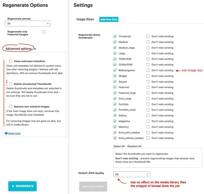
nice tool: because if you got a very big uploads folder with a lot of jpgs – you can use the advanced option by “deselect all” and “delete unselected Thumbnails” – then only the original images stay in uploads folder – save it for backup and then recalculate them to have what you like to preserve
Yes – but for my part it can be closed now – the new snippet works fine – and for me 50% compression is good enough since I use the images more or less only as layout elements ( background motifs or sliders etc.).
Maybe for photographers with subjects that are e.g. monochromatic or with very fine structures it is necessary to have zero compression – but then they have original files that are not too compressed either.left is original / right is compressed image with 55% compression level
only a little color difference is there – guess my uploaded original has implemented the rgb color profile. i do not know if recalculated Images do have implemented Profiles too.
to get rid of calculated images the snippet in https://kriesi.at/support/topic/media-upload-and-enfolds-thumbnail-sizes/#post-1270140 “// Disable loads of Enfold & WP image sizes upon upload …”
will do a good job without a plugin.i will try your snippet as:
add_filter("avf_jpeg_quality", "avf_set_quality_mod", 9999, 1);
add_filter("avf_wp_editor_set_quality", "avf_set_quality_mod", 9999, 1);

function avf_set_quality_mod($quality) { $quality = 55; return $quality;}
____________
But you see on the tables above that there is the original file optimized in photoshop for web.
These file-size is best for the file – but we recognize that a lot of the calculated are much bigger than the original file.We were already aware that the original file remains unaffected!
But we want to have influence of the compression level of the calculated files. The calculated file which is highlighted in the table is much larger in file size, but also much more blurred.
On Upload that works fine – and recalculation too !
see same file results ( but with 50%)

by the way: no PC for PartiCipant
just a moment – i will place a layerslider to see what we can do:
just give to the color-section a z-index and a relative position ( on my end the layerslider got 35 ) so :.reverse-order { z-index: 50; position: relative; }see example-page: https://webers-testseite.de/steviger/
-
This reply was modified 5 years, 2 months ago by
if it is a menu – as you said above – it might be usefull to set the reverse order to the columns on mobile view.
Then give a custom-class to the color-section f.e: reverse-order
and put this to quick css:.reverse-order .entry-content-wrapper { display: flex; flex-flow: row wrap-reverse; }ps : do only that content to your color-section and other content to the next one.
See what happens on mobile view.simple way : give a custom-class to the column that should shift up f.e.: shift-up
https://webers-testseite.de/steviger/
then insert this to your quick css:@media (min-width:768px) { .flex_column.shift-up { position: relative; top: -150px; } }if you have on top an advanced layerslider – it maybe necessary to give a higher z-index to that container.
And you can use the animations on that columns as you see in the example pages.or use the flexbox model:
maybe this helps you : https://webers-testseite.de/overlap-to-followed-section/Hey Nikko and others – following this topic: https://kriesi.at/support/topic/media-upload-and-enfolds-thumbnail-sizes/
there is that new filter: avf_responsive_images_defaults – which i do not get to work.
you see that changing the two original files will end in much smaller calculated Images.Maybe Günter knows how to get the filter work
my snippet above should work.
but on reading the magnific popup docu – a better idea comes to my thoughts:
we can try on Ismaels inline popup code the before and after function – remove all done so far except the snippet from Ismael https://kriesi.at/support/topic/lightbox-17/#post-1270093
and add some callbacks:jQuery('.open-popup-link').magnificPopup({ type:'inline', midClick: true, callbacks: { beforeOpen: function () { jQuery('html').css("overflow-y", "hidden"); }, close: function() { jQuery('html').css("overflow-y", "auto"); }, }, });PS to Ismael: the overflowY parameter for magnific popup only rules the sidebars in the popup itself ! Link
“Defines scrollbar of the popup… ”
______________PPS: again
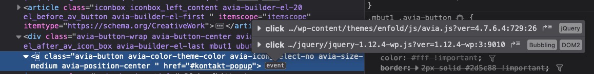
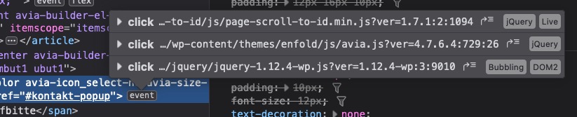
and if i look to that DOM – and the events on that inline links – i never had so much jQuery on those inline-popups
maybe there are different events on that click too !
this is the amount of jQuery on my inline popups:
-
This reply was modified 5 years, 2 months ago by
for that page in edit mode : did you already set it to the wanted layout?
on your css there must be a rule set those headings to display: none:
.av-masonry-date, .slide-meta,
.single-product .related h2 {
    display: none !important;
}
because of your merging – i can not give you more precise info where this is. Hope you can find it yourself.
Because it is set to important – it may not be overwritten in quick css.no – i think they have to look how the filter is working in a proper way. I prefer a child-theme solution too.
________
you see the lines in the php code from my post
there is:'default_jpeg_quality' => 100,
on both files change it to f.e. 55______
PS : btw. I have already mentioned it on other occasions
it would be nice if filters are added or replaced/renamed we could read a tutorial e.g. in github.-
This reply was modified 5 years, 2 months ago by
if i change it in those two files of the original (parent) files : functions.php line 240 and class-responsive-images.php line127 ( enfold / framework / php ) then it works – so the filter does not do the job via child-theme functions.php !

btw: the original has a pixel-ratio of 1500×850
results with 55% compression
The benefit of those image formats is the aspect ratio – f.e. in banners on top.
The big disadvantage is ( if the snippets of compression do not work in a satisfying manner ) that the original upload image is much smaller in file-size than nearly all of the generated formats (except those images less than 120px).
The services such as gtmetrix will not be happy about the scaling ( when using the original upload image ) and will criticize this; however, the loading times of the images will be lower.
?i tried allready “loadedmetadata” – without any effort
avia.js line 497ff – that is the way the class is added – and is in dependency to the event canplay – isn’t it?
setTimeout(function()
{
	if (mediaElement.pluginType == 'flash')
	{
		mediaElement.addEventListener('canplay', function() { fv.trigger('av-mediajs-loaded'); }, false);
	}
	else
	{
        fv.trigger('av-mediajs-loaded').addClass('av-mediajs-loaded');
	}
the class does not exist in Safari Browsers
but on safari this does not happen – and this: https://webers-testseite.de/mute-unmute-video-slide/ leads to that error mentioned here: https://kriesi.at/support/topic/adding-button-to-mute-unmute-audio-on-fullscreen-background-video-2/#post-1268456
January 5, 2021 at 7:39 pm in reply to: BUG: content no longer showing after editing copyright field via theme options #1270461The content of my site is no longer visible after I edited the copyright info via theme options.
hm – yes i know that – but the “bug” – how is that solved
these two columns ( i took 2/3 and 1/3 – but the width is set on the css code) – with individual height are together in a color-section with that trigger class: overlapping-columns – thats all.
The top shift of the right column must be found as margin-bottom on that column.
The left shift ( overlapping ) is added to the width of the right column – so that the whole width will fill the setted content width.
As you can see – you can use all those animations Enfold ALB is given for those columns.Edit : see example page again : this is a single Icongrid element in a column. ( a shadow is a bit tricky there – because a shadow on the column will be not nice )
Everything – with example and css code here: https://webers-testseite.de/overlapping/
January 5, 2021 at 12:06 pm in reply to: BUG: content no longer showing after editing copyright field via theme options #1270369please tell us why : is it solved – and how did you solve it?
i tested now:
function av_return_100(){ return 55; }
add_filter('avf_responsive_images_defaults', 'av_return_100');
add_filter('avf_wp_editor_set_quality', 'av_return_100');
and the native WordPress setting:
add_filter('jpeg_quality', function($arg){return 50;});
add_filter( 'wp_editor_set_quality', function($arg){return 50;} );
without luck.
the scroll to top i only know if you did that on magnific parameters: https://dimsemenov.com/plugins/magnific-popup/documentation.html#aligntop
and if i look to that DOM – and the events on that inline links – i never had so much jQuery on those inline-popups :

-
This reply was modified 5 years, 2 months ago by
the old snippet does not work anymore ? :
function no_background_scroll_on_lightbox_open(){
?>
<script type="text/javascript">
(function($) {
    function a() {
      $('body').on('click', '.lightbox-added', function() {
        if($('.mfp-bg').length >= 1) {
          $('html').css("overflow-y", "hidden");
        }
      });

      $('body').on('click', function() {
        setTimeout( function() {
          if($('.mfp-bg').length == 0) {
            $('html').css("overflow-y", "scroll");
          }
        },500);
      });
    }
  a();
})(jQuery);
</script>
<?php
}
add_action('wp_footer', 'no_background_scroll_on_lightbox_open');
but on some browsers this will cause a jump of the content because the scrollbar space needed or not.
so here is a solution you can test without the snippet above:.mfp-wrap ~ #wrap_all { position: fixed !important ; }because of the browser policy
It’s not because of Enfold or because of WordPress.
The browser specs do not allow autoplay without the user’s consent if the video has sound enabled.These settings can not be influenced by the theme – if you set the policy by yourself in the browser ( that could be done separately for different pages ) to trust that site the themes autoplay could be done.
f.e. firefox:
(click to enlarge) – each bowser got his own way to make these settings.

Edit: HM ? i tested it on a nearly fresh installation – but the snippet to set the thumbnail compression does not work as expected !
and – the newer plugin has this compression option in its settings – here also the compression seems to be not taken into account
my uploaded image has 1500px width so it is comparable to the calculated format with 1500px width.
Uploaded Size : 128kb Calculated Format: 545kb allthough i do set the rate to 40% ???i knew that on former Enfold Versions this snippet does the job as we want to have it.
Maybe Günter knows a different method that works.Even if i take the filter : avf_responsive_images_defaults i have no file-size reduction at all
-
This reply was modified 5 years, 2 months ago by
-
AuthorPosts