Forum Replies Created
-
AuthorPosts
-
is there a link to your page where you tested this?
Think of – i’m not mod – participant as you – i do not see your private content messages.but nevertheless – i resetted one of my testpages – with enfold avia_reset button.
i emptied my child-theme functions.php – when i insert a new gallery – even make the setting of “Lightbox image description text” before inserting the images to the gallery – the lightbox shows the title. It seems that the lightbox images still take the title from the img and not from the anchor-tag. (and that is normal behavior on magnific popup titleSrc.
Again : i would have expected that there is no text in the lightbox.
_____________
@rob:
div .mfp-title { display: none !important;}
is working on that testinstall ( WP5.7/Enfold4.8.1) – and – yes you had to refresh all merging and browser cache etc. pp. if there are other caching tools too.btw. rob an error like this in your konsole : Uncaught TypeError: e.indexOf is not a function

often comes if the new jQuery 3.5.1 is confrontrated with script like$(window).load(function(){
– that is deprecated code
replace instead :$(window).on('load', function(){
.click(function() with .on('click', function()you got it in:
jQuery(window).load(function(){
	jQuery('#wrap_all a').removeAttr('title');
	jQuery('#wrap_all img').removeAttr('title');
	jQuery('.av-masonry-image-container').removeAttr('title');
});
have a look if there are other places you use the mentioned above.
Well – if i do insert on my all newest WordPress/Enfold a gallery – and i choose no_text i would have expected that there is no text in the lightbox.
But i see the titles!
Yes that is something Rob doesn’t help with his already existing galleries – but that is on my installation. So – is it a bug?
That the display: none rule does not work – is strange – on my test installation this works good.have a look at this page – with your image:
https://webers-testseite.de/jean/
you see on the lightbox now a magnifier – it only magnifies ( quick solution) to 200% on click – but that would be enough?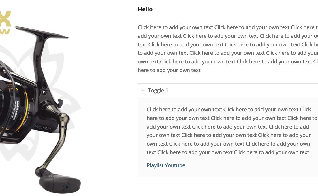 : “playlist youtube”
And you really did this step by step : https://kriesi.at/support/topic/lightbox-show-everything-and-more/#post-1288918 and you have not forgotten to insert the two custom classes ( without dots in the inputfield etc. )
Can you give me the link to a page where you have tried that?now i do not see the video – why do you try to insert it via text-block element?
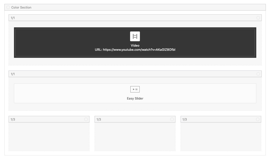
you got a video layout builder element on Enfold ( Media-Elements tab – video)
put in that alb element the video link like :https://www.youtube.com/watch?v=AKaGlZ8OfbI
see: https://webers-testseite.de/nicole/you do not see the video on top behind the png?
only on the bottom?
on my mac browsers ( firefox, safari, chrome) i can see it the way you want it.
but nevertheless – the mobile versions will not work as expected-
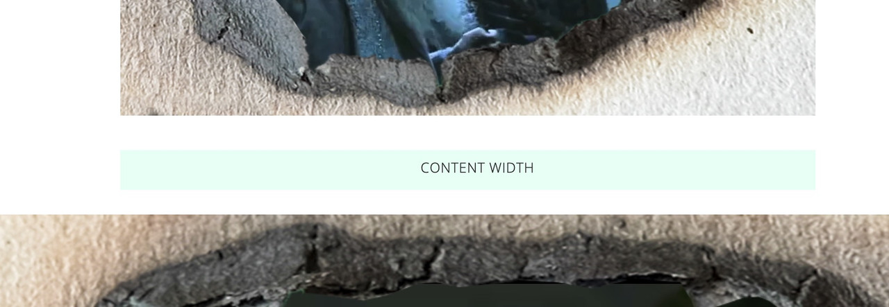
so maybe then you do all that code in a media query with min-widthon the bottom – this is a color-section with custom-class: video-section :
give the color-section the video background -you like – but as you know – it will be muted on default !
color-section with no padding and no minimum height !.video-section:after { content: ""; width: 100%; height: 100% !important; position: absolute; top: 0; left: 0; background-image: url(https://webers-testseite.de/wp-content/uploads/fire-hole-2908115.png); background-repeat: no-repeat; background-size: cover; pointer-events: none !important; z-index: 5; } .video-section { height: 56.25vw !important; /** depends on your video aspect ratio **/ }have a look : https://webers-testseite.de/video-behind-a-hole/
but a png will be very performance intensive on that.
this is a video alb in a color-section ( color-section with custom-class: hole-before ).hole-before .avia-iframe-wrap::after { content: ""; width: 100%; height: 100%; position: absolute; top: 0; left: 0; background-image: url(https://webers-testseite.de/wp-content/uploads/fire-hole-2908115.png); background-repeat: no-repeat; background-size: cover; pointer-events:none }why did you place the video in a 1/2 container and have two 1/4 empty containers besides?
If you like to have the video as wide as the slider take a 1/1 container and get rid of the two 1/4 columns.______
you have this rule in your css:
#top #wrap_all .all_colors h1 {
    color: purple;
    font-size: 32px;
    font-family: raleway,helveticaneue,helvetica neue,helvetica-neue,Helvetica,Arial,sans-serif;
    text-transform: lowercase;
}
The text-transform is the point you had to change. You can have here captalize ( only first letters are big) or uppercase ( all Letters are big ) etc.
because you have merged js files i cannot say exactliy where it comes from ( quick css or maybe Enfold – Advanced Styling)
The merging seems to come from siteground-optimizer – have a look if your settings are refreshed after changing something.
My advice – as long as you are not ready with layout and styling – switch off all merging and caching. When you are finished – then test performance with all switched on.If you only like to influence the subtext in your logo :
#top #wrap_all .all_colors .logo .subtext h1 { font-size: 14px !important; text-transform: uppercase; }-
This reply was modified 5 years ago by
Guenni007.
my question was – for what you load a script in child, which is already loaded via parent theme.
It would only make sense if you have made changes to the script. – However, then it must be done as I showed – first deregister the parent script and then load the script in the child theme. ( and your folder-structure is the same as above: child-theme/js/aviapopup/ )
The : Enfold – Theme Options – “Lightbox Modal Window” – it is on default checked.
So just leave it activated and take this loading of the script out of your child theme better again.
Did you use the predefined child-theme of enfold? : Link
Why do you think that something is not loaded correctly ?Or is it an older install that you have updated to newest Enfold?
there are some instructions concerning to lightbox in the header.php – so if you got in your child-theme an older header.php – you had to bring this file again to the newest version and place your changings in it again.i would do it this way: https://kriesi.at/support/topic/lightbox-show-everything-and-more/#post-1288918
See here that it works – even if the playlist link is in a accordion tab: https://webers-testseite.de/jean/#toggle-id-1
Or like you did it on that page: https://www.sakura-fishing.com/moulinet/casting-lagoa/#toggle-id-1-closed
there you have it as external link – to your playlist placed on youtubeyes – thats it ( for newly added images )
and you see the advantage of heaving this if there is an image with lightbox – it has the title in the bottom-bar: https://webers-testseite.de/images/ (right-side image)by the way : wordpress / wp-includes / kses.php / lines227ff:
'img'        => array(
	'alt'      => true,
	'align'    => true,
	'border'   => true,
	'height'   => true,
	'hspace'   => true,
	'loading'  => true,
	'longdesc' => true,
	'vspace'   => true,
	'src'      => true,
	'usemap'   => true,
	'width'    => true,
),
not title anymore as allowed tags
Or at least you do it without complex solutions. And do it like on those pages – where it works – there you got your playlist link to link to the youtube site with your playlist and not to a lightbox.
see here: https://www.sakura-fishing.com/moulinet/casting-lagoa/did you use the full resolution images for the lightbox?
on default it is not that case. It uses the large image for it. – There are some snippets for child-theme functions.php to set the source for lightbox images to “full”btw: how did you realise the zoom?
-
This reply was modified 5 years ago by
Dear Mods and Devs :
maybe this is a bug – don’t know if it is enfold or the new magnific-popup script since jQuery 3.5.1 that causes the issue.
i believe i remember that the mfp-iframe was not included in the image galleries in the past.My assumption:
maybe it’s only the videos that are included in the gallery that call the lightbox using “iframe=true”.One chance to get for this image in the first column an own magnific-popup.
give to the first column with that image two custom classes ( put in that custom-class input field: ) noLightbox group1the first class is to hamper enfolds lightbox for all those images inside that column.
The second is for having a trigger to get the popup.put this in your child-theme functions.php:
function open_image_in_popup_group(){
?>
<script type="text/javascript">
(function($){
	$(window).on('load', function(){
		$('.group1').magnificPopup({
		  delegate: 'a',
		  type: 'image',
		  mainClass: 'avia-popup mfp-zoom-in mfp-image-loaded',
		  closeBtnInside: true,
		  closeOnContentClick:false,
		  midClick: true,
		  gallery: { enabled:true }
		});
	});
})(jQuery);
</script>
<?php
}
add_action('wp_footer', 'open_image_in_popup_group');
See again my test page: https://webers-testseite.de/jean/
-
This reply was modified 5 years ago by
Ok now i see – you got a link in that toggle – with the playlist of your videos.
just a moment – allthough this is an iframe lightbox it seems to build a gallery with the image.
it is this playlist linking to a lightbox which is part of the gallery – not the videos beneath.
…
maybe this is a bug – don’t know if it is enfold or the new magnific-popup script since jQuery 3.5.1 that causes the issue.
i believe i remember that the mfp-iframe was not included in the image galleries in the past.-
This reply was modified 5 years ago by
it had to be an additional tool or script-
if i inspect my test page to look for the youtube id – i only find these ( in this case 4 sources – local preview image with same id – iframes ) but all are place inside the color section it concerns.
When i inspect your site and look for the id: Ri38SkRFDcY there are a lot of script entries about that ID – script with class: rank-math-schema-pro.
Maybe this is causing the issueFirst i thought i can manage it for newly inserted images this way.
function html_insert_image( $html, $id, $caption, $title, $align, $url, $size, $alt ) { $src = wp_get_attachment_image_src( $id, $size, false ); $html = "<figure id=\"post-$id media-$id\" class=\"align-$align\">"; if ( $url ) { $html .= "<a href=\"$url\" class=\"image-link\"><img src=\"$src[0]\" title=\"$title\" alt=\"$alt\" /></a>"; } else { $html .= "<img src=\"$src[0]\" title=\"$title\" alt=\"$alt\" />"; } if ( $caption ) { $html .= "<p class='wp-caption-text'>$caption</p>"; } $html .= "</figure>"; return $html; } add_filter( 'image_send_to_editor', 'html_insert_image', 10, 9 );BUT: as mentioned above that line in ajax-actions.php – the title tag isn’t supported anymore for images
Maybe the people at WordPress will reconsider this decision.
even if:For both accessibility and search engine optimization (SEO), alt text is more important than title text. This is why we strongly recommend including alt text for all your images.
but magnific-popup is part of Enfold – did you deregister the parent script in your child-theme before ?
wp_deregister_script( 'avia-popup-js' );
wp_enqueue_script( 'avia-popup-js-child', get_stylesheet_directory_uri().'/js/aviapopup/jquery.magnific-popup.min.js', array('jquery'), $vn, true);
so what is your benefit to have an own child-theme loading of the script? It is already loaded!
“I’m using a (possibly old version)…”
Or maybe you have a misconception about how a child theme interacts with the parent theme?A child theme on its fundamental construction has three files – a style.css – and that is the basic part telling WordPress that eventually parts will be added to the parent theme; an initially still empty functions.php and a thumbnail for the dashboard.
Files with the same name in the child theme folder replace the corresponding files in the parent theme – except for the functions.php file.
The functions.php is used to add additional properties to the parent theme via code snippets. These snippets can of course also override parent theme functions through certain phrases.And even if i set the videos in advanced tab of the video alb element to show in lightbox – the galleries are separated:
https://webers-testseite.de/jean/hey Jean – a few days ago i come to your topic here and indeed i saw your described behavior on the first link.
But now – when i open your link the image is loaded in the lightbox but video not.
Did you solve your problems?By the way: what function did the gallery have in your layout ?
Edit: oh now i see – i did only check the small image under the big one. Yes – it is still there-
I would try to separate the colums by putting them in different color-sections. Because you do not have sidebar here – this would be an option.
This is strange because you haven’t an image link on the videos.
This behavior i got once because i set up an image with youtube open in a lightbox. But even there are different lightbox types ( image, iframe)
@Rikard : that extra-class : anchor-link is only on my installation present. Not on default Enfold settings. ;)-
This reply was modified 5 years ago by
Depends how often you need it.
If you take over an older WordPress installation and you want to change the style to Enfold, and the posts (blog) are all created with the Classic Editor which contains several 100 images, the manual method is an option but should be avoidable if at all possible.
__________
this does not solve my issue above, but probably explains why there are no more title tags on the images
i found this filter: image_send_to_editor – and i can influence the output then on the inserted images in the textblock – but the title attribute is always missing! ( Allthough it is in the filterapply_filters( 'image_send_to_editor', $html, $id, $caption, $title, $align, $url, $size, $alt, $rel );edit: aha – on wordpress/ wp-admin / includes / ajax-actions.php line: 3251:
$title = ''; // We no longer insert title tags into <img> tags, as they are redundant.-
This reply was modified 5 years ago by
yes that was already clear to me that this is not due to Enfold, I thought you had a hint or knowledge about how to extend the tinyMCE so that it automatically reads and uses the attachment title and alt attributes.
I’m going to start looking for it myself now – and I’ll report back.Thank you very much for this – I find it better this way.
Wow – the js file has been practically rewritten.
Can be closed now.ich möchte ja schon das magnific popup script dafür nutzen, aber eben mit meinem eigenen Markup. Das sieht ja auch die Doku von Dmitry Semenov vor.
Es hat auch früher sehr gut geklappt, dass man Animationen, Markup, Callbacks etc. hinzufügen konnte. Das neue Markup wurde auch immer angenommen von allen Browsern. Jetzt macht der Firefox mal mit – meist jedoch nicht. Er nimmt dann das default markup und öffnet die lightbox.Wenn ich deinen Rat befolge und dann definiere:
<script type="text/javascript">
(function($){
$(window).on('load', function () {
  $('#bildnavigation').magnificPopup({
	delegate: 'a.avia_image',
    type: 'image',
    image: {
        markup:…
dann funktioniert es, aber die Klasse am anchor brauche ich damit die Buttons nicht mit integriert werden in die lightbox und so die Galerie zerschießen.
Trotzdem ist es mir unbegreiflich warum es vorher ging – jetzt nicht mehr.
warum es in Chrom und Safari geht – Firefox nicht.
Schade – macht es wieder ein wenig aufwendiger.Danke – kannst Du schließen!
you can see what i mean here on that page: https://webers-testseite.de/images/
An image placed in a text-block via Media-Library insertion does not have title attribute ( right side an image alb with title – and the option to give custom alt/title attributes to it ) – but that is not what i want. Why does the left image got no title if it has one ( see right flowers )March 15, 2021 at 6:03 am in reply to: How do I remove powered by Enfold WordPress Theme on the footer? #1288161 -
This reply was modified 5 years ago by
-
AuthorPosts