Forum Replies Created
-
AuthorPosts
-
yes that would be ok – if there was no margin between the columns.
but second and third column got a margin-left of 6% – so for your columns in total there are only 88%
so try 22% 22% and 44%or if you can live with less space between the columns:
@media only screen and (min-width: 768px) { #footer .flex_column.av_one_third:nth-child(1) { width: 24%; } #footer .flex_column.av_one_third:nth-child(2) { width: 24%; margin-left:3% } #footer .flex_column.av_one_third:nth-child(3) { width: 46%; margin-left:3% } }by the way – i posted here: https://kriesi.at/support/topic/how-put-two-functional-arrows-in-the-tab-section/#post-1295725
an updated version vor those arrows left/right.
It will loop – if the last slide is reached – the next click will go to the first slideDa muss was mit deiner Seite nicht gänzlich in Ordnung sein.
Ich bekomme keine reproduzierbaren Seitendarstellungen hin.
Soll bedeuten: Wenn ich in den Browsercache komplett lösche z.B. mittels Tastenkombination in Firefox:- «ctrl + shift + r» (Windows)
- «command + shift + r» (Mac)
dann sieht es mal so auch – mal anders. ( halbe bilder im slider oder in der erwähnten tab-section ; logo mal ganz links dann wieder nicht etc. pp )
Da musst du mal nachforschen woran das liegen könnte._____________________
There must be something wrong with your page.
I can’t get a reproducible page display.
This should mean: If I delete the browser cache completely, e.g. using the key combination in Firefox:- “ctrl + shift + r” (Windows)
- “command + shift + r” (Mac)
then it looks sometimes like this – sometimes different. ( half images in the slider or in the mentioned tab-section ; logo sometimes all the way to the left then again not etc. pp )
You’ll have to investigate what that could be.ok – an sowas fundamentales habe ich nicht gedacht.
Du hast also so viele Kategorien, dass es eine Paginierung hat?May 4, 2021 at 8:22 am in reply to: How to make a color section containing 2 columns full width #1298202for every single cell you can have a background-image – but the whole grid-row element doesn’t have that feature.
( on options dialogs ) on quick css you can set this aswell.May 3, 2021 at 11:57 pm in reply to: How to make a color section containing 2 columns full width #1298099Well first of all – i do not see in your css the code from above!
However, with a look at your page now, I would have recommended using the grid row element anyway.
It provides the required properties from the start, but does not offer a background image for the entire element per se, which is not necessary in your case.Nevertheless – my code from above will work, if it exists. Of course, it could be that you have activated file merging and have not refreshed these merged files after adding the new css codes.
May 3, 2021 at 7:25 pm in reply to: How to make a color section containing 2 columns full width #1298081On the alb options of your columns – you had to choose “no space between columns”
Then on quick css:#top #fullwidthsection .container { max-width: 100%; width: 100%; padding: 0; }see here: https://webers-testseite.de/color-section-full-width-container/
if it is important for you that on responsive case the columns are without space and the full-width is still there:
@media only screen and (max-width: 767px) { .responsive #top #wrap_all #fullwidthsection .container { width: 100%; max-width: 100%; } .responsive #top #wrap_all #fullwidthsection .container .flex_column { margin-bottom: 0 } }a similar thing happens on scroll down -see solution here:
https://kriesi.at/support/topic/a-flash-in-the-header-on-small-screens/for the slider …
.avia-slideshow-dots a {
  height: 25px;
  width: 25px;
  border-radius: 50%;
  margin: 0 5px;
  padding: 5px;
}
for the tab section:
#top .av-tab-section-icon:before {
    font-size: 90px !important;
}
May 2, 2021 at 7:24 pm in reply to: How to make a color section containing 2 columns full width #1297803set the max-width and width to 100%
ich habe das eben an dem neuesten Enfold getestet. Bei mir geht das
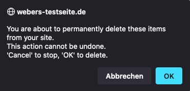
Wenn ich dann in die Kategorien wechsle danach, erscheint folgende Warnung ( da meine Testumgebung in Englisch ist ):
meine Befürchtung war das auch die Items – also die Einzelbeiträge in der Kategorie gelöscht sind- erwies sich als nicht richtig.
Diese Beiträge bekamen dann die Standard Kategorie zugeteilt.April 30, 2021 at 12:26 pm in reply to: Anpassung der Galeriespalten für mobiles // Adaptation of the gallery columns fo #1297529Du spricht oben ja explizit von 8 columns ( von einer neunten war nicht die Rede )
Bei 8 columns: 100/8= 12.5
Bei 9 columns: ? (100/9 ≅ 11.1 )ausserdem recht deutlich – wenn du den Umbruch lieber linksbündig haben möchtest …
https://kriesi.at/support/topic/anpassung-der-galeriespalten-fur-mobiles-adaptation-of-the-gallery-columns-fo/#post-1297391nicht space-evenly ( space-around, space-between) sondern flex-start.
Ich habe es jetzt mal auf der Testseite umgestellt auf flex-start.
siehe 4/4/1 Situation.Selber Lesen macht klug – hier ein informativer Link dazu
https://css-tricks.com/snippets/css/a-guide-to-flexbox/April 29, 2021 at 3:42 pm in reply to: Anpassung der Galeriespalten für mobiles // Adaptation of the gallery columns fo #1297391see here a demo with code : https://webers-testseite.de/gallery-with-8-images/
if you like to have those images on the left side on break ( see 3/3/2 )
change that rule to:.flexed-gallery .avia-gallery-thumb { display: flex !important; flex-flow: row wrap; justify-content: flex-start; }maybe this could be an informative topic: https://kriesi.at/support/topic/beitragsbild-eines-blogbeitrags-automatisch-anzeigen/#post-1202606
this little Snippet enables you to set even on alb based portfolios/posts the featured image if meta-box is set to : “show on single entry”:
function avf_template_builder_content_postimage_mod($content = ""){
  if(is_singular('post')   && ( '1' != get_post_meta( get_the_ID(), '_avia_hide_featured_image', true ) ) ||
     is_singular('portfolio') &&  ( '1' != get_post_meta( get_the_ID(), '_avia_hide_featured_image', true ) ) ) {
        $featuredImage = get_the_post_thumbnail( $the_id, 'entry_with_sidebar' );
        $content = '<div class="post-image">' .$featuredImage. '</div>' . $content ;
      }
  return $content;
}
add_filter('avf_template_builder_content', 'avf_template_builder_content_postimage_mod', 10, 1);
on that line:
$featuredImage = get_the_post_thumbnail( $the_id, 'entry_with_sidebar' );
you decide what dimension the source of the image has ( entry_with_sidebar ) is 845×321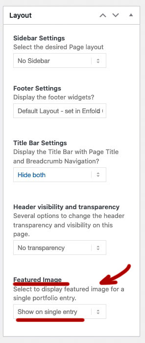
you can have on child-theme functions.php this:
function thumbnail_in_content($atts) {
    global $post;
    return get_the_post_thumbnail($post->ID);
}
add_shortcode('thumbnail', 'thumbnail_in_content');
you use it on the pages / posts as shortcode then:
[thumbnail]hast du die denn auch in Beiträgen erstellt, oder doch in Portfolios?
Dann findest du die unter Portfolio Categories.Alle Schriften oder sind es die Überschriften?
Viele der Elemente haben die Möglichkeit die Schriftgrößen von der Screenweite zu setzen.
zB. die Überschriften – wenn du die Moderne Variante wählst, dann ist da:

Es ist auch möglich von Vornherein – varialble Einstellungen via quick css zu setzen.
https://css-tricks.com/how-do-you-do-max-font-size-in-css/f.e. this will work on all modern browsers:
#top.home #av_section_1 .av-special-heading-tag { font-size:min(max(48px,10vw),120px) !important; }The link is from me the fix is from Günter ;)
We are just namesakesand you can now see on your site that the av_section_6 is touched by this – but then you will have a white space!
Sorry
you had to think of the avia-sections too:.responsive.avia_mobile #top .avia-section *[style*="url("] , .responsive.avia_mobile #top .avia-section[style*="url("]{ background-image : none !important; }the first asterisk indicates that only the following elements are choosen – so the avia-section itself is missing.
see again here: https://css-tricks.com/snippets/css/media-queries-for-standard-devices/
What I think you haven’t quite realized is that there isn’t one tablet – there’s a plethora of different sizes and resolutions.
This is only for ipad:/* ----------- iPad 1, 2, Mini and Air ----------- */ /* Landscape */ @media only screen and (min-device-width: 768px) and (max-device-width: 1024px) and (orientation: landscape) and (-webkit-min-device-pixel-ratio: 1) { } /* ----------- iPad 3, 4 and Pro 9.7" ----------- */ /* Landscape */ @media only screen and (min-device-width: 768px) and (max-device-width: 1024px) and (orientation: landscape) and (-webkit-min-device-pixel-ratio: 2) { } /* ----------- iPad Pro 10.5" ----------- */ /* Landscape */ /* Declare the same value for min- and max-width to avoid colliding with desktops */ /* Source: https://medium.com/connect-the-dots/css-media-queries-for-ipad-pro-8cad10e17106*/ @media only screen and (min-device-width: 1112px) and (max-device-width: 1112px) and (orientation: landscape) and (-webkit-min-device-pixel-ratio: 2) { } /* ----------- iPad Pro 12.9" ----------- */ /* Landscape */ /* Declare the same value for min- and max-width to avoid colliding with desktops */ /* Source: https://medium.com/connect-the-dots/css-media-queries-for-ipad-pro-8cad10e17106*/ @media only screen and (min-device-width: 1366px) and (max-device-width: 1366px) and (orientation: landscape) and (-webkit-min-device-pixel-ratio: 2) { }and then you have to think of : Galaxy, Nexus, Kindle etc. pp
I’ve already given you a rough idea of the selector above.
But as soon as you have sections with url and gradient this won’t work either.
.avia_mobile – if you only want to have that rule on mobile devices to work and not on small screens..responsive.avia_mobile #top .avia-section *[style*="url("]{ background-image : none !important; }What do you do with gaps ?
a lot of css rules are set by adding the html class to the css code .responsive
f.e.: .responsive #top .logo img
if your quick css code only has a rule about .logo img this is not able to overwrite the other selector.
You had to be more specific than the given rule. ( https://specificity.keegan.st/ )
ID’s count on that calculation more than classes than pseudo-classes or attribute selectors.Is there a live site that can demonstrate your issue – where the rules do not work as you expected?
And think of : https://github.com/KriesiMedia/enfold-library/tree/master/temp_fixes/Enfold_4_8_2/framework
i had some troubles with that and php7.4x – see here: https://kriesi.at/support/topic/lightbox-and-srcset/#post-1296108
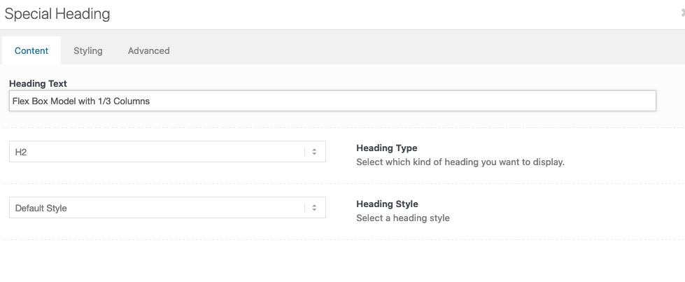
if you open the heading in your layout – where you enter the content ( heading text ) of the heading one option under it you can choose the heading tag.
on the bottom of that tab there is the heading style. These littel borders belong to the classic style. – if you go and choose modern style these borders are gone.
But if you have already set many of these headings, changing them manually might be too time consuming.
Put this to your quick css:.special-heading-border { display: none !important; }you see the layout here: https://kriesi.at/support/topic/icon-boxes-8/#post-1296421
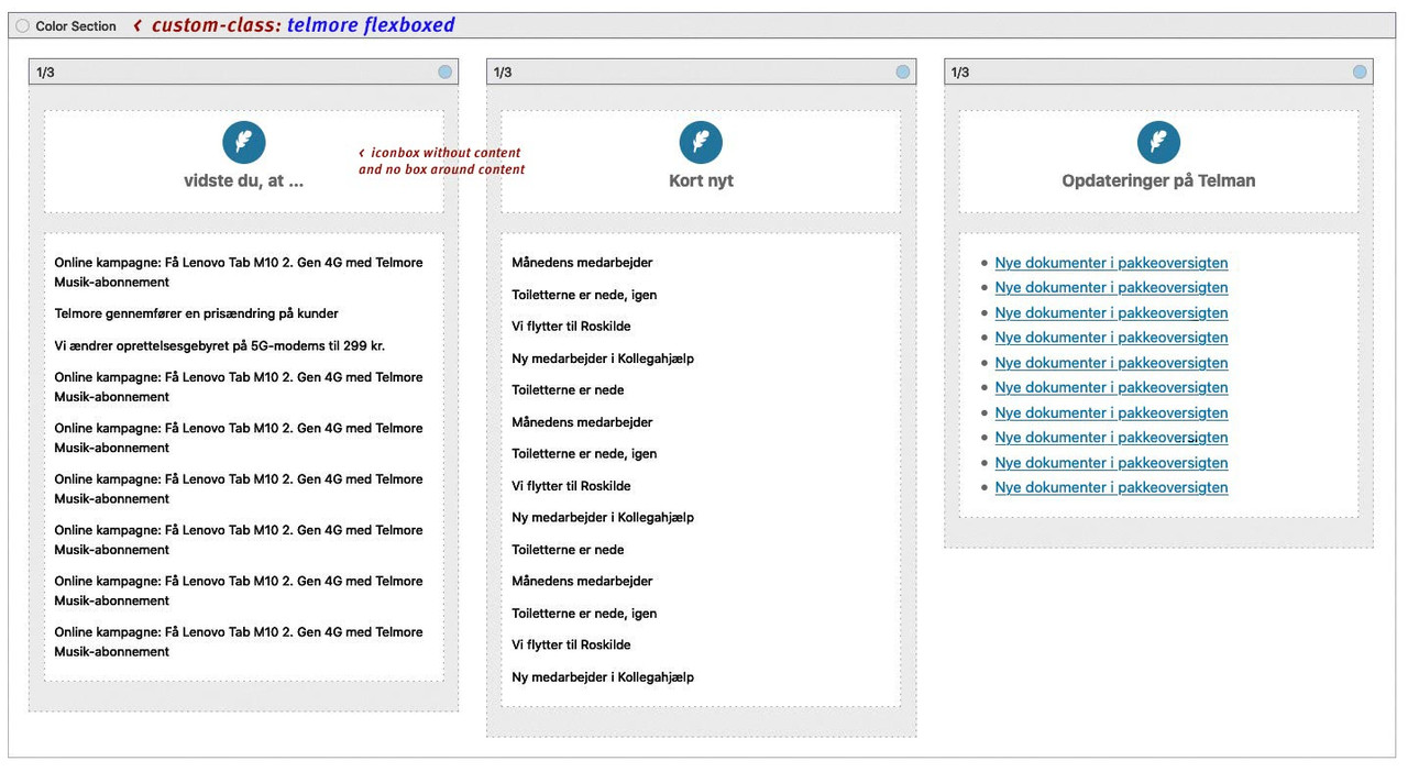
It is important that the content of your list is not part of the iconbox.
The Iconbox element only is for the icon and the heading.
The content you wanted to have in a scroll window must be separated – because we must have different overflow values.The icons you can set what ever you like yourself in the iconbox element.
The shadow is part of the column setting – so it can be removed or adjusted by yourself.It is important that you read the answers carefully – and not only to copy paste the css in the answers.
: no i can not do that for you – i’m participant as you are – maybe a mod is willing to implement this for you.
___________
or if you are familiar with enfold-shortcodes and you know how to get a new page by this – here is the column-section i used on the bottom:
and use the css from here: https://kriesi.at/support/topic/icon-boxes-8/#post-1296475[av_section min_height='' min_height_pc='25' min_height_px='500px' padding='huge' custom_margin='0px' custom_margin_sync='true' color='main_color' background='bg_color' custom_bg='' background_gradient_color1='' background_gradient_color2='' background_gradient_direction='vertical' src='' attachment='' attachment_size='' attach='scroll' position='top left' repeat='no-repeat' video='' video_ratio='16:9' overlay_opacity='0.5' overlay_color='' overlay_pattern='' overlay_custom_pattern='' shadow='no-border-styling' bottom_border='no-border-styling' bottom_border_diagonal_color='#333333' bottom_border_diagonal_direction='' bottom_border_style='' custom_arrow_bg='' id='' custom_class='telmore1 flexboxed' template_class='' aria_label='' av_element_hidden_in_editor='0' av_uid='av-knvcep5w' sc_version='1.0'] [av_one_third first min_height='' vertical_alignment='av-align-top' space='' row_boxshadow_color='' row_boxshadow_width='10' margin='0px' margin_sync='true' mobile_breaking='' border='' border_color='' radius='0px' radius_sync='true' padding='30px' padding_sync='true' column_boxshadow='aviaTBcolumn_boxshadow' column_boxshadow_color='#4c4c4c' column_boxshadow_width='10' background='bg_color' background_color='#deeef7' background_gradient_color1='' background_gradient_color2='' background_gradient_direction='vertical' src='' attachment='' attachment_size='' background_position='top left' background_repeat='no-repeat' highlight_size='1.1' animation='' link='' linktarget='' link_hover='' title_attr='' alt_attr='' mobile_display='' id='' custom_class='column1' template_class='' aria_label='' av_uid='av-4hq6raq' sc_version='1.0'] [av_icon_box icon='ue837' font='entypo-fontello' title='vidste du, at …' position='top' icon_style='' boxed='av-no-box' font_color='' custom_title='' custom_content='' color='custom' custom_bg='#083a96' custom_font='#ffffff' custom_border='#083a96' custom_title_size='' av-medium-font-size-title='' av-small-font-size-title='' av-mini-font-size-title='' custom_content_size='' av-medium-font-size='' av-small-font-size='' av-mini-font-size='' heading_tag='' heading_class='' link='' linktarget='' linkelement='' id='' custom_class='' template_class='' av_uid='av-3yvn15e' sc_version='1.0' admin_preview_bg=''][/av_icon_box] [av_textblock size='' av-medium-font-size='' av-small-font-size='' av-mini-font-size='' font_color='' color='' id='' custom_class='' template_class='' av_uid='av-3athmaa' sc_version='1.0' admin_preview_bg=''] <span class="test pum-trigger" style="cursor: pointer;">Online kampagne: Få Lenovo Tab M10 2. Gen 4G med Telmore Musik-abonnement</span> <span class="test pum-trigger" style="cursor: pointer;">Telmore gennemfører en prisændring på kunder</span> <span class="test pum-trigger" style="cursor: pointer;">Vi ændrer oprettelsesgebyret på 5G-modems til 299 kr.</span> <span class="test pum-trigger" style="cursor: pointer;">Online kampagne: Få Lenovo Tab M10 2. Gen 4G med Telmore Musik-abonnement</span> <span class="test pum-trigger" style="cursor: pointer;">Online kampagne: Få Lenovo Tab M10 2. Gen 4G med Telmore Musik-abonnement</span> <span class="test pum-trigger" style="cursor: pointer;">Online kampagne: Få Lenovo Tab M10 2. Gen 4G med Telmore Musik-abonnement</span> <span class="test pum-trigger" style="cursor: pointer;">Online kampagne: Få Lenovo Tab M10 2. Gen 4G med Telmore Musik-abonnement</span> <span class="test pum-trigger" style="cursor: pointer;">Online kampagne: Få Lenovo Tab M10 2. Gen 4G med Telmore Musik-abonnement</span> <span class="test pum-trigger" style="cursor: pointer;">Online kampagne: Få Lenovo Tab M10 2. Gen 4G med Telmore Musik-abonnement</span> [/av_textblock] [/av_one_third][av_one_third min_height='av-equal-height-column' vertical_alignment='av-align-top' space='' row_boxshadow_color='' row_boxshadow_width='10' margin='0px' margin_sync='true' mobile_breaking='' border='' border_color='' radius='0px' radius_sync='true' padding='30px' padding_sync='true' column_boxshadow='aviaTBcolumn_boxshadow' column_boxshadow_color='#4c4c4c' column_boxshadow_width='10' background='bg_color' background_color='#deeef7' background_gradient_color1='' background_gradient_color2='' background_gradient_direction='vertical' src='' attachment='' attachment_size='' background_position='top left' background_repeat='no-repeat' highlight_size='1.1' animation='' link='' linktarget='' link_hover='' title_attr='' alt_attr='' mobile_display='' id='' custom_class='column1' template_class='' aria_label='' av_uid='av-2vojkaa' sc_version='1.0'] [av_icon_box icon='ue837' font='entypo-fontello' title='Kort nyt' position='top' icon_style='' boxed='av-no-box' font_color='' custom_title='' custom_content='' color='custom' custom_bg='#083a96' custom_font='#ffffff' custom_border='#083a96' custom_title_size='' av-medium-font-size-title='' av-small-font-size-title='' av-mini-font-size-title='' custom_content_size='' av-medium-font-size='' av-small-font-size='' av-mini-font-size='' heading_tag='' heading_class='' link='' linktarget='' linkelement='' id='' custom_class='' template_class='' av_uid='av-2qjmbsi' sc_version='1.0' admin_preview_bg=''][/av_icon_box] [av_textblock size='' av-medium-font-size='' av-small-font-size='' av-mini-font-size='' font_color='' color='' id='' custom_class='' template_class='' av_uid='av-20i9gz6' sc_version='1.0' admin_preview_bg=''] <span class="test pum-trigger" style="cursor: pointer;">Månedens medarbejder</span> <span class="test pum-trigger" style="cursor: pointer;">Toiletterne er nede, igen</span> <span class="test pum-trigger" style="cursor: pointer;">Vi flytter til Roskilde</span> <span class="test pum-trigger" style="cursor: pointer;">Ny medarbejder i Kollegahjælp</span> <span class="test pum-trigger" style="cursor: pointer;">Toiletterne er nede</span> <span class="test pum-trigger" style="cursor: pointer;">Månedens medarbejder</span> <span class="test pum-trigger" style="cursor: pointer;">Toiletterne er nede, igen</span> <span class="test pum-trigger" style="cursor: pointer;">Vi flytter til Roskilde</span> <span class="test pum-trigger" style="cursor: pointer;">Ny medarbejder i Kollegahjælp</span> <span class="test pum-trigger" style="cursor: pointer;">Toiletterne er nede</span> <span class="test pum-trigger" style="cursor: pointer;">Månedens medarbejder</span> <span class="test pum-trigger" style="cursor: pointer;">Toiletterne er nede, igen</span> <span class="test pum-trigger" style="cursor: pointer;">Vi flytter til Roskilde</span> <span class="test pum-trigger" style="cursor: pointer;">Ny medarbejder i Kollegahjælp</span> [/av_textblock] [/av_one_third][av_one_third min_height='av-equal-height-column' vertical_alignment='av-align-top' space='' row_boxshadow_color='' row_boxshadow_width='10' margin='0px' margin_sync='true' mobile_breaking='' border='' border_color='' radius='0px' radius_sync='true' padding='30px' padding_sync='true' column_boxshadow='aviaTBcolumn_boxshadow' column_boxshadow_color='#4c4c4c' column_boxshadow_width='10' background='bg_color' background_color='#deeef7' background_gradient_color1='' background_gradient_color2='' background_gradient_direction='vertical' src='' attachment='' attachment_size='' background_position='top left' background_repeat='no-repeat' highlight_size='1.1' animation='' link='' linktarget='' link_hover='' title_attr='' alt_attr='' mobile_display='' id='' custom_class='column1' template_class='' aria_label='' av_uid='av-1nmcieq' sc_version='1.0'] [av_icon_box icon='ue837' font='entypo-fontello' title='Opdateringer på Telman' position='top' icon_style='' boxed='av-no-box' font_color='' custom_title='' custom_content='' color='custom' custom_bg='#083a96' custom_font='#ffffff' custom_border='#083a96' custom_title_size='' av-medium-font-size-title='' av-small-font-size-title='' av-mini-font-size-title='' custom_content_size='' av-medium-font-size='' av-small-font-size='' av-mini-font-size='' heading_tag='' heading_class='' link='' linktarget='' linkelement='' id='' custom_class='' template_class='' av_uid='av-11jp9aq' sc_version='1.0' admin_preview_bg=''][/av_icon_box] [av_textblock size='' av-medium-font-size='' av-small-font-size='' av-mini-font-size='' font_color='' color='' id='' custom_class='' template_class='' av_uid='av-ofkiky' sc_version='1.0' admin_preview_bg=''] <ul> <li style="text-align: left; font-size: 15px;">Nye dokumenter i pakkeoversigten</li> <li style="text-align: left; font-size: 15px;">Nye dokumenter i pakkeoversigten</li> <li style="text-align: left; font-size: 15px;">Nye dokumenter i pakkeoversigten</li> <li style="text-align: left; font-size: 15px;">Nye dokumenter i pakkeoversigten</li> <li style="text-align: left; font-size: 15px;">Nye dokumenter i pakkeoversigten</li> <li style="text-align: left; font-size: 15px;">Nye dokumenter i pakkeoversigten</li> <li style="text-align: left; font-size: 15px;">Nye dokumenter i pakkeoversigten</li> <li style="text-align: left; font-size: 15px;">Nye dokumenter i pakkeoversigten</li> <li style="text-align: left; font-size: 15px;">Nye dokumenter i pakkeoversigten</li> <li style="text-align: left; font-size: 15px;">Nye dokumenter i pakkeoversigten</li> </ul> [/av_textblock] [/av_one_third] [/av_section]maybe you show a little icon that your users can see that there is interaction with that text-block:
.telmore .av_textblock_section:before, .telmore1 .av_textblock_section:before { content: "↕"; position: absolute; left: 8px; top: 50%; font-size: 30px; color: #083a96; }now same test page – but with custom-class telmore1 flexboxed
and the columns set to individual height/*** same as above - shifting the iconbox ****/ .telmore1 .iconbox.iconbox_top { position: relative; top: -100px; margin-bottom: -100px; padding-bottom: 20px; background-color: transparent !important; } .telmore1 .av_textblock_section { height: 400px; /*** this decides how big / long is the scroll-window ***/ overflow-y: scroll; background-color: rgba(255,255,255,0.5) /*** just to see better that there is an extra window to scroll ***/ } /**** now flexbox setting : ******/ .flexboxed .entry-content-wrapper:before, .flexboxed .entry-content-wrapper:after { display: none } .flexboxed .entry-content-wrapper { display: flex; flex-flow: row wrap; justify-content: space-between; } .flexboxed .entry-content-wrapper .flex_column { width: unset; flex: 0 1 31%; padding: 0; margin: 0; } @media only screen and (max-width: 1025px) { .flexboxed .entry-content-wrapper { justify-content: space-evenly; } .flexboxed .entry-content-wrapper .flex_column { width: unset; flex: 0 1 42%; padding: 0; margin: 0 0 90px !important; } } @media only screen and (max-width: 915px) { .flexboxed .entry-content-wrapper { justify-content: center; } .flexboxed .entry-content-wrapper .flex_column { flex: 0 1 100%; } }
see difference on responsive behavior – more control with flexbox modeljust wait a little – i think my first idea could work too – so that will be much easier – …
here : columns in equal height – see on top: https://webers-testseite.de/iconbox-with-equal-height/
click to enlarge:
.telmore .iconbox.iconbox_top  {
    position: relative;
    top: -100px;
    margin-bottom: -100px;
    padding-bottom: 20px;
    background-color: transparent !important;
}

.telmore .av_textblock_section {
  height: 400px;
  overflow-y: scroll
}

@media only screen and (max-width: 767px) {
  .telmore .flex_column {
    margin-bottom: 90px !important
  }
}
but to have a better responsive behavior it would be best to control the columns by flexbox model …
can you please send me the link to that page.
Or if you can not make it public – copy the shortcodes enfold generates ( you find them on activating the debug mode) Use the code block vor posting here.ok – read above
-
AuthorPosts