Forum Replies Created
-
AuthorPosts
-
it is simple – you can not use a function that isn’t present. That snippet is a jQuery based snippet. Without jQuery it won’t run.
There are some good reasons to load jQuery into the footer – however, all jQuery-based functions must then be loaded temporally afterwards in order to use its functions. This could be done by setting in the add_action the priority. Low values ( default is 10) are loaded earlier – high values later.August 3, 2021 at 10:39 am in reply to: Black space on videos (both self hosted and youtube) #1314106if you got mp4 videos – i do check them by pressing command * i on my Mac OS – maybe there is something similar on windows machines.
maybe context menu of the mp4 …
i do see something like this:
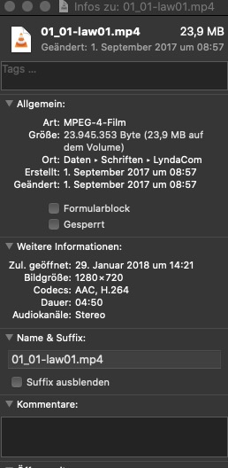
there you got your aspect-ratio and the file-size – the codec etc.
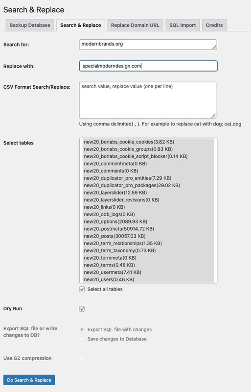
you first can do a dry run on that substitution – that will only do a test :
then next step the “hot run”:
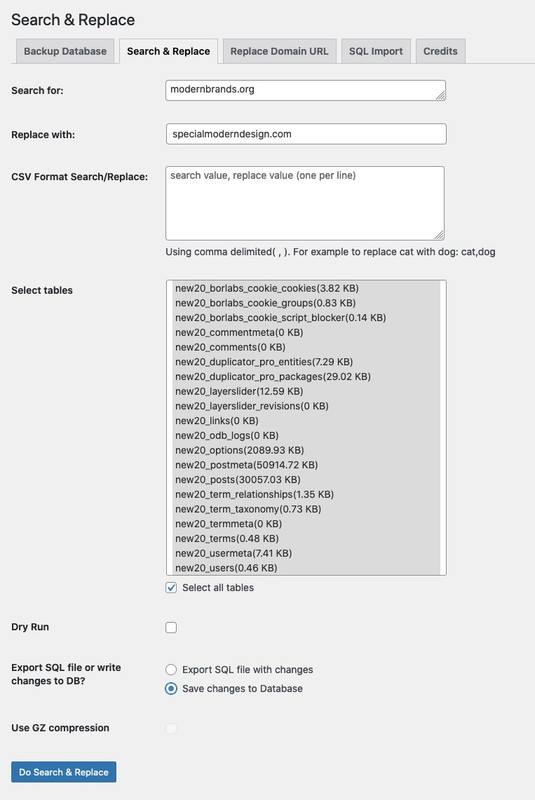
or try the domain change ( you can change here directly from http to https too:

i do use for that a plugin. Allthough this is an older plugin – i know that it still works: https://wordpress.org/plugins/search-and-replace/
It does what it is called – but also has an extra option to change domain.
Nevertheless – you should always have on working with such tools a complete backup of the running system.For example a duplicator backup ( the free version of that wonderfull plugin is mighty enough to do the job )
If you have that you can decide to run both in combination. Or you decide to just install on the new domain a second copy of that (migration) – and delete afterwards the other installation.Yesterday i tested it on my installation – both methods work on my end here.
Did you try the other method of chlld-theme alb element? On SEO Reasons this will be the better way, because this method already creates the desired markup when generating the DOM and does not replace the p tag afterwards.When / Where did you load the jQuery? On Enfold Options there is the possibility to load the jQuery in the footer. But then you have to ensure that these scripts written on JQuery basis are also loaded in time afterwards.
Try to influence the order ( priority ) of loading the script. f.e.:function replace_tags_with_tags(){ ?> <script> (function($) { function replaceElementTag(targetSelector, newTagString) { $(targetSelector).each(function(){ var newElem = $(newTagString, {html: $(this).html()}); $.each(this.attributes, function() { newElem.attr(this.name, this.value); }); $(this).replaceWith(newElem); }); } /* replaceElementTag('h3.aviaccordion-title', '<h2></h2>'); */ replaceElementTag('p.toggler', '<h2></h2>'); }(jQuery)); </script> <?php } add_action('wp_footer', 'replace_tags_with_tags', 999);the 999 is a late priority and will ensure the loading after jQuery already exists : see link
Do you see any errors on developer tools console view?by the way – if you like to have that on tabs alb element : on tabs.php there is that line 626 (Enfold 4.8.6)
change to :$output .= '<h2 aria-controls="' . $tab_atts['custom_id'] . '-content" role="tab" tabindex="0" data-fake-id="#' . $tab_atts['custom_id'] . '" class="tab ' . $titleClass . '" ' . $markup_title . '>' . $icon.$tab_atts['title'] . "</h2>\n";Pastebin: Link
by the way – i do not test it on life site. If the toggles do not work after replacement !
you had to do that solution here with a child-theme alb element : https://kriesi.at/support/topic/accordion-title-to-h2/#post-1313348
you see there that current and hover etc are correlated to p tag.
just use the edited alb element for new enfold (4.8.6 ) from here: Link
from SEO point of view this is the better solution anyway.@rvga : on developer console it works this way:
maybe you had to refresh all cache and regenerate the merged enfold js files.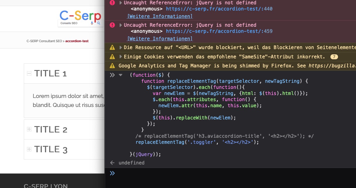
______
don’t know if the class toggler is used elsewhere in the dom – so be a bit more selective – to avoid replacement at the wrong place.function replace_tags_with_tags(){ ?> <script> (function($) { function replaceElementTag(targetSelector, newTagString) { $(targetSelector).each(function(){ var newElem = $(newTagString, {html: $(this).html()}); $.each(this.attributes, function() { newElem.attr(this.name, this.value); }); $(this).replaceWith(newElem); }); } /* replaceElementTag('h3.aviaccordion-title', '<h2></h2>'); */ replaceElementTag('p.toggler', '<h2></h2>'); }(jQuery)); </script> <?php } add_action('wp_footer', 'replace_tags_with_tags');there are some usefull filters in the coresponding php file: class-svg-shapes.php
for the most of my installations – i do not use the month and year based media setting. All Images i upload goes to the uploads folder. So i set for those custom svg the path by:
to child-theme functions.phpfunction my_svg_path(){ $path = get_site_url().'/wp-content/uploads'; return $path; } add_filter( 'avf_custom_svg_shapes_files_directory', 'my_svg_path', 10, 1 );so i can upload those custom-svgs via media library – that is nice to have – even to see how they look like.
if you prefer a folder in your child-themes folder ( like shortcodes folder for custom alb elements )
you can set it up by ( name the folder as you like f.e.: custom-svg ):
to child-theme functions.phpfunction my_svg_path(){ $path = get_stylesheet_directory().'/custom-svg/'; return $path; } add_filter( 'avf_custom_svg_shapes_files_directory', 'my_svg_path', 10, 1 );all your custom svgs come to that folder ( enfold-child/custom-svg/ )
to get new svg in that dropdown list you can do that to child-theme functions.php
( set to false if you do not want to have the given options )function custom_avf_custom_svg_shapes( array $custom_shapes ) { // example for uploading a svg file: your_file.svg $custom_shapes = array ( 'your_file' => array( 'title' => __('YOUR FILE NAME', 'avia_framework' ), // Name displayed in select box - whatever you like 'has_negative' => true, // uploaded file had to be named: your_file-negative.svg 'has_flip' => true, 'has_width' => true, 'path' => string, // if you like to determine a different path (absolute) 'filename' => 'your_file', // .svg will be added if missing 'attachment' => integer, // attachment id of uploaded media ( if you like to determine ) 'attachment_negative' => integer // attachment id of negative uploaded media ( if you like to determine ) ), ); return $custom_shapes; } add_filter( 'avf_custom_svg_shapes', 'custom_avf_custom_svg_shapes', 10, 1 );_______________________
info
the default enfold svg is a top positioned one so it has its 100% fill color on top (except the negative svgs):
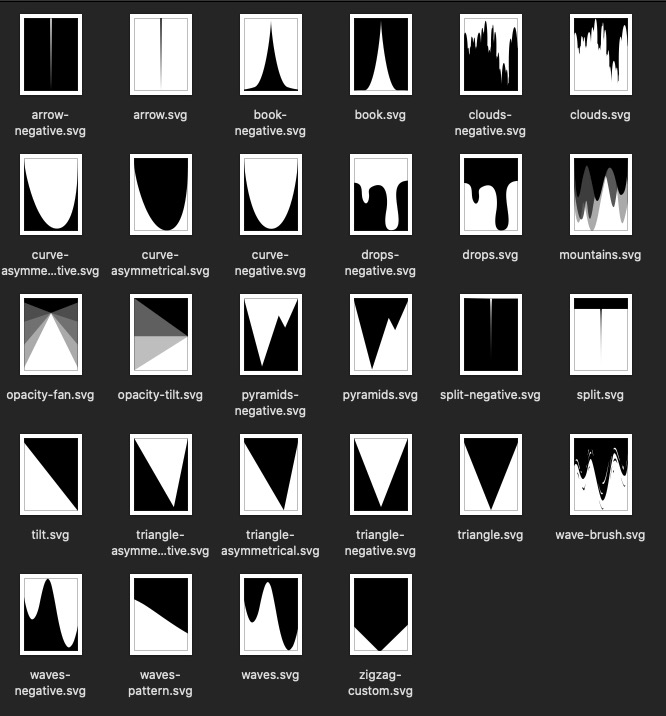
the bottom svg dividers are transformed by 180deg rotation – they do not need an extra file.now you had to decide what behavior your divider has to have. Should it be responsive or you like to use it as pattern etc.
most of the enfold default svgs do have inline : preserveAspectRatio=”none”
with the given options- to set it to a fixed height – the svg will keep the set height and is squashed in its width.
- if you set it to : “auto, defined by svg viewport” and set the max-height to none – it will react “responsive”.
- if you set it to : “auto, defined by svg viewport” and a fixed max-height – it will be squashed in width for larger screens – and reacts responsive on smaller screens
.
____________________
If you like to preserve allways responsiveness – you had to set inside your svg : preserveAspectRatio=”xMidYMin meet” xml:space=”preserve”
then the limitation by max-height will end up a divider that has on big screenwidth a given dimension – on smaller screens when the width fits the screen width it will shrink with the aspect ratio.
____________________
Patterns tend to have inside the svg : preserveAspectRatio=”xMidYMin slice” ( see enfold wave-pattern)
( the Y-Value had to be on min ( fill-color is on top – see above) )
the x-Value depends on you.August 2, 2021 at 11:03 am in reply to: slideshow_layerslider.php on line 28 | functions.php on line 5535 | php on line #1313873i see that your login page is still reachable: Are you able to login?
If so have a look what is on General Settings Dialog:

On default these urls are the same. Changing the site address url is possible ( f.e. on installing a wordpress to a subfolder ) but it is not as simple as changing the url only on that place.
August 2, 2021 at 10:45 am in reply to: slideshow_layerslider.php on line 28 | functions.php on line 5535 | php on line #1313869Enfold 4.4.1 – yes – an update maybe usefull.
Then : on wayback machine i can see a working page of your homepage.
but path is : https://www.mypalmbeachwebdesign.com/
did you change something on your installation path ( maybe wp-config ) that now the path is with public_html? :
https://www.mypalmbeachwebdesign.com/public_html/your style sheet is reachable over: https://www.mypalmbeachwebdesign.com/wp-content/themes/enfold/style.css
( i know some providers that will have in the absolute path of the server that public_html – but that is only on absolute server path – not on wordpress url or site address url )
ist es denn nicht automatisch ausgeladen, wenn du im Optionen Dialog ( Theme Optionen – Lightbox Modal Window ) deaktivierst?
Geladen wird es in der functions.php lines 478ff (Enfold 4.8.5)
hier siehst du dann auch, dass die Bedingung zum Laden der Scripte und CSS :$condition = ! empty( $avia_config['use_standard_lightbox'] ) && ( 'disabled' != $avia_config['use_standard_lightbox'] );wenn es eben disabled ist, dann wird der Rest auch nicht geladen
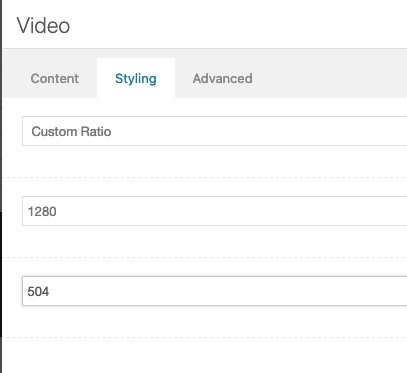
thats easy – you had to know your own video aspect ratio !!!
Guess the headings under the video have a height of (576-504=72) ;)
your selfhosted video got : 1280 x 576:lol: https://consulting.webers-testseite.de/externe-videos/
schicke mir mal bitte den Zugang – wenn es nicht öffentlich geht – gerne auch via E-Mail ( kontaktdaten sind unter dem Avatar oder Nick zu finden)
Auf der Original Seite ist das Logo ein svg file ( bei dem sogar der slogan noch vorhanden ist.
Linkman könnte das Ganze auch ohne header widget machen, und es über ein Filter mit einsetzen.
Es würde dann sogar Teil im Logo container sein und so zB das Shrinken mit machenfunction kriesi_logo_addition($sub){ $sub .= '<img class="second-logo" src="PATH_TO_SECOND_LOGO" alt="Logo 2" />'; return $sub; } add_filter('avf_logo_subtext', 'kriesi_logo_addition');siehe hier : https://consulting.webers-testseite.de/
nachdem du das gesehen hast nehme ich es aber wieder raus.
und hier schiebe mal dein Browserfenster zusammen und schau was aus dem Groh Logo wird.
So kann man innerhalb eines svg das Aussehen steuern:
https://consulting.webers-testseite.de/groh/-
This reply was modified 4 years, 7 months ago by
Guenni007.
besides Autohaus Groh ?
i see them ( Audi, Renault, Daccia, etc. ) in both screenshots under the logo.
Autohaus Groh is an SVG ( on the current page ) – so why not use a whole SVG as an inline SVG logo.
each logo has its own group within the svg – then you can comfortably resize, move or hide the individual logos via media-query.PS : why are there two burger menu?
Same setting
see again : https://consulting.webers-testseite.de/externe-videos/#hitrev
under Styling 1280:504What alb do you mean : the Accordion Slider – there a filter exists to change it : avf_customize_heading_settings
function my_avf_customize_heading_settings( array $args, $context, array $extra_args = array()){
  if( $context == 'aviaccordion' ){
    $args['heading'] = 'h2';
  }
  return $args;
}
add_filter( 'avf_customize_heading_settings', 'my_avf_customize_heading_settings', 10, 3 );
but the toggles ( on toggles.php ) there is no such filter.
and I’m afraid that it’s not as easy as changing two places in the code as with some other ALB elements.line: 1048ff ( Enfold 4.8.5)
$output .=		"<p data-fake-id='#{$toggle_atts['custom_id']}' class='toggler {$item_titleClass} {$titleClass} {$item_inherit}' {$markup_title} role='tab' tabindex='0' aria-controls='{$toggle_atts['custom_id']}'>";
$output .=			$toggle_atts['title'];
$output .=			'<span class="toggle_icon">';
$output .=				'<span class="vert_icon"></span>';
$output .=				'<span class="hor_icon"></span>';
$output .=			'</span>';
$output .=		'</p>';
but you find in that toggles.php also some code correlated to the p-tag:
829ff:'toggle' => ".togglecontainer.{$element_id} p.toggler", 'toggle-current' => ".togglecontainer.{$element_id} p.toggler.activeTitle", 'toggle-hover' => ".togglecontainer.{$element_id} p.toggler:not(.activeTitle):hover", 'toggle-icon' => ".togglecontainer.{$element_id} p.toggler .toggle_icon",so you can try to change that to f.e.: h2
see here for enfold 4.8.5 : Pastebin
and have your own child-theme toggles.php via well known snippet: https://kriesi.at/documentation/enfold/intro-to-layout-builder/#customizationJuly 29, 2021 at 11:06 pm in reply to: Whats better, update theme from inside WordPress or manually using Transmit? #1313338this is my method on updating when there are some major updates. :
https://kriesi.at/support/topic/some-hints-and-advice-to-update-enfold/#post-1056107The big advantage of that is – that you always have a rollback version in the backhand.
But it is less fast than the WordPress method.On former times when upgrading some “bug fix versions” i used the plugin “update Themes and Plugins from zip file”
– but on newer WordPress Version this method is adopted by WordPress.
Go To Themes and klick add New.
On uploading the new Enfold.zip file – WordPress will check if an older Version of Enfold is installed. If yes – it will ask you what to do!
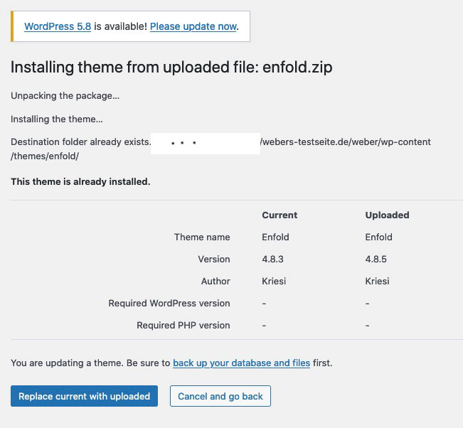
But one of the safest ways is the first one via ftp
July 29, 2021 at 10:41 pm in reply to: Black space on videos (both self hosted and youtube) #1313335you do not need to enter small natural integers there.
The closer you get to the aspect ratio, the better the black bars will be.
see here: https://consulting.webers-testseite.de/externe-videos/#hitrev
just put in the exact ratio
PS: When you first open the page my cookie blocker is still active, and shows a local preview image ( based on the youtube thumbnails – that are most in 16:9 format ) if you don’t agree to the cookie policy. so there the black bar is still shown.
Accept the Cookies and see your videosorry no screenshot for me – i’m participant as you are.
And besides that logo you like to have a second one ?
What should happen with the second logo – when the screen width is narrowed?
Do you use a shrinking header ?what kind of header setting do you have?
Logo left – nav below ?Well, then I won’t be able to spare the time to solve your problems.
I see that there is a new button: “Add contact form”.
And what is behind those 4 Square symbol besides that?
I guess this has been inserted there by a plugin?
Could you deactivate that, and refresh all cache – including the merged files.July 27, 2021 at 10:15 pm in reply to: Black space on videos (both self hosted and youtube) #1312861can you show me the sites where the videos are running?
well jQuery 3.5.1 got some changes and if your snippet contains:
$(window).load(function(){just replace that line with:
$(window).on('load', function(){Finde ich auch. – ich denke damit kann man jetzt wirklich viel abdecken an styling optionen.
Danke für die Umsetzung, welche ich aber auch glaube durchaus Sinn macht.Thanks
beim Triangle and Triangle asymmetrical kannst du das gut sehen was es bringt.
während bottom unverändert in der Höhe bleibt, ergibt sich bei top eher eine Natürlichkeit – vor allem , wenn die color-section nicht auf einen festen Wert gesetzt wird.-
This reply was modified 4 years, 7 months ago by
Danke
-
AuthorPosts