Forum Replies Created
-
AuthorPosts
-
no login is needed – send me the page it concerns. Screenshots do not help me.
Maybe I’ll explain what I’m talking about:
If I have a live page, I can test and examine all css settings in advance using the developer tools that come with such a browser – without ever having to change anything in your source code. The setting as you have created the ALB is then in the DOM as your settings are. Even jQuery scripts can be run in the console. So a screenshot is not really a substitute for the live page.
It would also be enough for me if you find a page in the demos that is set analogously to yours. For example: if you tell me that you are interested in the images like here: https://kriesi.at/themes/enfold-2017/elements/image/.PM is not for me- i’m participant as you. So when i should help you – you had to be more precise what settings of image alb you set. And the most easiest way is to show me a page where this should work.
but – sorry then i would like to see your site!
Always rebuilding the situation on my own sites costs a lot of time.
__________
one thing to mention before this to the developers. I do not understand why some of the settings in enfold css are set to !important.
Each individual change stops working on this.F.e.:
The rule in image.css :.av-overlay-hover-deactivate .avia-image-overlay-wrap:hover .av-caption-image-overlay-bg{opacity: 0 !important;}it will work too without that setting to important. But it is hard to overwrite if we like to change it.
August 10, 2021 at 11:51 am in reply to: Inline SVG Graphics displaced and cut by other elements #1316037wobei ich momentan die gleich svg auf deiner Seite sehe.
Edit: but remember – there are reasons for inline clip-path in svgs. But the one – building the whole rectangle is unnecessary in this caseAugust 10, 2021 at 10:58 am in reply to: Inline SVG Graphics displaced and cut by other elements #1316028;) next svg info: there is a clip-path in it !
Well – a clip-path does what it is supposed to do.
If this clip-path is not present – it will show even the path’s with the translation from the second svg !August 10, 2021 at 10:48 am in reply to: Inline SVG Graphics displaced and cut by other elements #1316023i did not look completely through your svgs – if there are duplicate IDs ( or even classes – when they were determined differently ) you had to avoid that too!
Not only that this will end up in an invalid html document in case of IDs ;)August 10, 2021 at 10:36 am in reply to: Inline SVG Graphics displaced and cut by other elements #1316018you have two svg on your site ( like on css ) if there are the same rules – the last one wins ;)
in your second svg there you use the same keyframe names – with different translation amounts ! ( MoveUpDown, MoveUpDownS and MoveUpDownS2 )
the setting of the second one will influence the first one and is defining the rules for those keyframes.PS: this happens a lot with classes in svg created by Illustrator.
All Illustrator Classes ( if not set have st0, st1, st2 etc. pp.)PPS: rename in one of the svg your keyframes – f.e. in the second one by MoveUpDownS3 , MoveUpDownS4, MoveUpDownS5
do not forget to insert the new names in the animation rules.-
This reply was modified 4 years, 7 months ago by
Guenni007.
August 10, 2021 at 7:14 am in reply to: Inline SVG Graphics displaced and cut by other elements #1315966can you show me the svg please.
A link to a public place would be ok.Update to Enfold 4.8.6 and use for the setting auto and a limiting height or none
EDIT – ok i found your website – these svgs do not concern to the svg defiders. – which I mistakenly assumed without seeing the page.
You are welcome
I am not quite sure that I understand the question correctly.
A new “order” is added and it is included to an alb (f.e. a fullwidth-slider, or partner-logo) . On each of the individual customer pages, this ALB then appears again with the changed data, but it is on all customer pages the same banner! ?________
what if you create a new page – with only that banner. This is the page you had to add the new “order”.
Then you can add that banner via “Page Content” ALB to your customer pages.
Eachtime you edit that Content – it will be synchonized to all customer pages.all following adjacents
the heading and the excerpt got background colors – avoiding to have two rules for that – i decided to give to all children that attribute.Next way to automatism.
the excerpt – if it is a long excerpt like on my example on third or fourth entry it will be as mentioned above better to set the justify-content to : flex-start.On css the parent selektor does not exist and a selector for “element does not have sibling with a child with class”
so if you like to make this perfect : we have to have a class that decides if there is an excerpt or not.
I put this to child-theme funtions.php:function add_class_if_excerpt(){ ?> <script type="text/javascript"> (function($) { $(document).ready(function(){ $('.grid-entry').each( function() { if($(this).find('.grid-entry-excerpt').length !== 0){ $(this).find('.grid-content').addClass('has-excerpt'); }; }); }); })(jQuery); </script> <?php } add_action('wp_footer', 'add_class_if_excerpt');so if there is an excerpt – the grid-content container got the class: has-excerpt now.
then we can style it as above ( with justify-content: space-around ) – and have that extra rule:
.grid-content.has-excerpt {
  justify-content: flex-start;
}
=> Stand alone Titles will be centered and those with excerpt are placed on top.
btw: now you can have different settings f.e.:
.grid-content.has-excerpt {
    transform: translate(-50%, 40%);
    opacity: 1;
}

.grid-content:not(.has-excerpt) {
    transform: translate(-50%, 50%);
    opacity: 0;
}
with excerpt the title is visible and on hover the whole thing is shown
PPS : i had to find a solution for much content in small entries … if shifting the content on hover to top
Edit: done – just set the beginning opacity to zero for grid-content.just for info:
the general sibling selector is the tilde : ~ ( that means all siblings those before and after the selected element )
but if we want the adjacent sibling it is the plus sign : +you can even influence the transiton for it not synchronized by:
transition: 0.3s opacity ease, 1s transform ease;
separated by commassee f.e. here: https://webers-testseite.de/xeovision4/
.grid-entry  .inner-entry {
  overflow: hidden !important
}

.grid-content {
  display:flex;
  flex-flow: column nowrap;
  justify-content: space-around;
  position: absolute;
  top: 50%;
  left: 50%;
  transform: translate(-50%, 50%);
  width: 100%;
  height: 100%;
  padding: 10px;
  background: rgba(255,255,255,0.9) !important;
  z-index: 0;
  opacity: 0;
  transition: 1s all ease;
  pointer-events: none;
}

.grid-content * {
  background: transparent !important
}

.image-overlay {
  display: none !important;
}

.grid-content .avia-arrow {
  display: none;
}

a:hover.grid-image +  .grid-content {
  opacity: 1;
  transform: translate(-50%, -50%);
  transition: 1s all ease;
}
PS : the excerpt should not be too long. If so – you must accept that there will be a cutoff on that. You then had to choose for grid-content
justify-content: flex-start;btw: the pointer-events: none is important – otherwise you will loose link functionality on anchor.
-
This reply was modified 4 years, 7 months ago by
Then grid-content is a sibling ( not a descendent ) to the anchor
so maybe you had to use the sibling selector for it (a:hover.grid-image + .grid-content)First : what should this do – is an outcommentation for you ?
xxxopacity: 0;Next: the whole overlay story is that the
overlay-color comes from image-overlay class
and
overlay-image comes from image-overlay-inside classhope this will help you: https://webers-testseite.de/overlapping/
don’t know why this happens – you can avoid it by quick css:
.responsive #top.page-id-206 #av_section_2 .flex_column:first-of-type { margin-top:-450px ; margin-bottom:100px; }But your site now is online – what was the matter with it Karen?
so why don’t you use then instead masonry ! The Masonry offers to show even Portfolios.
if you do not like the 3d animation – get rid of it by:.avia_desktop.avia_transform3d .av-masonry-entry { perspective: none !important; }yes and ( that was new to me too ) the link to ogp.me shows me that this might be a mandatory entry:
<html prefix="og: https://ogp.me/ns#">f.e.: https://freecodetools.org/ogp/
the code you got there comes to:function add_meta_to_head(){ ?> <html prefix="og: https://ogp.me/ns#"> // replace this by the code from ogp generators <?php } add_action('wp_head', 'add_meta_to_head');yes – seems to be a good idea.
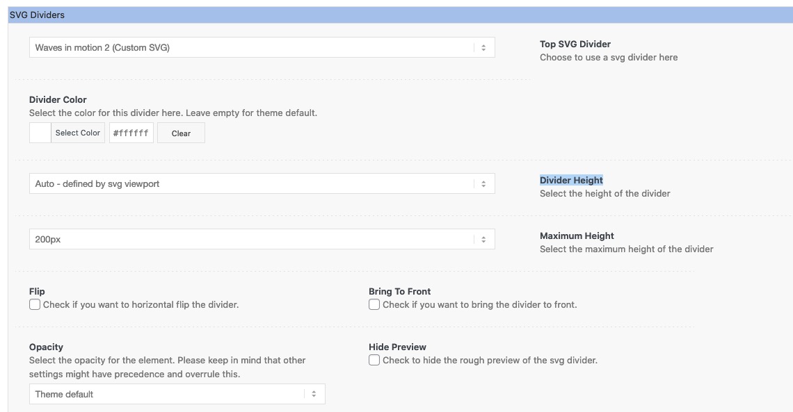
In principle, I warned a long time ago against inflating this very good theme unnecessarily. Unfortunately, such a top theme must also submit to the taste of the times – and offer as many users as possible the opportunity to set such separators themselves without the help of web designers.
Offering these things is already a competitive advantage. Elementor, Divi, etc. pp are fighting for market share.
Used sparingly, these svg separators can serve to offer a more relaxed structure – or to set smaller accents.By the way – if you want to do it the very right way – the image could be defined by that:
<meta property="og:image" content="https://example.com/ogp.jpg" />
<meta property="og:image:secure_url" content="https://secure.example.com/ogp.jpg" />
<meta property="og:image:type" content="image/jpeg" />
<meta property="og:image:width" content="1200" />
<meta property="og:image:height" content="630" />
<meta property="og:image:alt" content="A shiny red apple with a bite taken out" />
see: https://ogp.me
there are a lot of opengraph online generators – you can do a search by yourself.
after that you can manually insert the information via child-theme functions.php
( including other meta infos to your site head area ) f.e:function add_meta_to_head(){ ?> <html prefix="og: https://ogp.me/ns#"> <meta name="viewport" content="width=device-width, initial-scale=1"> <meta name="description" content="best not more than 140letters"> <meta name="keywords" content=" seperated by commata "> <link rel="shortcut icon" type="image/x-icon" href="/wp-content/uploads/icons/favicon.ico"> <link rel="apple-touch-icon" href="/wp-content/uploads/icons/apple-touch-icon.png"> <meta property="og:title" content="Webers Worldwide Webdesign"> <meta property="og:site_name" content="Webers Webdesign"> <meta property="og:url" content="https://webers-webdesign.de"> <meta property="og:description" content="Webers Webdesign gestaltet Ihre individuelle Webseite nach Ihren Vorgaben. Wir setzen Ihr Corporate Design in eine technisch saubere Webseite um. Das leicht Machbare darf nie die Grenze auf dem Weg zu der Visualisierung Ihrer Ideen sein."> <meta property="og:type" content="website"> <meta property="og:image" content="/wp-content/uploads/WeberWebdesign-OG-image.jpg"> <?php } add_action('wp_head', 'add_meta_to_head');strange thing the first line comes to the right place with that snippet ( to html )
it is best if the image has approx 1.91/1 aspect-ratio and has on minimum 1200px x 630px
PS if Facebook is important for you – do not forget : fb:app_idthat line 442 –
$img_style = '';why don’t I have this error message?
I don’t install any other Enfold than all the others. Nevertheless, I have to observe that some people describe “bugs” that I can’t reproduce.
Is it because I have activated the latest php version?PS : on trying to reproduce the issue – i see that if you have on masonry or masonry gallery a custom background color. And have large gaps. it might be looking nicer if :
#top .container .av-masonry.av-large-gap {
    padding: 15px 0 0 15px;
}
August 4, 2021 at 11:42 am in reply to: Plugin or technique to create password protected pages? #1314347if you are on an apache server you can do that with htaccess file in that folder and the common solution
have a look here : https://help.dreamhost.com/hc/en-us/articles/216363187-Password-protecting-your-site-with-an-htaccess-filethere are a few htacces / htpasswd generators online
both files ( the are invisible files with a dot in front: .htaccess / .htpasswd ) had to be uploaded to the concerning folder via ftp.
a .htaccess file f.e. looks like this:AuthType Basic AuthName "Password needed" AuthUserFile /absolute-server-path-to/.htpasswd Require valid-userthe path is the unix path . On your ftp client you can determine it via context menu of .htpasswd
wouldn’t it be the same:
on line 905 :
$selector_background = ( !empty( $atts['src']) && $atts['attach'] == 'parallax' ) ? 'section-parallax-inner' : 'section-outer';PS:
Who thinks of such a thing:
First you insert an image, then you set it to parallax. Then you think about the whole thing and delete the image without resetting the options of the image you no longer want. This is the construct when the “bug” is present.August 4, 2021 at 7:19 am in reply to: slideshow_layerslider.php on line 28 | functions.php on line 5535 | php on line #1314283did you read what I wrote?
For me, the /public_html/ does not fit behind your domain.
That would be very unusual to have it like that.
As I said – some providers have this server structure e.g: sftp://HOSTERDOMAIN/home/www/public_html/license.txt
You can see here that the root directory of the installation – your domain – comes after the public_html.
You can see that it used to be different because this can still be found at
https://mypalmbeachwebdesign.com/wp-content/themes/enfold/screenshot.pngMaybe you ask your provider what could be the reason for that
PS :
You wouldn’t believe how often I’ve heard this sentence: I didn’t do anything, suddenly the computer / the installation didn’t work anymore. ;)
Hacker attacks are not that commonhm – ich dachte es ginge genau darum es zu deaktivieren?
Das Enfold LIghtbox funktioniert auf Basis des Magnific Popup Scriptes.
Wenn du kein anderes Script dafür einsetzt, dann kann auch kein Popup mehr funktionieren.in der functions.php steht explizit die Bedingung drin:
//lightbox inclusion
$condition = ! empty( $avia_config['use_standard_lightbox'] ) && ( 'disabled' != $avia_config['use_standard_lightbox'] );
avia_enqueue_style_conditionally( $condition, 'avia-popup-css', $template_url . '/js/aviapopup/magnific-popup.css', array( 'avia-layout' ), $vn, 'screen' );
avia_enqueue_style_conditionally( $condition, 'avia-lightbox', $template_url . '/css/avia-snippet-lightbox.css', array( 'avia-layout' ), $vn, 'screen' );
avia_enqueue_script_conditionally( $condition, 'avia-popup-js', $template_url . '/js/aviapopup/jquery.magnific-popup.min.js', array( 'jquery' ), $vn, true );
avia_enqueue_script_conditionally( $condition, 'avia-lightbox-activation', $template_url . '/js/avia-snippet-lightbox.js', array( 'avia-default' ), $vn, true );
alle Scripte und auch das zugehörige css werden nur geladen, wenn die Option ( $condition ) in Enfold aktivert ist.
wenn du dir das avia-snippet-lightbox.js mal öffnest, siehst du das es ein script zugehörig zu magnific popup ist und nur die Einstellungen regelt ( trigger klassen etc. ) -
This reply was modified 4 years, 7 months ago by
-
AuthorPosts