Forum Replies Created
-
AuthorPosts
-
November 18, 2021 at 11:12 am in reply to: Image gallery with thumbnails element – click instead of hover #1329476
ok – sorry, then I misunderstood him.
I thought he just didn’t want the lightbox to open when clicking the thumbnails.
So only the large image should be shown when clicking the thumbnails.November 18, 2021 at 11:03 am in reply to: YouTube Videos Not Playing with latest Enfold release 4.8.7.1 and WordPress 5.8. #1329474sorry i didn’t see that you solved allready your issue.
-
This reply was modified 4 years, 4 months ago by
Guenni007.
ja weil #main nicht den #header einschließt sondern Sibling ( Geschwister ) ist , die liegen also auf gleicher Ebene
– das #top ist o.k.ich weiß nicht woran es liegt. Früher gingen die youtu.be links.
PS : an deiner Font Geschichte mußt du arbeiten, da sind eine Menge Fehlermeldungen in der Konsole
try to insert not the youtu.be link but
https://www.youtube.com/watch?v=aa5k3o5lDJIthe
https://youtu.be/aa5k3o5lDJIdoes not work on my site – because i have strict Header Policies on my page.
if i allowhttps://youtu.beon frame-src it will do exactly the same error.to what element does the ID: #impact-boxes belong?
i do not believe that it is a parent of #wrap_all ! This is parent of all content you can set on default.
the #top ID belongs to the body tag and is parent of #wrap_all
so this might be the right sequence ( cascading ) : .responsive #top #wrap_all #impact-boxes .flex_column
if it is a color-section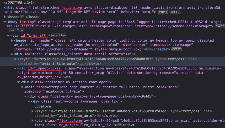
Thank you – that works – looks horrible in child-theme functions.php – but it is faster than:
function replace_transparent_logo_on_some_pages(){
if(is_front_page()){
?>
<script>
(function($){
    $.get('URL_of_that_SVG', function(svg){
      $( ".avia-svg-logo-sub" ).html( svg );
    }, 'text');
})(jQuery);
</script>
<?php
}
}
add_action('wp_footer', 'replace_transparent_logo_on_some_pages');
i try to get a combination of both ;)
November 17, 2021 at 12:40 pm in reply to: Image gallery with thumbnails element – click instead of hover #1329337yes – that is nearly exactly my solution – only that change in gallery.js i think it is not necessary.
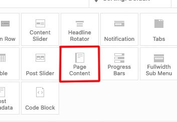
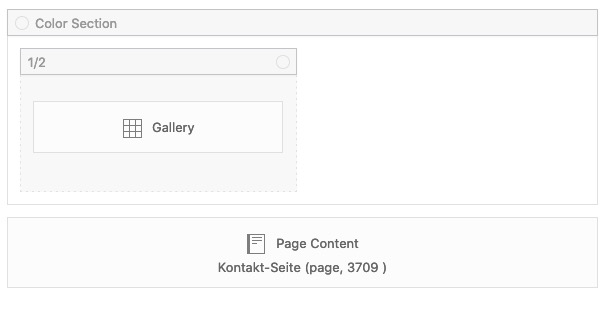
– but it has the disadvantage ( as mentioned above ) – that there is no “gallery mode” ( on magnificPopup: gallery: { enabled:true }, )Next: for that option to change one page and change on several pages i use the ALB: Page Content
Layout your page you like to insert on a different page and insert it with that alb.
Editing that page will change it on every place it is inserted to.
________
And how about the option to save the color-section as template?
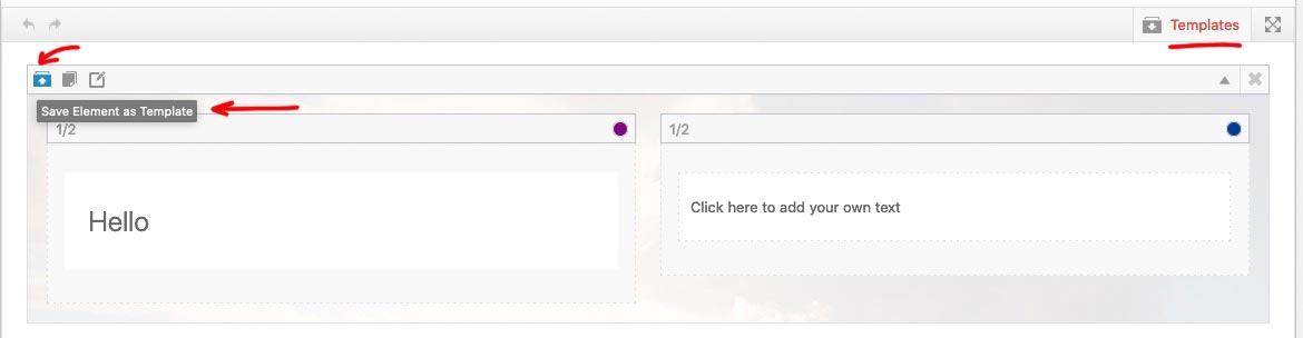
I use that for a lot of prestyled layouted Color-Sections
you find those templates in the upper right side –
Or save a whole page as template !November 16, 2021 at 1:01 pm in reply to: Archive (especially tag archive) in grid layout with featured image #1329209Hi Ismael – and when will 4.8.7.2. be downloadable ? ;)
November 15, 2021 at 11:25 pm in reply to: Archive (especially tag archive) in grid layout with featured image #1329139Ja Danke
November 14, 2021 at 9:24 pm in reply to: Image gallery with thumbnails element – click instead of hover #1328975no my solution is only a temporary solution – because it does not have a gallery function in the lightbox.
https://webers-testseite.de/ajax-gallery/-
This reply was modified 4 years, 4 months ago by
but if you have that search on your main-navigation the magnifier symbol ( search ) is also on hamburger open visible !
Maybe you only had to style the colors of that Search icon
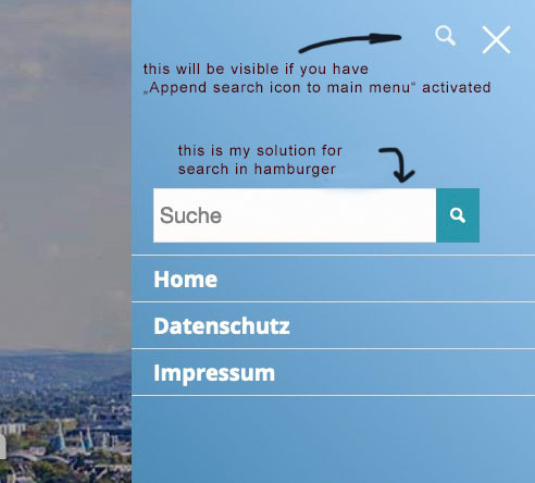
then you will not need anything else ? express your request a little more precisely.
__________
but if you want it like this: https://webers-web.info
you can hide that custom link in your “non-hamburger” navigation by setting it to display none.
Think of that custom class on that custom link:
#avia-menu li.menu-search {
    display: none;
}
now we got a menu item search – to have the chance to write into that input field – the link on the item itself disturbs – we had to get rid of the href :
this to child-theme functions.php:function remove_href_from_search_input(){ ?> <script type="text/javascript"> (function($) { $('#header').on('click', '.av-main-nav-wrap', function() { $('#av-burger-menu-ul .menu-search > a:first-of-type').removeAttr("href"); }); })(jQuery); </script> <?php } add_action('wp_footer', 'remove_href_from_search_input');on my testinstallation i got this in my quick css – but you had to adjust it to your settings and needs:
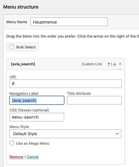
#avia-menu li.menu-search { display: none; } #av-burger-menu-ul li.menu-search a:hover { background-color: transparent !important; } #av-burger-menu-ul li.menu-search a:hover { opacity: 1 !important } #av-burger-menu-ul li.menu-search .ajax_search_response { margin-top: 30px !important; } #av-burger-menu-ul li.menu-search .ajax_search_response * { color: #fff; } #av-burger-menu-ul li.menu-search .ajax_search_response .av_ajax_search_content .av_ajax_search_title { font-size: 16px } #av-burger-menu-ul li.menu-search .ajax_search_response .av_ajax_search_entry:hover .av_ajax_search_title { letter-spacing:0.4px; color: #004e7f } #av-burger-menu-ul li.menu-search .av_ajax_search_image { background-color: #fff; border-radius: 0; color: #000 !important }Go and activate the shortcode for search in child-theme functions.php
add_shortcode('avia_search', 'get_search_form');then you can place an custom link to your menu by Navigation Label:
[avia_search]
maybe to select it easier give a custom class to that custom link.
The rest is csssorry editing when you wrote your text:
do you want the search only on hamburger?what kind of header do you have?
do you want the search only on hamburger?November 11, 2021 at 10:02 am in reply to: Add file-size and dimensions to Media Library – with sortable file-size column #1328633I thank you again for the fact that good ideas from the participants are also adopted here in a prompt manner. Top!
From my part you may close this – now soon obsolete – topic.yes – but strang it is anyway. Because at frontend the font works.
November 10, 2021 at 1:31 pm in reply to: Archive (especially tag archive) in grid layout with featured image #1328485Next: On my tag archive page the $label (tag.php line 83) there is ony “posts” showing ( on german Beiträge ) , why isn’t there the current tag nam instead?
Edit : change tag.php arround line 132 to:
if( isset( $post_type_obj[ $key ]->labels->name ) )
{
    $label = apply_filters('avf_tag_label_names', $post_type_obj[$key]->labels->name);
	$current_tag = single_tag_title("", false);
	echo "<{$heading} class='post-title tag-page-post-type-title'>". __( 'Tag', 'avia_framework' ) .": <span>".$current_tag."</span></{$heading}>";
}
or maybe better to have on top of that list : ” Tag Archive for: “
if( isset( $post_type_obj[ $key ]->labels->name ) )
{
    $label = apply_filters('avf_tag_label_names', $post_type_obj[$key]->labels->name);
	$current_tag = single_tag_title("", false);
	echo "<{$heading} class='post-title tag-page-post-type-title'>". __( 'Tag Archive for:', 'avia_framework' ) ." <span>".$current_tag."</span></{$heading}>";
}
and have now my own child-theme tag.php – but is there maybe a different way to get this via filter ?
on a customer installation – the hoster updated to Debian Bullseye (I guess it’s version 11), this version implemented only Apache 2.4 modules.
This caused some problems with various plugins. In the older theme was yes debian 9.x at the start, but maybe thinkjarvis problems stem exactly from that. Ask your provider if they also run Bullseye in the meantime.sorry – forgot to mention – each of the entries in the svg tag is separated by a space ; as you can see in the example above.
these are the svgs itself
you can open with a good texteditor your svgs and place your wanted alt and title tags you like – before uploading.
On media library the alt tag is only if you use the svg as img tag (<img src="/wp-content/uploads/abc.svg" alt="" />on default a svg starts with the svg tag – put in what you need – f.e.:
<svg xmlns="http://www.w3.org/2000/svg" id="nicht_animiertes_Logo" alt="Mein Logo" title="Logo" x="0" y="0" preserveAspectRatio="xMinYMid meet" version="1.1" viewBox="0 0 420 150" xml:space="preserve">November 8, 2021 at 4:22 pm in reply to: More columns in the portfolio or in the blog overview #1328242Now that’s what I call: looking for solutions at an early stage!
November 8, 2021 at 2:42 pm in reply to: More columns in the portfolio or in the blog overview #1328230hey Mike
Otherwise, I can just use an image grid, but that would be more cumbersome because I would then have to link each image individually. With the other two options, I would only need to create the individual pages.
I guess the above solution will satisfy her
see example-page: https://webers-testseite.de/sabine/November 8, 2021 at 2:33 pm in reply to: More columns in the portfolio or in the blog overview #1328227maybe you consider Mike’s warning and leave this 8col layout only for wide screens
@media only screen and (min-width: 990px){
	.grid-col-8 .grid-entry {
	  width: calc(12.5% - 8.75px) !important;
	  padding: 0;
	  margin: 0 10px 10px 0 !important;
	}

	.grid-col-8 .grid-entry:nth-child(8n) {
	  margin-right: 0 !important;
	}
}
November 8, 2021 at 2:30 pm in reply to: More columns in the portfolio or in the blog overview #1328226you can increase the Column Count number there at the drop-down by making appropriate changes in the portfolio.php.
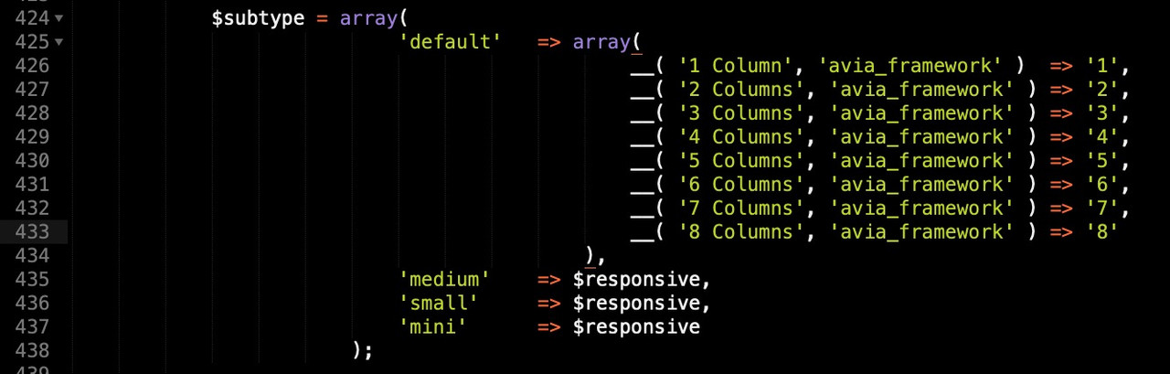
you can download the whole portfolio.php from pastebin:
( this is on basis of enfold 4.8.7.1)
look: https://pastebin.com/v1s9sdQb
download: https://pastebin.com/dl/v1s9sdQbThis new portfolio.php you can upload via ftp to a folder named shortcodes in your child-theme folder:
child-theme/shortcodes
To load those edited child-theme alb elements ( see docu ) – you had to place that snippet in your child-theme functions.php:function avia_include_shortcode_template($paths){ $template_url = get_stylesheet_directory(); array_unshift($paths, $template_url.'/shortcodes/'); return $paths; } add_filter('avia_load_shortcodes', 'avia_include_shortcode_template', 15, 1);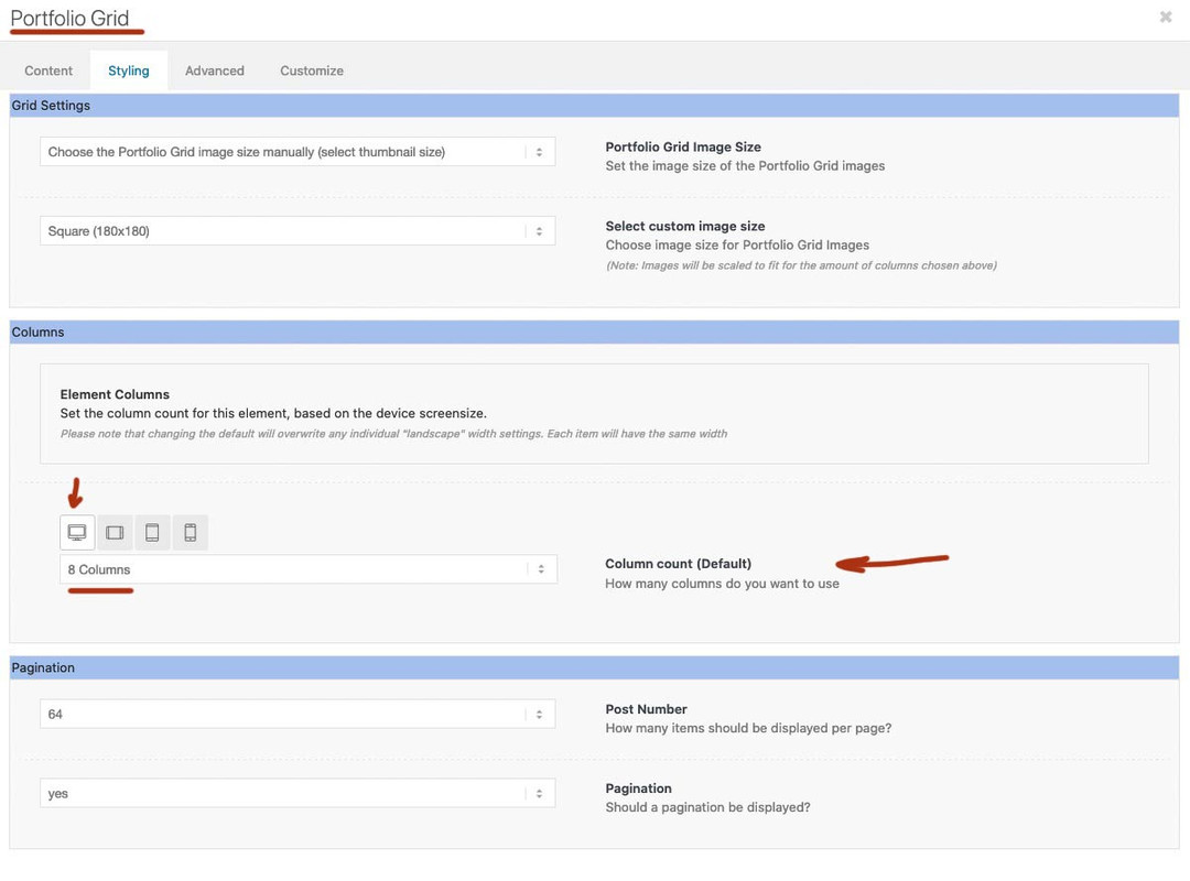
after that in the dom the portfolio will have that extra class : grid-col-8 ( in your case )
now you only have to put this to your quick css ( or something similar ):.grid-col-8 .grid-entry { width: calc(12.5% - 8.75px) !important; padding: 0; margin: 0 10px 10px 0 !important; } .grid-col-8 .grid-entry:nth-child(8n) { margin-right: 0 !important; }ps: 8.75px because 8cols will have 7 spaces between with a setting of 10px it is 70px total space 70px/8 = 8.75px
November 8, 2021 at 1:45 pm in reply to: More columns in the portfolio or in the blog overview #1328222but the Media Gallery has the possibility to accept up to 12 columns.
So put in your 64 Images with link and choose 8 columns with gallery style: small thumbnailEdit: sorry i didn’t read on from Otherwise …
i’m looking now for a portfolio solutionI suspect that pure css animations can’t do what you want them to do.
These animations need detection of whether an element is in the viewport or not. These events could be detected via Element.getBoundingClientRect() and this has wide browser support so far, but that seems to be a continuous high performance interaction.
in the meantime there seems to be a better solution using intersectionObserver. But you would have to add these listeners yourself via child-theme functions.php. But then they are very flexible to use. -
This reply was modified 4 years, 4 months ago by
-
AuthorPosts