Forum Replies Created
-
AuthorPosts
-
you mean the backend – and not the frontend.
Guess you have activated the debug mode – in this case there is after the layout input drag&drop window – a window with the generated shortcodes. That is ok. If you do not like to see it – deactivate debug mode.have a look into your child-theme functions.php if there is a snippet like this:
function builder_set_debug(){ return 'debug'; } add_action('avia_builder_mode', 'builder_set_debug');f.e.:
.responsive #top #wrap_all #av-extra-columns .entry-content-wrapper {
    display: flex;
    flex-flow: row wrap;
    justify-content: space-between !important;
}

.responsive #top #wrap_all #av-extra-columns .entry-content-wrapper::before,
.responsive #top #wrap_all #av-extra-columns .entry-content-wrapper::after {
  display: none;
}

/*** the flex-items ***/
.responsive #top #wrap_all #av-extra-columns .flex_column {
  flex: 0 1 15%;
  margin: 0px !important;
  margin-bottom: 20px !important;
  margin-left: 0px !important;
  padding: 5px;
  width: unset !important;
  background-color: rgba(255,255,255,0.4);
  box-shadow: 1px 1px 5px #aaa;
}

/*** flex-item media queries - to have on iPad that too ***/
@media only screen and (max-width: 989px) {
  .responsive #top #wrap_all #av-extra-columns .flex_column {
      flex: 0 1 30%;
      width: unset !important;
  }
}

@media only screen and (max-width: 519px) {
  .responsive #top #wrap_all #av-extra-columns .flex_column {
      flex: 0 1 48%;
      width: unset !important;
  }
}

@media only screen and (max-width: 379px) {
  .responsive #top #wrap_all #av-extra-columns .flex_column {
      flex: 1 1 100%;
      width: unset !important;
  }
}
December 2, 2021 at 9:42 am in reply to: Filter to prevent Google Maps API loading in backend deprecated? #1331262you are concerning to this code ?
add_filter( 'avf_load_google_map_api_prohibited', '__return_true' );maybe that worked :
add_filter( 'avf_load_google_map_api', '__return_false' );you can try this:
function disable_google_map_api($load_google_map_api) {
        $load_google_map_api = false;
        return $load_google_map_api;
}
add_filter('avf_load_google_map_api', 'disable_google_map_api', 10, 1);
or that:
add_action('after_setup_theme', 'ava_disable_gmap'); function ava_disable_gmap() { add_filter('avf_load_google_map_api', function($load_google_map_api) { $load_google_map_api = false; return $load_google_map_api; },10,1); add_filter('avia_google_maps_widget_load_api', function($load_google_map_api) { $load_google_map_api = false; return $load_google_map_api; },10,1); }place only the columns that should be part of the flex-container (color-section) and the text-block in an extra color-section before. ( “Las lesiones por trauma …”)
btw: if you only set your custom-ID (av-extra-columns) – and remove the css you set til now
– i will optimize your flex code a bit on that. !can you try mikes post with that if clause
function landingpage_for_mobile() {
if(wp_is_mobile()){
?>
<script>
  if (window.location.pathname == '/' ) {
     window.location = "/mobile-home/";
  }
</script>
<?php
}
}
add_action( 'wp_head', 'landingpage_for_mobile', 10 );
or:
function redirect_mobile_devices() {
    if ( wp_is_mobile() && is_front_page() ) {
        wp_safe_redirect( get_site_url(). '/mobile-home', 301 );
        exit;
    }
}
add_action( 'wp', 'redirect_mobile_devices' );
November 29, 2021 at 12:07 pm in reply to: Search autofocus on field and click on mobile search #1330828Sorry – i thougth he uses only the better and easier solution of Ismaels link here: https://kriesi.at/support/topic/search-box-in-overlay-search-box/#post-1320840
A combination of both solutions should be avoided.In my solution the search input field is placed by the shortcode via menu-item – so the inputfiled gets a link functionality. Thats the reason i removed from that input field (only – by the selector ) the href.
November 28, 2021 at 3:46 pm in reply to: Search autofocus on field and click on mobile search #1330744yes they are – test yourself on my link above – but you are right on mobile there is focus on the input field.
But that was not your question above. Desktop : no focus ( see link ) mobile test yourself.November 27, 2021 at 8:33 am in reply to: Search autofocus on field and click on mobile search #1330665and you realy placed the edited file here:
so on my pages it works ? …
https://webers-testseite.de/This is very much needed!
? but then it was probably not so urgent ;)
i would create a svg ( vectorise ) of your logo – group the “wooden shoes” to a class and set them to display none on header-scrolled
November 25, 2021 at 10:18 pm in reply to: Search autofocus on field and click on mobile search #1330524guess this will be part of next Update: 4.8.7.2
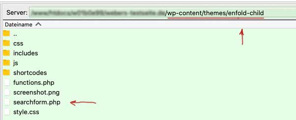
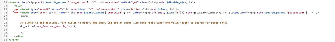
it is in searchform.php if you change position of the two input lines like this:
first sumit then text
( click to enlarge )
it will do the job ( although it is not logic why )
if you don’t want to wait – edit your searchform.php yourself and upload it to the child-theme root folder ( besides style.css )the reason why i ask is – if it is an image placed to a text-block via media library – you can set these options on hovering the image after placement – click that pencil (edit) and fill in what you need: especially the noLightbox class:

is it the ALB Element : Image – or is it an image placed via Media Library to a text-block ?
besides that – what do you like to obtain by – that on a “shrinking” header?
newH = el_height/1;Changing only this line – causes the header height to jump when it has covered the scroll distance.
Here you can see the mathematical background of the shrinking header : https://kriesi.at/support/topic/shrinking-of-header-amount-an-info/maybe it is better to hamper the shrinking via Enfold Options – header – Header Behavior : Shrinking Header
November 23, 2021 at 4:26 pm in reply to: Archive (especially tag archive) in grid layout with featured image #1330148Yes – thats it !
I should have seen it too. It was clear that it could not go like that.
Now close it.OK my test site on this is: https://basis.webers-testseite.de/garrod/
i just changed position – and use a child-theme edited avia-snippet-sticky-header.js on this
( then i stop now to style the responsive case )One thing is to use the header: logo – center, menu – below
and then change position in dom via child-theme functions.php:function change_position() { ?> <script> (function($){ $('#header_main_alternate').insertBefore($('.av-logo-container')); })(jQuery); </script> <?php } add_action('wp_footer', 'change_position');next will be to calculate the shrink amount – i test that in the meanwhile.
November 23, 2021 at 10:11 am in reply to: Archive (especially tag archive) in grid layout with featured image #1330086ok – can be closed then. I did not found that filter – and it is in there @since 4.5.4.
Asche auf mein Haupt ;)Edit: Using that filter – will end in:
 November 23, 2021 at 9:36 am in reply to: How to align Text to match picture with two sections #1330083
the p tag got a top/bottom margin of 0.85em
p {
    margin: 0.85em 0;
}
even if you set this to Zero – there will be a litle distance.
But what if you place a separator/whitespace line above the image with a height of 0.85em ?
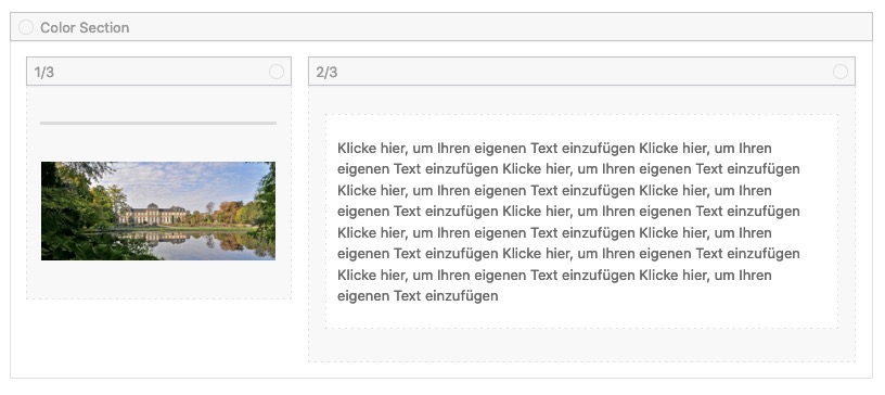
and on responsive case – that text under the image – you can set the whitespace to hide on smaller screens.
November 21, 2021 at 11:17 am in reply to: Archive (especially tag archive) in grid layout with featured image #1329836Many many thanks. You did that for the widgets allready ( avf_newsbox_image_size ) in former times – and i guess that would be a nice idea here too!
And because of event.which is deprecated ( i erased that function above ) use better:
( on child-theme functions.php )function disable_enter_key(){ ?> <script type="text/javascript"> (function($) { $(document).on('keypress keydown keyup', '#searchform', function(e) { if(e.keyCode == 13) { e.preventDefault(); return false; } }); })(jQuery); </script> <?php } add_action('wp_footer', 'disable_enter_key');by the way: on small screens ( mobile devices ) the ajax response list maybe too big for the screen. On default – it is not scrollable that window:
#top #searchform .ajax_search_response {
    max-height: calc(100vh - 200px);  /* test it with fitting settings */
    overflow-y: auto;
    height: auto;
}
disadvantage: maybe you do only hamper enter key on desktop devices ! because on my mobile the text input will be closed by enter key ;)
so maybe that line above to replace by:
$(document).on('keypress keydown keyup', 'html:not(.avia_mobile) #searchform', function(e) {das habe ich noch nie getestet. In der Tat bei Enter öffnet sich die Suchseite.
versuche mal :
_______
I have never tested this. In fact, if you press Enter, the search page opens.Edit : use the next code
you are reffering to a page ( you link above https://kriesi.at/support/topic/open-popup-modal-with-button/ ) – there are several snippets – but this is an older topic – you have to replace that line with mine – not to replace the whole code . This is mikes link to Ismaels Post . You see that here is the setting of no-scroll class on the initiating anchor. And you see that there is window on load.
___________
Some info on that.
So you have placed a hidden code block on the page. That codeblock got an unique ID – and an anchor is linking to that ID.
How would a (non-lightbox) link to an ID on the same page behave?
You click it, and it scrolls to the anchor there.
The trick with this modal window is that the html code is inside a code block. Nevertheless, the code block is in a place inside your DOM. So if this codeblock is at the bottom – the modalwindow opens, but still the window scrolls to the place where the codeblock is in the layout. This can be prevented in Enfold, by setting the class no-scoll to that link.The fact that the background no longer moves with the scroll when the lightbox is open has become standard – or so I thought. (This is what Mike had recommended and belongs to the earlier solution to assign the property overflow-y: hidden to the html.
If you could please post your snippet here, then I can tell you better in this regard what to change.November 20, 2021 at 10:28 am in reply to: Archive (especially tag archive) in grid layout with featured image #1329770yes thanks –
the options on that code is only big and small – Is there a way to choose the source of the image used for that? I see on loop-index.php – so i can have a child-theme loop-index.php:
$size = strpos( $blog_style, 'big' ) ? ( ( strpos( $current_post['post_layout'], 'sidebar' ) !== false ) ? 'entry_with_sidebar' : 'entry_without_sidebar' ) : 'square';
but it would be nicer to have a snippet solution.try to give to the link that initiates the modal window a custom-class ( has to go to the anchor itself ) : no-scroll
PS: pay attention that is a very old topic – in the meanwhile we got jQuery 3.5.1 –
the codejQuery(window).load(function(){is deprecated
and you had to use instead:$(window).on('load', function(){Den Code hatte dir doch Mike gepostet.
Nur #main ist wie gesagt nicht Teil des Headers in dem sich das alles abspielt und ich stellte fest, das es ohne den Zusatz !important nicht ging – also:#top .av_ajax_search_entry_view_all { display: none !important; }Du möchtest keinerlei Link dort haben?
Ist das wirklich das was ein Besucher deiner Seite erwarten würde, wenn er die Suche anstrengt?
Wenn ich irgendwo auf einer Seite einen Begriff suche erwarte ich auch, dass mir der entsprechende Link dorthin auch angezeigt wird.
Was bezweckst Du damit?
__________
You don’t want to have any link there?
Is that really what a visitor to your site would expect when they search?
When I search for a term somewhere on a page, I also expect the corresponding link to be displayed.
What do you want to achieve with that?.ajax_search_response a { pointer-events: none !important; }PS – du kannst auch die ajax Suche ganz abschalten und direkt zur Suchseite weiterleiten.
he’s got the 4.8.6 so the svg is loaded as img tag – but even then the svg should be sharp – but i do not know how the browser will render a svg in an img-tag.
Best would be to update as ismael said – after having an inline svg logo we will see if that helps.and how to use it – for setting excerpt_length ?
-
AuthorPosts