Forum Replies Created
-
AuthorPosts
-
i can not see any script error at the moment.
PS : i don’t like the new outlook of Layerslider 7 – the old slider was much more intuitive to set.
Edit : 10 days ago your last posting – i remove now the example page ( due to copyright )
nearly one month ago : hm – I think actually very detailed – speak noob safe solutions to offer; obviously, however, some fellow here on board are lazy to read. Probably only ways in summary mode are accepted, which present a solution if possible without learning curve.
By the way: i like to preserve the ratio it has as landscape photo. This gives the image a better balance. ;)
– next – now i followed the whole video ( sorry ) – you want to do that with two advanced layersliders.
First: is it necessary – think of that a touchscreen has no hover effect – so the parallax effect will not be seen.
Taking this into account – do activate the advanced setting on project settings and mark: “Optimize for mobile”Next: do not activate the “Hide on Mobile” for the desktop slider – because this is for mobile devices meant and not for screenwidth – if you activate it it will not be seen on tabletts – even if they have a bigger screenwidth than 768px.
Second: on advanced layerslider the preview images had to be set by your own.
Thrid : you had to choose the right ratio for that responsive slider – in my example case it is the dimension of that portrait image: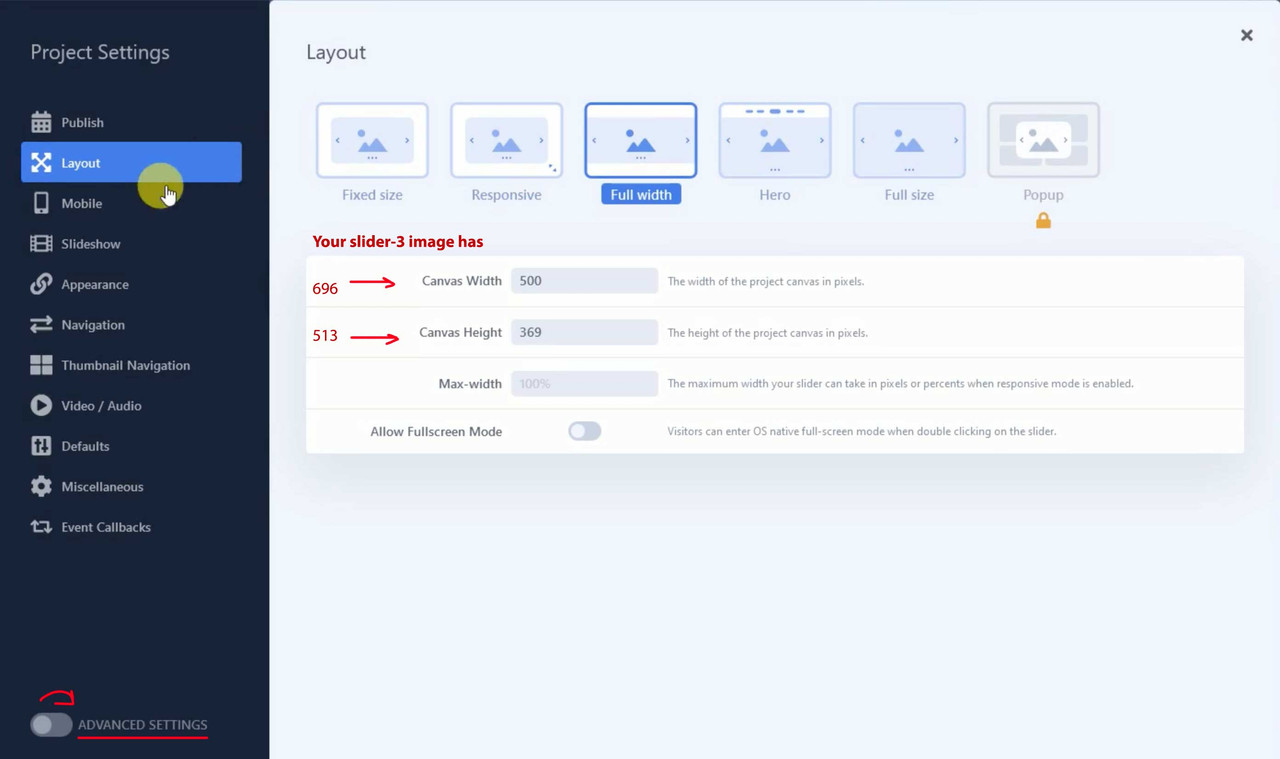
On your film i see that you have your homeslider mobile on: width : 500px and height: 369px so not the wanted portrait format.
now i will insert it to the example page.
the
https://simonehirsch.de/wp-content/uploads/slider-3.jpgis even not a real portrait photo.
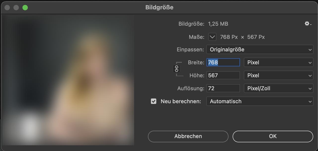
And it is to small – you have it on 300dpi – but if you go and set the the dpi to 72 without recalculating the photo it only got 768px width:Nevertheless – you could use for the smaller screens that image and the fullwidth image slider – and you can stretch it – but go to the alb and open the tab: Styling and choose under : “Slideshow Image and Video Size” no scaling.
If you use a portrait it will show the way you like:
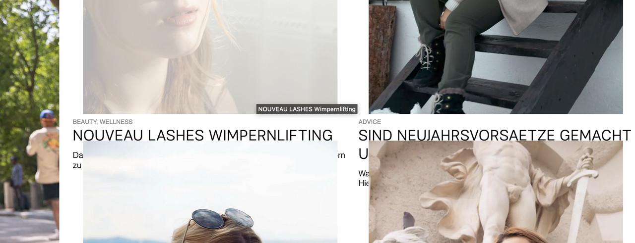
f.e. here with two fullwidth easy sliders: The image detail is not good now due to lack of source material, but it is sufficient for demonstration purposes.
https://enfold.webers-webdesign.de/simone-hirsch/When you have seen the example page i remove that page again.
@xxtita : this subtext logo is only used for transparency headers. Whilst the one got opacity 0, the others got opacity 1:
/*** no transparency header ***/
.logo img,
.logo svg {
  opacity : 1;
}

.logo img.alternate,
.logo .subtext.avia-svg-logo-sub svg {
  opacity: 0;
}

/*** for transparency headers ***/
.av_header_transparency .logo img.alternate,
.av_header_transparency .logo .subtext.avia-svg-logo-sub svg {
  opacity: 1;
  filter: alpha(opacity=1);
}

#top .av_header_transparency.av_alternate_logo_active .logo a > img,
#top .av_header_transparency.av_alternate_logo_active .logo a > svg {
  opacity: 0;
  filter: alpha(opacity=0);
}
June 21, 2022 at 5:33 pm in reply to: Font-size in search result list pages, editing of search-result pages, e #1356031i think this comes from using gtranslate :
i only read about multiple widgets in conjuction with gtranslate.PS: bitte dringend um DSGVO kümmern. Da wird alles zu Google gefunkt bevor irgendetwas abgefragt und zugestimmt wird.
Click the linkPPS: ist das die Enfold Suchfunktion, die du einblendest? Weil normalerweise bei Enfold die img’s nicht mit in Suchergebnisse mit aufgenommen werden.
as participant i do not see your private content area – but :
do you have real links behind those social media links? on enfold every external link gets the rel=”noopener” and that is enough to hamper the script window.opener – no need to set both!
If you have entered # for testing purposes – the rel attribute will not be set.Where did you get a social media widget. Or do you mean the social buttons alb element?
i don’t know if this is correlated to your troubles – but i can see an error on developer tools:
Can you have a look on one of your text-widgets where a script is placed. Guess it is a tracking script inside a text-widget.
There are inconsistent p tags inside the inserted text. Maybe you open that text widget in text mode and look for those tags.Next – your website does not redirect to the www “subdomain” that is why your link above without www. does not lead to your website. This could be a reason for login/logout errors.
Edit – no i see – you forgot the .com on your link above
if you choose on content tab of the image alb the caption – another Option Toggle will be shown on Styling Tab: “Image Caption”.
Font and weight had to be styled via css. Selector is:.av-image-caption-overlay-center { font-weight: bold; }background on hovering is styled by:
.av-overlay-hover-deactivate .avia-image-overlay-wrap:hover .av-caption-image-overlay-bg {
  opacity: 0 !important;
}
and if you like to change the font on hovering:
.av-overlay-hover-deactivate .avia-image-overlay-wrap:hover .av-image-caption-overlay-center {
  color: #FFF !important
}
June 20, 2022 at 11:01 pm in reply to: Blog Posts Widget Uses a Small Portfolio Size Image Instead of Full Size Image #1355903hm … i try to get what you have taken for the alb element inside that page.
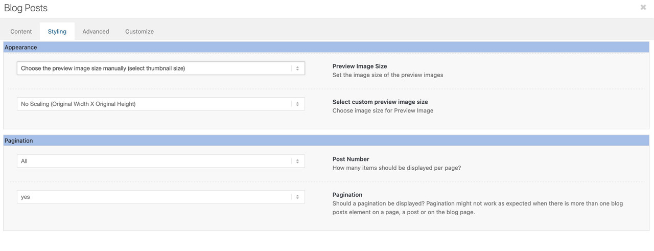
First – if you use the blog post alb element to insert. There is on the Styling Tab the option “Preview Image Size”
there you can choose the image size.
At the moment i could not say if there is a filter to preset that image_size attribute
What you can do as “quick and dirty” solution is to have a child-theme postslider.php
But then you will have in all alb elements getting the infos from postslider.php the full resolution.can you use instead:
function temporary_removal_title_tags(){
?>
<script>
  window.onload = function() {
      var links = document.querySelectorAll('a, img, *[title]');
      for (var i = 0; i < links.length; i++) {
          var link = links[i];
          link.onmouseover = function() {
              this.setAttribute("data-tooltip", this.title);
              this.title = "";
          };
          link.onmouseout = function() {
              this.title = this.getAttribute("data-tooltip");
          };
          link.onmousedown = function() {
              this.title = this.getAttribute("data-tooltip");
          };
      }
  };
</script>
<?php
}
add_action('wp_footer', 'temporary_removal_title_tags');
June 20, 2022 at 8:10 pm in reply to: Blog Posts Widget Uses a Small Portfolio Size Image Instead of Full Size Image #1355880or do you realy mean “widget” – this is kind of technical term.
I now think you are talking about the postslider – and the thumbnails shown on this.
But be carefull – if you got a big list of portfolio – and each got a full resolution – performance will suffer on that.Try this snippet in your child-theme functions.php:
f.e. on archiv pages like categories :function custom_post_featured_image_link( $image_link, array $current_post, $size ){ if(is_tag() || is_archive()){ $image_link = get_the_post_thumbnail( $current_post['the_id'], 'full' ); } return $image_link; } add_filter( 'avf_post_featured_image_link', 'custom_post_featured_image_link', 10, 3 );June 20, 2022 at 7:25 pm in reply to: Blog Posts Widget Uses a Small Portfolio Size Image Instead of Full Size Image #1355864Sorry – I’m a participant like you – so there’s no private content area for me to see either.
( if it is the page that is part of your src in the first post – i can not see any widget )with all this – to style web pages it is useful to learn how to use the developer tools of the browsers. In Chrome, Firefox, Opera these are available by default. With Safari you have to activate the Developer Tools in the Settings – Advanced Settings at the bottom. Then you have the possibility to point to elements via the context menu of the mouse and to inspect them. Mostly a window is shown like this one above. On the left side there is the html structure and mostly on the right side the css settings related to the shown element.
So you go with the mouse over your portfolio widget and open the context menu (usually the right mouse button). There you will see something like examine or inspect. The window above will show up.
June 20, 2022 at 10:30 am in reply to: Blog Posts Widget Uses a Small Portfolio Size Image Instead of Full Size Image #1355817are there any questions on how to do it?
you have to look into the frontend html code what widget ID is your portfolio :
( click to enlarge )
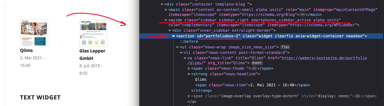
this is what had to be inside that little snippet on top ( here on that example it would be : portfoliobox-2
June 20, 2022 at 10:16 am in reply to: Color section video background not staying constrained #1355813i only can reproduce that a background-video overflows the parent container – if i do force to do so on three different container to set the overflow to visible. But this is something i do not believe that you have done.
Next – big advantage of that inline svg logo.
What if you got a transparent dark header ? You can have now white letters for it – just by quick css.
You only had to know that enfold sets on header classes for that : av_header_transparency#top.page-id-3228 #header:not(.header-scrolled).av_header_transparency .mir1, #top.page-id-3228 #header:not(.header-scrolled).av_header_transparency .mir2 { fill: #FFF; }see: https://enfold.webers-webdesign.de/dark-header/
Edit : i switched back a logo of mine. But with the info above and the download of the svg i provided it has to work now.if you inspect the svg ( on mac i do take sublime text for it – on pc i can open it with Notepad ++) there are set inline styles ( similar to html – you can do that with xml too )
Illustrator f.e. will do that too but always name the classes : st0, st1, st2 etc – and all settings for the groups will go to that inline style as classes.
i did for the icon : mir0; miretta : mir1 and interiors : mir2
with these classes you can now set new colors via fill option in your quick css.why do i like to rename the classes. If you have more than one inline svg on your page – and all have this nomenclature – the last inline svg in the DOM will overwrite the classes with its properties.
PPS: if you checked all that – i will return on my testpage to my own logo again.
how to prepare the svg file:
Layout it in a vectorbased graphic program of your choice. Most will do it with Adobe Illustrator.
Group to your needs parts of the logo – in your case i have three first level groups – and i named the level as you can see ( icon, miretta, interior ).
The level names are transformed from illustrator to group ID’s.
you see the structure of that svg – and i set the fill-opacity to the icon inside to zero:

Since Enfold supports for the logo inline svg we now can address the ID’s and Classes via CSS Rules.
Only some properties are svg specific ( fill for the background-color, fill-opacity etc. pp. – you can google that )ok now the font – do you have from the letters an info. …
The Miretta Letters i do not find but we have a good png file of it to vectorize – see your footer.
the Interiors Letter fits well with Mrs Eaves Font.see now the Logo: https://enfold.webers-webdesign.de/wp-content/uploads/Miretta-Logo.svg
We had one thing to do before you put in as logo file.
Enfold adds this preserveAspectRatio attribute to the logo, because that’s what few people know about svg creation. However, they set it so that x and y value shrink to the left center. But we don’t want to overwrite our statement inside the svg. Therefore Günter set a filter to avoid this overwriting. This comes as a snippet in the child theme functions.php
( if you like to shrink the logo to the left – then you don’t need that snippet – the position of the icon in the middle of the logo will be untouched of that )function custom_svg_images_get_html( $svg, $attachment_id, $url, $preserve_aspect_ratio, aviaSVGImages $obj_svg_img, $svg_original ){ $return_default_svg = false; if($return_default_svg){ return $svg; } return $svg_original; } add_filter( 'avf_svg_images_get_html', 'custom_svg_images_get_html', 10, 6 );#header.header-scrolled #icon { fill-opacity: 1 !important; transition: 1s all ease; } #header.header-scrolled #miretta, #header.header-scrolled #interiors { fill-opacity: 0 !important; transition: 1s all ease; } #header:not(.header-scrolled) #icon, #header:not(.header-scrolled) #miretta, #header:not(.header-scrolled) #interiors { transition: 1s all ease; } /*** only if you like to see that the logo is shrinking inside its container to the middle ***/ .av-contains-svg, .av-contains-svg svg { width: 500px !important; }there must be other css code or a different one . because between 768 and 989 px the header is not fixed and not transparent at the beginning.
I have now rebuilt this in a quick procedure (very unprecise: Link ). Of course, it is better to have the original layout template. And the font would be good to know, then you can save the part of rebuilding already times. It is only meant as a demo.
Look again at the svg in the DOM.
#header.header-scrolled #icon {
  fill-opacity: 1 !important;
  transition: 1s all ease;
}
#header.header-scrolled #miretta,
#header.header-scrolled #interiors {
  fill-opacity: 0 !important;
  transition: 1s all ease;
}
#header:not(.header-scrolled) #icon,
#header:not(.header-scrolled) #miretta,
#header:not(.header-scrolled) #interiors {
  transition: 1s all ease;
}
and you see each group got his own class – so your can colorize it you like by fill option – and to see the preserveaAspectRatio Effect you had to hamper width shrinking of logo and logo container
#header #miretta .mir0 {
  fill: green
}
.av-contains-svg, .av-contains-svg svg {
  width: 500px !important;
}
see example page: https://enfold.webers-webdesign.de/
this is not important – if something is running – do not change it
on my page that works – but it seems to be easier to setup a new magnificPopup than to overwrite an existing one. i tried to redifine that popup – and mikes code let the code untouched and only give the av-image-hotspot_inner a title-
This reply was modified 3 years, 9 months ago by
Guenni007.
by the way – your css code :
@media only screen and (min-width: 1210px) {
  .home_post_layout2 article:nth-child(2n) {
    padding-top: 100px;
  }

  .slide-entry-wrap:not(:nth-child(1)) {
    margin-top: -100px;
  }
}
is the reason why on bigger screens this happens:
furthermore: if you look to the svg again – in the header – there is that setting: preserveAspectRatio=”xMinYMid meet”
that means – if that graphic shrinks or grows bigger – it will do that on the x-achsis to be left – and on y-Achsis it will be centered.
so if we set it to : preserveAspectRatio=”xMidYMid meet” it shrinks centered. ( in its container )You can give me that logo as vector ( ai , eps , svg – i will prepare that svg for you )
does the logo exist in a vector format. svg is one but illustrator etc. too.
We need this.
You don’t need to update – it is pure layout and a bit css.
PS: what is the name of the font
( click the image to enlarge )
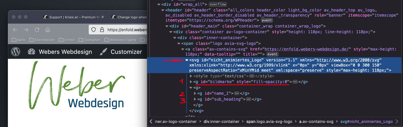
if you inspect my logo on that page you see that the xml based notation of a svg graphic is nearby a html programming.
it could have parts like style infos and tags. see 1, 2, 3 i have that “bildmarke” in a group tag and the “letters” in different ones. I can address them with css. so my Groups got ID’s. You see on the inspection – that i set the fill-opacity of that “bildmarke” directly to zero.This is the look of it all seen without fill-opacity zero inside the svg:

Now i can use the enfold class header-scrolled to switch the visibility.
Css code here is:.header-scrolled #bildmarke { fill-opacity: 1 !important; transition: 1s all ease; } .header-scrolled #name_1, .header-scrolled #sub_heading { fill-opacity: 0 !important; transition: 1s all ease; } #header:not(.header-scrolled) #bildmarke, #header:not(.header-scrolled) #name_1, #header:not(.header-scrolled) #sub_heading { transition: 1s all ease; }It’s a pity that so much secrecy is always made about pages that will be public at some later date.
Every now and then, fellow participants also have good ideas, not least because they are busy every day with the implementation of a layout, and not only approach solutions theoretically.
Not only that you as a questioner may receive help much later, but by reading along other participants can often find solutions for their own problems.i would realize it by creating the logo as svg.
Shouldn’t be too difficult with fonts and a figurative mark.
Depending on where you want your image mark to appear after scrolling, I would then place it on the left or in the center directly inside the svg, and set the fill-opacity of this group to zero.
Then you can even change the fill-opacity animated with the class header-scrolled.By the way – what font is it – i found similar fonts – but not exactly the same.
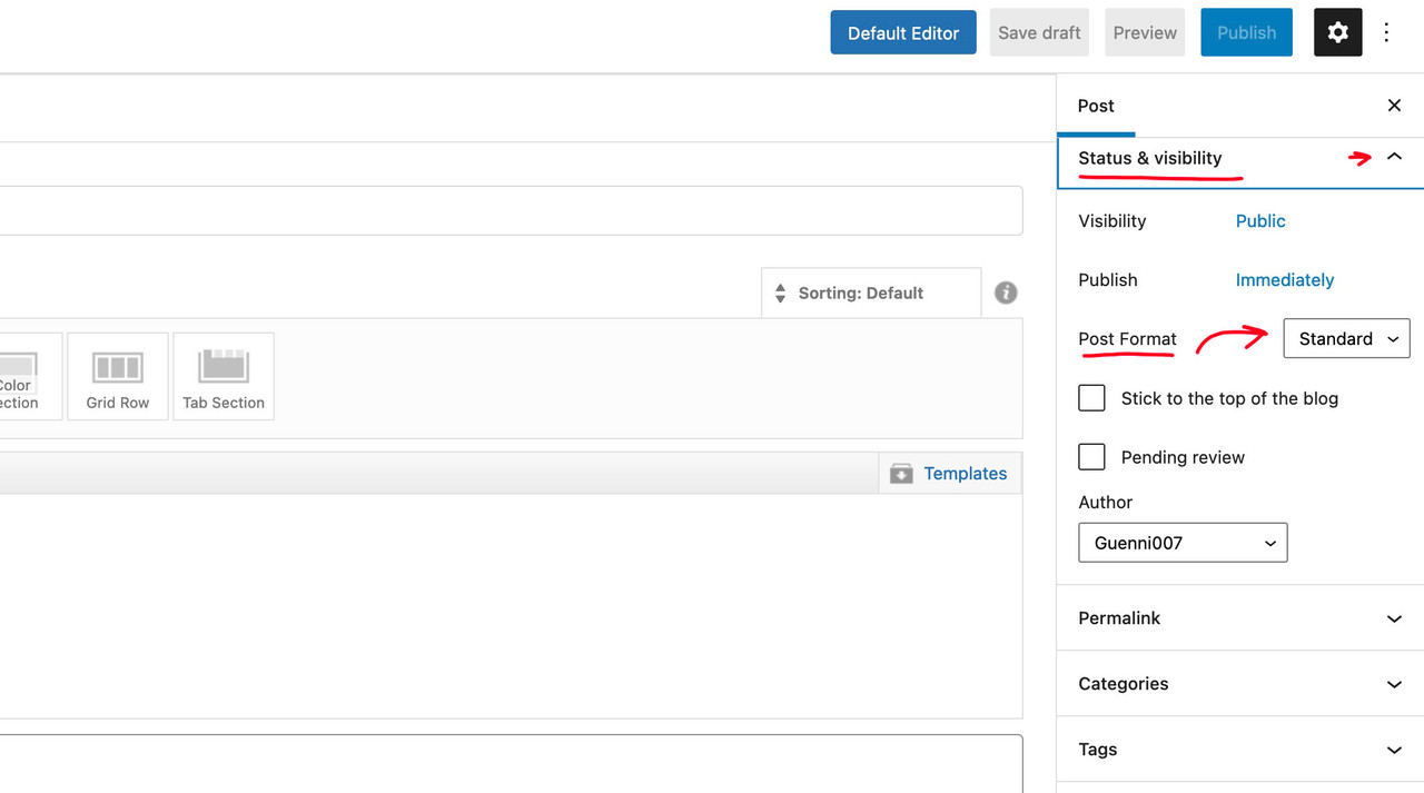
see here : https://enfold.webers-webdesign.de/Yes – thats why you are using the block-editor:
see on the right side: status – visibility:
 June 17, 2022 at 12:29 pm in reply to: Blog Posts Widget Uses a Small Portfolio Size Image Instead of Full Size Image #1355592
are you familiar with inspecting the DOM? Look what is your portfoliobox-ID
use this to get influence on image source as a snippet in your child-theme functions.php:
function my_avf_newsbox_image_size( $image_size, array $args, array $instance ){
  if( $args['widget_id'] == ( 'portfoliobox-3' || 'newsbox-2' || 'newsbox-4' ) ){
    $image_size = 'full';
  }
  return $image_size;
}
add_filter( 'avf_newsbox_image_size', 'my_avf_newsbox_image_size', 10, 3 );
______________
just for INFO:
change full to what you like to have ( small, medium, large etc. pp.) you can find the names of the enfold image-sizes on functions.php lines 211ff:$avia_config['imgSize']['widget'] = array('width'=>36, 'height'=>36); // small preview pics eg sidebar news $avia_config['imgSize']['square'] = array('width'=>180, 'height'=>180); // small image for blogs $avia_config['imgSize']['featured'] = array('width'=>1500, 'height'=>430 ); // images for fullsize pages and fullsize slider $avia_config['imgSize']['featured_large'] = array('width'=>1500, 'height'=>630 ); // images for fullsize pages and fullsize slider $avia_config['imgSize']['extra_large'] = array('width'=>1500, 'height'=>1500 , 'crop' => false); // images for fullscrren slider $avia_config['imgSize']['portfolio'] = array('width'=>495, 'height'=>400 ); // images for portfolio entries (2,3 column) $avia_config['imgSize']['portfolio_small'] = array('width'=>260, 'height'=>185 ); // images for portfolio 4 columns $avia_config['imgSize']['gallery'] = array('width'=>845, 'height'=>684 ); // images for portfolio entries (2,3 column) $avia_config['imgSize']['magazine'] = array('width'=>710, 'height'=>375 ); // images for magazines $avia_config['imgSize']['masonry'] = array('width'=>705, 'height'=>705 , 'crop' => false); // images for fullscreen masonry $avia_config['imgSize']['entry_with_sidebar'] = array('width'=>845, 'height'=>321); // big images for blog and page entries $avia_config['imgSize']['entry_without_sidebar'] = array('width'=>1210, 'height'=>423 ); // images for fullsize pages and fullsize slider -
This reply was modified 3 years, 9 months ago by
-
AuthorPosts