Forum Replies Created
-
AuthorPosts
-
Edit: here is the solution with working separators on those color-sections
the color-section that should react like this:
give a custom class to it: av-video-section
give a background-color to it that does not disturb your video switch (not white – something that fits to your video content
place a codeblock element on top of your color-section ( codeblock to content – not as codesnippet)<video class="responsive-background-video" autoplay muted loop playsinline data-video-mobile="path/to/mobile.mp4" data-video-desktop="path/to/desktop.mp4"> <source src="" type="video/mp4"> </video>this to your quick css:
.responsive #top #wrap_all .avia-section.av-video-section {
  position: relative;
  overflow: hidden;
  min-height: initial; /* taken from Enfold section setting  */
}
.responsive #top #wrap_all .avia-section.av-video-section .container {
  position: relative;
  z-index: 1;
  max-width: 100% !important;
  width: 100% !important;
  padding: 0 !important;
}
.responsive #top #wrap_all .avia-section.av-video-section .responsive-background-video {
  position: absolute;
  top: 0;
  left: 0;
  width: 100%;
  height: 100%;
  object-fit: cover !important;
  z-index: 0;
  min-height: inherit; /* transfer from Enfold section setting  */
}
.responsive #top #wrap_all .avia-section.av-video-section .avia-divider-svg {
  z-index:2;
}
.responsive #top #wrap_all .avia-section.av-video-section .avia-divider-svg.avia-to-front {
  z-index:100;
}
the snippet for child-theme functions.php
function custom_responsive_background_video_script() {
?>
<script>
(function($) {
    "use strict";

    $(document).ready(function() {
        $('.responsive-background-video').each(function() {
            const video = this;
            const $video = $(video);
            const source = video.querySelector('source');
            const win = $(window);

            // Get video paths from data attributes
            const mobileVideo = $video.data('video-mobile');
            const desktopVideo = $video.data('video-desktop');

            if (!mobileVideo || !desktopVideo) return;

            function updateVideoSource() {
                const isMobile = win.width() < 768;
                const newSrc = isMobile ? mobileVideo : desktopVideo;

                if (source.src.indexOf(newSrc) === -1) {
                    source.src = newSrc;
                    video.load();
                }
            }

            // Initial load
            updateVideoSource();

            // Resize handling
            win.on('debouncedresize', updateVideoSource);
        });
    });
})(jQuery);
</script>
<?php
}
add_action('wp_footer', 'custom_responsive_background_video_script', 999);
see example page with divider : https://webers-testseite.de/background-video/
PS: Nice side effect: you could equip two sections on the same page (each loop) – you would then only have to place it in one color section:
    <video class="responsive-background-video"
           autoplay muted loop playsinline
           data-video-mobile="hero-mobile.mp4"
           data-video-desktop="hero-desktop.mp4">
        <source src="" type="video/mp4">
    </video>
    <div class="content">Hero Content</div>
and then in another section:
    <video class="responsive-background-video"
           autoplay muted loop playsinline
           data-video-mobile="about-mobile.mp4"
           data-video-desktop="about-desktop.mp4">
        <source src="" type="video/mp4">
    </video>
You must then add the corresponding data-video attributes to your video links.
what you can do – ( not with enfold specific tools )!
do not set the background-image with enfold color-section settings.
put into the color-section on top a code-block element with this content
(adjust to your path and videos):See Solution on next posts
October 30, 2025 at 6:39 pm in reply to: How to remove the bar above the main menu? (preferebly without any CSS code) #1490770you do not see the image above in https://kriesi.at/support/topic/how-to-remove-the-bar-above-the-main-menu-preferebly-without-any-css-code/#post-1490697
click on it to enlarge the image.so Enfold (or Enfold-Child) – Header then on the right “extra Elements” Tab
remove all entries there.Header Social Icons : No social Icons
Header Secondary Menu : No Secondary Menu
Header Phone Number/Extra Info: No Phone Number/Extra Info
Theory and practice: I cannot see any improvement in performance. Unfortunately.
As I said, you’ll have to figure out the GDPR and consent yourself.
You could try – initially just with an array for your pages where you use Vimeo:function vimeo_preconnects_specific() { $vimeo_pages = array( 12, // Seiten-ID 45, // Seiten-ID 'portfolio', // Slug 'about' // Slug ); if (is_front_page() || is_page($vimeo_pages)) { ?> <link rel="preconnect" href="https://player.vimeo.com" crossorigin> <link rel="preconnect" href="https://i.vimeocdn.com" crossorigin> <link rel="dns-prefetch" href="https://f.vimeocdn.com"> <?php } } add_action('wp_head', 'vimeo_preconnects_specific', 5);i do not know if appending preload=auto can have a positive effect on that.
you can try to add to that page a preconnect to vimeo headers.
<link rel='preconnect' id='preconnect-vimeo-css'  href='https://player.vimeo.com' type='text/css' media='all' />
<link rel='preconnect' id='preconnect-vimeo-i-css'  href='https://i.vimeocdn.com' type='text/css' media='all' />
<link rel='preconnect' id='preconnect-vimeo-f-css'  href='https://f.vimeocdn.com' type='text/css' media='all' />
if this is GDPR compliant (DSGVO for our german spoken Participants – like me ) is a different question.
have a look at: https://ciffonedigital.com/video-backgrounds-wordpress-vimeo/If the video file-size is not big – the best performance will be to self-host the video.
October 29, 2025 at 4:22 pm in reply to: How to remove the bar above the main menu? (preferebly without any CSS code) #1490697just remove all entries inside the extra elements:

btw. all – means the phono-number too. ( This is only my screenshot of an existing installation of mine )
because you did not hamper to embed your sources to other sites – i can show the result on my page with your video:
https://webers-testseite.de/lara-video/Once you have inspected it, I will replace the page with another video.
EDIT: i replaced now your video with a pexel video – i entered the aspect ration as mentioned above ( here in this case it is 1920:800)
on styling the slider :
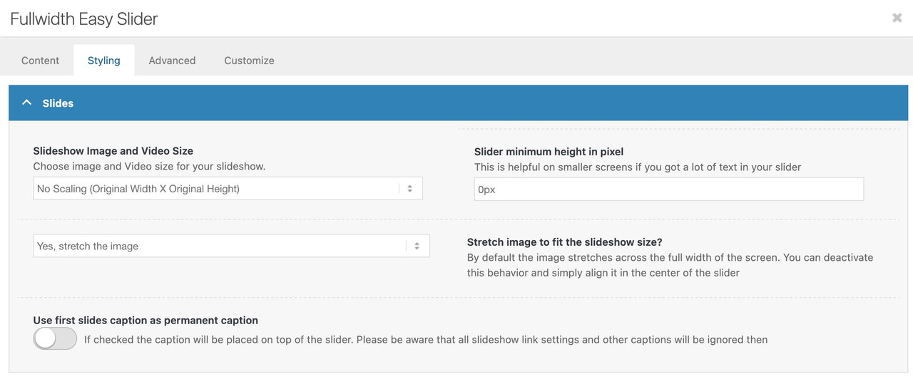
on default enfold tries to use the common 16/9 aspect ratio.
If your video does not fit to that ratio – just put in the concerning field your used aspect ratio.
If it is your video struct-vo-bg-music-final.mp4 – this video got a ratio of 1500 / 710
you can insert these values.
Open that slide popup and …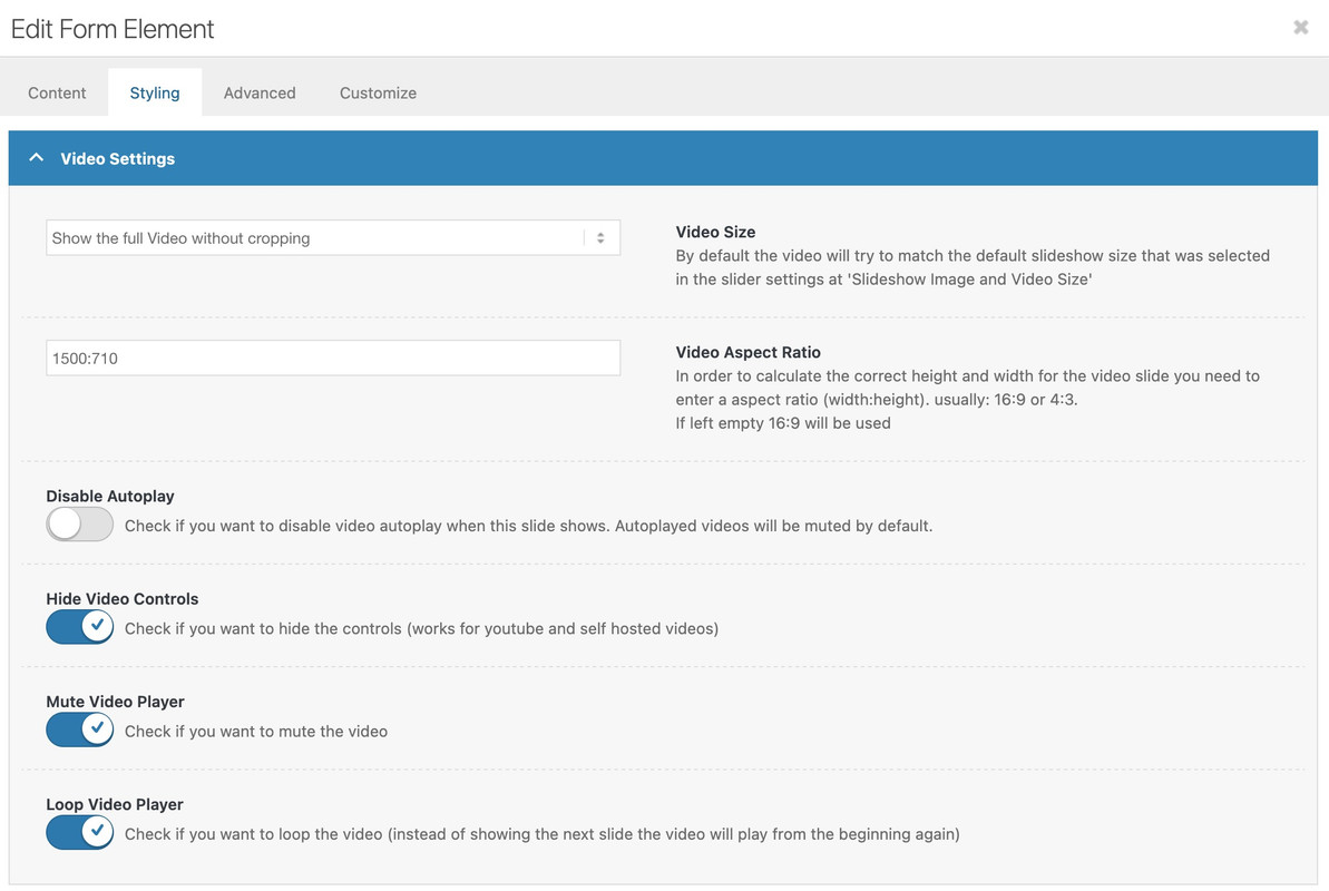
PS: with these settings you do not need any additonal css.
The only thing that can happen is if the slides do not have the same aspect ratio. Then the height would adjust dynamically depending on the slide, which would interfere with viewing (or even reading) the subsequent content.@ismael – i guess that this rule belongs to the ruleset that should show the burger menu on larger screens than the settings of 768px or 990px :
@media only screen and (max-width: 1295px) {
    #top #header .av-main-nav > li.menu-item  {
        display: none!important;
    }
    #top #header .av-burger-menu-main {
        cursor: pointer;
        display: block!important;
    }
}
so i guess that amyedwards misses the icon in between that 990px and her 1295px
try:@media only screen and (max-width: 1285px) { .responsive #top .av-main-nav #menu-item-search.menu-item-avia-special { display: block; } }I plan to reuse elements from multiple demos to build a custom layout.
in this case – maybe my method of getting the enfold shortcodes from pages by downloading the xml files of the demo.
You find the demos here on :
https://github.com/KriesiMedia/enfold-library/tree/master/demosDownload the concerning zip file of the demo and extract the xml file.
Open it in a good text editor (f.e. on Mac sublime text – on windows pc’s use notepad++)now you can search for “isPermaLink” (without the quotes) in that xml
or if you look for a page look for “page_id”
or for portfolio: “post_type=portfolio”Just above, you can see the title of the page and the link
Or even more specifically, search for the title of the desired layout you want to transfer, e.g.,
<title>Home</title>The Enfold shortcodes can be found directly below that reference wrapped by:
<content:encoded><![CDATA[
        … here is the avia shortcode inside
]]></content:encoded>
Pay attention to CDATA – there are two opening square brackets and two closing brackets below.
The third closing bracket at the end usually belongs to the Enfold shortcodes.Of course, this only provides you with the layout framework, including all element settings, but the links and images must then be edited.
October 20, 2025 at 7:52 pm in reply to: Full screen slider links don’t work when permanent caption is selected. #1490426the only thing that is strange is that on my real mobile device (an iPhone) the fallbackimage is shown – but the link will not open. But thats only on a real mobile device.
Next if you let yout fingers on that button a few seconds (on iPhone) a context menu will open and on open in new tab will work. ???
on all browsers i can test on my OSX ( Firefox, Chrome, Safari, Opera) Desktop all is ok.October 20, 2025 at 7:44 pm in reply to: Full screen slider links don’t work when permanent caption is selected. #1490423what browser do you use?
October 20, 2025 at 7:35 pm in reply to: Full screen slider links don’t work when permanent caption is selected. #1490421hm- on my testpage this is the case : https://webers-testseite.de/slider-with-permanent-caption/: second slide is a selfhosted video
Enfold 7.1.3 and newest WPok – i test now the fullscreen slider – if this will work too. …
same on fullscreen sliders on my end: https://webers-testseite.de/fullscreen-slider-with-permanent-caption/
PS : check your logo – i guess it is “Nutzfahrzeuge”
October 19, 2025 at 9:05 pm in reply to: Full screen slider links don’t work when permanent caption is selected. #1490379what is a bit strange – it seems only be the fact if it is a self-hosted video.
i tested it with a youtube video – the button works !if you switch off the video controls:
Hide Video Controls (Check if you want to hide the controls (works for youtube and self hosted videos) )then the button is working
October 17, 2025 at 12:27 pm in reply to: Sticky TOC in Echo Knowledge base plugin not working #1490340if they rule it by position sticky – have a look here :
https://webers-testseite.de/sticky-sidebar/
this principle can be used on different elements:
https://webers-testseite.de/sticky-elements/hm – didn’t i mention a solution before ? …
but take this instead from https://kriesi.at/support/topic/scroll-down-link/#post-1489662 – because we have choosen before this slightly rounded version :
function avia_replace_default_icons($icons){
 $icons['svg__scrolldown'] =  array( 'font' =>'svg_entypo-fontello', 'icon' => 'down-open');
 $icons['svg__prev'] =  array( 'font' =>'svg_entypo-fontello', 'icon' => 'left-open');
 $icons['svg__next'] =  array( 'font' =>'svg_entypo-fontello', 'icon' => 'right-open');
 return $icons;
}
add_filter('avf_default_icons','avia_replace_default_icons', 10, 1);
and try :
#top .avia-post-nav {
  padding: 20px;
}

#top .avia-post-nav .label {
  position:absolute;
  top:50% !important;
  transform: translateY(-50%);
  height:48px;
  margin-top:0;
}

.avia-post-nav .label.avia-svg-icon svg:first-child {
  fill: #FFF;
  height:48px;
  width: auto;
}
btw: you can have on opend slide-out a different fill color:
#top .avia-post-nav:hover .label.avia-svg-icon svg:first-child { fill: #eee }next:
to get different custom margins on this elements
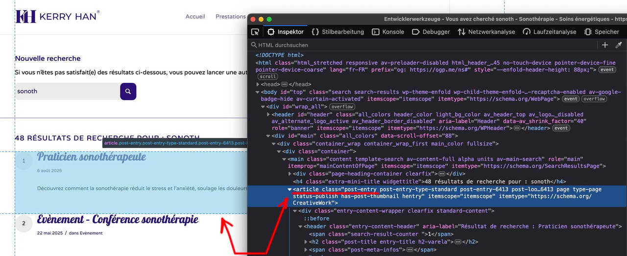
Get familiar with your browser’s developer tools! Does “this” belong to the articles?
@media only screen and (min-width: 1010px) {
  /* your rulesets here */
}

@media only screen and (min-width: 990px) and (max-width: 1009px) {
  /* your rulesets here */
}

@media only screen and (min-width: 768px) and (max-width: 989px) {
  /* your rulesets here */
}

@media only screen and (max-width: 767px) {
  /* your rulesets here */
}
It is good practice (as Enfold also does) to use even values for the min-width and odd values for the max-width.
” tablet and mobile etc” tablet and mobile are not well defined as screen width.
and “this elements” is clear for you what you are belonging to, but for us it is hard to find out what you are talking about.
I tried but it won’t work so i need a code for this.
– i do not see what “this” means”
you should be more precise what you like to have – ” tablet and mobile etc” tablet and mobile are not well defined as screen width.
F.e. there are so many iPad versions (
iPad mini 768×102; iPad 800×1080; iPad 11inch 834×1194; iPad 12.9inch 1024×1366 etc. )
then there are different media queries for screen orientations ( portrait or landscape)
then there are different media queries for screen resolutions to differ between Retina Displays to normal one. etc. etc. pp
for example:@media screen and (min-width:600px) and (-webkit-min-device-pixel-ratio: 2), screen and (min-width:600px) and (min-resolution: 192dpi), screen and (min-resolution: 2dppx) { /* an example rule: */ div {background:url( (Email address hidden if logged out) );} }Therefore, I would focus on a few screen widths, e.g., the 767px and 989px used by Enfold.
Incidentally, Enfold also uses various classes on the html tag that can be used to target only mobile devices (avia_mobile) or devices with touch screens (touch-device).By the way: The link provided by Rikard leads to a more detailed page with my above-mentioned notes:
https://www.w3schools.com/css/css3_mediaqueries_ex.aspdo you have set your header to logo top menu below?
What do you mean by ‘devices’ – there are no restrictions regarding different devices in the CSS rules above?
By the way, you should not set this for mobile devices, as it looks terrible (it is not easy to read with these settings).
f.e.:/*Ajout de marges personnalisées dans les sections spécifiques de la page de résultats de recherche*/ @media only screen and (min-width: 768px) { .responsive #top.search #main .container { max-width: 100%; } .responsive #top.search #main .page-heading-container { max-width: 1310px !important; padding-right: 100px !important; padding-left: 100px !important; } .responsive #top.search #main .post-entry { margin-left: 100px !important; margin-right: 100px !important; } }It seems so, Rikard, because the page now looks as desired.
even though I believe that 20px is more like an equidistance. ;)something like this:
.responsive #top.search #main .container { max-width: 100%; } .responsive #top.search #main .page-heading-container { max-width: 1310px !important; margin: 0 auto 50px; padding: 0 50px 50px; } .responsive #top.search #main .post-entry { margin-left: 50px; margin-right: 150px; }you should shift not the button but the p-tag that has that button.
because pseudo class :has is already for most browsers usable we can do:.page-id-15 p.form_element:has(.av-recaptcha-submit) { margin-top: -20px; }or if you are able to give a custom-class to that p-tag use that instead for better browser support.
i can see both images on mobile ( dev tools setting ). So autoplay works on my end here
i did not check if real mobile device shows it.October 12, 2025 at 6:17 pm in reply to: Having trouble with a full width image header that scales responsively #1490080if it is the about/leadership page – there is no background-image at all – not even on mobile!
If you don’t have any content, why use a color section? The easiest option is to use a full-width slider. If you don’t want slider controls, you can adjust the options accordingly.
but my solution with declaring the background-size: cover and set the color-section height to aspect-ratio of your image will work properly.
https://webers-testseite.de/hostworks/ -
AuthorPosts