Forum Replies Created
-
AuthorPosts
-
June 25, 2022 at 12:32 pm in reply to: Centering an Element within a column on the homepage #1356469
but btw. what do you expect from a 2/5 – 3/5 column layout?
why not using a 1/2 – 1/2 layout?The same with the color-section on top:
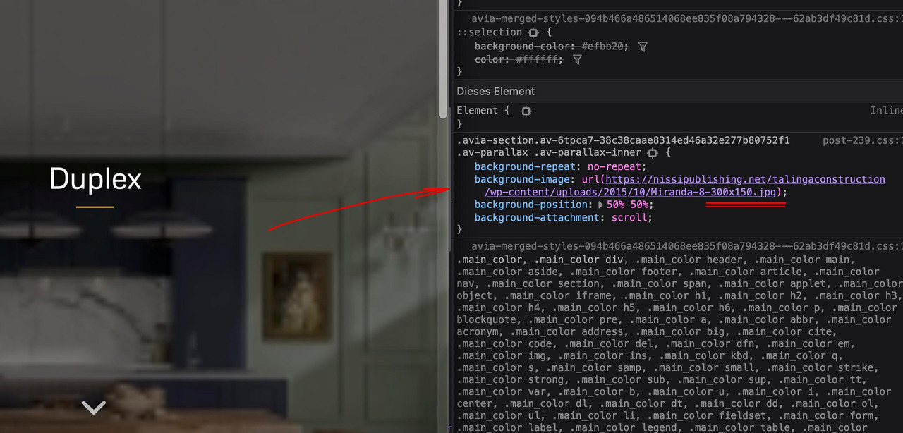
on inserting an image to your color-section background ( or other alb elments ) – you had to pay attention what image-size you put in.
There is in that dialog a drop-down menu on the right to click and to choose what you like to insert.

you have inserted a small one : 300px x 150px.
The same with the image beneath:
( click to enlarge the image: )
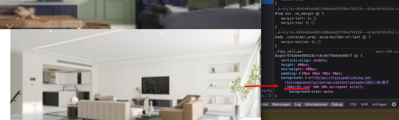
300px x 195px
____________________________________________________________
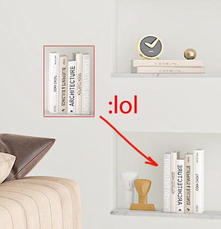
? i’m kidding: maybe books from Leonardo
PS: what about the new feature : “Typography Input Fields” – what happens to the entered values on the screen width options.
is the first value inherited to the others too?
Thanks for the interim report. The backwards compatibility makes sense to me.
But especially with the column/image position should be at least as a selection “use theme default” with it. In order not to have to set also still all values and not inherited over the first setting. Default value could stay at “use desktop setting”. Same with parallax setting – if there was as second choice “none” and default is “use desktop setting”and this was always the caption – i see now that on the example page caption and title are synchronized ( guess manually ).
Then it was my fault of thinking, because here was a match to think it would show the title in the avia tooltip.June 24, 2022 at 10:35 am in reply to: Change Blog Grid Button Text from READ MORE to TELL ME MORE #1356379or put this to your child-theme functions.php:
function my_text_strings( $translated_text, $text, $domain ){ switch ( $translated_text ){ case 'Read more' : $translated_text = __( 'Tell me more', $domain ); break; } return $translated_text; } add_filter('gettext', 'my_text_strings', 20, 3);i guess that this is the troublemaker:
@media only screen and (max-width:1100px) {
 #top #wrap_all .av_header_transparency,
 .av_header_transparency #advanced_menu_toggle {
  background:transparent!important;
  position:absolute!important
 }
}
the class: av_header_transparency is a class that is removed when the header is scrolled.
The switch from absolute to relative is the reason for that “jump”what do you try to reach with it?
this looks as if the padding-top is swiched when header-scrolled class is in the DOM.
May i see the example page – maybe you have set some css that is inconsistant.
PS: on top the white flash comes from the header_bg background-color.
___________________________________________________
PS if you like to look to the fix i provided above –
go and look to :
https://consulting.webers-testseite.de/leistungen2/
https://consulting.webers-testseite.de/leistungen2a/
with your iphoneSchau nochmal meinen Kommentar, glaube wir haben gleichzeitig eingetippt
Edit: Ah – ich sehe jetzt das Filter – sorry.
add_filter( 'avf_media_gallery_sortable_filesize', '__return_true' );Danke : Thanks
you see – if i inspect the demo-link from above and add (virtually) in the dev tools the css :
(click to enlarge)

put it in General Styling – Quick CSS
maybe an important is necessary :#top .image-overlay .image-overlay-inside::before { content: "\e80f" !important; font-size: 50px; color: #fff !important; } #top div .avia-gallery .avia-gallery-big { padding: 0px !important; border-style: none !important; } #top div .avia-gallery img { border-style: none !important; padding: 0px !important; }the :
content: "\e80f"is a little camera – if you like to show a real image – code has to be adjusted.
if you like to have it specific only for one gallery – give a custom-class to that gallery – and this has to be part of the css code.PS: i do not see your private content area – i’m participant as you- so i only could investigate own or the enfold demo pages to give advice.
use on that the quick css input field.
if you mean this “Gallery with Preview” on https://kriesi.at/themes/enfold/shortcodes/gallery/
try:#top .image-overlay .image-overlay-inside::before { content: "\e80f" !important; font-size: 50px; color: #fff !important; } #top div .avia-gallery .avia-gallery-big { padding: 0px; border-style: none; } #top div .avia-gallery img { border-style: none; /*** padding: 0px; *** - if you like ***/ }June 23, 2022 at 11:56 am in reply to: Ausgangstext Slider arbeiten nach Update nicht mehr Hallo, nach dem neuestem Up #1356273i’m on Monterey 12.4 and Firefox Developer 102.0b9 (64-Bit)
no quick css – this is a snippet for functions.php.
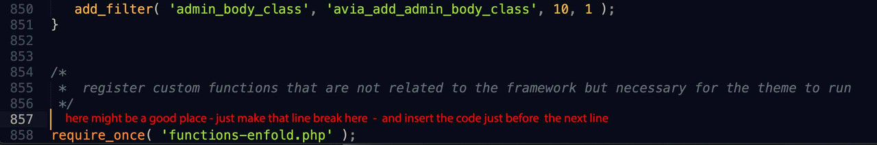
Most layouters want to change the heading tag for SEO reasons; you can adjust the headings so e.g. the h3 to the h4 appearance via css of course, but that would be a bad solution from my point of view.You can insert that in your parent theme as well, either the way of your link in the magazine.php file – or you put that snippet into your parent theme functions.php. But on the parent functions.php there are good and bad places to insert such code.
I guess one of the good places is just before the end of it:
( click to enlarge the images )
Next But you always have to do the edit – everytime you update your theme – this is really not a practical solution
( with magazine.php the same)Maybe a plugin is a good solution for you: https://wordpress.org/plugins/code-snippets/
I did not test it – but it seems to be very popular with over 600.000 installations. Then those snippets comes to the plugin dialog
Edit : tested right now – and it works !
-
This reply was modified 3 years, 8 months ago by
Guenni007.
if i put in the Discount Code – there are additonal errors.
First one is a Logical Not ( the exclamation mark : ! ) i think syntax needs a space between : (correct me if i’m wrong)function onLoad() { // make sure we have valid data from WP if (!__recaptureCart) { return; } …maybe i’m not well informed about that
if (! __recaptureCart) {_______
next – if i want to embed inside a script some php code – look here from your page:
<script>
    __recaptureCart = {
        checkoutUrl: 'https://www.lovefactorinventory.com/membership-account/membership-checkout/?level=9',
        products: [
            <? echo json_encode([    // <em>i think that is not correct syntax here - maybe a DEV from the team could look into it !</em>
                'externalId' => $pmpro_level->id,
                'sku' => $pmpro_level->id,
                'name' => $pmpro_level->name,
                'price' => floatval($pmpro_level->initial_payment),
                'imageUrl' => '',
                'quantity' => 1
            ]) ?>
        ],
        tax: 0,
        shipping: 0,
        discountCodes: []            };
</script>
and i believe this might be the right one:
<script>
    __recaptureCart = {
        checkoutUrl: 'https://www.lovefactorinventory.com/membership-account/membership-checkout/?level=9',
        products: [
            <?php echo json_encode([
                'externalId' => $pmpro_level->id,
                'sku' => $pmpro_level->id,
                'name' => $pmpro_level->name,
                'price' => floatval($pmpro_level->initial_payment),
                'imageUrl' => '',
                'quantity' => 1
            ]) ?>
        ],
        tax: 0,
        shipping: 0,
        discountCodes: []            };
</script>
where does these scripts come from? – Is it a plugin? Is it part of stripe? then ask the plugin devs if my suggestions are correct!
June 23, 2022 at 8:38 am in reply to: Ausgangstext Slider arbeiten nach Update nicht mehr Hallo, nach dem neuestem Up #1356252on my Mac here (Firefox Developer, Chrome and Safari) both shows (left and right) start automatically!
When you click to go to the next slide – the show stops after one pass ( no loop ) – but this is normal behavior I’m afraid.well – i do not see any script errors – but if the script code is correct – maybe the priority is wrong (999) so to test this. Remove the snippet from functions.php and place again a text-widget or maybe better a html widget to your footer again.
But if it is a text-widget insert the script code (oneliner from above) in text-mode – if you switch back then to visual mode you will see a littel icon in it:
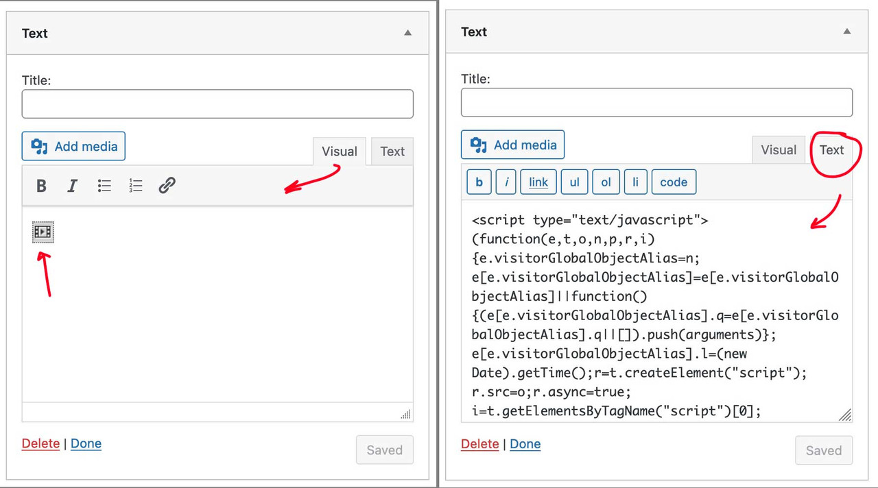
This might be helpful if someone wants to implement custom svg’s this way
if you like to have in List View of Media Library the Items-ID in a column ( and to have this sortable ) put this to child-theme functions.php: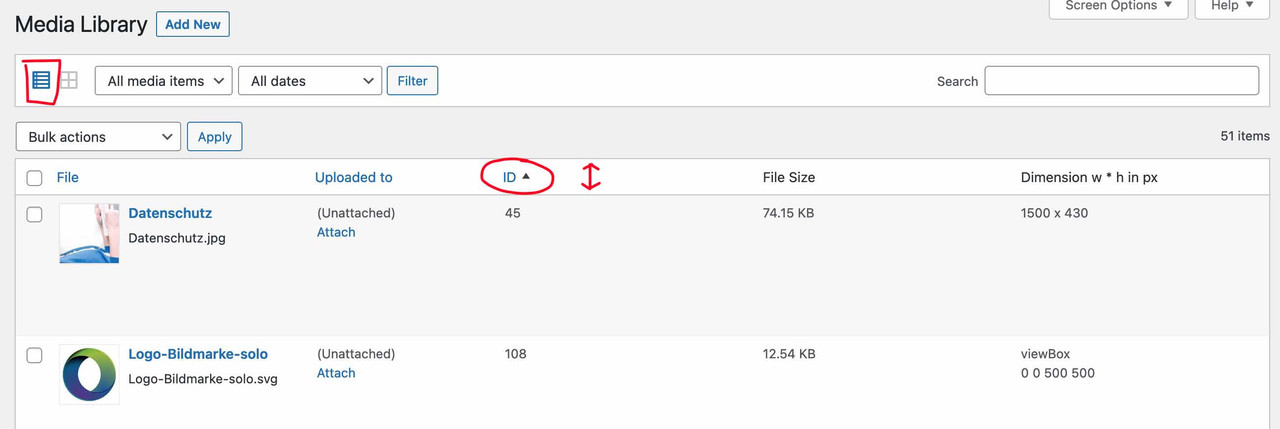
function posts_columns_attachment_id($columns){ $columns['post_attachments_id'] = __('ID'); return $columns; } function posts_custom_columns_attachment_id($column_name, $id){ if($column_name === 'post_attachments_id'){ echo $id; } } add_filter('manage_media_columns', 'posts_columns_attachment_id', 1); add_action('manage_media_custom_column', 'posts_custom_columns_attachment_id', 1, 2); function make_item_ID_column_sortable($columns) { $columns['post_attachments_id'] = __('ID'); return $columns; } add_filter('manage_upload_sortable_columns', 'make_item_ID_column_sortable'); // File-Size Column sorting logic (query modification) function items_ID_sorting_logic($query) { global $pagenow; if(is_admin() && 'upload.php' == $pagenow && $query->is_main_query() && !empty($_REQUEST['orderby']) && 'post_attachments_id' == $_REQUEST['orderby']) { $query->set('order', 'ASC'); $query->set('orderby', 'meta_value_num'); $query->set('meta_key', 'post_attachments_id'); if('desc' == $_REQUEST['order']) { $query->set('order', 'DSC'); } } } add_action('pre_get_posts', 'items_ID_sorting_logic');i did that – but it does not work.
Is the registration above correct? Or do i have to make some changes?function custom_avf_custom_svg_shapes( array $custom_shapes ) { $custom_shapes = array( 'waves-in-motion' => array( 'key' => 'waves-in-motion', 'title' => __( 'Waves in motion', 'avia_framework' ), 'has_flip' => true, 'has_width' => false, 'attachment' => 16, 'filename' => 'waves-in-motion' ), ); return $custom_shapes; } add_filter( 'avf_custom_svg_shapes', 'custom_avf_custom_svg_shapes', 10, 1 );EDIT: OK now i know – we had to look in media-library what ID is given to the uploaded file. This we must synchronize with the given register file.
Now it is clear – but then i think the easiest way would be to upload via ftp in that subfolder (avia_custom_shapes)no private content Area for me – i’m participant as you.
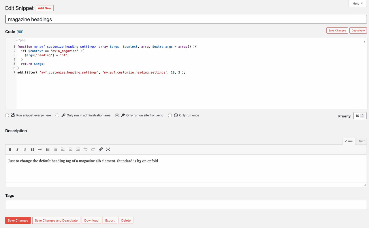
if you don’t like to make it public – mail me – contact data under my nick/avatarin the meantime there is a filter to do this. ( the former method via a child theme magazine.php is no longer necessary )
can you place this in your child-theme functions.php:function my_avf_customize_heading_settings( array $args, $context, array $extra_args = array() ){ if( $context == 'avia_magazine' ){ $args['heading'] = 'h4'; } return $args; } add_filter( 'avf_customize_heading_settings', 'my_avf_customize_heading_settings', 10, 3 );by the way the alb element itself got the option to set the heading tag – under Advanced Tab : Heading Tag.
on your page you use that ( by the way deprecated window.load is involved too ) script:
jQuery(window).load(function(){
	jQuery('a').removeAttr('title');
	jQuery('img').removeAttr('title');
});
without the titles – the lightbox got no info what to show!
The question now is when you inserted the script, because even in the earlier version of enfold this could not work.Have a look into the alb you set – maybe there is the option not to use the title but f.e. description.
Or just not to remove the title – but save it to another attribut and save back on click or on mouseout:can you try this instead :
function temporary_removal_title_tags(){
?>
<script>
  window.onload = function() {
      var links = document.querySelectorAll('a, img');
      for (var i = 0; i < links.length; i++) {
          var link = links[i];
          link.onmouseover = function() {
              this.setAttribute("data-tooltip", this.title);
              this.title = "";
          };
          link.onmouseout = function() {
              this.title = this.getAttribute("data-tooltip");
          };
          link.onmousedown = function() {
              this.title = this.getAttribute("data-tooltip");
          };
      }
  };
</script>
<?php
}
add_action('wp_footer', 'temporary_removal_title_tags');
btw: maybe you decide to darken the lightbox background a bit more – because the png files with the transparency will then be better seen:
.mfp-zoom-in.mfp-ready.mfp-bg,
.mfp-zoom-in.mfp-ready .mfp-preloader {
  opacity: 0.9 !important;
}
June 22, 2022 at 9:58 am in reply to: default Enfold Contact forms and contact form7 arrive in my client spam folder #1356114on former installations i got this when the domain and the mail address is not correlating.
Means your e-mail on http://www.domain.com contact form goes to (Email address hidden if logged out) .
It depends mostly on your hoster – you can edit the dns of your domain to include other domains that are allowed to send emails from.
That is the socalled SPF Record.
To shorten this read : https://www.digitalocean.com/community/tutorials/how-to-use-an-spf-record-to-prevent-spoofing-improve-e-mail-reliabilityAdding an SPF record to your DNS zone file is the best way to stop spammers from spoofing your domain. In addition, an SPF Record will reduce the number of legitimate e-mail messages that are flagged as spam or bounced back by your recipients’ mail servers. The SPF record is not 100% effective, unfortunately, because not all mail providers check for it. Many do, however, so you should notice a significant decrease in the amount of bounce-backs you receive.
your recipients email client get an email allegedly from a – but it send from b – and return answers will be send to b – thats why this goes to spam.
f.e.: on your contact form 7 form you have the entries like that:
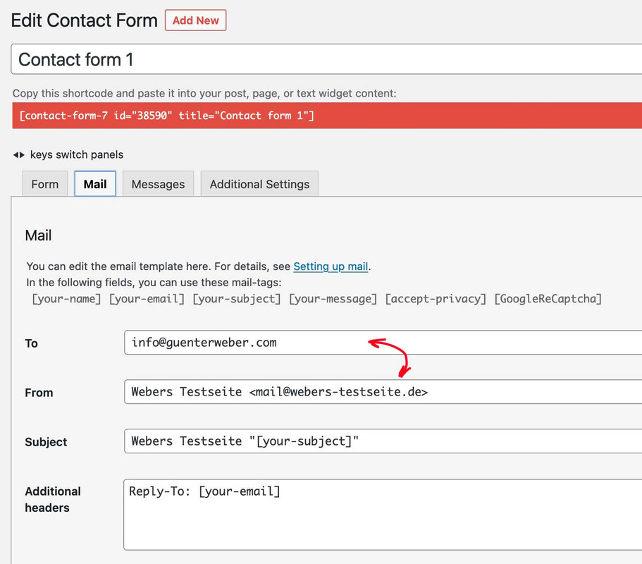
what now can be done is to login to the hoster (webers-testseite.de) and edit the dns by allowing (guenterweber.com) to send emails via spf record.
This could also be the case with your installationon your landing page – on the other page it still exists.
Edit : my suggestion is that your inserted script has some linebreaks that causes the automatic p-tag insertion in the text-widget – in a child-theme functions.php it does not matter if there are linebreaks – but in a text-widget it might be different.
– so try first to insert this pure one-liner:
<script type="text/javascript">(function(e,t,o,n,p,r,i){e.visitorGlobalObjectAlias=n;e[e.visitorGlobalObjectAlias]=e[e.visitorGlobalObjectAlias]||function(){(e[e.visitorGlobalObjectAlias].q=e[e.visitorGlobalObjectAlias].q||[]).push(arguments)};e[e.visitorGlobalObjectAlias].l=(new Date).getTime();r=t.createElement("script");r.src=o;r.async=true;i=t.getElementsByTagName("script")[0];i.parentNode.insertBefore(r,i)})(window,document,"https://diffuser-cdn.app-us1.com/diffuser/diffuser.js","vgo"); vgo('setAccount', '611343716'); vgo('setTrackByDefault', true); vgo('process');</script>__________
Or like Rikards advice:
Remove that text-widget and embed that script via child-theme functions.php.function ronmann_footer_script(){ ?> <script type="text/javascript"> (function(e,t,o,n,p,r,i){e.visitorGlobalObjectAlias=n;e[e.visitorGlobalObjectAlias]=e[e.visitorGlobalObjectAlias]||function(){(e[e.visitorGlobalObjectAlias].q=e[e.visitorGlobalObjectAlias].q||[]).push(arguments)};e[e.visitorGlobalObjectAlias].l=(new Date).getTime();r=t.createElement("script");r.src=o;r.async=true;i=t.getElementsByTagName("script")[0];i.parentNode.insertBefore(r,i)})(window,document,"https://diffuser-cdn.app-us1.com/diffuser/diffuser.js","vgo"); vgo('setAccount', '611343716'); vgo('setTrackByDefault', true); vgo('process'); </script> <?php } add_action('wp_footer', 'ronmann_footer_script', 999);so the container itself is only to determine the background via the alb element. The background-size was then reduced to zero. The color-section itself got with the clip-path a kind of keyhole function. That is important – because the later fixed pseudo-container should not be seen on other places – only through that keyhole.
The pseudo-container has the same dimension as the parent container and inherits the background-image of the parent. But now we can fix the whole background container. And this is something that is supported by Safari and iOS Devices.PS : if you got a lot of those containers on one page – it might be better to remove the will-change option on performance reasons.
my suggestion is ( i do as participant not see the private content) that the background-image is set to attachment fixed ! ;)
this is a known bug on safari and with iOs devices. Link
A trick to solve this problem is to bypass the attachment fixed property by passing the image to a pseudo-container ( you can take before aswell ) as a background image, but then fixing the pseudo-container. This works much better with an iPhone.https://kriesi.at/support/topic/theme-is-shaking-a-lot-in-safari/#post-1207474
so what to do :
- give to the color-section a custom-class: bg-fixed
- set the behavior to scroll
- put this to your quick css:
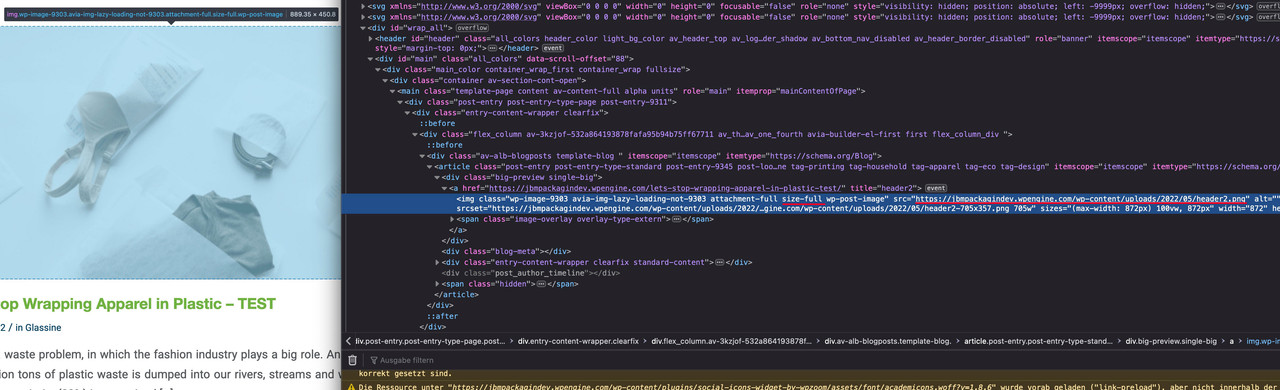
.avia-section.bg-fixed {
  -webkit-clip-path: inset(0 0 0 0);
  clip-path: inset(0 0 0 0);
  background-size: 0 !important;
  overflow: hidden;
  position: relative;
  top: 0;
}

.avia-section.bg-fixed::after {
  content: "";
  position: fixed;
  width: 100%;
  height: 100%;
  top: 0;
  left: 0;
  background-image: inherit !important;
  background-repeat: no-repeat !important;
  background-size: cover;
  background-position: inherit;
  pointer-events: none;
  will-change: transform;
  z-index: -1;
  visibility: visible !important;
}
June 21, 2022 at 9:07 pm in reply to: Blog Posts Widget Uses a Small Portfolio Size Image Instead of Full Size Image #1356060but on your example page i can see that the full image is taken for the source:
( click to enlarge – red underlined )
on my installations and here on one enfold demo – all external links got that attribut:
-
This reply was modified 3 years, 8 months ago by
-
AuthorPosts