Forum Replies Created
-
AuthorPosts
-
July 2, 2022 at 8:10 am in reply to: Don't display ANYTHING from Events Calendar in Enfold Search #1357040
maybe this is better – because even pages with tribe-events ( pages with tribe lists ) are not in the search:
(i hope so – i can not test it – lack of using Events Calendar)function exclude_tribe_events() { global $wp_post_types; if ( post_type_exists( 'tribe_events' ) ) { $wp_post_types['tribe_events']->exclude_from_search = true; } } add_action( 'init', 'exclude_tribe_events', 99 );So if you go and set for the direct child of the background-image container : the mix-blend-mode – it will work in firefox.
But then the whole container is influenced. And a min-height hampers the blend-mode too – because of display :table
…
i would like to set the min height of the container not by the alb – but with css – to get rid of display: table
see my testpage on the bottom: https://enfold.webers-webdesign.de/special-backgrounds/#av_section_3and css for that:
#top #main #av_section_3.mix-blend-mode  {
  background-size: cover;
  background-position: right center;
}

#top #main #av_section_3.mix-blend-mode .container {
  mix-blend-mode: multiply;
  display: block !important;
  min-height: 45vw;
}

#top #main #av_section_3.mix-blend-mode .container .content {
  float: left !important;
}
my comment on that: this is not a practical way to do it. It is unfortunately the whole container that would have to be set to this blend mode – so we should find another way.Unfortunately, I do not see the private content sector, so I have to guess what it’s about. It makes here far too many, a secret about their pages. You can only learn from the problems of others.
now i go and try to find a solution
Edit:
The mix-blend-mode property defines the blending of the element’s content with its direct parent background
If you look to a advanced layerslider solution – you see that the background-image container – is a sibling of the direkt image parent container.
both must have mix-blend-mode : multiply
the image itself got mix-blend-mode : normalha _ :lol: i have a Déjà-vu :
https://kriesi.at/support/topic/image-flip-box/#post-1342764 and https://webers-testseite.de/icongrid-with-frontimage/can not see if all is o.k. because when not using code tag here on board – a lot of signs are transfered to something else – but if you copy&paste it from here: Link – all will be o.k.
by the way : fontawesome is now on 6.11 and hosted on
https://www.jsdelivr.com/just not sure why you are making it so hard for yourself.
Why grid-row and why create that with background images.
6 1/3 columns and then images in there that get a caption. The caption is then styled.
Maybe also set the 6 columns as flex-box:__________________
ich bin mir nur nicht sicher, warum Du es dir so schwer machst.
Warum Grid-row und warum das mit Hintergrundbildern erstellen.
6 1/3 columns und dann Bilder hinein, die ein Caption bekommen. Das Caption wird dann gestyled.
Eventuell auch noch die 6 Columns als flex-box setzen:
https://enfold.webers-webdesign.de/images/PS: wenn du das gesehen hast, werde ich deine Bilder durch Platzhalter-Bilder ersetzen.
PPS: das Flexen geht allerdings nur wenn die flex-items nicht von anderen Elementen gestört werden. Heißt: es dürfen nur diese 6 Columns da drin sein in der Color-Section. Überschriften etc. müssen in einem anderen Container untergebracht werden.is there a way to see the page it belongs to?
I’m participant as you are – but sometimes we do also have good ideas ;)But this is not an error message that you can not write, but that the inserted was faulty. Therefore check the snippet for errors.
Are all quotation marks correct? not curved quotation marks but straight ones! – do all opening brackets also have closing equivalents? etc. pp.try this in your child-theme functions.php:
function ava_exclude_current_post($query) {
  if (is_singular('post') || is_singular('portfolio') ) {
    $exclude = avia_get_the_ID();
    $query->set( 'post__not_in', array($exclude) );
  }
}
add_action('pre_get_posts', 'ava_exclude_current_post');
or maybe shorter to use as condition above:
if(is_single()){Thank you for responding to the needs of fewer participants here as well. ;)
ok – now i understand BUT
even if you could load the script and styles only for home page:function front_page_preloader_script() { if( is_front_page() || is_home() ){ wp_enqueue_script( 'avia-siteloader-js', get_template_directory_uri().'/js/avia-snippet-site-preloader.js', array('avia-default'), $vn, true, false); wp_enqueue_style( 'avia-siteloader', get_template_directory_uri().'/css/avia-snippet-site-preloader.css', array('avia-layout'), $vn, 'screen', false); } } add_action( 'wp_enqueue_scripts', 'front_page_preloader_script' );in functions-enfold.php there is still that line 20:
$class = avia_get_option( 'preloader_transitions' ) != 'disabled' ? 'av-transition-enabled' : '';because it is in a Pluggable Function ( avia_preload_screen ) we could change that in child-theme functions.php.
and we had to change some entries in header.php
but even if we could do that – the preloader will also be shown if you leave the home page …_________________________
So my quick and dirty way is:
Set in Enfold Options the Preloader and do this to quick css:#top:not(.home) .av-siteloader-wrap { display: none !important }June 30, 2022 at 9:29 am in reply to: Enfold CSS/JS merging function still not working properly #1356914where does that cash.js come from?
what is cash?
cash is a small library (8kb) for modern browsers that provides jQuery style syntax to wrap modern Vanilla JS features.
It allows developers to use the jQuery syntax they already know, and utilizes modern browser features to minimize the codebase.
100% feature parity with jQuery isn’t a goal, but cash comes helpfully close, covering most day to day use cases.
If your project is a closed environment, or you only support the latest and greatest, this could be fairly helpful.what do you try to intend to have a benefit from that script?
And – if you need it – why do you load it from a different source domain ( https://sf.ezoiccdn.com/tardisrocinante ) ? 8kb is something that could be easily self-hosted.
If you try to load it extern – you can use:
A working link to that cash.js might be: https://cdnjs.cloudflare.com/ajax/libs/cash/8.1.1/cash.min.js or (Email address hidden if logged out) /dist/cash.min.js”>https: (Email address hidden if logged out) /dist/cash.min.js
Try to deactivate it if it comes from a plugin – or if it is loaded in your functions.php. Just to see if the error message still exists.yes – that is fast done with photoshop or affinity photo or if you do not use those tools often – try online on : https://www.photopea.com/
this is my layout : https://enfold.webers-webdesign.de/special-backgrounds/
color-section with custom-class: imageblend; Section divider – but you see on the image alb that even multiple backgrounds could be set; and a bit of css.
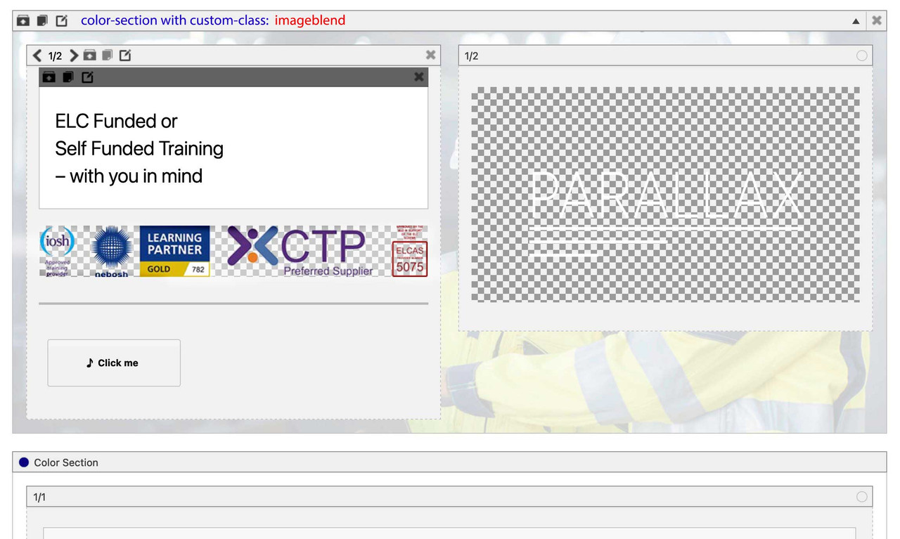
but i would set this gradient overlay only for larger screen widths.Now i try to do this with enfold images … see example page
see: https://caniuse.com/?search=mix-blend-mode
so why don’t you use a pseudocontainer to do the job?
#top .avia-section.imageblend {
  position: relative !important;
  overflow: hidden !important;
}

#top .avia-section.imageblend:after {
  position: absolute;
  content: " ";
  width: 100%;
  height: 100%;
  top: 0;
  left: 0;
  background-image: linear-gradient(90deg, rgba(130,208,221,1) 40%, rgba(130,208,221,0) 60%);
  background-size: cover;
  background-repeat: no-repeat !important;
  background-position: top left;
  pointer-events: none;
}
on a parallax section – selector is a bit different:
#top .avia-section.av-parallax-section.imageblend .av-section-color-overlay-wrap:afterSee: https://enfold.webers-webdesign.de/special-backgrounds/
you can use the section divider here and bring it to frontcan you temporarily remove the child-theme tag.php – and put this to your child-theme functions.php:
add_filter('avf_blog_style','avia_change_tag_blog_layout', 10, 2);
function avia_change_tag_blog_layout($layout, $context){
if($context == 'tag') $layout = 'blog-grid';
return $layout;
}

add_filter('avf_post_slider_args', function($atts, $context){
  if($context == 'tag') {
    $atts['type']  = 'grid';
    $atts['columns']  = 1;
  }
  return $atts;
}, 10, 2);
and this to quick css
#top.tag .entry-content-wrapper .post-title{ margin-bottom: 40px } #top.tag .slide-entry-wrap { margin-bottom: 10px; } #top.tag .slide-image { display: none !important; } #top.tag .slide-content > :not(.entry-content-header) { display: none; } #top.tag .slide-entry-wrap .entry-content-header .slide-entry-title:before { content: "Article:"; font-size: inherit; font-weight: inherit; color: #666; padding-right: 15px; }oh – is hard to inspect your site, one would probably have to know a translation service ;)
it depends on the exact page what you had to customize. Is it an archive category page or a archive tag page?
then: it is tag.php – but i guess that it is only here on board a typo ?June 29, 2022 at 11:00 am in reply to: Don't display ANYTHING from Events Calendar in Enfold Search #1356826i found here some hooks for tribe-events: https://docs.theeventscalendar.com/reference/classes/tribe-events-views-v2-hooks/
but I did not investigate the matter more deeply due to lack of time. ( so try first the last snippet)
maybe that filter is the one you need: add_filter( ‘tribe_suppress_query_filters’, ‘__return_true’ );Can you please describe in more detail how you want the header to look on small screens (or mobile devices)?
Do you want the header to stay fixed at the top? Do you want the header to shrink after scrolling, etc.? Maybe you can show a sketch.
you can see here a testpage where the header is still fixed on top – and i think it will be no problem to give to the header_bg a background-image after scroll: https://webers-testseite.de/yes – Yigits Code works – and in addition if you want to get rid of the padding on top and bottom use the following –
but i would advise to use a custom class, because you can have several easy sliders on one page.
( so instead of #section-container-width we have then: .section-container-width)@media only screen and (max-width: 767px) { .section-container-width .container { width: 100% !important; min-width: 100%; padding: 0; margin: 0; } .section-container-width .container .content { padding: 0 !important } }However, if you mean only mobile devices, i.e. mobile phones or tablets that may well have larger screen sizes, use this option instead:
.avia_mobile .section-container-width .container { width: 100% !important; min-width: 100%; padding: 0; margin: 0; } .avia_mobile .section-container-width .container .content { padding: 0 !important }if you mean that rotating preloader you can try this in your quick css:
.home .av-siteloader {
    border: none !important;
    content: url(/wp-content/uploads/alternative-image.png);   /***  might be a svg file too ***/
    width: 150px;
    height: 150px;
}
if you are referring to the logo above the rotating image:
.home .av-preloading-logo {
    content: url(/wp-content/uploads/alternative-image.png);
    width: 450px;
}
dimensions you had to test yourself.
the easy slider is inside a color-section ? inside a column ? etc. that is important to know.
June 28, 2022 at 11:39 am in reply to: Don't display ANYTHING from Events Calendar in Enfold Search #1356705well to include a custom-post-type to search results this is the snippet:
function include_custom_search( $query ) {
    if ( $query->is_search ) {
    $query->set( 'post_type', array( 'post', 'page', 'custom_post_type' ) );
    }
    return $query;
}
add_filter( 'pre_get_posts', 'include_custom_search' );
maybe it works the other way too :
function exclude_from_search($query) { if ( !$query->is_admin && $query->is_search) { $query->set('post_type', array('page','post') ); } return $query; } add_filter( 'pre_get_posts', 'exclude_from_search' );you can address these icons via attribute selector.
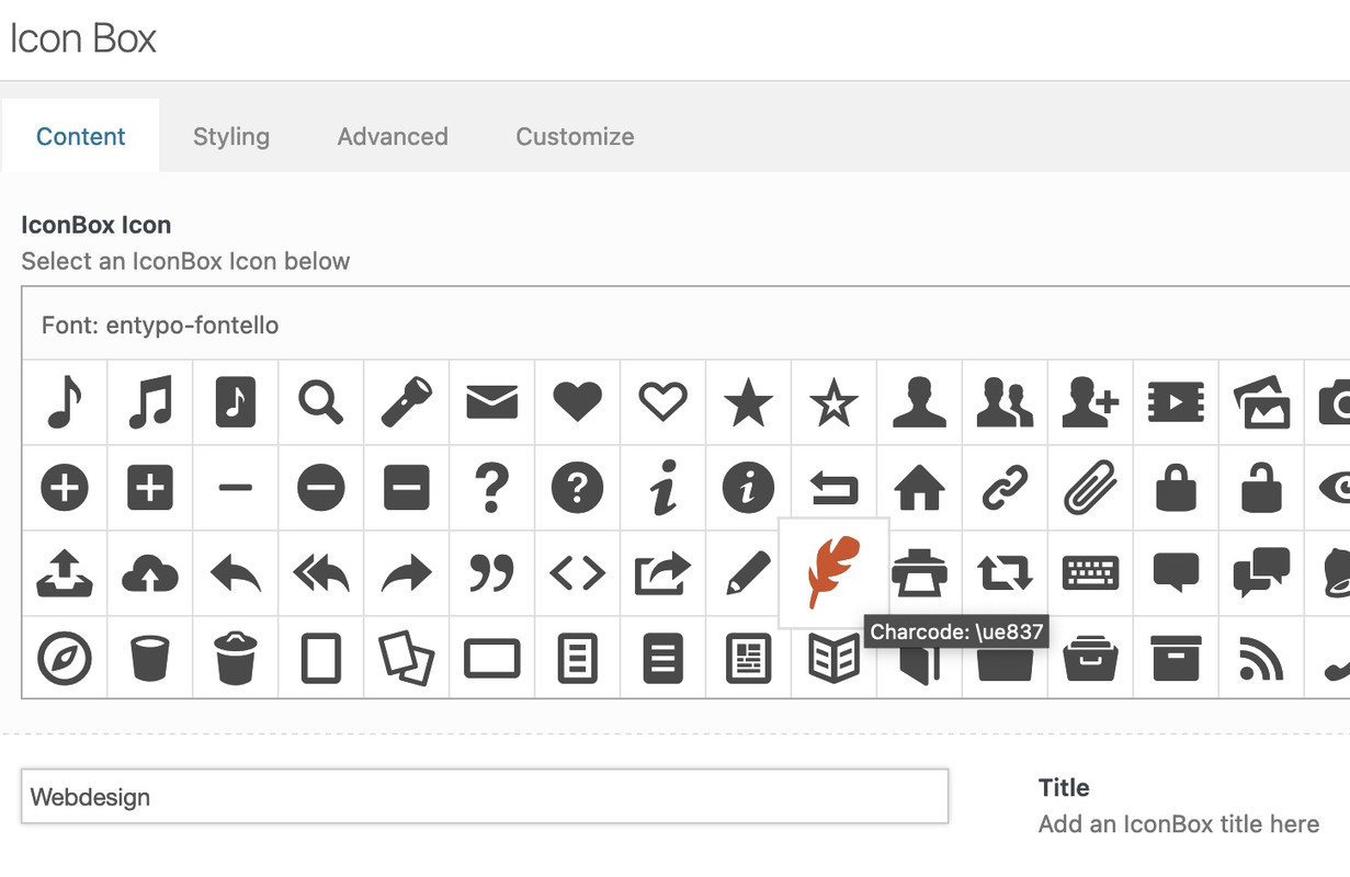
f.e. here on a testpage – see the first iconbox on the left: https://webers-testseite.de/
Open the alb ( in this case the iconbox – and hover the wanted icon to inspect the code behind that font-icon – here it is: ue837
get rid of the u ( i guess it stands for unicode ) and note your code for the icon as : \e837 ( the backslash is used here )
click to enlarge the image:
now my replacement code on quick css is:
div[data-av_icon="\e837"] {
	content: " ";
	background-image: url(/wp-content/uploads/ezgif-4-64b6614e32.gif);
	background-size: contain;
	background-repeat: no-repeat;
       font-size: 0 !important
}
this gif will now replace all occurrences of this font icon. And if the replacement image is transparent the alb settings for border-color and background-color will be adjustable too. ( Font-color : NOT ; self-evident )
:LOL and even in the preview it will be replace:
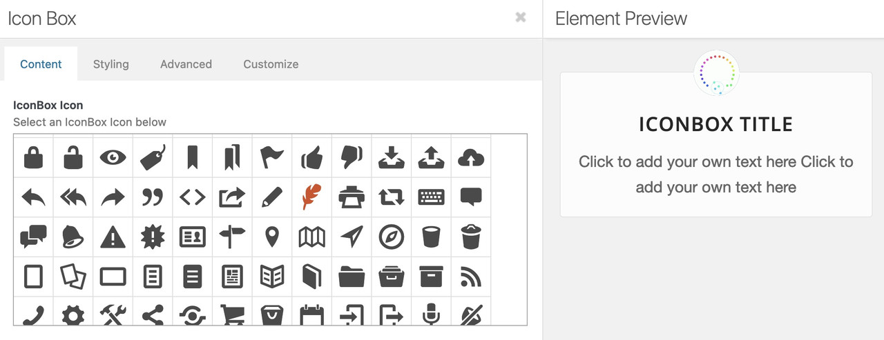
BUT: i see that some of those icons are placed in a different way ( f.e. as span – so be carefull to adjust the code then !
The icon import option of Enfold is only intended for icon fonts.
These have a predefined structure. To take full advantage of these font icons, they must still be monochrome black. It is therefore not possible to add coloured icons.
The idea behind this is to be able to colour them using css: color (font color).
However, coloured icons can be uploaded to the media library as svg or png. These could then replace existing icon fonts via css.______
L’option d’importation d’icônes d’Enfold est uniquement destinée aux fontes d’icônes.
Elles disposent d’une structure prédéfinie. Pour tirer pleinement parti de ces fontes d’icônes, celles-ci doivent toujours être noires monochromes. Il n’est donc pas possible d’ajouter des icônes de couleur.
L’idée derrière cela est de pouvoir les css: color en utilisant la couleur (couleur de la police).
Toutefois, les icônes colorées peuvent être téléchargées dans la médiathèque sous forme de svg ou de png. Elles pourraient alors remplacer les fontes d’icônes existantes via css.the plugin mentioned here is now obsolete – because wordpress has adopted some of it in newer versions. If the update process finds a theme or plugin that is already installed, you will be prompted to overwrite the existing one or not.
the question is – how did you update via ftp manually?
Did you really erased the old enfold folder and upload a new one? or do you try to write over all existing files etc. pp.My way to update in a save way ( because you will have a rollback version ) is:
https://kriesi.at/support/topic/some-hints-and-advice-to-update-enfold/#post-1056107
You don’t need now the rollback – because the existing version is now corrupted or buggy. When overwriting an exiting folder it depends with the ftp programs on which parameters one sets. Is it always overwritten? What happens to files that are no longer in the new folder – or have been renamed? etc.Next – i see on your screenshot that your child is renamed to Fysio ( not Enfold ) – do you have that too for the parent theme? ( This would not be necessary – but some users even want to obfuscate even that ) – But there are a few things to keep in mind.
The amount of pixels do determine the resolution – so you can even upload images with 1732×1155 in 72dpi – it has the same file-size.
Only the absolute dimensions of the 240dpi image are then 18,33cm x 12,22cm – and the 72dpi : 61,1cm x 40,75cm.
But that has no influence on the resolution. When you place that image ( same pixel amount ) to your layout both will have the same resolution.Next: i guess you do not pay attention on inserting the image to the elements – see here : https://kriesi.at/support/topic/project-images-blurry-issue/#post-1356450
yes – and the script is something i wrote in former enfold versions to have that behavior. No scroll on the background as long as the lightbox is opened.
But for a while i do not need to insert that code above to have that – and i thought it is due to enfold got this as the normal behavior. But now i see on new demo that now i can scroll even the lightbox out of sight ( with the background )there is the possiblity to set in the callback :
      callbacks: {
        beforeOpen: function () {
          $('html').css("overflow-y", "hidden");
        },
        close: function() {
          $('html').css("overflow-y", "auto");
        },
      },
that will do the job too.
And very strange on that page here: https://enfold.webers-webdesign.de/#portfolio i wrote a custom magnificPopup script to change some settings ( animations ) but not these overflow-y thing from above.
Only doing this the html styles are set. And you see that trying to scroll the background or the lightbox container does not work.but when i look to the js/avia-popup/jquery.magnific.popup.js file there are a lot of hints concerning to : fixedContentPos – and i thought that for a while this was default behavior.
Yes – please give me a bit time to think about. What i have allready done is to combine animate.css : Link with the transition between the images. see here the galleries in the tabs: next Link
But i guess it will be hard to differ between in- and out-transition.
Edit: Well – this is not perfect – and the question remains whether it is worth the effort.
You have to write your own MagnificPopup script for it, and still drive css adjustments here and there. : https://enfold.webers-webdesign.de/#portfolio
I do not see where the fault is with closing the lightbox in a nice way.see: https://enfold.webers-webdesign.de/#portfolio
main part is – i think for you to slow down the transition between – maybe you try first only:
.mfp-zoom-in .mfp-figure, .mfp-zoom-in .mfp-iframe-holder .mfp-iframe-scaler {
    opacity: 0; /*** here you can influence the transition opacity - test with 1 to see the difference ***/
    -webkit-transition: all 2s ease-out;
    transition: all 2s ease-out;
    -webkit-transform: scale(0.75);
    -ms-transform: scale(0.75);
    transform: scale(0.75);
}
___________________________________
– on my page i had :.mfp-ready .mfp-figure { opacity: 0; } .mfp-zoom-in .mfp-figure, .mfp-zoom-in .mfp-iframe-holder .mfp-iframe-scaler { opacity: 0; /*** here you can influence the transition opacity - test with 1 to see the difference ***/ -webkit-transition: all 2s ease-out; transition: all 2s ease-out; -webkit-transform: scale(0.75); -ms-transform: scale(0.75); transform: scale(0.75); } .mfp-zoom-in.mfp-bg, .mfp-zoom-in .mfp-preloader { opacity: 0; -webkit-transition: all 2s ease-out; transition: all 2s ease-out; } .mfp-zoom-in.mfp-image-loaded .mfp-figure, .mfp-zoom-in.mfp-ready .mfp-iframe-holder .mfp-iframe-scaler{ opacity: 1; -webkit-transform: scale(1); -ms-transform: scale(1); transform: scale(1); } .mfp-zoom-in.mfp-ready.mfp-bg, .mfp-zoom-in.mfp-ready .mfp-preloader { opacity: 0.85; } .mfp-zoom-in.mfp-removing .mfp-figure, .mfp-zoom-in.mfp-removing .mfp-iframe-holder .mfp-iframe-scaler { -webkit-transform: scale(0.75); -ms-transform: scale(0.75); transform: scale(0.75); opacity: 0; } .mfp-zoom-in.mfp-removing.mfp-bg, .mfp-zoom-in.mfp-removing .mfp-preloader { opacity: 0; } .mfp-iframe-scaler{ overflow: visible; /*so the close button is shown*/} .mfp-zoom-out-cur { cursor: auto; } .mfp-zoom-out-cur .mfp-image-holder .mfp-close { cursor: pointer; }the scale-factor is up to you – maybe a scale-factor nearby the 1 looks better
-
AuthorPosts