Forum Replies Created
-
AuthorPosts
-
what is the reason for making it white ? what you try to obtain with it?
To completly remove it it is much easier:.trail-begin { display: none !important; }it is not usefull to start double postings here : https://kriesi.at/support/topic/remove-link-from-featured-image-2/
BUT
if there is no floating text around the images – there is no need to do it this way.
It was much easier than to have a column with the images – or put a image gallery to the layout –
and then beneath a column with the text.yes – it is because if there is a caption – it tries to put each image in a p-tag.
if you switch to text-mode – you can see it:
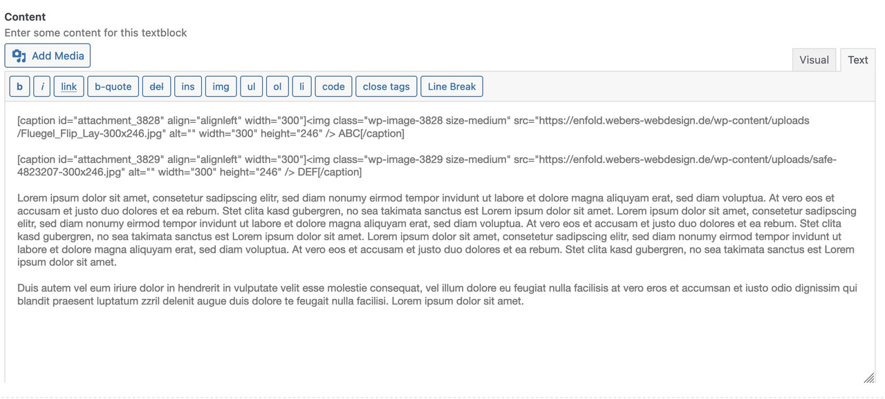
if you change it to:
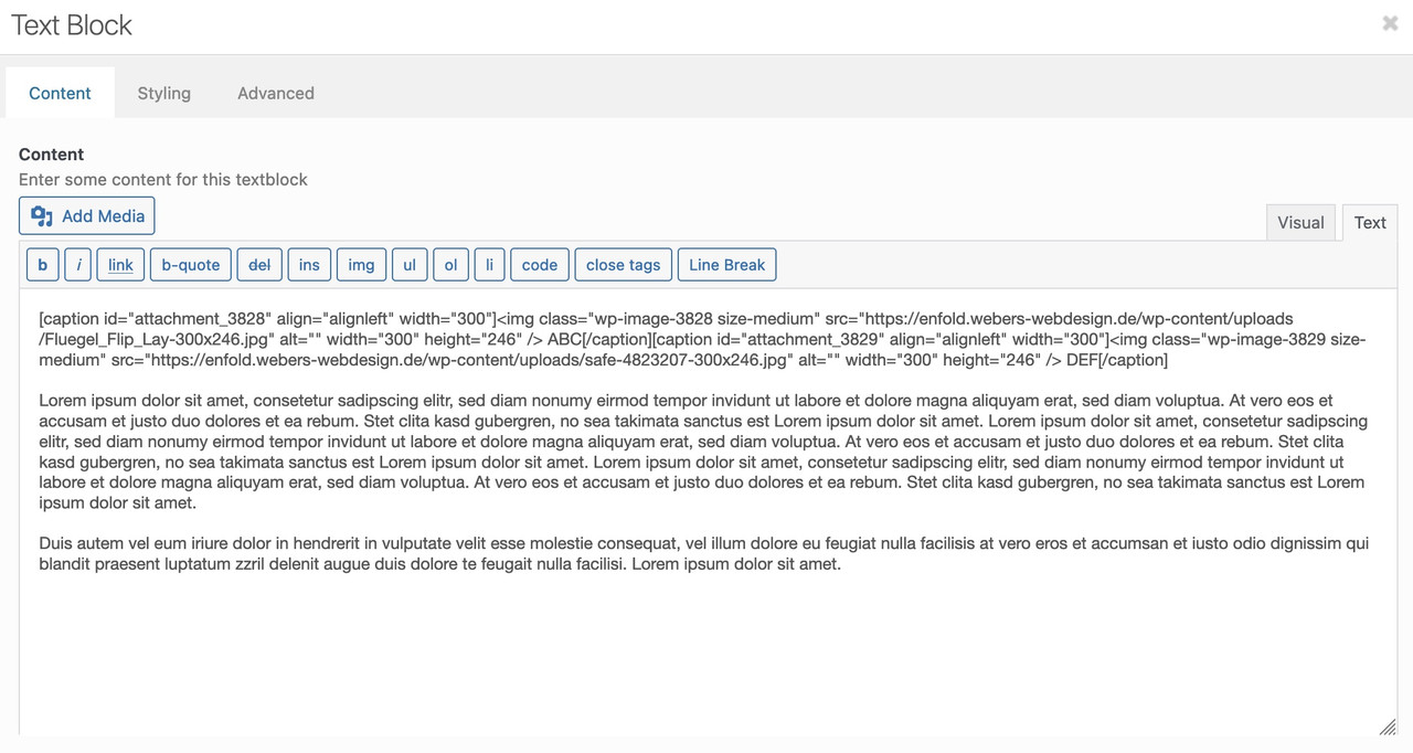
these images are besides each other. BUT editing that text-block again – it will again place that return.
see example page from above: https://enfold.webers-webdesign.de/magoo/see comment inside the css rule – a change to a different display is not possible – allthough the selector is more specific and rule is set to important.
______
now to your accordion. Can you show us a page it concerns? but at least one of the Enfold sample pages?yes – read here further a bit more in detail : https://kriesi.at/support/topic/problem-with-hyphens/#post-1179376
i only changed a bit the code to not always use before and after those substitutes 3#
and i added new entries
you can see here the edited php file: https://pastebin.com/jttc230xAnd – maybe your solution to similar problems can help others?
;)First – these are snippets for child-theme functions.php!
to reduce the compression level of calculated images :
/**** abstellen der von Enfold auf 100 gesetzten jpeg Qualität  *****/
add_filter("avf_jpeg_quality", "avf_set_quality_mod", 9999, 1);
add_filter("avf_wp_editor_set_quality", "avf_set_quality_mod", 9999, 1);
function avf_set_quality_mod($quality) { $quality = 55; return $quality;}
A) for WordPress image size formats
// Remove unneeded WP image sizes
// Remove default image sizes here.
function prefix_remove_default_images( $sizes ) {
// do NOT remove small and medium sizes, they are used in backend Media Library!
// unset( $sizes['small']); // 150px
// unset( $sizes['medium']); // 300px
 unset( $sizes['large']); // 1024px
 unset( $sizes['medium_large']); // 768px
 return $sizes;
}
add_filter( 'intermediate_image_sizes_advanced', 'prefix_remove_default_images' );
B) for Enfold image size formats
function remove_enfold_image_sizes() {
// do NOT remove widget size, is used in backend portfolio items!
// remove_image_size('widget');
  remove_image_size('square');
  remove_image_size('featured');
  remove_image_size('featured_large');
  remove_image_size('portfolio');
  remove_image_size('portfolio_small');
  remove_image_size('gallery');
  remove_image_size('magazine');
  remove_image_size('masonry');
  remove_image_size('entry_without_sidebar');
  remove_image_size('entry_with_sidebar');
  remove_image_size('shop_thumbnail');
  remove_image_size('shop_catalog');
  remove_image_size('shop_single');
  remove_image_size('shop_gallery_thumbnail');
}
add_action('init', 'remove_enfold_image_sizes');
After inserting these snippets you had to recalculate thumbnails – use a plugin for that
i prefer: regenerate-thumbnails-advanced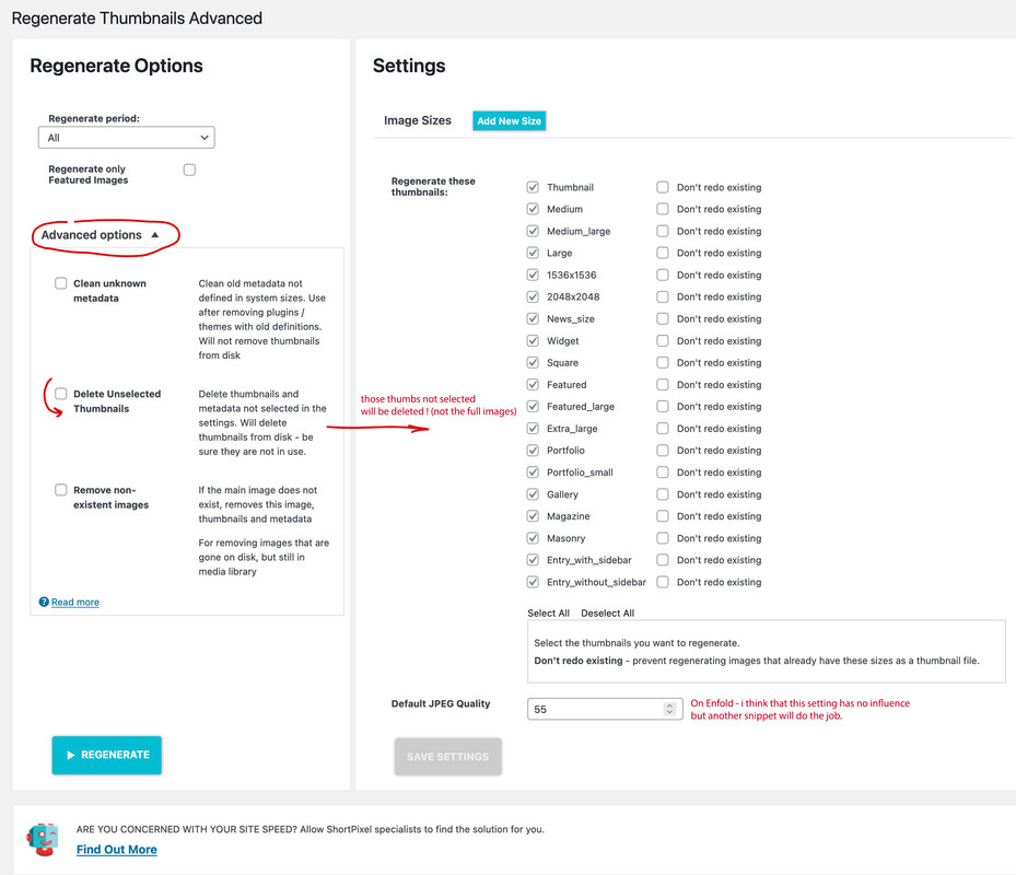
if your search results does not show too many results – you can easily increase the number of results to a high enough value – so there will be no pagination:
function enfold_search_results_per_page( $wp_query ) { if ( is_search() ) { $wp_query->query_vars["posts_per_page"] = 999; } } add_filter( 'pre_get_posts', 'enfold_search_results_per_page' );the text inside that image ?
then just take the full image as beforetry this in your child-theme functions.php:
(it avoids the generation of a link – and did not hamper only the link function – on seo reasons this might be better ):
use Ismaels solution:function av_remove_featured_image_link($image) { if (is_single()) { $image = get_the_post_thumbnail( $current_post['the_id'], 'featured' ); } echo $image; } add_filter('avf_post_featured_image_link','av_remove_featured_image_link', 10, 1);-
This reply was modified 3 years, 7 months ago by
Guenni007.
are your svg’s monochrome black?
then go to fontello.com – and drag&drop the svg’s to the input field on top of that page.
give a name to your set and download the zip from there. this zip upload to enfold.if fontello got some error warnings – f.e. on compound path – this little detour can help: https://kriesi.at/support/topic/custom-icons-showing-blank/#post-1357932
if not ( multicolor svg’s) we had to find a different solution.
but on your page – i do not see the new css code ?
the only thing i would change is the check – if there is a post thumbnail:
so change ismaels code by surrounding it with an if clause:
$searchthumb = get_the_post_thumbnail( $the_id, 'large' );
if( ! empty( $searchthumb ) ) {
	echo "<span class='search-result-counter {$counterclass}'>{$searchthumb}</span>";
}
_____________________________________________________________________________________________
i prefer to have the link on the image too and use square images : so i insert on that area instead:
$searchthumb = get_the_post_thumbnail( $the_id, 'square' );
if( ! empty( $searchthumb ) ) {
	echo "<a class='slide-image search_image' href='".get_permalink()."'><span class='search-result-image'>{$searchthumb}</span></a>";
}
my solution needs this in quick css:
.search-result-image {
    display: block;
}
.search-result-image img {
    width: 120px;
    border: 1px solid #aaa
}
a.slide-image.search_image {
  overflow: visible !important;
}
a.search_image .image-overlay.overlay-type-extern {
  left: 0 !important
}
see what it looks like on: https://webers-testseite.de/?s=portfolio
I don’t know why the breadcrumb feature that only shows the title is not practical for you – you can make it whatever you want – and for the pages that have a Transparent Header, you manually set the Title via shortcode to your first element in main.
i do not know if the get_field function is as it should. the rest of the code is ok i think
give a custom-class to your text-block element – f.e.: img-side-by-side
insert your images via add media – set for both images float left – or center or right – make one return and insert your text..avia_textblock.img-side-by-side p { display: flex; }see details on: https://enfold.webers-webdesign.de/magoo/
do you like to insert it manually with a shortcode?
this to child-theme functions.php :function insert_page_title_shortcode() { $page_title = "<h1 class='main-title'>". get_the_title() ."</h1>"; return $page_title; } add_shortcode( 'page_title', 'insert_page_title_shortcode' );and use as :
[page_title]
change h1 to whatever you like.for the automatic insertion we have to know where it should be placed.
There will be jQuery methods or using some hooks – or you can edit the page templates and have child-theme versions of them
There is a problem with pages that then needs to be solved: how to deal with transparent headers – how to deal with fixed header etc. ppis there a page where i can see the issue?
Please remember that I am a participant like you – so I don’t see a private content area.the last one is easier to get –
avia_appear (a bit less fast than on testimonial)
f.e. only for the image:.team-img-container img { -webkit-animation: avia_appear 0.8s 1 cubic-bezier(0.175,0.885,0.320,1.275); animation: avia_appear 0.8s 1 cubic-bezier(0.175,0.885,0.320,1.275); }the first has more settings – there is a keyframe animation – but on addition some other settings. i will have a look on that
by the way: wouldn’t it be the best to have this no-scroll option as default value?
From my point of view, jumping to the top position has no reasonable justification.Does that new filter : avf_default_lightbox_no_scroll work like this too!
add_filter( 'avf_default_lightbox_no_scroll', '__return_true' );i do insert that to my child theme functions.php to have no scroll on both – the lighbox itself and the background.
and that sample page has no url ?
there are a lot of demos : https://kriesi.at/themes/enfold-overview/
And inside every demo page there are a lot of suppages …But you don’t need to drag&drop a heading to the layout – just place a text-block instead. And center the text of that text-block .
What do you like to do? When should animation start – on load, on hover etc. What kind of animation? …
you can use f.e.: some of the predefined keyframe animations on enfold :
https://kriesi.at/documentation/enfold/animation/#customizing-animation-for-alb-elements
animate the whole container and image too.avia-team-member { -webkit-animation: avia-btt 0.7s 1 cubic-bezier(0.175, 0.885, 0.320, 1.275)!important; animation: avia-btt 0.7s 1 cubic-bezier(0.175, 0.885, 0.320, 1.275)!important; } .team-img-container img { -webkit-animation: avia-fadein 3s 1 linear !important ; animation: avia-fadein 3s 1 linear !important; }there is a qrcode you can scan ;)
This idea is not advisable for SEO reasons. If it’s just about the sizes, font thicknesses, font transformations, etc., then you can change that via css, or various Enfold option settings.
Yes – the rule that manages the font size is set to !important – so the rule can’t override that unless you do the same – then the higher specificity decides:
#footer .widget p.widgettitle { font-size: 30px !important; font-weight: 500; line-height: 33px; }try this :
function change_lightbox_size() { return "full"; } add_filter('avf_avia_builder_helper_lightbox_size','change_lightbox_size', 10);It is difficult to give advice only from screenshots. As a semi-transparent color definition, there may be several reasons for the differences.
I would indeed do it like Mike, with one exception – I would use Enfolds columns and use the Column link right away. Since the icon box is inside the column, we have the same construct as on your example page. I would assign a custom class to the column and save the whole thing as a template (e.g. icon-box-column).
If you then need this special iconbox, you can always use it via template – and only make the adjustments then ( icon, column color ).
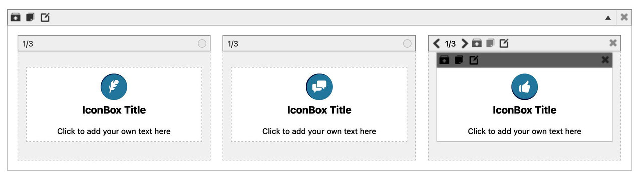
for the quick css entries and example page look: https://enfold.webers-webdesign.de/iconbox/
If you do not find nice icons on entypo-fontello iconset – use your own by uploading to fontello.com
PPS: my solution is easier to get – because it is only css and the rest will be done by Enfold alb options ;)
see example-pageThere are many places where the heading tag is predefined as h3 in the source code of enfold.
Editing all those entries and have a child-theme file is too complex.
The filter : avia_custom_widget_args will not work on those headings you like to influence.– you can try this here from Yigit : https://kriesi.at/support/topic/change-h3-tags-in-footer-widget-child-theme-of-enfold/#post-728320
and pay attention of his comment:You would need to update your widget areas.
In Shortform this will be ( and comes to child-theme functions.php ) :
function ava_re_register_footer_widgets(){
	$footer_columns = avia_get_option( 'footer_columns', '5' );
	for( $i = 1; $i <= $footer_columns; $i++ ){
		unregister_sidebar('av_footer_' . $i );
		register_sidebar( array(
			'name'		=> 'Footer - Column ' . $i,
			'before_widget'	=> '<section id="%1$s" class="widget clearfix %2$s">',
			'after_widget'	=> '<span class="seperator extralight-border"></span></section>',
			'before_title'	=> '<p class="widgettitle">',
			'after_title'	=> '</p>',
			'id'		=> 'av_footer_' . $i
		) );
	}
}
add_action( 'widgets_init', 'ava_re_register_footer_widgets', 11 );
the settings you mentioned had to be set via quick css
#footer p.widgettitle { font-size: 30px; font-weight: 500; line-height: 33px; }(For SEO reasons, this will probably be the better method. )
July 21, 2022 at 9:38 am in reply to: ALB for any post type (LearnDash). Spacebar doesn't work #1358979maybe offtopic – but on ajax search input field – i hampered the return key by this – so that you can not go to search results page by pressing return key.
function disable_enter_key(){
?>
<script type="text/javascript">
(function($) {
  $(document).on('keypress keydown keyup', '#searchform', function(e) {
    if(e.keyCode == 13) {
    e.preventDefault();
    return false;
    }
  });
})(jQuery);
</script>
<?php
}
add_action('wp_footer', 'disable_enter_key');
keyCode for Space is 32 – I don’t know if it is possible that a keyCode == 32 is accidentally suppressed on your installation.
-
This reply was modified 3 years, 7 months ago by
-
AuthorPosts