Forum Replies Created
-
AuthorPosts
-
entypo fontello ist der Font Icon Set den Enfold nutzt. All diese netten kleinen Symbole. Da es von deinem Server gehostet ist – also nicht über Dritte werden auch keinerlei daten eingeholt oder versandt. Somit ist das rechtlich o.k.
Bei Loom : ich nehme an, du nutzt den Browser Chrome denn: “loom” ist eine Erweiterung für den Chrome-Browser.
Glaube das ist ein Screencapture AddOn für den Chrome Browser.Seit Ihr Euch sicher, dass die auch über Enfold eingeladen werden? Einige Google Ads kommen auch gerne mit eigenen Schriften daher. Google Maps, Google Analytics etc. pp.
Ausserdem könnte auch im Advanced Layerslider in den Advanced Settings die Google Font Unterstützung aktiviert sein.
Frage : habt Ihr denn auch diese ( Sonderzeichen der ) Schriften mit heruntergeladen bei Google?
Befindet sich eines der beiden Snippets in eurer child-theme functions.php:// etwas neueres Snippet mittels filter function my_output_google_webfonts_script( $activate ){ return false; } add_filter( 'avf_output_google_webfonts_script', 'my_output_google_webfonts_script', 10, 1 );-
This reply was modified 3 years, 3 months ago by
Yigit.
Thanks Yigit – Good Idea
August 25, 2022 at 5:44 pm in reply to: Wie kann ich beim BLOG Hinterlasse einen Kommentar in Sie Form ändern? #1362821Wie gesagt Groß und Kleinschreibung beachten – die zu ersetzende Phrase muss genau so übernommen werden wie sie ist.
Case-sensitiv.August 25, 2022 at 3:27 pm in reply to: Wie kann ich beim BLOG Hinterlasse einen Kommentar in Sie Form ändern? #1362796die Methode oben erkennst du ja – also dann stattdessen:
function my_text_strings( $translated_text, $text, $domain ){
switch ( $translated_text ){
    case 'Dein Kommentar'          :  $translated_text = __( 'Ihr Kommentar', $domain ); break;
    case 'Hinterlasse uns Deinen Kommentar!'    :  $translated_text = __( 'Hinterlassen Sie uns Ihren Kommentar!', $domain ); break;
  }
  return $translated_text;
}
add_filter('gettext', 'my_text_strings', 20, 3);
August 25, 2022 at 3:17 pm in reply to: Wie kann ich beim BLOG Hinterlasse einen Kommentar in Sie Form ändern? #1362794Es ist wichtig, dass auch Groß/Kleinschreibung beachtet wird bei dem was ersetzt werden soll.
Das hier in die child-theme functions.php:function my_text_strings( $translated_text, $text, $domain ){ switch ( $translated_text ){ case 'Hinterlasse einen Kommentar' : $translated_text = __( 'Hinterlassen Sie einen Kommentar', $domain ); break; case 'Hinterlasse uns Deinen Kommentar!' : $translated_text = __( 'Hinterlassen Sie uns Ihren Kommentar!', $domain ); break; } return $translated_text; } add_filter('gettext', 'my_text_strings', 20, 3);den ersten Ausdruck finde ich nämlich nicht in meiner de_DE_formal.po
das steht für : Leave a Reply – Dein Kommentar
und nur in der informellen Sprach Datei steht da was du oben geschrieben hast.erneuere falls du das Merging bei Performance angestellt hast die css und js files. Lösche den Cache der Browser und eventuell vorhandener Caching Tools.
sorry – right answer to wrong post ;)
I still haven’t grasped the benefit of it all. Should the displayed page be displayed without header and navigation, without footer – that would make relatively little sense
_______
if you only like to insert a page content to another page:
Why not creating that target page – and embed that page with ALB Element “Page Content” – opening that target.
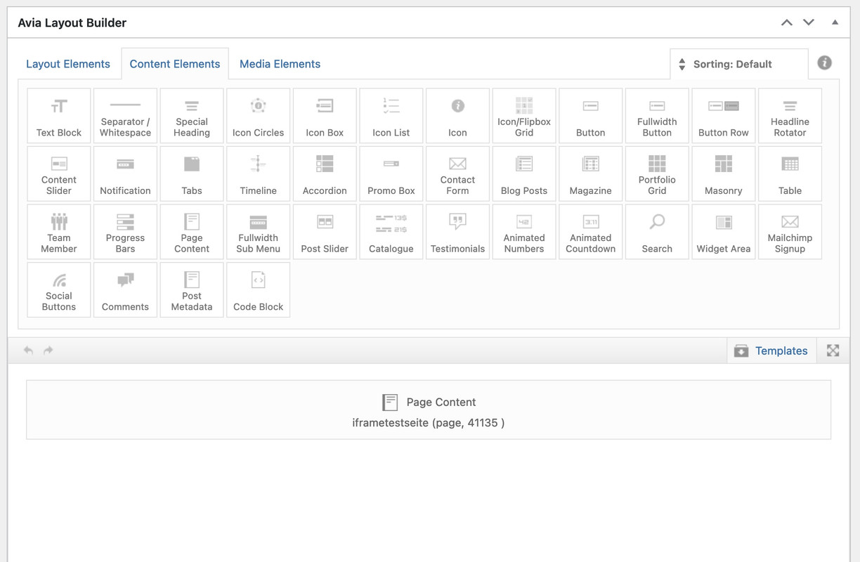
see here: https://enfold.webers-webdesign.de/schweg33/
PS: the content (code snippets ) of that iframe page has nothing to do with your topic. It is just an example page placed on another enfold page.-
This reply was modified 3 years, 6 months ago by
Guenni007.
ENFOLD > MAIN MENU > BURGER/MOBILE MENU STYLING > Flyout Width settings – still does not work.
so there must be something else – maybe a caching issue?
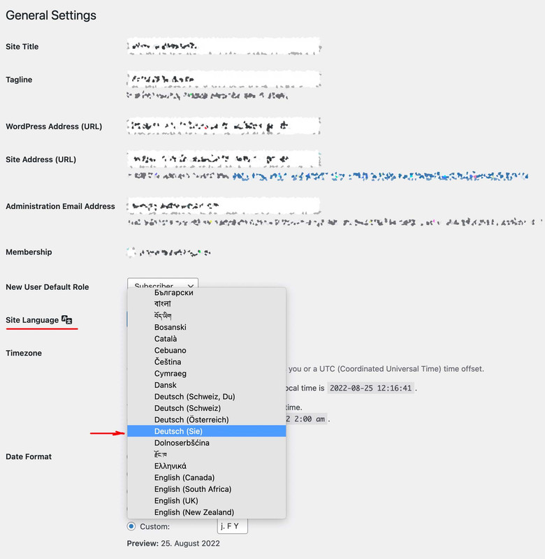
August 25, 2022 at 12:35 pm in reply to: Wie kann ich beim BLOG Hinterlasse einen Kommentar in Sie Form ändern? #1362773zunächst übernimmt Enfold die Sprache von der eingestellten WordPress Sprache.
Wenn Du also die informelle Deutsche Version unter Dashboard – Einstellungen – Allgemein gewählt hast nimmt auch Enfold die informellen Sprachfiles.
Um Übersetzungen zu verändern, kannst du die Lang Files im enfold/lang/ ordner bearbeiten, und diese als child-theme files hochladen.
Ich würde in dem Fall die Ordnerstruktur beibehalten und einen child-theme/lang/ folder dafür erstellen. Bedenke du musst zwei Files hochladen.
Editiert wird der po file der beiden, hochgeladen werden muss allerdings noch der mo file ( po-edit generiert beide)
Die Child-Theme Lang Files werden dann geladen via child-theme functions.php:function overwrite_language_file_child_theme() { $lang = get_stylesheet_directory().'/lang'; return $lang; } add_filter('ava_theme_textdomain_path', 'overwrite_language_file_child_theme');_________________________________
Soviel zu dem theoretischen Weg.
Es gibt aber die Quick and Dirty Version dazu – bitte stelle aber mal zunächst auf Deutsch (Sie) um – und poste hier dann die exakten Texte die dann erscheinen.Maybe offtopic – but i think it will be a nice idea to offer – f.e. on the documentation a download link for the icon-sets used on the demos.
Sometimes i do not want to use the medical demo – but like to use the iconset of it. ( or enfold-law etc. )But maybe it is better to do it yourself. You will find the link to the svg file on those demos by inspecting the css.
Download that svg – and upload it to fontello custom font area – activate all fonts then – name it as the original set – and download that zip file.
Now – even the woff2 is included ! Better to rename that zip file too – as the original filename is ;)As far as i can see there are:
enfold-knowledgebase, flaticon-sports, justice, light_ , medical-
This reply was modified 3 years, 6 months ago by
Zunächst – mal Nachgefragt: Dein Frontend der Neuen Seite läuft ohne Probleme, du kannst dich nur nicht mehr einloggen?
Solltest du nicht selbsttätig eine Veränderung der Login Seite gemacht haben, so wird /wp-admin zu /wp-login.php umgeleitet.
Momentan wird ja viel empfohlen, die login Seite wegen des WordPress-Test-Cookies aus DSGVO Gründen zu verlegen.
In dem Fall würde aber Duplicator das auch respektieren, und die migrierte Seite wäre dann über die neue Login Seite erreichbar.
Wird bei einer solchen Seite versucht mit /wp-admin sich einzuloggen, dann wird normalerweise eine 404 Seite angezeigt – und keine 500.
Hast Du auf die Ordner per ftp Zugriff?____________
First of all – I asked you: Your frontend of the new site runs without problems, you just can’t log in anymore?
If you have not manually made a change to the login page, then /wp-admin is redirected to /wp-login.php.
At the moment it is much recommended to relocate the login page because of the wordpress test cookie for GDPR reasons.
In that case, however, Duplicator would respect that as well, and the migrated page would then be accessible via the new login page.
If you try to login to such a page with /wp-admin, then normally a 404 page is displayed – and no 500.
Do you have access to the folders via ftp?hey Mike – if you have tested it on one of your domains – is it possible to see that test page?
I still haven’t quite figured out what the goal of such an intention is.
A button page should open in the lightbox (here in an iframe) – and what should be opened there by clicking on the buttons?Did you test it on that live Site? Because all my desktop Browsers ( Chrome, Safari, Firefox Developer, Opera ) will do the job in developer tools.
Even if i let shrink the browser window just before hamburger is active:

Was muss wohl mit einem Bild passieren, wenn es in der Breite 100% einnimmt, aber immer voll zu sehen ist, und nicht gestaucht wird?
Sein Seitenverhältnis also gleich bleibt!Wenn du nun umfangreichen Content innerhalb dieses Containers ( z.B.: einer Color-section ) hast, wird dieser dann immer Platz habe innerhalb einer schrumpfenden Höhe?
try this in your quick css :
#top #header .avia_mega_div > .sub-menu { display: flex !important; flex-flow: row nowrap; justify-content: space-evenly; margin: 0 !important; padding: 0 !important; } #top #header .avia_mega_div > .sub-menu > li { flex: 0 1 22%; padding: 2% 0 !important; }be more specific on the selector:
#top #avia-menu > li > a  > .avia-menu-text {
  text-shadow: -1px -1px 0 #000, 1px -1px 0 #000, -1px 1px 0 #000, 1px 1px 0 #000;
  color: #FFF;
}
the > indicates a direct child of the element
The whole thing was introduced in Enfold to achieve better page performance. You can find it under Enfold Child – Performance : “CSS File Merging And Compression” . If it is enabled, then the theme will cache css and js each in a single file to deliver the content faster.
Then it leads to some of the inclined participants here claiming that nothing has changed after using some snippets ( css or js ).
___
You must then use the option below: “Delete Old CSS And JS Files?” to renew them. Only then changes can take effect in the frontend.
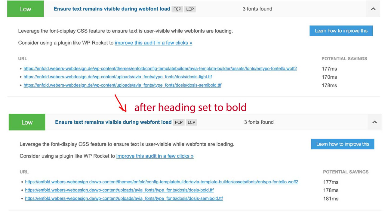
https://kriesi.at/support/topic/font-weights-all-400-when-importing-font-file/#post-1362386
I had to mention that you additionally need to stop the Google Webfont script from loading.
there is a newer filter method :function my_output_google_webfonts_script( $activate ){ return false; } add_filter( 'avf_output_google_webfonts_script', 'my_output_google_webfonts_script', 10, 1 );arbeitest du mit einem Child-Theme?
Hast du wenn du die Option Merged Styles und Scripts nutzt, diese erneuert?=-
This reply was modified 3 years, 6 months ago by
try:
function custom_post_slider_entry_excerpt( $excerpt, $prepare_excerpt, $read_more, $entry, $obj_post_slider = null ){
  $modify = true;
  if( $modify ){
    $new_excerpt_length = 50;
    $excerpt = substr( $excerpt, 0, $new_excerpt_length ) .  ' …';
  }
  return $excerpt;
}
add_filter( 'avf_post_slider_entry_excerpt', 'custom_post_slider_entry_excerpt', 10, 5 );
Edit : no that will be too easy.
just a moment …
can you try this instead:
i think that all these blog views are influenced by postslider.php – and there is that filterfunction custom_post_slider_entry_excerpt( $excerpt, $prepare_excerpt, $read_more, $entry, $obj_post_slider = null ){ $modify = true; if( $modify ){ $new_excerpt_length = 50; $excerpt = substr( $excerpt, 0, $new_excerpt_length ) . $read_more; } return $excerpt; } add_filter( 'avf_post_slider_entry_excerpt', 'custom_post_slider_entry_excerpt', 10, 5 );on original language it is : “Open Message Bar” – guess it is for reopening the privacy settings.
it is that option under advance options: “Show reopen badge”So you got the formal language German with “Sie”
What you always can do is in child-theme functions.php:
function my_text_strings( $translated_text, $text, $domain ){
    switch ( $translated_text ){
        case 'Nachrichtenleiste öffnen'          :  $translated_text = __( 'Öffne die Datenschutzeinstellungen', $domain ); break;
        case 'Öffnen Sie die Nachrichtenleiste'  :  $translated_text = __( 'Öffnen Sie die Datenschutzeinstellungen', $domain ); break;
    }
    return $translated_text;
}
add_filter('gettext', 'my_text_strings', 20, 3);
hier sind mal beide Fälle aufgeführt – der erste Fall ist die Übersetzung des informellen “Open Message Bar” – der zweite Fall des formellen
was Du auch machen kannst ist natürlich die lang Files bearbeiten und als child-theme lang files hochladen.for those who are interesed in : forwarding the category of posts , taxonomy of portfolio-entries and tags on both as class to the body in single posts:
function add_tags_to_body_class( $classes ) {
global $post;
	if( is_single() && ( $posttags = get_the_tags($post->ID))){
	    foreach( $posttags as $posttag ) {
	        $classes[] = 'tag-' . strtolower($posttag->name);
	    }
	}
	if(is_singular('post') &&  ($postcats = get_the_category($post->ID))){
	    foreach( $postcats as $postcat ) {
	      $classes[] =  'cat-' . strtolower($postcat->category_nicename);
	    }
	}
	if(is_singular('portfolio') && ($postterms = get_the_terms($post->ID, 'portfolio_entries'))){
	    foreach( $postterms as $postterm ) {
	      $classes[] =  'term-' . strtolower($postterm->slug);
	    }
	}
	return $classes;
}
add_filter( 'body_class', 'add_tags_to_body_class' );
and having those classes on the article.slide-entry in f.e. blog grid or masonry see postslider.php code on https://pastebin.com/F9KPRkxQ
( changed lines 902ff )
You will then have the possibility to set different appearance of the postings within the blog based on the source using the selectors.So the ulterior motive is that the provenance (category, keywords, taxonomy) is passed on when these posts are listed on a blog; and that the individual posts themselves can also be styled according to their belongings.
a paragraph is a p-tag not a h-tag not li etc.
Inside toc there are p-tags. but thats why i set the selector to find the first p-tag inside: entry-content and they have to be direct child p-tags (thats indicated by the > p )
the substitute line on the bottom is for the third p-tag inside entry-content:
(var targetElement = $(this).find('.entry-content-wrapper .entry-content > p:nth-of-type(3)');)insertBefore is what it says – and insertAfter … ;)
just try that snippet in your child-theme functions.php. If you are not satisfied – you can get rid of it immediately.try:
function move_featured_image_to_first_paragraph(){
?>
<script type="text/javascript">
window.addEventListener("DOMContentLoaded", function () {
(function($) {
        $('.single .post-entry').each( function() {
            var featuredImage = $(this).find('.big-preview.single-big');
            var targetElement = $(this).find('.entry-content-wrapper .entry-content > p:nth-of-type(3)');
            $(featuredImage).insertAfter($(targetElement));
        });
})(jQuery);
});
</script>
<?php
}
add_action('wp_footer', 'move_featured_image_to_first_paragraph');
and play with that numer x inside nth-of-type(x) and see what happens
(if you merge the js and css – do not forget to refresh those files )My test on developer tools: https://vimeo.com/742138679
or – if it is only the color that disturbs you – set your html to:
html { background-color: #000 !important; }I had written my own plugin a long time ago. But through your request I became curious if it works with Enfold methods in the meantime.
Through the transfonter page it is even possible to upload the font styles as a family, – and upload them all at once as a family.
And as you can see from the picture, only the fontstyles that are used are loaded.
_____
see here with italic font style
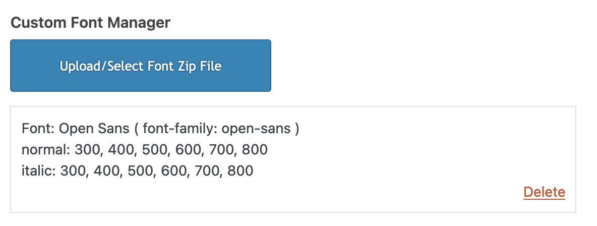
i do load my selfhosted fonts – in that way – without going the way by font upload on Enfold Options.
But if you like to use that.
Download it from Google fonts page – a ttf will be enough.Upload these ttf ( yes all at once ) to : https://transfonter.org/
As Fallback let the ttf stay in the newly generated zip file and add woff and woff2 ( on my opinion that would be enough )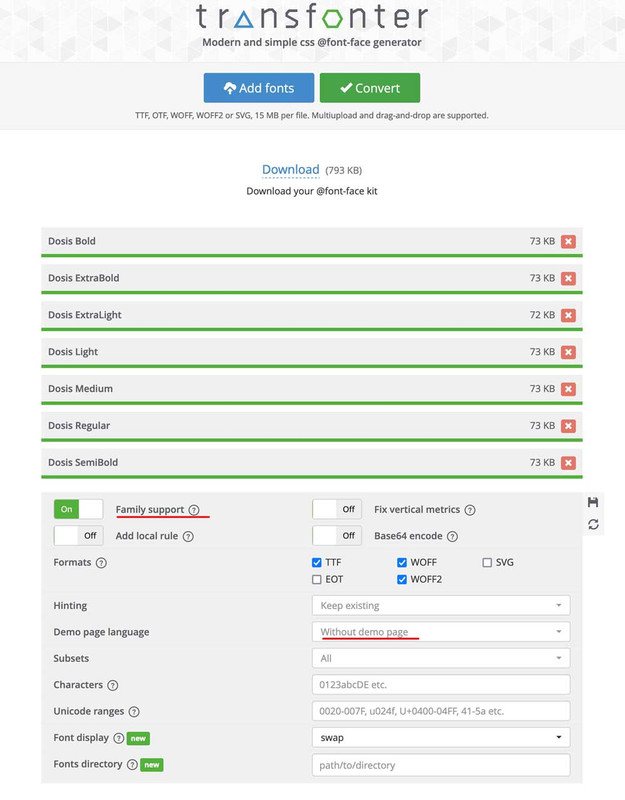
Download the generated zip file : rename it to your wanted font name – upload it to enfold via Custom Font Manager
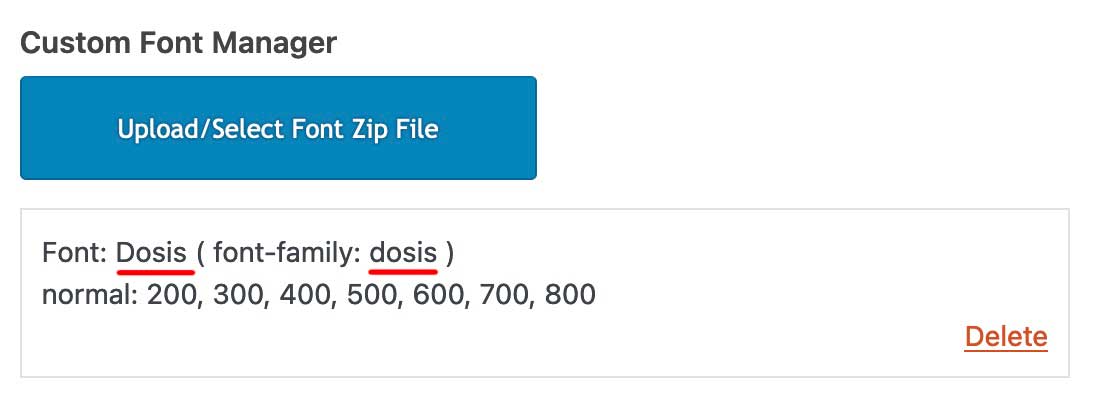
just for info – inside the tranfonter zip file ( exclude the demo page ) are those fonts and one stylesheet. But you can upload that zip to the font-manager as it is – the css will be ignored.
-
This reply was modified 3 years, 3 months ago by
-
AuthorPosts