Forum Replies Created
-
AuthorPosts
-
thanks Yigit: I know that manual setting is successful. As described above.
The workflow is to manually upload the variable font – and upload the fallback fonts via the Custom Font Manager.
Then using@supports (font-variation-settings: normal) {to set the switch.
But it would be easier on inserting the variable font to font options will preserve all Variable Properties.
PS: as said above – The fontuploader preserves all properties – ( because after uploading – i download the font via ftp from /wp-content/uploads/avia_fonts folder and test it on https://wakamaifondue.com/beta/
by the way – have a look what happens to your divider if on that page :
#top.page-id-5864 #av_section_1 .avia-divider-svg-top { transform: scaleY(-1); -webkit-transform-origin: center top; transform-origin: center top; z-index: 40; pointer-events: none; } #top.page-id-5864 #av_section_1 .avia-divider-svg-top svg { fill: #000; }next tip:
wenn du im Hamburger Menü nur eines der Untermenüs zeitgleich angezeigt bekommen möchtest:das hier in die functions.php
function only_one_submenu_open_on_burger(){
?>
<script>
window.addEventListener("DOMContentLoaded", function () {
	(function($) {
	  $('body').on( 'click touch', '.av-active-burger-items > a', function () {
	    $(this).parent('li').siblings().removeClass('av-show-submenu');
	    $(this).parent('li').siblings().find('ul').slideUp( "fast");
	  });
	  $('body').on( 'click touch', '.av-active-burger-items .av-width-submenu > a', function () {
	    $(this).closest('.sub-menu').siblings().find('li').removeClass('av-show-submenu');
	    $(this).closest('.sub-menu').siblings().find('ul').slideUp( "fast");
	  });
	})(jQuery);
});
</script>
<?php
}
add_action('wp_footer', 'only_one_submenu_open_on_burger');
in dem Zusammenhang ist eventuell besser wenn du das Menü nicht über die Höhe zentrierst.
#top #av-burger-menu-ul { vertical-align: top; padding: 150px 0 !important; }schön – ich sehe es klapt ja. Nur solltest du die Einfärbung des Menüs entweder nur auf das normal menü beschränken – oder für das Hamburger Menü extra css einführen – momentan hast du weiße schrift auf weißem Grund.
daher als Vorschlag entweder:
.header_color .av-hamburger-inner,
.header_color .av-hamburger-inner::before,
.header_color .av-hamburger-inner::after {
  background-color: #FFF !important;
}

.html_av-overlay-side #top .av-burger-overlay-scroll {
  background: #4083bb;
}

.main_menu #av-burger-menu-ul li a {
	color: #FFF !important;
}
oder:
.main_menu #av-burger-menu-ul li a { color: #0059a4 !important; } .header_color .av-hamburger-inner, .header_color .av-hamburger-inner::before, .header_color .av-hamburger-inner::after { background-color: #FFF !important; }Just for Info – no need to read
If you inspect the DOM in Chrome, for example, and click on the grid next to the grid container, the grid layout is displayed in the frontend.
Here you can see very clearly how a grid layout is structured. These hatched lines are the “gaps” – whereby you could even distinguish between row-gap and column-gap. And an ingenious feature is that gaps are only ever set between elements; if there is no neighbour, there is no gap.
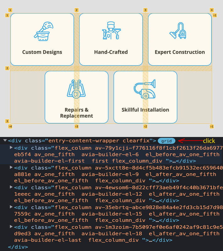
You see now with the 3 column grid that I shift the 4th and the 5th element out of the grid, by ( 50% minus half the gap value).
_________________
PS:
The numbers could also be used – e.g. by giving the first item an extension. So grid-column: 1 / 3;
would mean that the item extends from line 1 to line 3. (borrowing a little from the table layout, there is also the possibility of defining a span. Span 2 extends over 2 widths or heights.PS : i wonder about the selector of
flex_column:nth-of-type(n+6)
this is on theory wrong – but i do not see why it has to be this way.If i layout it myself you see the right selection of the 4th and 5th element in that container is
.flex_column:nth-of-type(n+4)see here the way i would layout it: https://enfold.webers-webdesign.de/navi1/
this rule here:
grid-template-columns: repeat(3, minmax(0, 1fr));means that there are 3 columns besides each other – and they will have exactly the same width.
you will often see :grid-template-columns: repeat(3, 1fr);but these columns will only have the same width if the content inside will allow that. ;)
it is much easier to select such elements if they were separated only in one surrounding container.
Means if they were alone f.e. in one color-section. – next we do not need on grid-layout or on flex-layout the need to set same height option – we can do that on different ways.
It is alway a good practice to have for special solutions a unique selector – means f.e. a unique ID or class on that surrounding container.
so now let all as it is and put this to your child-theme quick css:#top.page-id-5864 #av_section_2 .entry-content-wrapper .flex_column_table .av-flex-placeholder { display: none !important } #top.page-id-5864 #av_section_2 .entry-content-wrapper .flex_column_table { display: grid !important; grid-auto-flow: row; grid-auto-rows: 1fr; grid-template-columns: repeat(5, minmax(0, 1fr)); gap: 20px; } #top.page-id-5864 #av_section_2 .entry-content-wrapper .flex_column_table .flex_column { width: unset !important; margin: 0 !important } @media only screen and (min-width:560px) and (max-width: 989px){ #top.page-id-5864 #av_section_2 .entry-content-wrapper .flex_column_table { display: grid !important; grid-template-columns: repeat(3, minmax(0, 1fr)); gap: 20px; } #top.page-id-5864 #av_section_2 .entry-content-wrapper .flex_column_table > .flex_column:nth-of-type(n+6) { left: calc(50% + 10px) /*** just if you like to center last 2 items *****/ } } @media only screen and (min-width:320px) and (max-width: 559px){ #top.page-id-5864 #av_section_2 .entry-content-wrapper .flex_column_table { display: grid !important; grid-template-columns: repeat(2, minmax(0, 1fr)); gap: 10px; } #top.page-id-5864 #av_section_2 .entry-content-wrapper .flex_column_table .flex_column:last-of-type { left: calc(50% + 5px) /*** just if you like to center last item *****/ } #top.page-id-5864 #av_section_2 .entry-content-wrapper .flex_column_table .flex_column p { font-size: 17px; line-height: 24px } } @media only screen and (max-width: 319px){ #top.page-id-5864 #av_section_2 .entry-content-wrapper .flex_column_table { display: grid !important; grid-template-columns: 1fr; gap: 10px; } }5 to 3/2 to 2/2/1 screen sizes lower than 320px will end in 1 column layout.
just shrink your window size to see what happens on responsive case.so – zunächst – bitte nicht bei den Enfold Optionen unter “Main Menü” die Option : “Append Search Icon To Main Menu” auswählen. Das wäre dann nämlich die Lupe.
Wie oben beschrieben das in die child-theme functions.php:
add_shortcode('avia_search', 'get_search_form');

function avf_add_search( $items, $args ){
  if ($args->theme_location == 'avia'){
	  $search = '<li id="menu-item-search" class="menu-item menu-search menu-item-top-level">';
	  $search .= do_shortcode('[avia_search]');
	  $search .= '</li>';
    $items =  $items . $search;
  }
  return $items;
}
add_filter( 'wp_nav_menu_items', 'avf_add_search', 10, 2 );
und das hier in das quick css:
.av-main-nav-wrap > ul:first-of-type {
  display: inline-flex !important;
  height: 100%;
}

#menu-item-search {
  line-height: 30px;
  position: relative;
}

#menu-item-search #searchform {
  position: relative;
  top: 50%;
  transform: translateY(-50%);
  height: 40px;
  line-height: 40px;
}

#top #searchform > div:first-of-type {
  position: relative;
  max-width: 200px;
  opacity: 1 !important;
  display: block !important;
}

#menu-item-search #searchform #s {
  padding: 10px 40px 10px 5px;
  font-size: initial;
  background-color: rgba(255,255,255,0.85);   /*** if you like to have transparency ***/
}

#top #searchform .ajax_search_response {
  background-color: rgba(255,255,255,0.85);
  position: absolute;
  top: 45px;
  padding: 10px 0;
  width: 100%;
}
hier kannst du sogar alle Home Varianten durchgehen – passt immer ( unter Home ist das Dropdown )
4 entspricht dann deiner Header Setzung.soweit ich euch verstanden habe, wolltet ihr doch direkt das Sucheingabefeld im Menu? – und nicht die Lupe.
Nun wäre es hilfreich gewesen, ihr hättet erwähnt, dass es sich um den Header mit logo top menü darunter handelt. Denn hier hat man eine ganz andere Headerstruktur vorliegen – respektive natürlich die Selektoren sind andere.Ich werde mir mal so einen Header jetzt setzen um zu sehen, welche Selektoren hier zu nehmen sind.
_______________
as far as I understood you, you wanted directly the search input field in the menu? – and not the magnifying glass.
Now it would have been helpful, you would have mentioned that it is the header with logo top menu below. Because here you have a completely different header structure – respectively of course the selectors are different.I will set me times such a header now to see which selectors are to be taken here.
sorry i could not see private content as participant.
i use on some installations events manager – and the post-type for it is : event
not eventsDid you work with a child-theme or only parent theme ?
If you work with parent theme only – the very beginning of functions.php seems for me not the best position.I would recommend to insert it in between the comment and the last line:
there is a comment :/* * register custom functions that are not related to the framework but necessary for the theme to run */ require_once( 'functions-enfold.php' );i think your snippet is for using the alb editor on single events ( i do not use it with events – because content is set in the plugin itself )
you have to use both snippets.please have a look to that color-section with ID: #color_section
it is only visible on smaller screens – i guess you have set for it a negative padding via css. Paddings are always positive – maybe that is the reason for that sign.then there is no color : #transparent – it is only : transparent
you set it for : .text-overlaynext: justify-content is only for flex containers ( display: flex – or inline-flex )
if you even have no links on that – give a custom-class to those buttons – f.e.: nobutton
and put this to your quick css :.avia-button-wrap.nobutton a { pointer-events: none; }I support the last point, but for me a button is something with a link; but you exclude that above.
So why not just go and take a 1/5 or 2/5 column – set it (or not) with background color and put heading and text in there. Done.
______
Caution now a little bit of irony
The whole thing seems to me as if you would order a pizza quattro formaggi but without cheese but with tuna.
I call it tuna pizza ;)if you place a masonry or gallery – and for that pdf a placeholder image – then enter on custom link ( as said above pdf link with addendum: ?iframe=true – then it works with lightbox too.
https://enfold.webers-webdesign.de/image-gallery/
(look at paella service pdf)by the way – searching for that old topic – : in the meantime that little orthographic mistake is gone and the animation name is now: avia_masonry_show
try this in addition : ( if it is events manager ) :
( on tribe events you had to change that array from event to tribe-events )function enable_boxes_on_events($boxes) { $boxes[] = array( 'title' =>__('Avia Layout Builder','avia_framework' ), 'id'=>'avia_builder', 'page'=>array('event'), 'context'=>'normal', 'expandable'=>true ); $boxes[] = array( 'title' =>__('Layout','avia_framework' ), 'id'=>'layout', 'page'=>array('event'), 'context'=>'side', 'priority'=>'low'); return $boxes; } add_filter('avf_builder_boxes','enable_boxes_on_events');and if you like to show events you have to choose on top: show from a taxonomy – and then events-categories ( don’t know it is on tribe events )
(sorry screenshot is on german language)

you have to pay attention to get the correct post type – is it events or event ( events manager plugin ) or tribe-events ( The Events Calendar Plugin ) etc.
yes – sorry then i misunderstood his request. I was assuming a Gallery where images and pdfs alike do not open in new window, but like images typically open in lightbox. My mistake.yes sorry then i misunderstood his request.
well, your description above is not exactly that clear. After all, Button implies that something should happen. Therefore it would be good to get a more detailed description of what the “button” should be. I think we already understood that it should not change its appearance on hover or active state, but without an event it is not a button from my point of view. I would rather call that a badge.
can you try this snippet in your child-theme functions.php:
function ava_exclude_current_post($query) {
  if(is_single()){
    $exclude = avia_get_the_ID();
    $query->set( 'post__not_in', array($exclude) );
  }
}
add_action('pre_get_posts', 'ava_exclude_current_post');
i don’t know if the sidebars are affected on this – but give it a try.
EDIT : ok i see that you linked to that post – so have you tried it?
that macosx folder comes from zipping on OSX folders with mac tools – but f.e. better zip has that option to zip for pc. All invisible files OSX generates are then excluded from zipping.
you can do that via quick css with a rule or set on advaced styling tab – and add the rule for all headings:

did you test that mike?
on my page it does open the fallback image.so embedding is already possible, but just individually: https://webers-testseite.de/pdf-on-website/.
you can also set an image and enter as a manual link : …/xyz.pdf?iframe=true – that would also go into the lightbox.
yes even if you create a post, and inside ( it is enough the standard editior ) only the pdf link with ?iframe=true and the post format on “link” sets. These posts are then also displayed as Lightobox.______
also einbetten geht schon, aber eben einzeln: https://webers-testseite.de/pdf-on-website/
du kannst auch ein Bild setzen und als manuellen link eingeben : …/xyz.pdf?iframe=true – das ginge auch in die Lightbox.
ja sogar wenn du einen Post erstellst, und innerhalb ( es reicht der standard editior ) nur den pdf link mit ?iframe=true reinsetzt und das Beitragsformat auf “Link” setzt. Diese Posts werden dann auch als Lightobox angezeigt.-
This reply was modified 3 years, 5 months ago by
Guenni007.
if it makes you feel better, I don’t see the described on any of my browsers I have installed on OSX.
The element should either hide itself with the hr element – or another theory – it could be the hidden input field (I assume this is some kind of honeypot that Enfold sets).now i test it on a real mobile device – and indeed it is present.
to test if it is the hidden input field try:#top.page-id-5319 #avia_3_1 { background-color: transparent !important; border: none !important }or it might be the missing image in an image container – it is a different place – but i do not know what mobile devices do in that case:
 September 24, 2022 at 2:47 pm in reply to: on second page of search results page some articles are not inside content #1366200
you can see here the page : https://enfold.webers-webdesign.de/blog/
you can see on the bottom that code-block. It is a part of postslider.php.
And yes – i can see that the articel tag wasn’t closed before – but i do often post parts of code elements inside that code-block element. Never before i recognised such a result. But errors never occurred on the page/post itself; only in the search results page that error occurred.So can be closed – i only test now if the error occurs with Enfold code-block element only – or if it is due to the prism script to beautify codeblock element.
September 23, 2022 at 6:02 pm in reply to: Stopping the animation of the headline rotator after the first pass #1366166i edited the file on pastebin – since 128ff there are the changes for that typewriter case.
see: https://pastebin.com/2asu1gtk
download: https://pastebin.com/dl/2asu1gtkjust replace it with the former file – and refresh all cachings and merged files
see here working : https://enfold.webers-webdesign.de/rotator-typewriter/
by the way – i recognised with light font color on dark background the animated letters with the blinking caret looks a bit strange.
this comes not from my edited js file. i will see later what css might be responsible for it.EDIT: Now i changed the file once again :
if you set to the headline rotator that custom class:once
– it will stop after one cycleif not – then you have the default behavior
September 23, 2022 at 1:57 pm in reply to: enfold schriftfarbe besuchter links / enfold font color visited links #1366123hm – i read now on Web Storage API with Window.sessionStorage or Window.localStorage – maybe there is a way to do that this manner.
Maybe we should wait here for a developer from the team to see if there are possibilities beyond a cookie.September 23, 2022 at 1:04 pm in reply to: enfold schriftfarbe besuchter links / enfold font color visited links #1366105Das Snippet ist wie üblich für die child-theme functions.php. Das andere steht ja da – für die Quick css.
Wie gesagt – solange du die Seite geöffnet läßt und externe links z.B in ein neues Fenster/Tab gehen wird dann die Klasse an dem Link erhalten. Sobald diese Seite jedoch neu besucht wird – ist alles wieder auf default. Das ist ja der Grund für Cookies – dies für die Verweildauer der Cookies zu speichern.
Das wäre jetzt hier denke ich “outside the scope of support”________
The snippet is as usual for the child-theme functions.php. The other is there – for the quick css.
As I said – as long as you leave the page open and external links e.g. go into a new window/tab then the class at the link is preserved. But as soon as this page is visited again – everything is back to default. That is the reason for cookies – to save this for the duration of the cookies.
That would now be here I think “outside the scope of support”.zunächst würde ich dir dazu raten diese Logos immer auch in den Dimensionen gleich zu halten – auch deckungsgleich innerhalb der Fläche.
Bei deinem Logo ist zwischen dem Logo mit dem Schattenwurf und dem rein blauen Logo ein Versatz und Größenunterschied.Dann ist es wohl auch keine gute Idee ein blaues Logo auf blauem Grund zu zeigen. ;) daher wäre wohl noch ein weißes Logo gut.
Ich würde wohl versuchen, dem Logo Container einen Pseudo-Container ( :after ) zu geben, und dort ein background-image mit dem weißen Logo zu setzen. bei nicht gescrolltem Header ist das normale Logo zu sehen, bei gescrolltem Header wird dieses auf opacity null gesetzt und der pseudo-container erhält dann die Opacity 1.
Beispiel code:
#top #header .logo:after {
  content: "";
  position: absolute;
  top:0;
  left:0;
  width: 100%;
  height: 100%;
  background-image: url(/wp-content/uploads/logo-IIC_Website_white.png);
  background-repeat: no-repeat;
  background-size: cover;
}

#top #header .logo:after {
  opacity: 0;
  transition: opacity 0.3s ease;
}

#top #header.header-scrolled .logo:after {
  opacity: 1;
  transition: opacity 0.3s ease;
}

#top #header.header-scrolled .logo a {
  opacity: 0;
  transition: opacity 0.3s ease;
}

/************ hier bleibt das Logo bestehen, bei anfänglich gesetzter transparenz ************/
/************ die transprenten Header haben nämlich alle an html auch eine Klasse ************/
.html_header_transparency #top #header.header-scrolled .logo a {
  opacity: 1;
  transition: opacity 0.3s ease;
}

.html_header_transparency #top #header.header-scrolled .logo a img {
  opacity: 0;
  transition: opacity 0.3s ease;
}

.html_header_transparency #top #header.header-scrolled .logo a .avia-standard-logo-sub img {
  opacity: 1;
  transition: opacity 0.3s ease;
}
das unifarben blaue Logo kannst du dann als transparentes Logo setzen.
schau mal hier:
https://enfold.webers-webdesign.de/iic/
https://enfold.webers-webdesign.de/iic2/_________________
First of all, I would advise you to keep these logos always the same in the dimensions – also congruent within the area.
In your logo there is an offset and size difference between the logo with the shadow cast and the pure blue logo.Then it’s probably not a good idea to show a blue logo on a blue background ;) so another white logo would probably be good.
I would probably try to give the logo container a pseudo-container ( :after ), and put a background-image with the white logo there. when the header is not scrolled the normal logo is visible, when the header is scrolled it is set to opacity zero and the pseudo-container then gets opacity 1.
the unicolor blue logo you can then set as a transparent logo.
See example code above. and
https://enfold.webers-webdesign.de/iic/
https://enfold.webers-webdesign.de/iic2/or you let show for all – and remove it for some pages / posts
function avf_header_setting_filter_mod($header) {
  if(is_single() || is_front_page()){
    $header['header_title_bar'] = 'hidden_title_bar';
  }
  return $header;
}
add_filter('avf_header_setting_filter', 'avf_header_setting_filter_mod', 9999, 1);
if you like to preserve showing it for portfolios – use instead this
function avf_header_setting_filter_mod($header) { if(is_singular('post') || is_front_page()){ $header['header_title_bar'] = 'hidden_title_bar'; } return $header; } add_filter('avf_header_setting_filter', 'avf_header_setting_filter_mod', 9999, 1); -
This reply was modified 3 years, 5 months ago by
-
AuthorPosts