Forum Replies Created
-
AuthorPosts
-
November 2, 2022 at 10:59 pm in reply to: Important change request for avia_google_maps_api.js! #1371156
Next option to embed a google map is using the google maps script api
and just after the
function initMap()and before the info window and markers are set – insert the code from above in that manner:var head = document.getElementsByTagName('head')[0]; var insertBefore = head.insertBefore; head.insertBefore = function (newElement, referenceElement) { if( newElement.href && newElement.href.indexOf('//fonts.googleapis.com/css?family=Roboto') > -1 || newElement.href && newElement.href.indexOf('//fonts.googleapis.com/css?family=Google+Sans+Text') > -1 ){return;} insertBefore.call(head, newElement, referenceElement); };that will work too. see: https://enfold.webers-webdesign.de/google-maps/
November 2, 2022 at 9:16 pm in reply to: Important change request for avia_google_maps_api.js! #1371152i think it is better to load it as early as possible – maybe in the head:
function no_google_font_loading() {
?>
<script>
    var head = document.getElementsByTagName('head')[0];
    var insertBefore = head.insertBefore;
    head.insertBefore = function (newElement, referenceElement){
        if(
          newElement.href && newElement.href.indexOf('//fonts.googleapis.com/css?family=Roboto') > -1
       || newElement.href && newElement.href.indexOf('//fonts.googleapis.com/css?family=Google+Sans+Text') > -1

        )

        if(newElement.tagName.toLowerCase() === 'style' && newElement.innerHTML.indexOf('.gm-style') > -1){
            return;
        }
        insertBefore.call(head, newElement, referenceElement);
    };
</script>
<?php
echo '<style type="text/css">  .gm-style * { font-family: Helvetica,Arial,sans-serif !important;}.gm-style-cc, .gmnoscreen {display: none !important}</style>';
}
add_action('wp_head', 'no_google_font_loading');
BUT: this will not work on iframe!to be continued …
November 2, 2022 at 8:08 pm in reply to: Important change request for avia_google_maps_api.js! #1371145thats right – i now try to first register the external script and enqueue then. Maybe that makes a difference. …
No effort – how do you look – if fonts are loaded from external Sources ? i do it only with developer tools – on chrome – and there are always google fonts.
And even Google Fonts Checker comes to the same result.I tested it with Borlabs Cookie Plugin deactivated – and with only Google Maps ALB.
November 2, 2022 at 2:59 pm in reply to: Important change request for avia_google_maps_api.js! #1371064nothing of the above worked on my testinstallations.
November 1, 2022 at 12:13 pm in reply to: Copyright text "- Enfold WordPress Theme by Kriesi – can this be removed? #1370886one thing to mention – you can remove it – or you can create your own backlink text:
function my_own_backlink($link){
  $no = "rel='nofollow'";
  $backlink_url = 'Backlink URL';
  $theme_string = 'Custom Backlink Text';
  $link = " - <a {$no} href='{$backlink_url}'>{$theme_string}</a>";
  return $link;
}
add_filter( 'kriesi_backlink', 'my_own_backlink', 10, 1);
October 31, 2022 at 3:42 pm in reply to: How to change the px for when the Burger menu appears? #1370821try:
@media only screen and (max-width: 1399px) {
  nav.main_menu {
    display: block !important;
  }
  #avia-menu .menu-item {
    display: none;
  }
  .av-burger-menu-main.menu-item-avia-special {
    display: block;
  }
}
PS: 1399px – This value is not obligatory, but I have made the habit to note the min-values with even values – and the max-values with odd values.
@thinkjarvis : thanks – with no third party caching tools i prefer merging css but only minify the js files for standard enfold installations.
On my recaptcha / borlabs construction i had to exclude the script from merging – otherwise it will not block properly the google addons.
with your detailed instructions i will try now the wp rocket on a testinstallation.it is masonry-1 again but not on home page
@media only screen and (max-width: 767px) {
  .responsive #top.page-id-3005 #wrap_all #main #av-masonry-1 {
    width: 100vw !important;
    position: relative !important;
    left: calc(-50vw + 50%) !important;
  }
}
to avoid that you always have to look what ID or on what page/post you are – it maybe better to give to those masonries a custom-class to have a unique selector.
@media only screen and (max-width: 767px) {
  .responsive #top #wrap_all #main .av-masonry.custom-class {
    width: 100vw !important;
    position: relative !important;
    left: calc(-50vw + 50%) !important;
  }
}
October 31, 2022 at 10:05 am in reply to: Lokale font einbindung funktioniert nicht. Google Fonts ist nicht DSGVO-konform #1370764have a look if advanced layerslider options are on google font support.
Yes – see the wood for the trees. Is it already operational blindness?
well – the great benefit of inline svg files is that they can be addressed from outside with css.
So you do not need to have here that gif behind the logo. And on scrolled header to display the one the other not.
your logo – reworked a bit with text editors will have all you need to make things visible or not – or to move parts inside the svg file.

A logo in this way you can influence by:
#header.header-scrolled svg .branding {
  opacity: 0;
  transition: opacity 1s ease;
}
Thats it – and you do not have to look for if the one image has the same dimensions as the other. One graphic for all.
you find your logo here: https://webers-testseite.de/sneakaces.svgnext is the colors – you can influence them for each page/post or transparency you like.
you have your color class – so you can decide on transparency to have a white logo
either over header class: header-transparency or :not selector#header:not(.header-scrolled) .cls0 { fill: #FFF; }have you good advices for WP-Rocket Settings? Do you put on top to Enfold merging / minification the WP-Rocket Optimization, or do you switch off those enfold performance tools.
can you post your inline popup snippet here ( please use the code tag – to better inspect the code) ?
besides that – your suggestion to solve the problem with inline popup – seems to be misleading.
What do you think you’re going to accomplish by having a page/portfolio page that exists on your website run in a lightbox? As you already mentioned, it would be better for SEO reasons to simply call the page normally. – Or are they external pages?now you got a shrinking header on mobile – did you edit your avia-snippet-sticky-header.js
( respectively your avia-snippet-sticky-header.min.js) ?
And an additional header component is present ( cart ) – maybe it is better to put that cart icon to av-logo-container navigation div.i can not reproduce that –
i’m working with macOS Monterey ( in deep it is a unix based OS ) – so – downloading from envato ( the installable nor the other ) zip File – there are no hidden files inside the zip.i put one hidden file to that directory that you can see that i do show all – even hidden files .
On ftp clients like filezilla you can force to show those hidden files – dito – no hidden files :
So I can’t tell where your files might come from.
i removed that menu-item which opens an inline popup.
That inline popup div got a unique ID and is hidden by mfp-hide class. The individual link of that item is that unique ID.The point is on that – if i’m on a page abc – the menu-item abc is highlighted ( underlined by avia-menu-fx ) – but scrolling to the position where i placed my hidden div with the ID for opening the inline-popup – both menu-items are highlighted then.
But it is not so urgent for me now – because : see the first sentence
if you are referring to those older articles – you should know that some commands on jQuery are deprecated.
so have a look to f.e.
jQuery(window).load(function( ){
// it is now:
jQuery(window).on('load', function( ){
same with :
element.on('click', function( ){look to the htaccess file on root directory of your wordpress installation.
in editor mode of that page – and you go to admin bar on top and click “Seite ansehen” ( I guess you are working with a German WordPress ) – what happend then?
– just copy the content to another page and try to save that new page.
Du möchtest für eine spezielle Seite nur die Suchfunktion einschränken – wohingegen die anderen Seite alle Beiträge/Seiten durchsuchen?
you should work on your transparency colors ( menu and logo)
for mobile it would be better to have on all headers ( transparency or not ) a black fill of your svg class.
the blinking comes from the header-bg change on transparency to non-transparency:@media only screen and (max-width: 767px) { #header .logo .cls-1 { fill: #000; } .responsive #top .av_header_transparency .header_bg { background-color:#fff; opacity:1 } }Yes, of course.
… there are no header nor footer – just borders
#top.avia-blank #main .container_wrap { border: none !important }by the way: it seems that the merging of css files in combination with minified js files have best Performance Values on my end here.
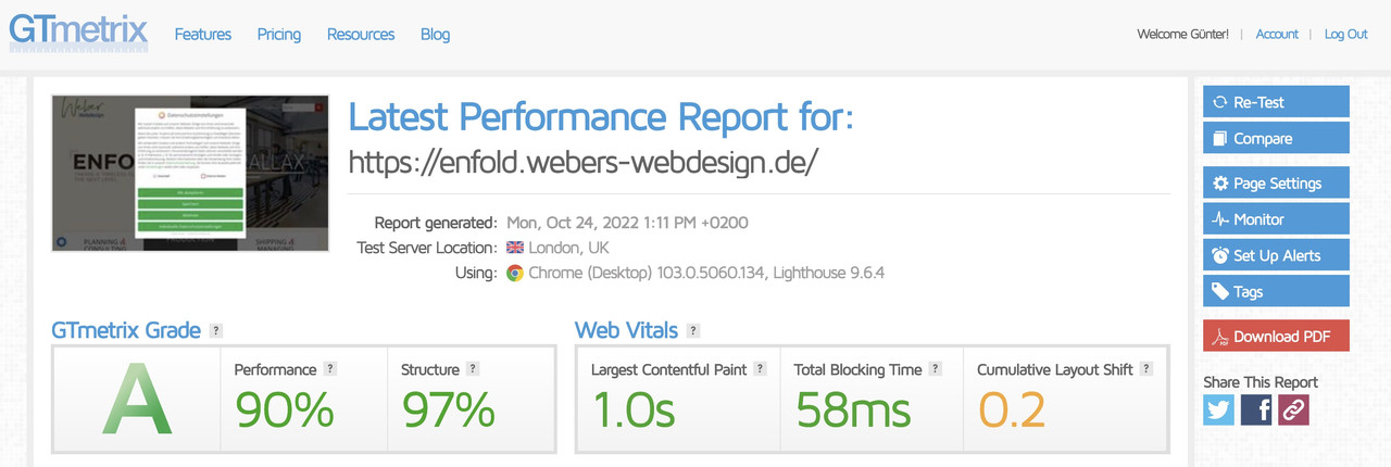
a friend told me to deactivate better the borlabs cookie to not influence the results :
ok – everything that is mentioned in functions.php had to be there for registering the child-theme:
function wp_change_sticky_header_script() {
	wp_deregister_script( 'avia-sticky-header' );

	$vn = avia_get_theme_version();
	$options = avia_get_option();
	$child_theme_url = get_stylesheet_directory_uri();

	$min_js = avia_minify_extension( 'js' );
	//  $min_css = avia_minify_extension( 'css' );  for that js - file not needed to mention here

	$condition  = ( isset( $options['header_position'] ) && $options['header_position'] == 'header_top' );
	$condition2 = ( isset( $options['header_sticky'] ) && $options['header_sticky'] == 'header_sticky' ) && $condition;
	avia_enqueue_script_conditionally( $condition2 , 'avia-sticky-header-child', "{$child_theme_url}/js/avia-snippet-sticky-header{$min_js}.js", array('avia-default'), $vn, true);
}
add_action( 'wp_enqueue_scripts', 'wp_change_sticky_header_script', 100 );
because in condition2 – condition1 is mentioned etc. vn etc.
Aha – ok
What I don’t quite understand is why it also shows up in the testimonials? Because there the assets are loaded correctly.
but you know that you can nest columns in a grid-row cell?
To have the grid-row not as full-width – you can add a snippet to your child-theme functions.php.See result and all code you need: https://enfold.webers-webdesign.de/grid-row-special/
PS: with no gap – there will be no gap !
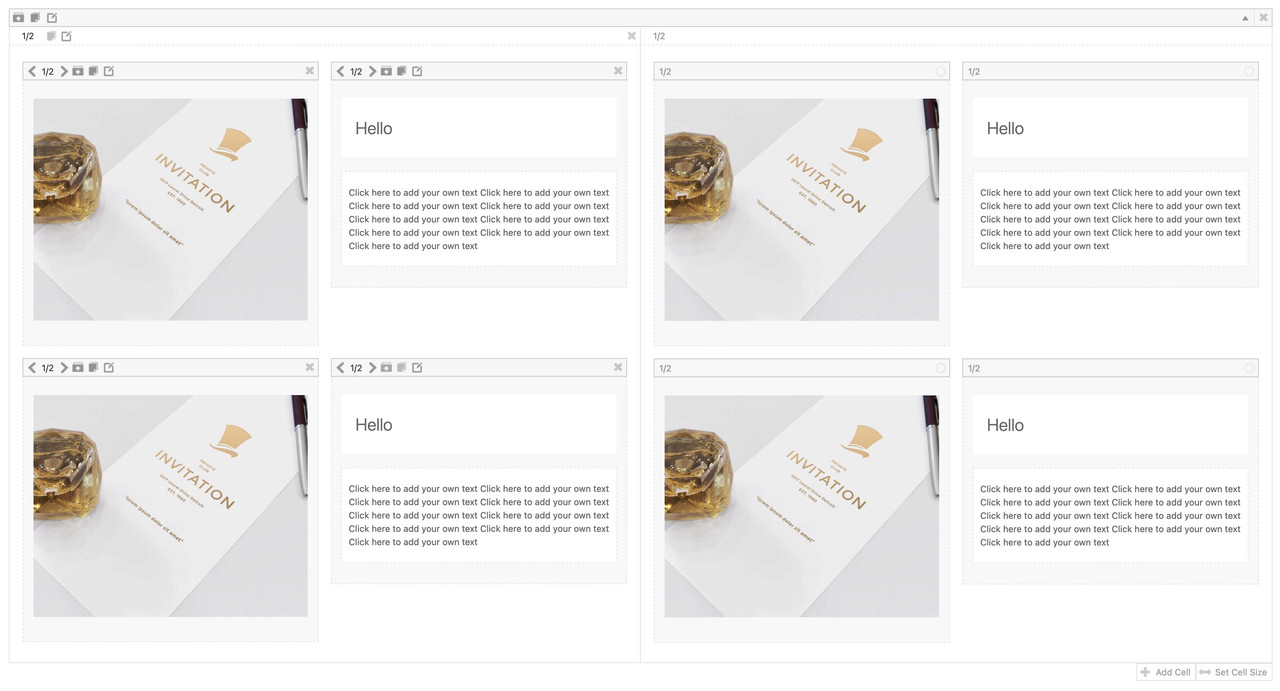
I prefer to have here 1/4 cells besides each other and style them by grid layout.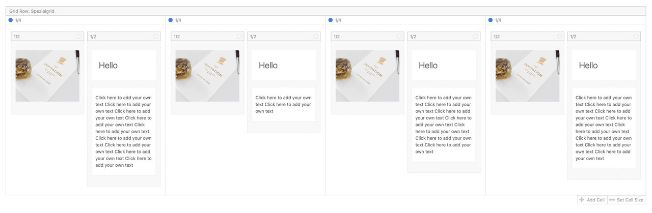
but you can also style it as 1/2 Cells this way:
 October 23, 2022 at 3:36 am in reply to: How to remove a section not visible on Edit page – and not in the footer #1369840
that too was my thought first – but it is not declared in the DOM as footerpage. In this case the inserted div got the ID : footer-page.
But on his DOM no such div.yes this is clear – but in the case above we have on functions.php the case of having conditions.
deregister will be as it was before – but register the child-theme file ?avia_enqueue_script_conditionally( $condition2 , 'avia-sticky-header', "{$template_url}/js/avia-snippet-sticky-header{$min_js}.js", array( 'avia-default' ), $vn, true );how to have here a child-theme pendent – if we want to offer both ( minified file and standard file) ?
-
AuthorPosts