Forum Replies Created
-
AuthorPosts
-
The rule above (with that selector: .av-3u8al6m-c0ee0906d6701a1a694ba457aa6b60d7 ) shows me that it is set in the Element itself.
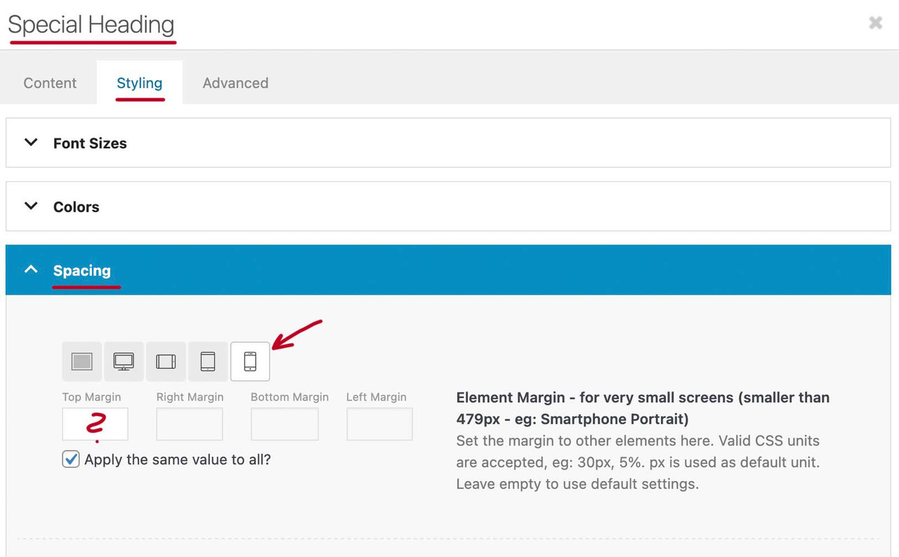
so please open the heading element – navigate to the styling Tab and open Spacing. The last icon represents the mobile version with less than 479px. ( see that image from https://kriesi.at/support/topic/fix-header-on-mobile-view/#post-1497051)
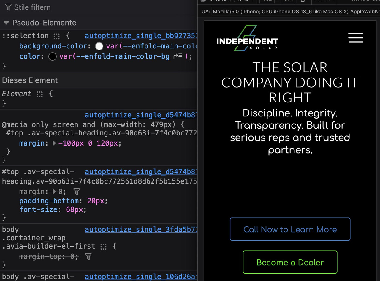
You can erase the bottom-margin (120px) – but my recommendation is not to shift that block by only the heading. Removing the 120px at bottom margin will solve that issue – but then a big space below will follow.
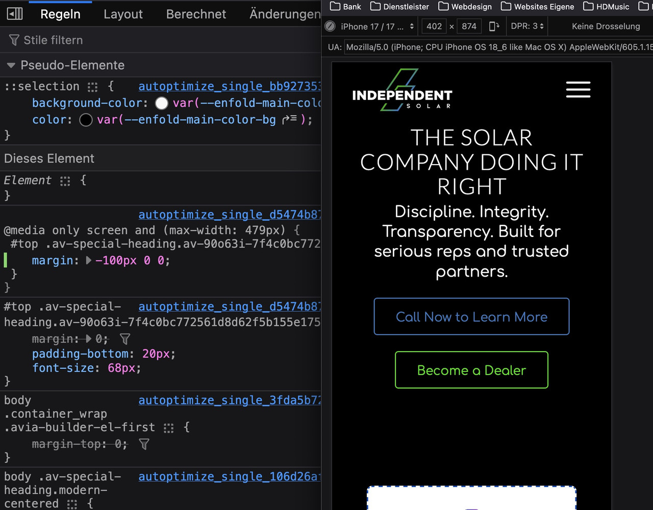
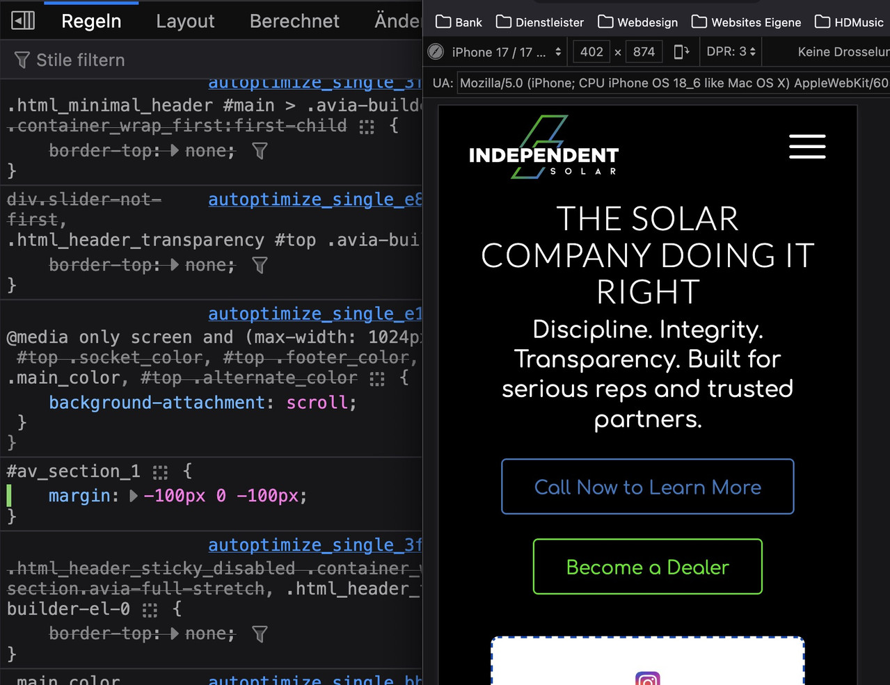
So do not shift the heading – try to influence the whole color-section in the element itself. Same Tab and last icon .
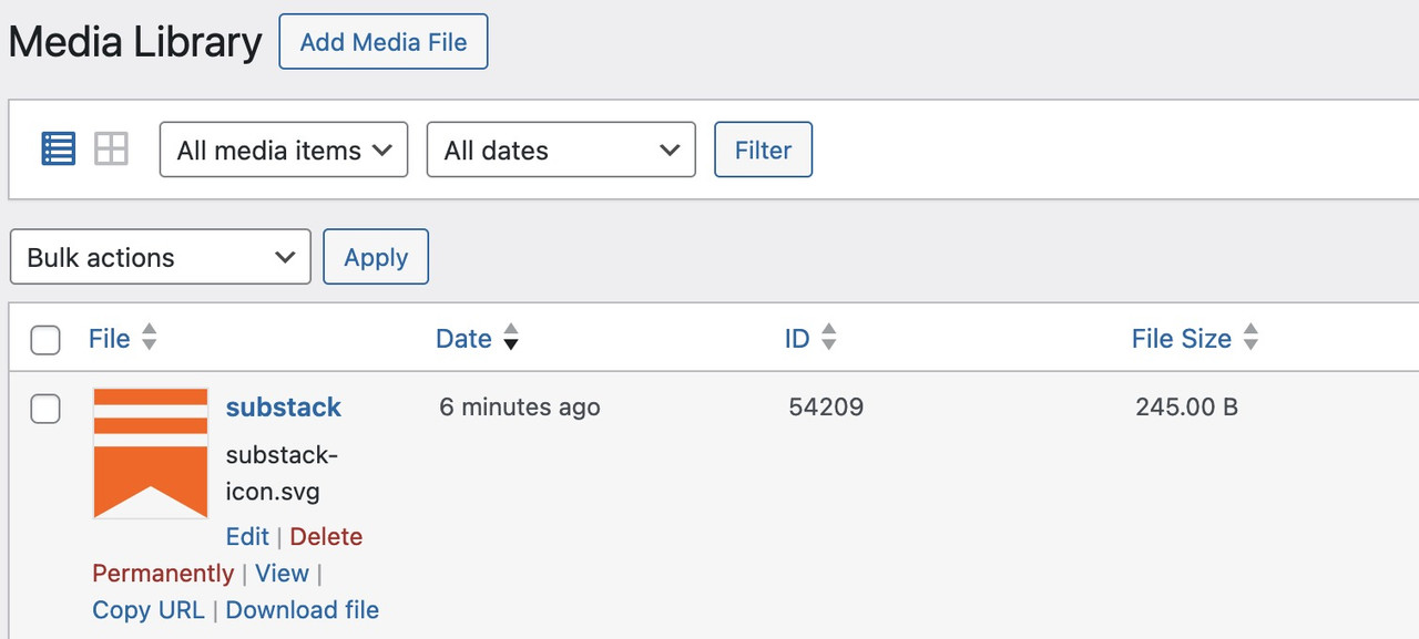
since we can have icons from the media library – upload the svg file- maybe from here : https://uxwing.com/substack-icon/
goto list view in your media library and copy the id of that svg file. ( in my case it is : 54209)
then enter on your child-theme functions.php:
(replace with your ID)function avia_add_custom_icons($icons){ $icons['substack'] = array( 'font' =>'svg_wp-media-library', 'icon' => '54209', 'display_name' => 'Substack'); return $icons; } add_filter('avf_default_icons','avia_add_custom_icons', 10, 1); function avia_add_custom_social_icon($icons){ $icons['substack'] = 'substack'; return $icons; } add_filter('avf_social_icons_options', 'avia_add_custom_social_icon', 10, 1);for styling:
#header_meta .social_bookmarks_substack svg path { fill: var(--enfold-header-color-meta) !important; } #header_meta .av-social-link-substack:hover a { background-color: #FF681A !important; } #header_meta .av-social-link-substack:hover svg path { fill: #FFF !important; }i can see in your css:
@media only screen and (max-width: 479px) {
  #top .av-special-heading.av-3u8al6m-c0ee0906d6701a1a694ba457aa6b60d7 {
    margin: -100px 0 120px;
  }
}
it might come from a setting you have on that heading ( “The Solar Company Doing It Right”)
maybe the second margin (bottom) is not neccessary (120px)
My recommendation: don’t set the margins for mobile on the heading, but on the color-section – so the followiing grid-row can have less space too.by the way – on : https://wakamaifondue.com/
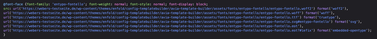
you can upload one of those font-files i created – to see what is all inside my woff2. ;)and second: if you need Main Hebrew Block (U+0590–U+05FF): Contains Alef–Tav, Niqqud (points), cantillation marks, and punctuation (e.g., Qaf). i had to include them for you.
First: Do not upload the “Open_Sans.zip” file created by Google—this ZIP archive also contains the static font files in a separate folder.
Unzip the archive, remove all unnecessary files, and keep only these two files:OpenSans-VariableFont_wdth,wght.ttf
and
OpenSans-Italic-VariableFont_wdth,wght.ttfThen zip this folder and upload it.
Then it will work. But!Secondly: It’s not recommended to offer the TTF. With WOFF2, you’ll cover 99% of all browsers—and the few users still running IE11 will just see the fallback font. The WOFF2 file is about half the size of the TTF.
Unfortunately, Google only offers the TTFs. There are tools—possibly even online tools—that can convert these TTFs to WOFF2. I’m not sure if they’ll preserve all the variable axes. I convert them via Terminal on my Mac.Third: Do you really need an explicit italic font? With OpenSans, there are essentially just a few kerning differences, and the lowercase ‘a’ becomes a single-storey ‘a’ and the little e has its own glyph styling. Otherwise, you could easily get by setting the normal font to italic via CSS.
To cut a long story short:
Why not give this font a try? I’ve removed a few language variants that aren’t used very often. However, I’ve kept many diacritical marks in the font.
(–unicodes=”U+0020-00FF,U+0100-017F,U+2000-206F,U+20A0-20CF,U+2100-214F,U+2200-22FF” )
https://webers-testseite.de/OpenSans-VariableFont.zip
(woff2: 101 an 87kb – instead of ttf: 580kb and 530kb)
_______________The range from U+0000 to U+00FF is identical to the ISO 8859-1 (Latin-1) character set. It forms the basis for the representation of text in many Latin-based languages within the Unicode standard.
one big misunderstanding is that you do not enter in those custom-class fields the classname with a dot:
Enter parking not .parkingnext: use only mp4 –
Since Enfold doesn’t allow you to enter two URLs in the input field, I assume that the webm file is provided by the host (a CDN setting) or something similar. But Safari just handles MP4 files better.
Your hosting provider (usercontent.one) may offer the option to disable the generation of WebM formats. I’m assuming you only uploaded an MP4 file to the Enfold input field.
Prefer MP4: MP4 is the “native format” for Safari.Force CDN bypass: You should try accessing the video via the actual domain, bypassing the usercontent.one proxy.
Instead of: https://usercontent.one/wp/www.rootsandjazz.dk/ …
Directly: https://www.rootsandjazz.dk/wp-content/uploads/…mp4One.com Support / Settings: They must disable the so-called “Performance Highlight” or “CDN Cache” for the /uploads/ directory in One.com. As soon as the server responds with status 206 instead of 200, Safari will play the video immediately.
First :
Cross-Origin Resource Sharing (CORS)
Safari often blocks media if it is loaded from a different domain (including a subdomain or a CDN proxy such as usercontent.one), unless the server explicitly sends the correct CORS headers.
If the main page is hosted on rootsandjazz.dk but the video comes from usercontent.one, Safari treats this as a “cross-origin” request.
If the HTTP header is missing an Access-Control-Allow-Origin: *, Safari will block the content, while other browsers are often more lenient.…
Second:
Byte-Range Requests (The Prime Suspect)
Safari requires that the server support byte-range requests for video files. This means that Safari does not request the entire file at once, but rather in small chunks.
Proxies or CDNs (such as the usercontent.one system) are sometimes configured to deliver files only as “whole” units.
If the server does not respond with a 206 Partial Content status code, Safari simply aborts the loading process.________
Next:
Check the file format: Make sure the video is encoded as H.264 MP4. Safari often has issues with unusual encodings when served via a CDN.Trial:
.htaccess configuration: If you have access to the .htaccess file, you could try explicitly allowing CORS:<IfModule mod_headers.c> Header set Access-Control-Allow-Origin "*" </IfModule>
But:
There is a 90% chance that this is due to the way usercontent.one delivers the file (byte-range support). The user should try disabling the “Performance Cache” or “CDN” for the media library in the One.com dashboard.
_____________
Here’s a quick tip: You can test this yourself by opening Safari’s Web Developer Tools (Cmd + Option + I) and checking the “Network” tab. If the status code for the video file shows as 200 OK but Safari doesn’t play the video, then support for 206 Partial Content is definitely missing.April 18, 2026 at 9:02 pm in reply to: Enfold and Custom Type Fonts Manager for variable Fonts #1496889can be closed
April 14, 2026 at 10:33 am in reply to: Background color for a specific active tab accordion element #1496802yes – but you can add a class to the accordion element itself.
then you can select by:
.togglecontainer.custom-class  .av_toggle_section:nth-child(9) .toggler.activeTitle {
  background-color: #5b9bd4;
  color: #003247;
}
so you can address even if you got multiple accordions on one page.
btw. you can select by that ID:
#toggle-my-special-toggler.activeTitle – the ID : my-special-toggler goes directly to the toggler
April 14, 2026 at 9:10 am in reply to: Background color for a specific active tab accordion element #1496795but if there are more than one toggler it would be better to select by a custom class on that Accordion Element.
custom-class will then be at the togglecontainer class : ( .togglecontainer.custom-class).togglecontainer .av_toggle_section:nth-child(9) .toggler.activeTitle { background-color: #5b9bd4; color: #003247; }April 11, 2026 at 5:48 pm in reply to: Enfold and Custom Type Fonts Manager for variable Fonts #1496736thanks – i will write an own variabel font plugin for it. not least because I also want to edit the variable fonts beforehand using python3 -m fontTools varLib.instancer
April 9, 2026 at 11:20 pm in reply to: Enfold and Custom Type Fonts Manager for variable Fonts #1496717ok – i found that function: function scan_font_files and see the setting – so a nomenklatura of the variable fonts had to be just after the last dash: variablefont – or VariableFont
if( false === strpos( $style, 'variablefont' ) )
{
	$style_info = isset( $this->google_fonts_def[ $style ] ) ? $this->google_fonts_def[ $style ] : array( 400, 'normal' );
}
so naming f.e. the font: Montserrat-VariableFont.woff2 will end in a @font-face rule :
@font-face {
  font-family:'montserrat-variablefont';
  src:url('https://webers-testseite.de/wp-content/uploads/dynamic_avia/avia_type_fonts/montserrat-variablefont/montserrat-variablefont.woff2') format('woff2');
  font-style:normal;
  font-display:swap
}
and this might be better than to have font-weight : 400
is there a way to get in that function scan_font_files the weight range given in the font?
FOIT – Flash of Invisible Text Effect
To give it a name for the sake of clarity, the effect is called “Flash of Invisible Text.” This means our text content flashes briefly after the web font has loaded. Of course, the abbreviation sounds better: FOIT (“Flash Of Invisible Text”).
The normal process is that while the font is still loading, text is automatically displayed in the system font after 3 seconds. We can speed this up using the CSS directive
font-display: swap;.However, what is intended for fonts prevents icon fonts from loading correctly—because they have no browser fallback equivalent.
Or read here for more info: https://css-tricks.com/almanac/properties/f/font-display/
if you look the rule:
#top .avia-font-entypo-fontello, body .avia-font-entypo-fontello, html body [data-av_iconfont="entypo-fontello"]::before {
  font-family: 'entypo-fontello';
}
you see what is the crux: no fallback Font – so if you swap those icon-fonts – the browser does not know what to show.
here you see the wanted behaviour by swap:
h1 {
  font-family:'opensans-flex',Helvetica,Arial,sans-serif
}
if the browser is still loading the opensans-flex files – it will show your content with Helvetica instead.
It could be a problem of font-display settings:
If you have activated the option to load the fonts by swap – then it might be neccessary to exclude those icon-font files from that.
it ist found on : Enfold Child – Performance – Show Advanced Options – Custom Font Display Behaviour.To exclude – put this to your child-theme functions.php:
function my_custom_font_display( $font_display, $font_name ){
  // List of all icon fonts that are not allowed to “swap”
  $icon_fonts = array(
    'entypo-fontello',
    'entypo-fontello-extra',
    'medical', // your custom icon-font files names
    'numbers',
    '3d-icons',
  );

  // Check whether the font name contains any of the icon terms (wildcard search)
  foreach( $icon_fonts as $icon_font ) {
    if ( strpos( $font_name, $icon_font ) !== false ) {
      return 'block';
    }
  }

  // Fallback for all other custom fonts from Enfold
  if( strpos( $font_name, 'avia-module-custom-font' ) !== false ) {
    return 'block';
  }

  return $font_display;
}
add_filter( 'avf_font_display', 'my_custom_font_display', 10, 2 );
this will then generated:
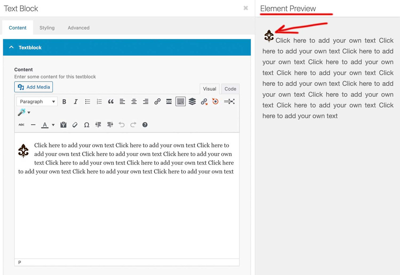
EDIT: It is incredibly difficult to transfer the size from the left side of the TinyMCE editor to the preview on the right, depending on the SVG property. And all while preserving the “floating” property.
Unfortunately, I don’t know if it’s possible to apply the size settings from TinyMCE to the preview on the right.
how did you “when i add a SVG icon to a page,”
if it is an Enfold Element like image or image with hotspot ect. – Enfold actually has CSS rules within avia-builder.css / avia-builder.min.css for these cases.
if you like to influence the preview inside textblock and backend:
you can set via child-theme functions.php that preview size.function admin_head_mod(){ echo '<style type="text/css"> .wp-admin .avia_textblock img[src*=".svg"] {width: 80px !important;height: auto !important;} </style>'; } add_action('admin_head', 'admin_head_mod');the point is the even not inline svgs need an absolute dimension ( % and auto will not work )
but:
this part where enfold loads this css for the preview window is inside: class-template-builder.php
there are filters we can use to influence the preview now.place a file custom-preview-fix.css inside enfold-child/css/
add_filter('avf_preview_window_css_files', function($css) {
    $css[ get_stylesheet_directory_uri() . '/css/custom-preview-fix.css' ] = 1;
    return $css;
}, 999);
and have inside custom-preview-fix.css:
#av-admin-preview img[src*=".svg"]:not([is-svg-img="true"]) {
  width: auto;
  height: auto;
  max-width: 100%;
  display: block;
}

#av-admin-preview .alignleft { float: left; margin: 0 20px 20px 0; }
#av-admin-preview .alignright { float: right; margin: 0 0 20px 20px; }
#av-admin-preview .aligncenter { display: block; margin-left: auto; margin-right: auto; }
April 4, 2026 at 1:23 pm in reply to: Enfold Theme Reset – Lost Options & Media / Recovery Assistance Needed #1496583Dear Mike, could you please suggest that the setting under “Enfold Child – Import/Export/… ‘Theme Reset All Options Button’” be set to “Block and hide reset all options button” by default, so that users must actively enable this option to perform the reset.
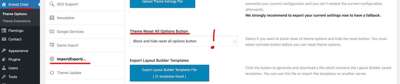
Unfortunately, this happens time and again—newcomers to Enfold fall into this trap, even despite the warning pop-up. You know how many people actually read what’s in pop-ups.
Edit: something new to me – yes Mike is right – it is the “different” mobile menue – and you choose the same menue as the desktop menue.
______________
For me a mobile Menue is always the hamburger one on enfold –But even then – there is no conflict because what is id in text-menu ist a class on hamburger menue.
My suggestion is that you use a footer-menue in this way:
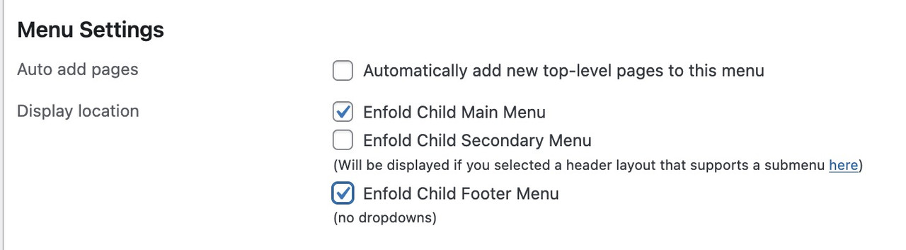
this will end in duplicate ID’s
March 31, 2026 at 9:01 am in reply to: Enfold ALB save routine strips closing tags from _aviaLayoutBuilderCle #1496457you are always talking about visual editor.
I think the safest way to add your own tags there is through Code Mode, not Visual Mode. If I want to use bold or headings, I select the words or lines and then use the TinyMCE buttons.
Here’s my test to see what happens when I manually test, for example, the
strongtag in visual mode. Only after closing and reopening the window does it interpret the text as a tag: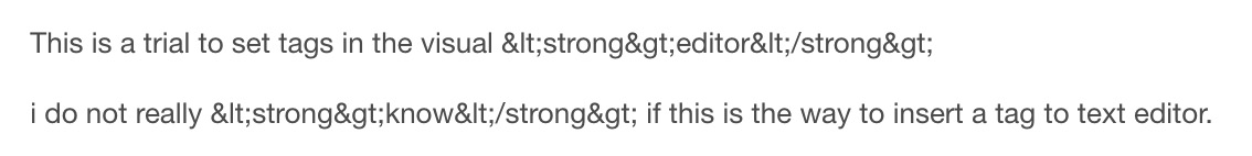
it uses first the html entities. That might be where the problem lies.
understanding that flexbox layout:
https://webers-testseite.de/flex-columns-understanding/Yes — and what I mean by that is that you can achieve consistent column heights even without using
display: table.
By the way, I’ve never understood why Enfold chose this method instead of using a true flex layout.Not really—don’t use the “equal-height” option; instead, set the “align-items: stretch” option for the flex container.
Take another look at the example page.
By the way: “align-items: stretch” is the default value on flex containers — so you don’t need to specify it explicitly._____________ just for info ______________
/* === flex container settings (default values):  === */
flex-direction: row	  /* === Side by side, not one below the other. === */
flex-wrap: nowrap   /* === Everything on a single line, no line breaks. === */
justify-content: flex-start  /* === Everything left-aligned (on the vertical axis). === */
align-items: stretch  /* === Full height (on the horizontal axis). === */

/* === Items Settings (default values):   === */
flex-grow: 0   /* === No automatic filling of empty space. === */
flex-shrink: 1  /* === Shrinking is permitted if space is limited. === */
have a look at: https://webers-testseite.de/7er-mega-div/
all you need for css is theresee my post above.
you see that image here:
https://kriesi.at/support/topic/making-the-logo-bigger-2/#post-1496150do not make it by mikes css – just use these settings on Enfold Header Options. Choose on the right custom pixel value – then the hidden input field will show – and enter 200px there – thats all.
put this to your quick css:
( or@media only screen and (min-width: 768px) {@media only screen and (min-width: 990px) { #top #menu-item-logo a { display: inline-block; transform-origin: center top; } #top #menu-item-logo img { max-height: 200px; height: 100%; position: relative; top: 50%; transform: translateY(-50%); } }after that you can decide to have more or less shrink-faktor on:
Are you using any caching tools ? They mostly got an option to clear the cache, if you edit (update) a post/page.
Next: Browser do also Cache Pages. Sometimes they deliver the cached Content. etc.i guess that these few icons (Entypo Fontello Enfold (Default)) are needed inside the enfold admin settings
allthough there is an entypo-fontello-enfold/charmap-svg.php for those icons
btw. : have a look what happens to your top divider on home page if you add this to your quick css:
#top.home #av_section_1 .avia-divider-svg.avia-divider-svg-top { transform: scaleY(-1); top: -39px; } #top.home #av_section_1 .avia-divider-svg.avia-divider-svg-top svg { fill: #FFF !important; } #top.home #av_section_1 .scroll-down-link { bottom: 25px; } -
AuthorPosts