Hi,
Thanks for the update. Please let us know if you should need any further help on the topic, or if we can close it.
Best regards,
Rikard
Hello Ismael,
Thanks for your assistance. I was able to solve this by using the button class as a trigger to open the popup instead of setting an anchor link with a #.
Consider this issue closed.
I would prefer to do a script solution so that my client can simply add buttons in the future instead of needing to use the code block. I did add the custom class of “pop-button” to the buttons that are intended to open the popup(s) but couldn’t figure out how to disable the scrolling to top.
Javascript is not my skill set. I tried several script solutions found online before contacting Enfold support and none actually worked. If you can point me to a script that does work, that is greatly appreciated. I have the plugin Code Snippets installed so I can add a script to the header or footer as needed.
-
This reply was modified 1 year, 1 month ago by
 rlhinirv57. Reason: Solved the issue
Thank you for this thoughtful response Guenni007. The issue isn’t a transparency issue, but rather the logo actually missing. I can use the emergency code you provided, but would rather find the issue if we can.
Ismael, as mentioned previously, I have added no code to the functions.php file. Am I supposed to? Enfold typically uses the main logo on desktop for the mobile version as well.
 Christian
Guest
Good morning everyone, first of all I would like to inform you that I have purchased your regular licence but it does not accept the token for my current site which is on a sub-domain for some tests and for which I would like to receive assistance before final publication.
Perhaps you do not accept the token for this subdomain?
The token is as follows: a612d7fb-9c08-4f06-8e00-979d92f3fba6
associated with the account (Email address hidden if logged out)
With the hope that this will be resolved, I am pleased to request your support in solving some problems with my site:
1. If I import the wall theme data to the child, not all of it is imported, even when managing the settings in the performance section as per the manual
2. I have called up a custom font for h1,h2,h3,h4,h5,h6 and menu, which works with all browsers except safari
3. I created the FULL WIGHT services section in the home, but in tables and smatphones it unfortunately does not respect the correct left and right margins
4. I would like to be able to manage the top and bottom margins of the widjets in the footer independently, to differentiate them on tables and smartphones
Thank you
Hi,
Please try this CSS as well:
.content {
  padding-top: 0;
}
Best regards,
Rikard
Hi,
Thanks for the update, please let us know if you should need any further help on the topic.
Best regards,
Rikard
Hi,
the threads I found about this topic are from 10 years ago so:
How can I make the icons of an icon list clickable too ?
Best regads
André
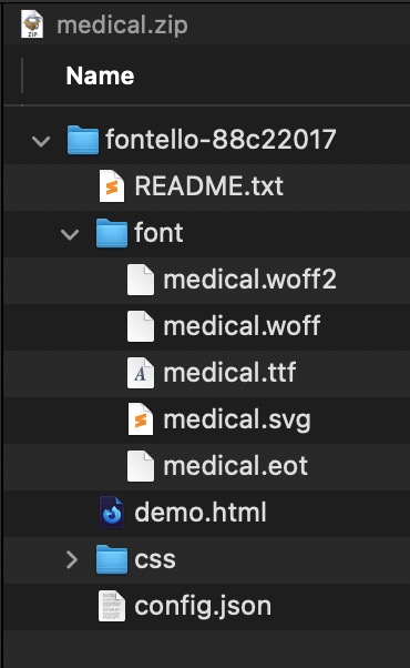
first: on fontello there is on top the option to give them a name.
second: before uploading – rename those zip files to something reflecting the icons ( as on enfold : enfold medical icons etc. )
( This is only to have in media-library a meaningfull name – not important for the function )
see: https://kriesi.at/documentation/enfold/icon#download-fontello-or-flaticon-icons-included-in-enfold-demos
PS : inside the zip-file there is a folder with fontello-123456xyz – you can leave that. important is to rename the zip file and the font on downloading on fontello.
Hey whdsolutions,
Thank you for the inquiry.
You can add this code in the Quick CSS field:
#top .av-m6p4vfy0-690d7ab656912433849d5b6fa16c29ad .av-masonry-container {
    padding-left: 12.5%;
}
Best regards,
Ismael
Sorry Ismael
now I have noticed that it is no longer correct on the desktop (PC)
link below
see printscreen desktop.png – uploaded
thanks
Hi,
Thank you for the update.
If you need to prevent the page from scrolling on “accueil-01”, please add this css code:
#top.page-id-2341 {
    max-height: 100vh;
    overflow: hidden;
    display: block;
    height: calc(100vh - 50px);
}
You may need to toggle or temporarily disable the Enfold > Performance > File Compression settings afterward.
Best regards,
Ismael
Hi,
Thank you for the info.
We added this css code to remove the gap.
#top .av-m1yjw3j3-8de8ef07635f179e0beedc245c4c38a7 + .sticky_placeholder {
    height: 0 !important;
}
Please make sure to purge the cache before testing the page.
Best regards,
Ismael
by the way – with that enormous main navigation menu – you had to break to the hamburger much earlier:
@media only screen and (max-width: 1200px) {
    #top #header .av-main-nav > li.menu-item  {
        display: none!important;
    }
    #top #header .av-burger-menu-main {
        cursor: pointer;
        display: block!important;
    }
}
it seems that you have all pages with transparency option ?
so you can overwrite the behaviour to show now the alternate logo anyway. on all mobile devices
This is merely an emergency solution now
.responsive.avia_mobile #top .header_bg {
  opacity: 0.1;
}

.responsive.avia_mobile #top #header:not(.av_header_transparency) .header_bg {
  opacity: 1;
  background-color: rgba(0,0,0,0.2) !important;
  -webkit-backdrop-filter: blur(5px);
  backdrop-filter: blur(5px);
}

.responsive.avia_mobile #top .av_alternate_logo_active .logo a > img,
.responsive.avia_mobile #top .av_alternate_logo_active .logo a > svg {
  opacity: 0;
  width: 200px
}
.responsive.avia_mobile #top  .logo img.alternate,
.responsive.avia_mobile #top  .logo .subtext.avia-svg-logo-sub {
  display: block;
  opacity: 1;
}
.responsive.avia_mobile #top  .logo img.alternate,
.responsive.avia_mobile #top  .logo .subtext.avia-svg-logo-sub {
  display: block;
  padding: 10px 0;
}

.responsive.avia_mobile #top .logo img.alternate,
.responsive.avia_mobile #top .logo .subtext.avia-svg-logo-sub svg {
  top: 50%;
  transform: translateY(-50%);
}
nevertheless – you had to find the reason for that url mismatch – and why the normal logo could not be overwritten by a new uploaded one.
there is no entry in your child-theme functions.php that uses the filter :
avf_logo – and you also have no entry regarding $logo ?
on default Enfold handles to show on mobile the normal logo – because they give up the transparency setting and have a white background on logo container. So you must have some css code to force transparency and to set #main to padding-top: 0
that is the reason why they show the normal logo allthough the header is set to transparency.
see demo behaviour on mobile: https://kriesi.at/themes/enfold-2017/
if you tried it then the DOM will have there a p-tag with an inline text-align: center!
so we can use this as a selector:
.avia-testimonial p[style*="center"] {
  margin-top: 0;
  display: inline-block;
}
see : https://webers-testseite.de/testimonial-styling/
PS: the css code there is only for the other styling of those testimonials
just a question – you are talking about events; you got an events plugin that does not have expiration dates?
Sorry i only read your topic – not the post
there are lot of plugins that can be asumed under events f.e.: https://wp-events-plugin.com/ The Free Plan is good enough for the most possibilities.
Hi there, so initially I was thinking this may be eventprime issue.. but while waiting for their support, I thought maybe you can help.
Issue I’m having is that when you click on get tickets, it opens a popup… and on test site with basic theme, it was fine but it looks like it’s pulling both TOP HEADER & FOOTER into popup… and makes it hard to use…
On the desktop, you can see top portion under the header & also can see through sidebar text…. on the phone, as soon as you scroll down a bit, footer comes up above popup, making it not usable…
Anything we can do on your end to help with this issue?
ATtaching URL to the event page
or:
#top.page-id-2 #main{
    background: transparent !important;
}

#top.page-id-2 .main_color,
#top.page-id-2 .header_bg,
#top.page-id-2 #socket {
    background-color: rgba(255,255,255,0.6);
   -webkit-backdrop-filter: blur(5px);
    backdrop-filter: blur(5px);
}
Hey Rolf,
The update to 6.0.9 has to be done manually from the version you are running, please refer to my replies in this thread: https://kriesi.at/support/topic/enfold-4-5-theme-update-update-failed-download-failed-a-valid-url-was-not-pro/#post-1021541
You can either update manually via FTP: https://kriesi.at/documentation/enfold/how-to-install-enfold-theme/#theme-update, or upload the theme as if it was new under Appearance->Themes->Add New Theme.
If that doesn’t work then please try to delete the whole theme folder, then replace it with the new version. Make sure that you have backups of the site before starting updating.
Also please read this after you have updated: https://kriesi.at/documentation/enfold/theme-registration/
Best regards,
Rikard
Hey sobreton,
We read your other thread and we understand that you have moved on to another template. Please let us know if you should need any further help with this. The problem with importing demos are due to your hosting provider, you can read more in these threads:
https://kriesi.at/support/topic/demo-installation-ovh/
https://kriesi.at/support/topic/issue-to-import-agency-demo-file-one-pager/
Best regards,
Rikard
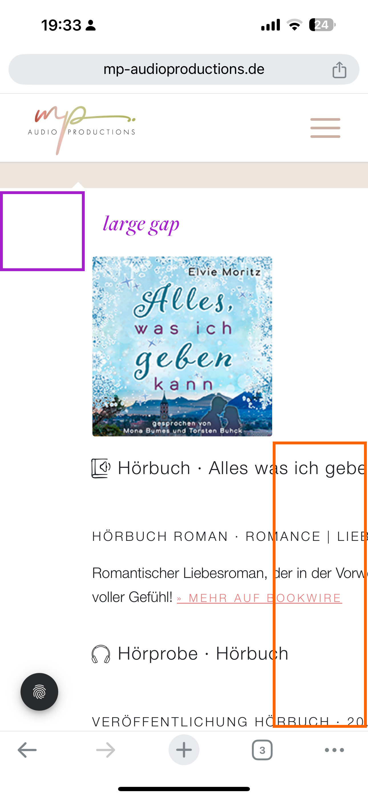
Dear Support Team,
on the following website we have a tab section with content that is always truncated on mobile devices: https://mp-audioproductions.de/mona-bumes/#tab-hoerbuecher
The screenshot of the mobile version is here: https://mp-audioproductions.de/support/mobile.jpeg
– The text is cut off.
– Is it possible to reduce the large space at the top nd left for mobile?
Many thanks and best regards, Diana
Hey Stefan,
You need access to the theme files first of all, and that is done via a Themeforest account. If you can’t access the account which was used to purchase your original license, then you will be better off buying a new license.
Once you have access to the theme files, then the update to 6.0.9 has to be done manually from the version you are running, please refer to my replies in this thread: https://kriesi.at/support/topic/enfold-4-5-theme-update-update-failed-download-failed-a-valid-url-was-not-pro/#post-1021541
You can either update manually via FTP: https://kriesi.at/documentation/enfold/how-to-install-enfold-theme/#theme-update, or upload the theme as if it was new under Appearance->Themes->Add New Theme.
If that doesn’t work then please try to delete the whole theme folder, then replace it with the new version. Make sure that you have backups of the site before starting updating.
Also please read this after you have updated: https://kriesi.at/documentation/enfold/theme-registration/
Best regards,
Rikard
Hi Ismael,
thanks for your prompt answer.
I did twice as explained but unhappily it didn’t work as expected and stopped at https://kids.aop-campus.com/wp-admin/admin.php?import=wordpress&step=2
It gave a blank screen and then nothing else happened for a (long) while.
Any idea?
so actually I would like to have a slider mixed with images and videos. In the video slide I turn off the autoplay. Still it doesn`t work on mobile
Hi,
Autoplay videos are disabled for mobile devices. Using a regular video element where the user has the option to start playing the video on mobile devices might be a good solution.
Best regards,
Rikard
why does logo image url differ to domanin url?
https://october7coalition.org
on mobile the normal logo (non transparency case ) is shown and this leads to :
https://october7coalition.org/wp-content/uploads/2024/01/logo_black.png
on desktop the transparency logo is shown so the alternate logo inside sub-text is there.
https://october7coalition.com/wp-content/uploads/2024/01/logo_black-300x133.png
Hi there thank you.
I have 5 columns for the social icons – 1/5 first column nothing in in then the next 3 are the social icons and the last is empty. Is there a better way to have this so that the ocons arent spread put to the edges of the colour section?
On mobile now the icons are side by side but are overlapping – how can I fix this?
And also on desktop they arent centred under the heading anymore they are off skew
Hey xfacta,
Thank you for the inquiry.
We didn’t find a 5-column layout on the homepage. Where can we check this? If you need to adjust the column width in mobile view, you can try this css code:
@media only screen and (max-width: 767px) {

  /* Add your Mobile Styles here */
  .responsive #top #wrap_all .content .entry-content-wrapper .flex_column.av_one_fifth {
    width: 19%;
  }
}
Please note that this will affect all 1/5 elements on the site. You may need to apply a Custom CSS Class name to the columns.
— https://kriesi.at/documentation/enfold/add-custom-css/
Let us know of the result.
Best regards,
Ismael
Hey rlhinirv57,
Thank you for the inquiry.
We extract the html of the “Get Started With IT Talent” button, place it in a Code Block element, then add the class name “no-scroll” to the link (a) tag.
<div class="avia-button-wrap av-nff239-2095338f556d798c2692e20ebf8185dd-wrap avia-button-center avia-builder-el-23 avia-builder-el-no-sibling "><a href="#popmake-19002" class="avia-button no-scroll av-nff239-2095338f556d798c2692e20ebf8185dd av-link-btn avia-icon_select-no avia-size-large avia-position-center avia-color-theme-color pum-trigger" aria-label="Get Started With IT Talent" style="cursor: pointer;"><span class="avia_iconbox_title">Get Started With IT Talent</span></a></div>
This should prevent the page from scrolling back to the top.
Best regards,
Ismael