Hi,
Is it possible to have the icon “pulse” like it does when you have a link set but with no link. Pulse on hover but do nothing on click?
Here is an example here – Scroll down to where you see 4 images with icons in the middle (pencil, camera, video, microphone). The pencil icon does not have a link and when you hover on it there is no pulse. The other 3 have a link of “#” which creates a pulse but unfortunately the link takes the viewer to the top of the page.
How can I NOT have a link but keep the pulse on hover?
Thanks,
Slade
Thanks Vinay for that idea. What I’m really trying to do has to do with the face that there is a top right menu box on mobile/small screens that replaces the white upper menu. I want the green lower submenu items to also be listed in the existing top right menu box the same way that the white upper menu items are already. Is that possible?
Main Menu overlaps logo on many screen sizes: if I view the site on Screenfly, menu overlaps on all desktops up to 22″ – on some tablets the mobile menu is not activate…
I tried a lot of the css I’ve seen in other posts, but nothing has resolved it. Thank you.
Done, I installed a previous version of the plugin while I wait for the update with no bugs.
You can close this topic!
Thank you soooo much :-)
Hey digitalprint2222,
We are happy to help you with that issue :)
Please try adding this code to the Quick CSS section under Enfold > General Styling or to your child themes style.css file:
.page-id-123 .standorte {
    width: 100%!important;
}
.page-id-123 div .av_one_half {
    margin-left: 3%!important;
    }
body.page-id-123 .column-top-margin {
    margin-top: 3%;
}
This layout can also be achieved using the 1/3 Grid rows.

If you still have any issues Please post us your login credentials (in the “private data” field), so we can take a look at your backend.
Login credentials include:
- The URL to the login screen.
- A valid username (with full administration capabilities).
- As well as a password for that username.
- permission to deactivate plugins if necessary.
Best regards,
Vinay
Thx Yigit
It worked for showing it 100px lower, thx.
Is there a CSS sollution to slide it from the top not from right (at the moment)…
Regards
Ananda
Thank you. I added the php code as described in the topic you pointed me to. This did allow me to add the content and header widget I needed, but does not reposition the slider and other page content to begin displaying below the new header content. The header now overlays the slider on all pages. Please see screenshot (link in private content area). Can this issue be fixed with CSS to push the page content down so it isn’t covered up by the new header widget? If so, can you please advise?
Since we’re placing the client’s logo in the new header widget, I’ll also need to remove the standard logo so it no longer displays. Again, you can see this in the attached screenshot.
Thanks so much.
-Chris
Afternoon all,
not really a support question more of a why-does-it-happen question.
The standard layout.css that come with Enfold has the following css…
.html_elegant-blog .avia-content-slider .read-more-link{
	position: relative;
	top:18px;
}
I was just wondering why? The css pushes the button down and renders it unseeable. Removing the top:18px; aligns the button correct. Is that line just an error or does it serve a purpose I can’t see?
Thanks
TJ
-
This topic was modified 9 years, 2 months ago by
 tjswarbs78.
Hi,
1. With the magazine-option i’m trying to put the title above of the picture, but can’t find the option to do that.
2. Is it also possible to put the title on top of (inside) the picture?
Like so: http://www.binnenvaartkrant.nl/nieuws/nieuwsitem/a2b-online-blijft-groeien/
Regards,
Steven.
Thank you for a very nice theme to work with. I think you are delivering an incredibly satisfactory all-round package! :D
///////////////////////////////////////////////////////////
The customer have trouble with a top of page Full Screen Slider with an image inside (locked + center,center placement).
I develop on Windows 10, and have tested in
- Edge
- Firefox
- Opera
- Chrome
- Windows 10 Mobile Edge (Lumia 950)
- Windows Phone 8.1 IE (Lumia 920)
All work well with the image scaling.
On iPhone 5 series however, it looks like below. (The image does not scale well, and you only see top left part of image I think)

https://www.dropbox.com/s/5vc48u9qz7p6u8r/Vi-arbejder-problem-p%C3%A5-iPhone.jpg?dl=0
Can you assist me in rooting out the problem. (I have tried the forum without luck.)
///////////////////////////////////////////////////////////
In addition
///////////////////////////////////////////////////////////
Another problem regarding fonts, again ONLY on iPhone Safari
I added webFonts via CSS3
body {
font-family: questa_sansregular !important;
}
h1,h2,h3,h4,h5,h6 {
font-family: questa_sansregular !important;
font-weight: normal;
}
`
and the fonts is reportingly not working there either.
What is wrong with Apple and iPhones?? :S
PS: I tried emulating on following sites without it showing the problem.
I have also verified the problem on iPhone 6 and iPhone 7 as well (do not have direct access to these though).
Hi Vinay,
I followed the instructions to add the avia_search to my topbar menu, but all I see is the “shortcode” text. It though that the following UBER Mega Menu function to remove the avia search is what’s causing it, but I removed it and still all I see is the shortcode text.
/*UBER MEGA MENU: Remove the Enfold Search in functions.php
Since the Enfold search won’t be compatible, we’ll remove it. You can add in an UberMenu search bar instead. */
function remove_avia_search(){
remove_filter( ‘wp_nav_menu_items’, ‘avia_append_search_nav’, 10, 2 );
}
add_action( ‘init’ , ‘remove_avia_search’ );
Thanks
Lyse
Hi Ismael,
Thank you again. The logo code worked fine, so long as I placed it at the top of the quick css field and also applied the !important part.
However the other problem with the colour sections doesn’t seem to have resolved things. I edited the js file as suggested and refreshed and cleared cache etc. but it still has that section that gets cut off. Am I asking too much of the theme do you think?#
As recommended I have also raised a new topic for the button styling. Thanks for the tip.
Thanks
Emma
As suggested by Ismael this is a new post regarding an issue I have with advanced styling for buttons not being applied when viewing the desktop version of the site. It works responsively though?
Basically there is particular piece of code below, which is knocking out the curved edge look so the button appears rounded. I do have quite a bit of custom css but I eliminated all other code by deleting one by one and this was the only section that affected the styling. Does anyone have any theories why this might be and offer a solution for me?
Thank you.
Emma
@media only screen and (max-width: 767px) {
.responsive .logo a {
display: inline-block;
vertical-align: middle;
}
Hey!
Please try adding this code to the Quick CSS section under Enfold > General Styling or to your child themes style.css file:
ul#mobile-advanced {
    padding-top: 0;
    margin-top: 100px;
}
Best regards,
Yigit
Hey Maria!
You can refer to this post – http://kriesi.at/documentation/enfold/hide-menu-itemselements-on-mobile/ and display/hide certain elements on mobile/desktop. You could replace your slider with a one that is made for mobile
Best regards,
Yigit
Hi Vinay,
Having tested the code you posted about the enfold mobile menu theme here: https://kriesi.at/support/topic/mobile-menu-animation-2/#post-708965
This works fine scrolling the menu up and down but if i change the orientation on the iphone whilst the menu is open I get strange results and the same occurs if you adjust the desktop browsers height by resizing your browser. This appears to move the open menu up or down depending on how you resize your browser. Do you know anything which could fix this issue please?
@dave
Please open your very own ticket in our forum.
@kilimats
Let us know if you still need help with this or not.
Best regards,
Andy
Hi Andy Yes i still require assistance thx.
Hey tremblayly,
To add the search bar to topbar menu please add the following code to functions.php file from Appearance > Editor
add_shortcode('avia_search', 'get_search_form');
Add the following shortcode as menu item or in Header > Extra Elements > Header Phone Number/Extra Info
[avia_search]

Best regards,
Vinay
-
This reply was modified 9 years, 2 months ago by
 Vinay.
Hi,
instead put your text as Icon’s Title and then use this code inside Quick CSS field:
.iconbox_content_title {
top: -60px;
}
Best regards,
Andy
Hey p-inc,
unfortunately we can’t really help you with this kind of customization. You need to find a plugin by yourself with such functions. Check our recommended plugin list for Enfold here: https://kriesi.at/support/topic/recommended-plugins/
Best regards,
Andy
Hi there,
I implemented a submenu and added a logo following https://kriesi.at/support/topic/logo-in-fullwidth-submenu/ .
How can I make that logo a clickable link?
Best Regards
Hey thanks for the quick reply, I’ve added a temporary login (details in private section) but there is nothing to see as I obviously didn’t keep the messed up pages, I had to create the same layout as a new or cloned page for it to work.
Please see new attached explaination image: http://fullrotation.com/img/page_breaking.jpg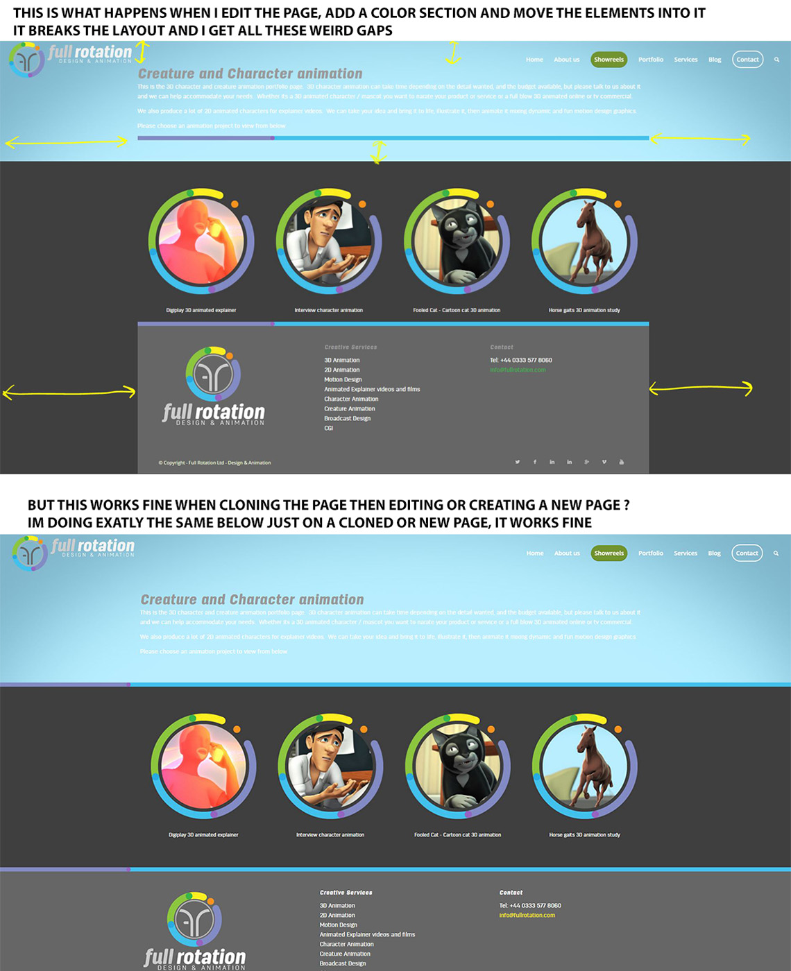
Basically,
1) If I edit the page, simply add a color section , and move the elements in, the whole layout breaks, as in the top image
2) … If I clone the original page (I use a clone page plugin) or simply create on a new page, then make my layout it works absolutely fine !? see the bottom image of exactly the same layout but working fine.
I just don’t understand why this is happening, is it a bug?
Many thanks again
Hi,
is there any possibility to change “portfolio-item” (settings>permalinks) with different language. like i did with portfolio category “all” in this post
I can not use custom permalink plugin because mail chimp is not working then
Hi,
ok, so instead use this one to call this specific menu item only:
.html_header_right #top .av-main-nav #menu-item-2198 ul ul {
top: 155px;
}
Best regards,
Andy
Hi, first of all thank you very much.
it is ok, but is it possibile to see on mobile just the row with the logo and the menu (without top header)?
In this way it take too much space in the page on smartphone.
I would like that on mobile appears top header and the row with logo and menu, but when scrolling just the row with logo and menu for a better usability of the website.
I’ll wait your answer. Thank you.
Regards
Hi,
I adjusted the code inside your Quick CSS to this one:
.menu-item-top-level {
pointer-events: none;
}
and now it’s working. Can you confirm please?
Best regards,
Andy
Hi,
Try adding this css code in Quick CSS:
#top #header li.current-menu-item > a .avia-menu-text {
    border-color: #fff;
    color: #fff;
}
then add this code at the bottom of functions.php:
function add_custom_menu_script(){
?>
<script type="text/javascript">
(function($){
	function menu_button() {
		jQuery("#avia-menu").find("li.current-menu-item").addClass("av-menu-button av-menu-button-bordered");
	}

	menu_button();
})(jQuery);
</script>
<?php
}
add_action('wp_footer', 'add_custom_menu_script');
Let us know if this helps :)
Cheers!
Nikko
Hi,
How can I show the complete content of the portfolio in the Ajax Box?
Thanks,
Christoph
-
This topic was modified 9 years, 2 months ago by
 imc-html.
Hi! One more addition to the questions here and here: is there a way to disable all Tuesdays, except some? So, I want to make an exception to open on February 14 (Valentine’s day..). Once again, thanks!!
Hey,
I’m not sure if I understood correctly but is it the white border at the bottom of an active menu? you might want to add this code in Quick CSS:
#top #avia-menu li.current-menu-item > a .avia-menu-fx {
    background: green;
    bottom: 1px;
}
Just adjust the background color as you see fit.
Best regards,
Nikko