-
Search Results
-
Hi Guys!
Hope all is well and love the new update! :)
I have a quick question regarding the header. Currently have it set as fixed at 140px height which looks great on desktop screens but takes up too much room on laptop screens. I’ve been trying to find the right CSS selectors to modify the header height on laptops but can’t seem to find the right one. Could someone please assist me with this? (see private link)
Thank you in advance!
Topic: Google Map/API Key problems
Hello!
I just moved my site from a development server to the real one and the map stopped working. I added an API key (screenshot attached privately). I’m not sure what I’m doing wrong.
I have the latest version of Enfold/Wordpress.
Thanks!
LizHello. The active color was pulling from Enfold -> Main Color. I’ve added the below CSS, to get the correct color. However, when I click on another item in the sort choices, the color stays at #666. I’d like the active sort item to be #000. I want the same look as this, in the new 2017 Demo.
#top.page-id-13637 #main > div.container_wrap:nth-child(2) .av-masonry .av-masonry-sort a{
color:#666666;
}Thank you,
RyanHello,
ist it possible to open the content text of a accordion as an overlay?
I am using 4 columns and the text gets too long vertically.
Here is an image:
This quick css doesn’t work:
.toggle_wrap active_tc { position: absolute !important; width: auto !important; max-width: 300px !important; border-top: 0 !important; padding: 0 !important; z-index: 30 !important; } div.toggle_content { z-index: 30; overflow: hidden; overflow-y: auto; border: 0px solid transparent; border-radius: 0 0 5px 5px; border-top-width: 3px; padding: 5px; position: relative; min-width: 40px; max-height: 300px; -webkit-box-sizing: border-box; -moz-box-sizing: border-box; box-sizing: border-box; background-color: #930270; font-color: white; }Hello support. I’ve added a color section on the top of my Enfold home page and linked to a YouTube video that’s playing as a background. It plays automatically when viewed on a desktop but just shows the YouTube play icon and a still image from the video on my iphone and ipad.
If I push the play button it doesn’t do anything on iphone or ipad. It would be great if it played on mobile and tablet too.
Thanks in advance for your help. Gary
Hi,
Thank you for your help so far!!On Desktop:
Chrome shows white text in menu (correct)
Safari shows black text in menu (how do I fix?)
ALSO: the menu dropdown backgrounds are also very different – can’t see them very well in Chrome – they are very light grey vs. dark grey in Safari.
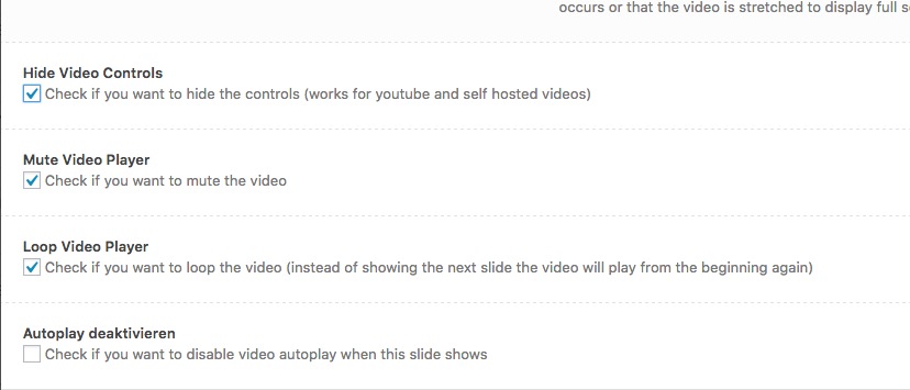
Hi,
i would not like the user to stop the video by clicking on the video.
Like in your demo: http://kriesi.at/themes/enfold-startup/i already hide and mute the mute and hide the controls:
https://dl.dropboxusercontent.com/s/kuhfktewe3fiqv0/2017-03-01%20at%2017.58.jpgwhat am i doing wrong?
Topic: Latest update and masonry
Hello,
After the update today, masonry pages are not showing categories anymore (on the top of the page).
Any help please ?
Thanks !
Topic: Landing page
Is it possible to make a second landingpage for distributing a free e-book to make some list-building? The landingpage should be without top menu.
Can I use the mailchimp form for this purpose or do I need some kind of plugin that will send a link to the new ‘customer’ to be able to download the book? (like Thrive?)
Can you evt. supply a link for a demo or how it works in the real world?
best
HenrikTopic: border-top-style:solid;
How can remove this line below 3 picture http://wescot.it/nuovo/
grid.css ?
.container_wrap {
border-top-style:solid;
border-top-width:1px;
clear:both;
position:relative;
}Hi, I do not find solutions has my problem.
I try to change the background of the rod at the top. That of the extra (number, mail…)
An idea, css to change the background of this part ?
Thank you for your help.
Topic: Blog Image Size (Change,
Hi Enfold Team,
I hope you can help me or give me a hint:
I want to edit the default Blog Post image (contributory picture), just read many threads and try to edit the follow code line
$avia_config['imgSize']['entry_with_sidebar'] = array('width'=>845, 'height'=>321);edit to 800 x 600after that I use a plugin to regenerate thumbnails (plugin – https://wordpress.org/plugins/regenerate-thumbnails/)
but that is not working the images have not the size I want to display and edit.
When I use the Investigate abilities of my browser they have this size:
left: -5px; top: 0px; overflow: hidden; display: block; height: 556px; width: 843px;
But my edit is 800 x 600Also I try to choose different sizes in the Blog Style. But that do nothing.
In my opinion, when I edit the image size of the blog “Select custom image size for preview”
the image of the Blog Post must have the size I choose? Or is the function for something else?And what about the WordPress Media-Size, is there a edit to do or can I stay at default settings?
—
I want a Blog Size Preview Image in format 4:3
for example 800 x 600 and the image from my mediathek should stay in there without a crop.
Is there a automatic size when I choose entry with sidebar for the image size and the white space etc.?I hope you understand what I want and can help me.
Thx a lot and have a gerat day
TobiasWhat is the current recommended guidance from Kriesi regarding this topic?
I get a reasonably good score from PageSpeed but YSlow and Pingdom mark the theme down heavily for such as:
Minify JavaScript
Minify CSS
Defer parsing of JavaScriptOther WP themes I’ve used in the past have recommended not touching JS or CSS as it messes them up – what’s the Enfold position?
The site uses WP Super Cache – have you got recommended settings for this? (I used to use W3 Total Cache but it’s too complex and messed the site up).
Are there plugins that can help? (And won’t mess up the site…)
Any advice welcome…
Viewing 30 results - 83,671 through 83,700 (of 142,823 total)