-
AuthorSearch Results
-
October 2, 2023 at 4:01 pm #1421167
Dear Mike,
I also agree with you. Too much work.
I deleted everything, but there is a problem on the homepage of the french website, on top it sais Warning: Unterminated comment starting line 2 in /home/hulaslim/public_html/wp-content/themes/enfold-child/functions.php on line 2and on the mobile screen a huge space appears before the slide show.
The english homepage has a smaller slide-show now, surrounded by a white square around.
How can I fix this ?
Thank you and kind regards,
NatachaOctober 2, 2023 at 3:55 pm #1421165Topic: top scroll link
in forum EnfoldStilecatalini
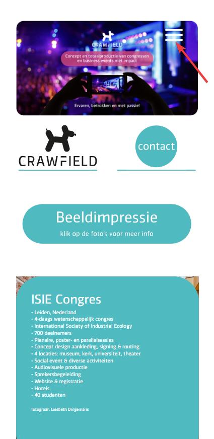
ParticipantHello, why the overlay of the top scroll link (arrow) is transparent? Where is that code? It should be gray little transparent like the other overlay buttons.
CHECK.
Thanks.October 2, 2023 at 3:50 pm #1421164Hi,
Try to adjust the z-index of the overlay.
.responsive #top .protectionOverlaytext {
    z-index: 99999;
}
Best regards,
IsmaelOctober 2, 2023 at 3:39 pm #1421155In reply to: Setting background overlay
Hey,
I added the code to the bottom of Enfold theme options > General Styling > Quick CSS.
You are setting the background color with the following custom CSS:
#top #wrap_all #header_main .av-burger-overlay-scroll {
    -webkit-backdrop-filter: saturate(0.9);
    backdrop-filter: saturate(0.9);
    background: rgba(0,0,0,0.9);
}
Best regards,
YigitOctober 2, 2023 at 3:38 pm #1421153In reply to: Setting background overlay
Or is this?
#top div.av-burger-overlay-bg {
background-color: transparent;
}But if i change transparent with another name like white or yellow, doesn’t change. WHY??????????????????
October 2, 2023 at 2:53 pm #1421143In reply to: link in footer menu
Hi,
Great, I’m glad that we could help you out. Please let us know if you should need any further help on the topic, or if we can close it.
Best regards,
RikardOctober 2, 2023 at 2:26 pm #1421141In reply to: Contact form
I wanted only to change the orange into red. No more! Is my request too difficult?!
Gray it’s ok.
Stop.October 2, 2023 at 1:49 pm #1421134In reply to: Contact form
Hey,
There isn’t a limit, but there’s a support policy ( https://themeforest.net/page/item_support_policy#whats-not-included-item-support ). I shared this link with you multiple times and pointed out that customization is out of the scope of the support. As far as I’m aware, only 1 thread out of the 46 you started is an actual issue in Enfold.
This thread is a perfect example: https://kriesi.at/support/topic/setting-background-overlay/. We provide you with a custom CSS, you say it doesn’t work, we tell you what could be the issue, you say “check”, we check it and the issue ends up being what we guessed earlier and the custom CSS we provided isn’t even added.
You’re clearly looking for someone to log in to your site and do the customizations for you but this is a task that’s meant for freelance developers, not us.
I provided you with a selector in this thread. If you’d like to apply this styling for a specific Contact Form element, you can edit your Contact Form element, go to Advanced > Developer Settings > Custom CSS Class, add a custom CSS class to your element (“your-custom-css-class” in the example below), and use the code as the following:
.your-custom-css-class .av-fields-with-error {
/* Your custom CSS for the Contact Form element with "your-custom-css-class" goes here */
}
Best regards,
YigitOctober 2, 2023 at 1:20 pm #1421129In reply to: Mobile View Issues
This reply has been marked as private.October 2, 2023 at 8:24 am #1421077Hi Ismael,
I also re-inserted the css and cleared the cache but on iPhone, by clicking and holding down the thumbs of the mansory gallery, the files continue to be downloadable. On desktop, the thumbs of the mansory gallery are draggable while the photo opened in the lightbox is not.October 2, 2023 at 8:14 am #1421074Topic: Purchase Code
in forum Pre Sale QuestionsTim
GuestAnswer (https://kriesi.at/support/topic/purchase-code-18/?avia_support_contact=avs_651a50516e45c3.75009914_1421067)
Hello!
Thank you for your answer! In “Downloads” there is nothing about Enfold… https://www.dropbox.com/scl/fi/5u6ilybbbiu63hzz8x50i/Screenshot-2023-10-02-080159.png?rlkey=pesyo6lvxowo6z40z5jjo2dp0&dl=0
But here (https://www.dropbox.com/scl/fi/5u6ilybbbiu63hzz8x50i/Screenshot-2023-10-02-080159.png?rlkey=pesyo6lvxowo6z40z5jjo2dp0&dl=0) and here (https://www.dropbox.com/scl/fi/7dvek5vsdo825aiagnn69/Screenshot-2023-10-02-081307.png?rlkey=irzfo2tisldmjf7dhn3em2di1&dl=0) it works…
:(
Best regards TimOctober 2, 2023 at 8:08 am #1421072Hi,
Thank you for following up.
Please add this script in the functions.php file to force the logo to resize on scroll.
function av_custom_inline_script()
{

    wp_add_inline_script( 'jquery',
    "
    (function($) {
            // resize logo on scroll
            $(window).on('scroll', function() {
                if ($(this).scrollTop() < 30) {
                    $(this).trigger('resize debouncedresize');
                }
            });
    })(jQuery);
    "
    );
}
add_action( 'wp_enqueue_scripts', 'av_custom_inline_script' );
Best regards,
IsmaelOctober 2, 2023 at 7:05 am #1421066Hi Ismael,
I saw the changes to the class-avia-masonry.php file and I added the css code.
Unfortunately, on pages where there are multiple mansory galleries, only the last one is displayed.
Furthermore, on iPhone, by clicking and holding down the thumbs of the mansory gallery, the files continue to be downloadable. On desktop, the thumbs of the mansory gallery are draggable while the photo opened in the lightbox is not.
For now, I restored the original file and renamed the modified one class-avia-masonry_MOD.php.October 1, 2023 at 9:36 pm #1421043In reply to: Transparant logo area on mobile phone
Hey Martijn,
Try this CSS in your Enfold Theme Options ▸ General Styling ▸ Quick CSS field:@media only screen and (max-width: 767px) { .responsive #top #wrap_all #header { background-color: transparent; } }the expected results:
Best regards,
MikeOctober 1, 2023 at 9:26 pm #1421042In reply to: Social media icons in the mobile version
Hi,
Try this CSS in your Enfold Theme Options ▸ General Styling ▸ Quick CSS field:@media only screen and (max-width: 989px) { .team-social-inner { top: 25%; } .responsive.av-no-preview #top .avia-team-member .team-social { height: 100px; } }the expected results:

Best regards,
MikeOctober 1, 2023 at 7:50 pm #1421037I have two picture to upload…not sure how to do that.
1. Your suggestion above works! But…it also distorts the circular images in the color sections. Seems to move the top of the color sections to under the svg divider?
I took a picture, I just need to attach it for you.
2. The second picture shows the line I want to remove. I think now it is the top border for the color section. That is what the arrow on the TOP color block that is pointing to the section below is pointing TO. In my case, it looks navy blue. This line I would like to remove on all 3 color blocks appears ABOVE the svg divider.
Thanks for your suggestion above. it DID work, it just seems to affect something else.
October 1, 2023 at 7:06 pm #1421032In reply to: hide image title on mouse hover – masonry gallery
Hi,
Thank you for the link to your site, I found that you are not using a child theme and I didn’t see any other code snippet plugins, so I added the WPcode plugin this plugin supports PHP code snippets, JavaScript code snippets, & CSS code snippets.
I then added the function temporary_removal_title_tags and cleared my browser cache and now the titles are not shown on mouse-over:

please clear your browser cache and check. Please note Safari can be hard to clear the cache, often you need to also clear the history to fully purge the cache, following these steps for Safari and note Step 4 where you will Clear the History.Best regards,
MikeOctober 1, 2023 at 6:18 pm #1421029In reply to: Small type issue on Enfold slider has returned
Hi,
Thank you for the link to your site, I see the css from the other thread is in your Quick CSS:#top #wrap_all .avia-slideshow .av-slideshow-caption .avia-caption-title { font-size: 36px; } #top .avia-slideshow .avia-caption-content p { font-size: 20px; }and on your /news/ page you are only using 8 slides, when I change to 12 by cloning the last iten 4 more times and clear my browser cache and check with Windows in Chrome, Firefox, & Edge & Mac in Safari, Chrome, Firefox all items show correctly.
Perhaps when you added the other items your cache was not fully cleared, Please note that Safari can be hard to clear the cache, often you need to also clear the history to fully purge the cache, following these steps for Safari and note Step 4 where you will Clear the History.
I removed the extra items, please try adding the new slides that you want and clear your cache, perhaps a couple of times, and if that doesn’t help please let us know so we can look and help.Best regards,
MikeOctober 1, 2023 at 5:52 pm #1421025In reply to: Line in template doesn’t display on live page
Hi,
Thanks for the link to your site, I’m not sure why you are experiencing this issue, I copied your page to my test site and the css for your custom HR worked fine, on your site the css for the style is missing, so I copied the css and created a WPCode snippet on your site and now the custom HR is showing correctly:.hr.av-4al98j-e36af9cb9fd782dc084f71f90c9e0c74 .hr-inner { width: 45%; border-color: #1b75bb; max-width: 45%; } .hr.av-4al98j-e36af9cb9fd782dc084f71f90c9e0c74 .av-seperator-icon { color: #ff6207; } .hr.av-4al98j-e36af9cb9fd782dc084f71f90c9e0c74 .hr-inner { width: 45%; border-color: #1b75bb; max-width: 45%; } #top .hr.av-4al98j-e36af9cb9fd782dc084f71f90c9e0c74 { margin-top: 15px; margin-bottom: 15px; }If you want to explore what the issue on your site is I recommend disabling your plugins including your CDN and clear your CDN along with your server cache, which may take some time, and then see if the css is applied. Or if you are not experiencing any other issues you can use this css I added to your WPCode, but keep this in mind if you do find other issues in the future.
Best regards,
MikeOctober 1, 2023 at 4:41 pm #1421019In reply to: hide image title on mouse hover – masonry gallery
Hey Karin_Tara,
Try this solution I tested it on your page and it removes the title on mouse-over but still allows the lightbox to show the title under the image in lightbox.Best regards,
MikeOctober 1, 2023 at 4:24 pm #1421016In reply to: Mobile View Issues
Hi,
Sure, so first I copyied your page and created a test page to demonstrate /podcasting-test/ Then I enabled the right sidebar on the test page:

The screenshots will be from the Classic Editor, as I prefer it over the Block Editor. Then I created the three sidebar widgets to replace your “fake sidebar”

WordPress ▸ Appearance ▸ Widgets ▸ Sidebar Pages

Then in the backend I removed the sections not needed, and added a little css to remove the sidebar border:#top #main .sidebar.sidebar_right { border: none; } #top .container_wrap.sidebar_right .template-page.content { border-right: none; }and added a little css so the sidebar will show on mobile centered:
@media only screen and (max-width: 767px) {
	.responsive #top #main .sidebar {
		display: block;
		width: 100%;
		padding-top: 0;
	}
	.responsive #top #main .sidebar .inner_sidebar {
		margin: 0;
	}
	.responsive #top #main .sidebar .inner_sidebar .avia_textblock * {
		text-align: center !important;

	}
	#top .container_wrap.sidebar_right .template-page.content {
		padding-bottom: 0;
	}
}
Now if you compare the original /podcasting/ with the new /podcasting-test/ I don’t think you can tell the difference, except on mobile the sidebar is under the Podcast “Aircheck” and if you want to add this sidebar to other pages it will be easy.
Please clear your browser cache and check.Best regards,
MikeOctober 1, 2023 at 10:54 am #1421008In reply to: Animated Numbers and Accordian not working on page
Hi,
Great, I’m glad that Nikko could help you out. Please let us know if you should need any further help on the topic, or if we can close it.
Best regards,
RikardOctober 1, 2023 at 10:53 am #1421007Hi,
Great, I’m glad that Ismael could help you out. Please let us know if you should need any further help on the topic, or if we can close it.
Best regards,
RikardOctober 1, 2023 at 10:52 am #1421006Hey CharlieTh,
1. I’m not sure I understand what you are looking to remove, could you post a screenshot highlighting it please?
2. Please try the following in Quick CSS under Enfold->General Styling:
.page-id-699 #after_submenu_1 .content {
    padding-top: 0;
    padding-bottom: 0;
    min-height: 0;
}
Best regards,
RikardOctober 1, 2023 at 10:46 am #1421005In reply to: Fullscreen Slider background color change
Hi,
Thanks for the update, and glad to hear that you found a solution for your problem. Please let us know if you should need any further help on the topic, or if we can close it
Best regards,
RikardOctober 1, 2023 at 1:48 am #1421002Hi,
Yes this is possible and I have made this modification to your site, but in doing so I found that your URLs are not the same across all three sites so you will need to change all pages on all sites to match, and you may not wish to do this, but I added the code so you can decide.
So to test this I added three test pages on these three sites:your french site is your core site with no “FR” in the URL, I know you know this but in the future people will want to know how this works 🙂
Anyways, I disabled your topbar menu and enabled the topbar Enfold Theme Options ▸ Header ▸ Extra Elements ▸ Phone Number or small info text to hold the language switcher shortcode, you can easily switch back to using the topbar menu there if you wish.
This is the shortcode I added:[dynamic_lang_switcher lang="EN"] * [dynamic_lang_switcher lang="IT"] * [dynamic_lang_switcher lang="FR"]on the frontend it shows the whole language word:

Then I added this code to the end of your child theme functions.php file in Appearance ▸ Editor on all three sites:function dynamic_language_switcher($lang) { // Get the current full URL $protocol = (isset($_SERVER['HTTPS']) && $_SERVER['HTTPS'] === 'on' ? "https" : "http") . "://"; $current_url = $protocol . $_SERVER["HTTP_HOST"] . $_SERVER["REQUEST_URI"]; // Base URL without language $base_url = $protocol . 'guidedtour.ch/'; // If the language is French, return the current URL without language segment if (strtoupper($lang) == 'FR') { $path = str_replace($base_url, '', $current_url); $segments = explode('/', trim($path, '/')); if (in_array($segments[0], array('EN', 'IT'))) { array_shift($segments); // Remove the language segment } return $base_url . implode('/', $segments) . '/'; } // Remove the base URL to get just the path $path = str_replace($base_url, '', $current_url); // Split the path into segments $segments = explode('/', trim($path, '/')); // Check if the first segment is a known language code if (in_array($segments[0], array('EN', 'IT'))) { // Replace the existing language code with the desired one $segments[0] = $lang; } else { // If the first segment is not a language code, prepend the desired language code array_unshift($segments, $lang); } // Construct the new URL $new_url = $base_url . implode('/', $segments) . '/'; return $new_url; } function dynamic_language_switcher_shortcode($atts) { // Mapping short language codes to their full word representations $language_names = array( 'EN' => 'English', 'IT' => 'Italian', 'FR' => 'French' ); $atts = shortcode_atts( array( 'lang' => 'EN' ), $atts, 'dynamic_lang_switcher' ); $url = dynamic_language_switcher($atts['lang']); // Display the full word representation, but link to the appropriate URL return '<a href="' . $url . '">' . $language_names[strtoupper($atts['lang'])] . '</a>'; } add_shortcode('dynamic_lang_switcher', 'dynamic_language_switcher_shortcode');and now you can go to any of those three pages and click the new language switcher and go to the corresponding page in any language.
But unfortunately it looks like all of your other menu items don’t match across your sites.Best regards,
MikeSeptember 30, 2023 at 10:29 pm #1420995In reply to: Menue/ Submenue
Hi,
To add custom images before menu items for both regular submenus and mega menus like this:
Main menu items:

Regular submenu items:

and mega menu items:

Try adding this code to the end of your child theme functions.php file in Appearance ▸ Editor:function add_image_before_menu_item_based_on_class($items) { // Define the images for specific CSS classes. $class_image_mapping = array( 'custom-class-1' => 'https://swisspecial.com/wp-content/uploads/2023/09/png-e1695487023144.png', 'custom-class-2' => 'https://swisspecial.com/wp-content/uploads/2023/09/siberian-husky-e1695493493574.png', // ... add more class-to-image mappings as needed ); // Loop through each menu item foreach ($items as &$item) { // Check if any of the item's classes matches our custom classes foreach ($item->classes as $class) { if (isset($class_image_mapping[$class])) { // If a match is found, prepend the image to the title $item->title = '<img src="' . esc_url($class_image_mapping[$class]) . '" alt="" style="margin-right: 5px;width: 30px;vertical-align: middle;margin-left: -15px;" />' . $item->title; break; // exit the loop once the first match is found } } } return $items; } add_filter('wp_nav_menu_objects', 'add_image_before_menu_item_based_on_class');Note the custom classes have the image path assigned, and also not the inline css to set the width of the images and the margin and the vertical-align, while these work well in my example, you may wish to adjust to your specific menu style.
Then click on the Screen Options tab at the top-right corner of the screen in the menu panel and check the box next to “CSS Classes”, then click on any menu item to expand it. You will see an option named “CSS Classes” where you can add a custom class.

Best regards,
MikeSeptember 30, 2023 at 9:32 pm #1420990CharlieTh
ParticipantI am having two problems with this page:
1. I am trying to use the svg in a more creative (for me) way! But I’d like to remove that border line that’s right above the scroll arrow, to really make it look better. Is this possible with css, please?
2. I have a large white space under the submenu and haven’t been able to figure out how to vamoose it.Thanks in advance for any magic you can perform!
September 30, 2023 at 8:45 pm #1420983In reply to: Mobile View Issues
Hi,
For the image that overlaps the text at the bottom of your page, I added a little padding between the text and image:

fell free to adjust if you want more space.
Your other page was much harder because of the column structure, I added this css:@media only screen and (min-width: 768px) and (max-width: 1280px) { .podcast-image, .avia-image-container.avia-align-center.podcast-image { margin-top: 20px; } } @media only screen and (min-width: 768px) and (max-width: 1160px) { .podcast-image, .avia-image-container.avia-align-center.podcast-image { margin-top: 50px; } } @media only screen and (min-width: 768px) and (max-width: 989px) { .responsive #top.page-id-1313 .av_one_half.first + .av_one_fourth + .av_one_fourth.flex_column_div{ width: 20%; position: absolute; right: 0; top: -50px; } .podcast-image, .avia-image-container.avia-align-center.podcast-image { margin-top: -50px; } } @media only screen and (min-width: 768px) and (max-width: 989px){ .responsive .av_one_half.avia-builder-el-14.first.el_before_av_one_fourth.flex_column_div { width: 72%; } } @media only screen and (max-width: 767px) { #top.page-id-1313 #av_section_3 .template-page.content { padding-bottom: 0 !important; } #top.page-id-1313 #av_section_4 .template-page.content { padding-top: 0 !important; } }and I made some extra elements on the page to show at the mobile size, in my test it seems to be working, please clear your browser cache and check.
for tablet before the mobile break you will see that the right side “sidebar” items look like that are in a sidebar, Please see the screenshot in the Private Content area.
and then at mobile they become full width and are under each other, Please see the screenshot in the Private Content area.
If you don’t see it this way try clearing your cache a few times.Best regards,
MikeSeptember 30, 2023 at 8:26 pm #1420974In reply to: contact form field border color wrong after submit
-
AuthorSearch Results
-
Search Results
-
Topic: top scroll link
Hello, why the overlay of the top scroll link (arrow) is transparent? Where is that code? It should be gray little transparent like the other overlay buttons.
CHECK.
Thanks.Topic: Purchase Code
Answer (https://kriesi.at/support/topic/purchase-code-18/?avia_support_contact=avs_651a50516e45c3.75009914_1421067)
Hello!
Thank you for your answer! In “Downloads” there is nothing about Enfold… https://www.dropbox.com/scl/fi/5u6ilybbbiu63hzz8x50i/Screenshot-2023-10-02-080159.png?rlkey=pesyo6lvxowo6z40z5jjo2dp0&dl=0
But here (https://www.dropbox.com/scl/fi/5u6ilybbbiu63hzz8x50i/Screenshot-2023-10-02-080159.png?rlkey=pesyo6lvxowo6z40z5jjo2dp0&dl=0) and here (https://www.dropbox.com/scl/fi/7dvek5vsdo825aiagnn69/Screenshot-2023-10-02-081307.png?rlkey=irzfo2tisldmjf7dhn3em2di1&dl=0) it works…
:(
Best regards TimI am having two problems with this page:
1. I am trying to use the svg in a more creative (for me) way! But I’d like to remove that border line that’s right above the scroll arrow, to really make it look better. Is this possible with css, please?
2. I have a large white space under the submenu and haven’t been able to figure out how to vamoose it.Thanks in advance for any magic you can perform!