-
Search Results
-
Topic: Huge space
I am having a problem on mobile view of a website. On one page there is a huge gap between a textbox inside a color section and grid row. When checking the site on desktop everything looks like it should, but on mobile there is a huge gap. When choosing to inspect element in chrome it looks like there is three whitespace separators in the empty space, but there is no separator at all.
Any idea why this is? Link to the page below.Regards
NinaDear team,
on my page https://www.auto-wulf.de I use the extra info top bar.in the backend it shows:
[av_font_icon icon='ue854' font='entypo-fontello' size='20px' color='#ffffff'] Geesthacht: 04152 / 87780 Dömitz: 038758 / 24077on safari the phone symbol appear correctly, but on chrome just a white square box.
what is the reason / how to fix?
thx a lot & best regards Tilman
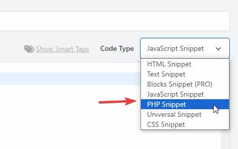
Topic: Search Icon Color
Hi.. The client (site link in private content) wants a Search Icon on the right of the main menù but the icon does not appear, if I click after the last menù item the search box appear but not the icon. I’ve try the following code, it makes the icon visible but the search box does not come out:
.header_color .main_menu ul:first-child > #menu-item-search > a svg:first-child {
    stroke: #ffffff;
    fill: #ffffff;
    color: #ffffff;
    z-index: 10;
}
This other code has no effect:
#top #wrap_all .header_color.av_header_transparency .avia-svg-icon svg:first-child {
  fill: #fff;
}
Could You please help?
Thank You Very much
Note: the Search works regularly and on mobile the icon is correctly displayedHI
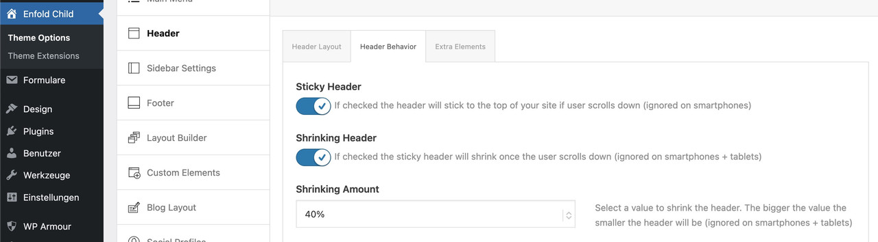
I’ve got an issue with my mobile header – it’s set to stick to the top, but I’m seeing the content above the header when I scroll.
see: https://imgur.com/a/wfbMInN
Can you see how to fix that?
thanks
NancyI am trying to translate URLs/Links for LayerSlider bundled in the Enfold Theme. Please see summary of the issue:
https://wpml.org/forums/topic/translating-page-links-in-layerslider/
Topic: Center “boxed” layout
Hi,
The solution in my earlier post works fine on pages, but not on posts. On posts the content is still to much to the right and not centered.
Do you know how I can center the post-content?The credentials are in the private part. The site is under construction.
Best regards,
ErwinTopic: Hero area not rendering
I’ve got a hero section at top of my homepage – a headline rotator in a color section. When i preview the page it renders fine as it should. When i navigate to the homepage though it doesn’t render properly. I’m on latest verion of wordpress, all themes and plugins are updated and I’ve purged the cache. Not sure hwy this has started now?
Subject: CRITICAL: Enfold 7.1.4 Redirect Failure & PHP Fatal Error (get_page_permastruct on null)
“Dear Enfold Support Team,
I am experiencing a critical issue with Enfold 7.1.4 on a site running the latest WordPress version and PHP 8.1 (also tested with 8.2 and 8.3).
The Problem:
A registration form (created with DigiMember) has stopped functioning correctly. While the user is successfully registered in the database, the AJAX redirect to the thank-you page fails completely. The button does not trigger the redirect, leaving the user stuck on the form page.Technical Analysis & Error Logs:
The error logs show that the process is interrupted by a Fatal Error within the WordPress core, triggered during an AJAX call. Even with PHP 8.1, I get the following stack trace:PHP Fatal error: Uncaught Error: Call to a member function get_page_permastruct() on null in …/wp-includes/link-template.php:435
Stack Trace highlights:
#0 …/wp-includes/link-template.php(397): _get_page_link()
#1 …/wp-includes/link-template.php(197): get_page_link()
#2 …/plugins/digimember/…/payment_handler.php(878): get_permalink()
Additionally, the log is flooded with hundreds of deprecated warnings regarding the Enfold core:
PHP Deprecated: Class avia_style_generator was called with an argument that has been deprecated since version 5.3! Trying to set protected/private property: avia_style_generator::print_extra_output.Environment:
Enfold Version: 7.1.4WordPress: Latest (6.9.1)
PHP: 8.1.34
Active Plugins: Cookiebot, DigiMember, GetResponse.
It seems that the way Enfold handles the style generator or AJAX environment is causing WordPress to lose its permastruct context, leading to the null error during the redirect.
Do you have a temporary fix, a filter for my child theme’s functions.php, or a patch to resolve this redirect failure? This is currently breaking my sales funnel.
Best regards,”
