-
AuthorSearch Results
-
May 20, 2024 at 7:33 pm #1444788
In reply to: PHP upgrade fail
Hey SugarPR,
I see that you are running an old version of the theme, could you try to update to the latest version (5.7.1) to see if that helps please? The update to 5.7.1 has to be done manually from the version you are running, please refer to my replies in this thread: https://kriesi.at/support/topic/enfold-4-5-theme-update-update-failed-download-failed-a-valid-url-was-not-pro/#post-1021541
You can either update manually via FTP: https://kriesi.at/documentation/enfold/how-to-install-enfold-theme/#theme-update, or upload the theme as if it was new under Appearance->Themes->Add New Theme.
If that doesn’t work then please try to delete the whole theme folder, then replace it with the new version. Make sure that you have backups of the site before starting updating.
Also please read this after you have updated: https://kriesi.at/documentation/enfold/theme-registration/Best regards,
RikardMay 20, 2024 at 7:30 pm #1444785In reply to: Logo container
Hi,
Great, I’m glad that Ismael could help you out. Please let us know if you should need any further help on the topic, or if we can close it.
Best regards,
RikardMay 20, 2024 at 7:28 pm #1444783In reply to: ajax-search-lite plugin: how to enable?
Hi,
Thanks for sharing that. Do you need any more help on this topic?
Best regards,
RikardMay 20, 2024 at 4:57 pm #1444771In reply to: Auto player video on mobile
It looks like it is autoplaying on desktop now
can you verify for me? https://bowl360.com/Regarding mobile, you are saying auto play is not possible?
May 20, 2024 at 4:27 pm #1444765In reply to: Auto player video on mobile
if i set your video with the given settings of muted !!!
https://webers-testseite.de/vimeo-bg-video/You have this button to toggle between mute and unmute – so I’m guessing that’s the culprit – that you try to have sound. That is something only desktop browsers will support as bg-video
May 20, 2024 at 4:17 pm #1444759In reply to: Auto player video on mobile
I just change that settings but it seems like nothing changed on my end
did it update on your end? https://bowl360.com/
desktop and mobile
May 20, 2024 at 4:15 pm #1444757In reply to: Shop Category List Size
Hi,
Great, I’m glad that Mike could help you out. Please let us know if you should need any further help on the topic, or if we can close it.
Best regards,
RikardMay 20, 2024 at 10:59 am #1444708In reply to: Shop Category List Size
Hi,
Try this instead@media only screen and (min-width: 768px) { #top .avia_codeblock_section .woocommerce.columns-4, #top .avia_codeblock_section .products.columns-4 { display: flex; } #top .avia_codeblock_section .products .product.last, #top #main .avia_codeblock_section .products .product.last { margin-right: 13px; } }Best regards,
MikeMay 20, 2024 at 9:31 am #1444690In reply to: Shop Category List Size
Hello Mike :)
Thank you very much. Looks perfect on the desktop PC.
The mobile view is unfortunatelly off the grid :) and the 5th category is not visible until I rotate the phone to landscape.Kind regards
Martina-
This reply was modified 1 year, 10 months ago by
biscuitik.
May 20, 2024 at 7:57 am #1444681In reply to: Section autoplay video (force with js)
But you are talking about a background-video with audio?
For me, as background these videos are muted and can be played automatically, except on a mobile device – but this is not an Enfold setting – it is a browser-dependent agreement not to unnecessarily increase traffic nor power-consumption from mobile phones.so – you can try to force muted by adding playerparameters
on youtube for example:?autoplay=1&mute=1&playsinline=1so the inserted video is for example:
https://www.youtube.com/watch?v=81hhkBaIvNM?autoplay=1&mute=1&playsinline=1by the way – if you have set a loop for the youtube video – then the ID had to be added as playlist:
&playlist=81hhkBaIvNM
but the parameter “playlist” seems to be removed by Enfold at data-original_url for data-videoid
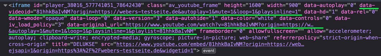
See: https://webers-testseite.de/youtube-background/
Password is : Enfoldbut nevertheless – it seems to work on f.e. ipad
May 20, 2024 at 6:08 am #1444667In reply to: Section autoplay video (force with js)
Hey Jan,
Thank you for the inquiry.
We don’t have a solution for this yet. In the meantime, you can try using the Layer Slider element. Add a Video/Audio layer, then toggle the Background Video option under the Layer Settings > Content > Media Options section. This background video should play on both desktop and mobile views.
Best regards,
IsmaelMay 20, 2024 at 1:58 am #1444633Topic: Auto player video on mobile
in forum Enfoldnavindesigns
ParticipantOn my site, https://bowl360.com/ I am using advanced layer slider at the top of my page, I would like the video to play automatically on both desktop and mobile but it is not doing so
In settings, I have set it to auto play as well (see login details below)
Please help
May 19, 2024 at 11:57 pm #1444619Hi,
The article said that they use 3g only for mobile, they probably use lan for the desktop and that is why the score is much higher. You should research this more I saw many articles that said that it is not a good tool.Best regards,
MikeMay 19, 2024 at 11:10 pm #1444612With pagespeed using 3g, seems like that would also impact my desktop scores at 3g speed? Those are consistently in the mid to high 90’s (sometimes 100) even at that 3g speed.
May 19, 2024 at 11:08 pm #1444611Yeah, my GTmetrix desktop is always really high . . . same on pagespeed insights, webpagetest.net etc. Just that mobile score. I’m looking at DebugBear now. Thanks!
I have no idea how you get such amazing scores whereas I get this: https://www.debugbear.com/test/website-speed/JK9HGUlN/overview#
Still better than 30’s, but still lower than 94Jon
-
This reply was modified 1 year, 10 months ago by
gatehealing.
May 19, 2024 at 8:54 pm #1444595In reply to: Shop Category List Size
Hi,
Try this CSS instead:#top .avia_codeblock_section .woocommerce.columns-4, #top .avia_codeblock_section .products.columns-4 { display: flex; } #top .avia_codeblock_section .products .product.last, #top #main .avia_codeblock_section .products .product.last { margin-right: 13px; }Please ensure to copy the code from the forum and not an email notification so the symbols are not converted.
After applying the css, and removing the previous css, please clear your browser cache and check.Best regards,
MikeMay 19, 2024 at 5:02 pm #1444547Hey lyubopopov,
Thank you for the link to your site, try adding this code to the end of your child theme functions.php file in Appearance ▸ Editor, or if you are not using a child theme you could use the WP Code plugin then add a new snippet, in the top right corner use the PHP snippet as the code type:

then add this code and save:function select_value_in_form() { ?> <script> document.addEventListener('DOMContentLoaded', function() { var selectFields = document.querySelectorAll('.page-id-15 #avia_6_1'); selectFields.forEach(function(selectField) { for (var i = 0; i < selectField.options.length; i++) { if (selectField.options[i].value === 'Brazil') { selectField.selectedIndex = i; break; } } }); }); </script> <?php } add_action( 'wp_footer', 'select_value_in_form', 99 );Please ensure to copy the code from the forum and not an email notification so the symbols are not converted.
I wrote this to only work on the one page so it won’t interfere with other pages.Best regards,
MikeMay 19, 2024 at 4:11 pm #1444537Hi,
I tried looking into why PageSpeed Insights are not consent, and I found many articles like this one: Why Google PageSpeed Insights don’t reflect realityPageSpeed Insights uses a slow 3G connection for its mobile testing, rather than 4G or 5G or a regular broadband connection. This means that the large majority of your visitors will see faster page loads and have a much better experience browsing your website by default than PageSpeed Insights suggests.
On GTMetrix the desktop version of your /counseling-austin-tx/ page is 99

but you need a paid plan to test as mobile.
The Pingdom Website Speed Test rates your /counseling-austin-tx/ mobile version as 85

DebugBear rates your /counseling-austin-tx/ mobile version as 94

This site claims to be More accurate data than Page Speed Insights:

Best regards,
MikeMay 19, 2024 at 2:07 pm #1444525In reply to: frames the same width?
Hey schweg33,
Try this CSS in your <strong style=’color:#000′>Enfold Theme Options ▸ General Styling ▸ Quick CSS field:@media only screen and (max-width: 1224px) { #top.home .avia-button.avia-size-small { min-width: 100%; } }Please ensure to copy the code from the forum and not an email notification so the symbols are not converted.
After applying the css, please clear your browser cache and check.Best regards,
MikeMay 19, 2024 at 11:31 am #1444505In reply to: Shop Category List Size
Hi,
Thanks for that. Please try the following in Quick CSS under Enfold->General Styling:
#top .woocommerce.columns-4, #top .products.columns-4 {
  display: flex;
}

#top .products .product.last, #top #main .products .product.last {
  margin-right: 13px;
}
Best regards,
RikardMay 19, 2024 at 11:26 am #1444504In reply to: SVG header logo not showing on iPhone
Hi,
Great, I’m glad that Mike could help you out. Please let us know if you should need any further help on the topic, or if we can close it.
Best regards,
RikardMay 19, 2024 at 3:57 am #1444459Tell me if I need to put this under a different ticket: How does the theme manage mobile site delivery? Since it is only my mobile scores that are suffering, and my host is saying that their server doesn’t differentiate between desktop and mobile device data (it just serves up what is called), they are saying that it’s probably something with the theme that is causing these speed issues…that my desktop results are near perfect shows their server is working fine.
I explained that y’all get 90’s on your shared server when you cloned my site to it though. . . I almost want to get the 2 of you talking directly so we can find out once and for all where the problem lives.
May 19, 2024 at 1:32 am #1444428the changes seem to hit the webpagetest tool: https://www.webpagetest.org/result/240518_AiDcAH_BSH/
When you click Is It Fast, it’ll pull up details of that part of test . . . looks like the TTFB is hit. Looking at the waterfall graph, that top light blue line is definitely longer than it was before.
May 19, 2024 at 1:06 am #1444424Oh, I see that you were running the test only on the homepage. That one seems ok. . . I have been testing using gatehealing.com/counseling-austin-tx/ since that page has a video at the top as well as images in the body.
May 19, 2024 at 12:40 am #1444422In reply to: Alb full width submenu sticky on mobile
Hey manurimini,
As I understand your question when you click a anchor link the page scrolls too far and goes under the sticky sub-menu, to change this you will need to adjust the offset.
The following script will change it but you may need to adjust the offset for your site, so in this example our header is 80px high on mobile and the sub-menu is 60px height, making 140px:

The height doesn’t change until 990px when the burger menu is replaced with text items, and then the header is 90px high on mobile and the sub-menu is 60px height, making 150px:

So add this code to the end of your child theme functions.php file in Appearance ▸ Editor or If you are not using a child theme you could use the WP Code plugin then add a new snippet, in the top right corner use the PHP snippet as the code type:
then add this code and save.function custom_change_offset() { ?> <script> (function($) { var width = $(window).width(); if ((width < 989)) { $('a[href*=#]:not([href=#])').click(function() { if (location.pathname.replace(/^\//,'') == this.pathname.replace(/^\//,'') && location.hostname == this.hostname) { var target = $(this.hash); target = target.length ? target : $('[name=' + this.hash.slice(1) +']'); if (target.length) { $('html,body').animate({ scrollTop: target.offset().top - 140 //offset }, 1000); return false; } } }); //Executed on page load with URL containing an anchor tag. if($(location.href.split("#")[1])) { var target = $('#'+location.href.split("#")[1]); if (target.length) { $('html,body').animate({ scrollTop: target.offset().top - 140 //offset }, 1000); return false; } } } else if ((width > 990)) { $('a[href*=#]:not([href=#])').click(function() { if (location.pathname.replace(/^\//,'') == this.pathname.replace(/^\//,'') && location.hostname == this.hostname) { var target = $(this.hash); target = target.length ? target : $('[name=' + this.hash.slice(1) +']'); if (target.length) { $('html,body').animate({ scrollTop: target.offset().top - 150 //offset }, 1000); return false; } } }); //Executed on page load with URL containing an anchor tag. if($(location.href.split("#")[1])) { var targett = $('#'+location.href.split("#")[1]); if (targett.length) { $('html,body').animate({ scrollTop: targett.offset().top - 150 //offset }, 1000); return false; } } } }(jQuery)); </script> <?php } add_action( 'wp_footer', 'custom_change_offset', 99 );Please ensure to copy the code from the forum and not an email notification so the symbols are not converted.
Note that there is four places you may need to adjust two 140px & two 150px
Also note that you can add more space if you like, it doesn’t have to be exact.
In my example I added a red border around the sections to make it easy to see, on mobile it is like this:

and on tablet 1024px like this:

and desktop like this:

Please note that when testing by changing your browser widow size it is best to reload the page so the screen size can be recalculated, this won’t be an issue on real devices.Best regards,
MikeMay 19, 2024 at 12:24 am #1444420In reply to: Upgrade from 4.8 6.3
Hi,
This works great, everything works fine, but before I upgrade the normal site, I have a little thing still bugging me. The fonts on the upgraded site overall loos bold compared with the old one. I managed to make some looks normal, from the advanced style.
For the menu I made the Menu links 0,03em and normal
For the H1-H6 changed the headings to normal size text.
For the top text above the menu change the Small bar above the menu to font weight clear and letter spacing 0,02em
For the normal text I changed the body and p to font weight to clear yet still looks bold. Can I make this look like the original site and not bold, or is there an easier way to make to change the font overall without changing all this?Bellow is the staging site and the original check the menu and submenu, and the content text on the page.
http://staging.jabonescalvo.com/quienes-somos
https://jabonescalvo.com/quienes-somosThank you
-
This reply was modified 1 year, 10 months ago by
smic717394.
May 18, 2024 at 11:19 pm #1444409In reply to: Arrow on the menu items that have submenu
Hi,
Thanks for the mockup image, try this CSS in your Enfold Theme Options ▸ General Styling ▸ Quick CSS field:#top .menu-item-has-children > a > .avia-menu-text:after { content:"\e873"; font-family: 'entypo-fontello'; right: -10px; position: relative; }Please ensure to copy the code from the forum and not an email notification so the symbols are not converted.
This is the expected results:

Best regards,
MikeMay 18, 2024 at 11:05 pm #1444407In reply to: contact form drop-down list background colour
Hey Diana,
For #2 the selection menu items in “uppercase” due to this custom css, try to find the text-transform and remove:

if you can’t find it try adding this CSS in your Enfold Theme Options ▸ General Styling ▸ Quick CSS field:#top #main .avia_ajax_form .select { text-transform: none !important; }For your first question, the background color is set by your browser, it is blue on my computer:

When I search stackoverflow.com I’m not able to find any working solutions, most people say that it is not possible, I tried for almost an hour but didn’t find one.Best regards,
MikeMay 18, 2024 at 10:09 pm #1444404Hi,
Your website link in the copyright (Website Design by) is broken, try clicking it.
If you are not using a child theme you could use the WP Code plugin then add a new snippet, in the top right corner use the PHP snippet as the code type:
then add Guenni007’s code and save.Best regards,
MikeMay 18, 2024 at 8:36 pm #1444391In reply to: Navigation menu small separator height
Hi,
Unfortunately the line is a pseudo-element so it’s state is related to the parent element, if you want to remove the hover effect try this CSS in your Enfold Theme Options ▸ General Styling ▸ Quick CSS field:#top .av_header_transparency .main_menu ul:first-child > li > a:hover { opacity: 1 !important; }Best regards,
Mike -
This reply was modified 1 year, 10 months ago by
-
AuthorSearch Results
Viewing 30 results - 4,861 through 4,890 (of 142,862 total)
-
Search Results
-
Topic: Auto player video on mobile
On my site, https://bowl360.com/ I am using advanced layer slider at the top of my page, I would like the video to play automatically on both desktop and mobile but it is not doing so
In settings, I have set it to auto play as well (see login details below)
Please help