Hallo Enfold Team,
bei einer Onepager Seite arbeite ich in der Top Navigationsleiste mit lokalen Sprungmarken, angelegt im WP-Menü als “Individueller Link” (z.B. “https://xxx.de/#expertise-anchor”).
Diesen sind im ALB Element “Trennlinie/Leerraum” unter “Entwickler-Einstellungen” jeweils an den passenden Positionen unterschiedliche “Benutzerdefinierte IDs” als Sprungziel zugeordnet (z.B. “expertise-anchor”).
Klicke ich den Link in der Navigation eines Navielements an, so springt die Seite korrekt dorthin, jedoch highlighted die Navigationsleiste einen anderen Punkt als “aktiv”.
Wenn ich die Seite manuell nach unten scrolle (anstatt die Navipunkte zu benutzen) springt die Markierung in der Navigation anstatt zu dem jeweils aktiven Bereich wechselnd scheinbar beliebige Punkte in der Navigation an.
Ich kann das Problem für dieses Verhalten nicht nachvollziehen bzw. beheben und wäre für eine Lösung dankbar.
Beste Grüße
Hi,
Thank you for the update.
On the first link or page, the pagination is positioned above the post, which means that the modification works. If you’d like to adjust the counter container, please try adding this css code:
#top .template-search.content .entry-content-wrapper {
    padding-right: 50px;
}
Best regards,
Ismael
 Hichem Bouchouareb
Guest
hi, i experience a bug with enfold and wanted to ask a question in the forum and have the bad surprise to read i need to buy another licence ??? isnt the theme buy a life buy ? i bought 3 enfold and am now asked to buy again just for some support ??? come on.
my color section at the top at the page keeps white despite all the attempt to change it
also, it seems the logo at the header doesnt want to appear (i re loaded it as the data base was oddly dubbing all the images, i delated the doubles and thus needs to re affect some images in some pages. including the footer and header logo … but the logo seems to always show a broken image .. what is happening with enfold guys ?
Hey Nick_Skehan,
Please note that the height settings are for “minimum” height, your logo image in the color section is 354px with a lot of transparent space around it, try removing the transparent space so the image is smaller. The inner color section has a top and bottom padding of 50px, you can remove it with this css:
.home #av_section_1 .content.av-content-full {
	  padding-top: 0;
    padding-bottom: 0;
}
Also note that you are using a transparent header, which is 118px in height, so you should not count the height from the top of the screen, but from the bottom of the header, to see what I mean change the header Header visibility and transparency to No Transparency
Best regards,
Mike
Hey kurson,
Thank you for your patience but your page is not loading for me, the best way to have an alternative mobile view is to add another element with the mobile view that you want below your current desktop element and use the element Advanced ▸ Element Visibility to show them on the correct device size:

Best regards,
Mike
Hi,
Thanks for the update. Please let us know if you should need any further help on the topic, or if we can close it.
Best regards,
Rikard
Hey halkmarine,
Thanks for your patience, unfortunately for mobile this is not a good way to achieve is, instead try this CSS in your Enfold Theme Options ▸ General Styling ▸ Quick CSS field to prevent the overlap:
@media only screen and (max-width: 767px) {
	#menu-item-shop .cart_dropdown_link {
    padding: 0;
	}
  .responsive.html_cart_at_menu #top .main_menu .menu>li:last-child {
    padding-right: 0;
    margin-right: -24px;
  }
}
After applying the css, please clear your browser cache and check.
This is the expected result:

Best regards,
Mike
you have changed the value of that input field.
How did you do that?
But you can bring back the magnifier by :
#top .avia_search_element #searchsubmit {
  padding-left: 1.3em;
}

#top .avia_search_element .av_searchsubmit_wrapper::before {
  content: "\e803";
  font-family: "entypo-fontello";
  font-size: 18px;
  color: #FFF;
  position: relative;
  left: 10px;
  top: 2px;
  width: 40px;
  z-index: 3;
  padding-left: 0.7em;
  font-weight: 400
}
Hi,
i am looking for a solution to provide marketing assets (images, videos, docs, …) only to users with given login.
There should be also a login page / form that redirects you to the overview page with all assets. It can be just one login for all but the upload should be done in backend.
Has someone expirience with such topic? I know that the is a WP solution with hidden page but this is not very user friendly.
May a Plugin?
Thx
Hi,
Thanks for the update. Please let us know if you should need any further help on the topic, or if we can close it.
Best regards,
Rikard
Hey David,
If you don’t own a license then you can purchase one here: https://themeforest.net/item/enfold-responsive-multipurpose-theme/4519990. The update to 6.0.6 has to be done manually from the version you are running, please refer to my replies in this thread: https://kriesi.at/support/topic/enfold-4-5-theme-update-update-failed-download-failed-a-valid-url-was-not-pro/#post-1021541
You can either update manually via FTP: https://kriesi.at/documentation/enfold/how-to-install-enfold-theme/#theme-update, or upload the theme as if it was new under Appearance->Themes->Add New Theme.
If that doesn’t work then please try to delete the whole theme folder, then replace it with the new version. Make sure that you have backups of the site before starting updating.
Also please read this after you have updated: https://kriesi.at/documentation/enfold/theme-registration/
Best regards,
Rikard
Hi
To figure out the correct CSS I did the following:
I made the desktop browser small so the Hamburger/mobile menu showed up. I right clicked the background color and selected Inspect (various browsers do something similar but might call it a little different from each other). In Inspect one can see the HTML and the CSS. I looked at the CSS and clicked into the code and added a color to see if that impacted the mobile menu. I end up using this code:
@media only screen and (max-width: 989px) {
    #top #av-burger-menu-ul {
        vertical-align: top;
        background: orange !important;
    }
}
aber hochladen der svg geht doch in der Media Library – oder?
svg’s benötigen absolute Größen Angaben! Manche svg codes haben Weiten und Höhen Angaben intern – Viele bevorzugen jedoch ausschließlich viewbox Angaben. Dann musst du im Quick css eine absolute Weite setzen. Bei den meisten Elementen bestimmt dann der umgebende Eltern-Container die Größe.
z.B über das Quick css:
#top img[src*=".svg"],
 #top #main svg {
  width: 900px;
}
muss man dann halt sehen.
I’m using the Fullwidth Easy Slider on the home page, at the top of the page. It looks like the image is responsive, however the text is not. Can this also be responsive so that it does not get cut off?
-
This topic was modified 1 year, 5 months ago by
 dnweil.
Hi,
I’m having a similar problem. First I can’t add spaces using the spacebar. I’m still trying to work out which plugin is causing the issue.
If I disable all plugins I can add spaces, but if I add two spaces in succession the first space becomes a fullstop/period
Here’s a loom https://www.loom.com/share/019973a78e01420aaed81b19857b1ae5?sid=93d69c6c-2033-4b08-9feb-48bc5afaf97e
Regards
Phil
Hello Ismael,
Thanks for the feedback. I have integrated the code and adjusted the number of px a little. The code is now:
#section-container-width {
margin-bottom: -15px !important;
margin-top: -6px !important;
}
> It works reasonably well in Firefox, but when I test the page in Google Chrome or Safari, it doesn’t work again – a margin is displayed there again.
I also don’t understand where this is coming from. Maybe you can think of something else?
Otherwise I’ll just leave it as it is …
VG Diana
Hi,
I’m not sure if I need to open another topic on this. But here is my issue.
Yes, please open a new thread for this unrelated inquiry. We’ll close this thread for now.
Best regards,
Ismael
Hey Mariarita,
Thank you for the inquiry.
Would you like to adjust the position of the background on mobile view? Please try to add this css code:
@media only screen and (max-width: 767px) {
	/* Add your Mobile Styles here */
	#top .avia-section.av-dbfgfq-f2644380a901f8b152d8e61b95c6c28b {
		background-position: 80% 50%;
	}
}
Best regards,
Ismael
Hi,
Thank you for the screenshot.
You can try this css code instead:
#top .av-special-heading.av-csfzhy-f690435c7a4f1368fea2bacd1626ec2f {
    text-shadow: -1px -1px 0 white,
                 1px -1px 0 white,
                 -1px 1px 0 white,
                 1px 1px 0 white;
}
Best regards,
Ismael
Dear Rikard,
unfortunately the script does not work. First I tried it with the specified section #approach. But my problem with the white borders refers to the section with the OpenStreetMap > so I changed the name #section-container-width in the second attempt, but unfortunately the white borders still exist.
What else can I do to remove the white borders at the top and bottom of the map?
Best regards, Diana
I need the ability to set alternative image cells in mobile mode than desktop mode. The layout looks bad in mobile mode when I deal in desktop mode for:
https://blgenvironmental.com/.
Mobile Screenshot: https://tinyurl.com/2a2wvpks
Presently the site looks ideal on a desktop but since upgrading the theme to 6.0.6 my mobile layout looks suspect.
on my test page the dropcap2 looks like this: https://webers-testseite.de/4inarow/ i just shifted the h3 a little to the middle of the circle – but thats all. (10 depends on h3 size setting)
.av_dropcap2 + h3 {
  position: relative !important;
  top: 10px;
}
I’m working on the top orange button here: https://www.bradmontgomery.com/testimonials/industries/healthcare-speakers/
The orange “button” opens the YouTube link into a YouTube page. I want to have the button open the video ( https://youtu.be/B-aLuJuVgKU?si=y6kIsWfYvjW7RCJ0 )in a light box.
I’m totally flummoxed. If you could help you’ll be my hero!
Du sagst – Sei es drum – du hast ja für diese zweite Section ( wie oben angemerkt auch eine unterschiedliche min-height definiert
bei av_section_1 ist es 300px – bei av_section_2 ist es relativ auf : 34vh
ob das sinnvoll ist es auf die Screenhöhe zu setzen ist fraglich. – ich wäre geneigt hier sogar es abhängig von der Screenweite zu machen.
mit doppelten ontent meinst du dass ich ein Element für Desktop und ein anderes für mobil einsetze? Dachte das macht man so. Habe lange rumprobiert bis es einimassen gut aussieht. Wenn es ein andere möglichkeit gibt dann gerne. Finde es sowieso sehr leidvoll, dass es nur diese presets gibt. Verstehe nicht was du meinst von abhängig machen von screenweite?
Dear,
I’m having problems with the photo inserted on the home page, specifically the one you see at the top as soon as you open the website. Unfortunately on mobile it is not responsive, I also tried changing photos, but the problem persists *SEE PHOTOS. I kindly ask you if we can modify this via css.
desktop https://prnt.sc/jPhQtVijno20
mobile https://prnt.sc/awfCV-KvdDf2
Thank you,
Mariarita
I’m not sure if I need to open another topic on this. But here is my issue.
I want to reduce the size of the colour section on the homepage that contains the video overlay, but the height will not be reduced no matter what option I pick.
I have also tried to give it a custom ID and add that to the CSS, but nothing seems to work.
Can you advise?
Thanks
Nick
On Styling Tab you have “Pagination”
____
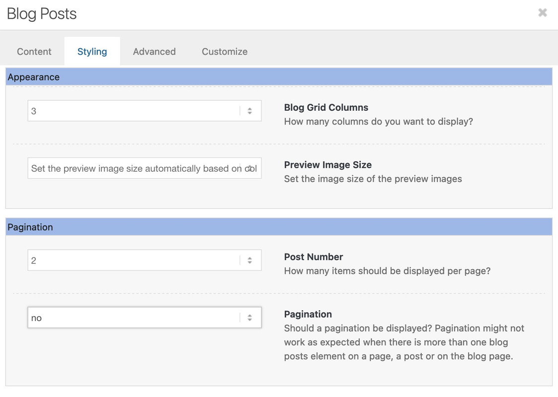
and of course you should probably only choose 2 columns at the top.
Dear Ismael
Thank you very much for the lightning-fast reply :)
I have integrated the script as indicated and YES the map is now displayed over the entire width of the screen.
But there is still a white border at the top and bottom – although margin and padding are set to 0.
Could you help me further so that I can remove this border?
Best regards Diana
Hi!
Is there any way to apply the same efect to a column background image without border?
Yes, this should be possible. Please apply a unique class name (e.g., av-custom-rounded-column) to the column element in the Advanced > Developer Settings > Custom CSS Class field, then add this css code:
#top .av-custom-rounded-column {
   border-radius: 30px;
   overflow: hidden;
}
Cheers!
Ismael