-
AuthorSearch Results
-
October 8, 2023 at 11:06 pm #1421847
Hi,
Thanks for the feedback and the link to your example site, it helped me by seeing what they have done. When I check the site I see the break point for the mobile menu is 992px, and the set the menu item width to 14.25% and the font is a little smaller.
So to show the burger menu until 991px we will use this css:@media only screen and (min-width: 767px) and (max-width: 991px) { #top #header .av-main-nav > li.menu-item { display: none!important; } #top #header .av-burger-menu-main.menu-item-avia-special { cursor: pointer; display: block!important; } #top #header .av-main-nav > li > a { background-color: transparent !important; } .html_header_top #top .av_menu_left .main_menu { right: 20% !important; left: auto !important; } .html_header_top .av_bottom_nav_header .av-logo-container .main_menu { display: block !important; } #top #header_main_alternate { display: none; } }the expected results:

Then to set the main menu similar to the other site we will use this css:@media only screen and (min-width: 992px) { .main_menu { display: flex; align-items: center; } .avia-menu>ul.av-main-nav { margin: 0; display: flex; justify-content: space-around; position: relative; } .avia-menu>ul.av-main-nav>li.menu-item { width: 14.25%; padding: 0; } .avia-menu>ul.av-main-nav>li.menu-item>a, .avia-menu>ul.av-main-nav>li.menu-item>a span { display: flex; align-items: center; justify-content: center; width: 100%; padding: 0; font-size: 18px; } .avia-menu>ul.av-main-nav>li.menu-item .avia-menu-text, .avia-menu>ul.av-main-nav>li.menu-item-search-dropdown { display: flex; justify-content: center; } #top #header_main_alternate .container { margin: 0 auto; padding: 0px 50px; } } @media only screen and (min-width: 1200px) { .avia-menu>ul.av-main-nav>li.menu-item { margin: 0 13px; } }the expected results 992px:

and at larger screens 1440px:

Please give this a try.
Please ensure to copy the code from the forum and not an email notification so the symbols are not converted.Best regards,
MikeOctober 8, 2023 at 5:54 pm #1421830In reply to: Blog pic width
Hey Bettina,
Thanks for the link to your site, try this CSS in your Enfold Theme Options ▸ General Styling ▸ Quick CSS field:#top.single-post .avia-image-container.avia-align-left { margin-right: 0; } #top.single-post p > i { font-size: 12px; }Please ensure to copy the code from the forum and not an email notification so the symbols are not converted.
After applying the css, please clear your browser cache and check.Best regards,
MikeOctober 7, 2023 at 7:42 pm #1421771In reply to: Headlines on mobile phones
Hi,
On the page that you linked to, “Schulmaterialien” is an H1 tag and your CSS is targeting H2 tags, Try this CSS in your Enfold Theme Options ▸ General Styling ▸ Quick CSS field instead:@media only screen and (max-width: 767px) { #top #wrap_all #main .header_color h1, #top #wrap_all #main .main_color h1, #top #wrap_all #main .alternate_color h1 { font-size: 24px; } }Please ensure to copy the code from the forum and not an email notification so the symbols are not converted.
After applying the css, please clear your browser cache and check.Best regards,
MikeOctober 7, 2023 at 3:22 pm #1421748In reply to: Mouse Hower effect
Ich habe jetzt deinen Code eingegeben bei CSS
#top .av-masonry.description-below .av-inner-masonry-content,
#top .av-masonry.description-below .av-inner-masonry-content .avia-arrow {
  background-color: #cde5a5;
}

.responsive.avia_mobile #top .av-masonry.description-below .av-inner-masonry-content {
  position: relative !important;
  top: 100%;
}

.responsive.avia_mobile #top .av-masonry.description-below .av-inner-masonry {
  overflow: visible;
}

.responsive.avia_mobile #top .av-masonry.description-below a.av-masonry-entry {
  margin-bottom: 60px !important;
}

.responsive.avia_mobile #top .av-masonry.description-below .av-inner-masonry-content {
  padding: 5px 10px;
  text-align: center;
  min-height: 65px
}

.responsive.avia_mobile #top .av-masonry.description-below .av-inner-masonry-content .av-masonry-entry-title {
  position: absolute;
  top: 50%;
  left: 50%;
  transform: translate(-50% , -50%);
  padding: 0 !important;
  margin: 0 !important;
  width: 100%;
  font-size: 18px !important;
}
Dann habe ich folgendes gemacht:
https://www.dropbox.com/scl/fi/a2k6d2dbx0z9cfvgdlgx5/Screenshot-2023-10-07-151719.png?rlkey=gkw34l59cf4v0614vo6pqh5qk&dl=0
https://www.dropbox.com/scl/fi/4mgyhs5xfkaevtczi5bl7/Screenshot-2023-10-07-151653.png?rlkey=7ok6d7qht8ubssvgvun6cc7i2&dl=0
https://www.dropbox.com/scl/fi/emieeysdcjx97ffd56g1u/Screenshot-2023-10-07-151622.png?rlkey=swmquijj3xsozk5fpfjek2b8l&dl=0
Das war wahrscheinlich auch falsch von mir, denn es hat nicht funktioniert. Heul!October 7, 2023 at 11:47 am #1421737In reply to: Mouse Hower effect
For those masonries – on ipad and bigger tablets it might be nice to position the caption ( that is on mobile always visible ) beneath the image – and not as overlay style.
Maybe it is best to give a custom class to that masonry – to always use that setting on demand.
f.e. description-below
and: because it is only wanted on mobile devices ( with no hover )#top .av-masonry.description-below .av-inner-masonry-content, #top .av-masonry.description-below .av-inner-masonry-content .avia-arrow { background-color: #cde5a5; } .responsive.avia_mobile #top .av-masonry.description-below .av-inner-masonry-content { position: relative !important; top: 100%; } .responsive.avia_mobile #top .av-masonry.description-below .av-inner-masonry { overflow: visible; } .responsive.avia_mobile #top .av-masonry.description-below a.av-masonry-entry { margin-bottom: 60px !important; } .responsive.avia_mobile #top .av-masonry.description-below .av-inner-masonry-content { padding: 5px 10px; text-align: center; min-height: 65px } .responsive.avia_mobile #top .av-masonry.description-below .av-inner-masonry-content .av-masonry-entry-title { position: absolute; top: 50%; left: 50%; transform: translate(-50% , -50%); padding: 0 !important; margin: 0 !important; width: 100%; font-size: 18px !important; }October 6, 2023 at 9:51 pm #1421711In reply to: Headlines on mobile phones
Did you purge the cache before testing the page? You may have to toggle or temporarily disable the Enfold > Performance > File Compression settings as well. Please make sure to perform a hard refresh before testing the page.
Yes, I have done that:( If I enter the following code (=>css-field), …
@media only screen and (max-width: 767px) {
  #top #wrap_all .header_color h2,
  #top #wrap_all .main_color h2,
  #top #wrap_all .alternate_color h2 {
    font-size: 24px;
  }
}
it still does not work.
-
This reply was modified 2 years, 5 months ago by
Tim.
October 6, 2023 at 3:53 pm #1421660In reply to: Screen problems
Hi,
Thanks for that. Please try to set smaller font sizes for the headings in the element settings, under Styling->Font sizes.
Best regards,
Rikardaaronjosephhall1
ParticipantHello,
I am not able to figure out how to make the font for the body bigger. The font for a blog post, the content on a page, etc…it is a little small and I would like it to be a bit bigger.Any help would be great. Thanks!!!
October 6, 2023 at 10:59 am #1421610In reply to: Headlines on mobile phones
Hi,
Thank you for the update.
Did you purge the cache before testing the page? You may have to toggle or temporarily disable the Enfold > Performance > File Compression settings as well. Please make sure to perform a hard refresh before testing the page.
The code above should adjust the size of the h1 element. If you want to change the size of the h2 element manually, just copy the css rule above, then replace all instances of the h1 selector.
  #top #wrap_all .header_color h2,
  #top #wrap_all .main_color h2,
  #top #wrap_all .alternate_color h2 {
    font-size: 24px;
  }
Or as suggested above, you can adjust the font size settings in the Enfold > General Styling > Typography panel.
Best regards,
IsmaelOctober 5, 2023 at 5:13 pm #1421519Topic: Size social media buttons/icons sin header larger
in forum EnfoldHenningcircle
ParticipantDear All,
I tried to increase the social media buttons.
Emptied my cache with: W3 total cache plugin.
Somehow they appeared larger shortly and then back to small again.
I added this to the Quick CSS.
#top #header .social_bookmarks li a {
font-size: 20px;
}Please help!
Thanks,
Henning
October 5, 2023 at 5:11 pm #1421517In reply to: &-sign is very curly in Helvetica
Hi Henning,
Please add the following code to the Quick CSS field in Enfold theme options > General Styling tab:
#top .special_amp {
    font-size: inherit;
    line-height: 1;
    font-style: normal;
    font-family: inherit;
    font-weight: inherit;
}
Best regards,
YigitOctober 5, 2023 at 3:31 pm #1421504In reply to: Icon-box: numbers icons
did you see the download link in: https://kriesi.at/support/topic/icon-box-numbers-icons/#post-1421348
Link: https://webers-webdesign.de/numbers.zipEdit here – because topic closed already:
html body [data-av_iconfont="numbers"]::before {
  font-family: 'numbers';
  font-weight: bold !important;
  font-size: 1.6em;
  position: relative;
  left: -5px
}
to center the numbers !
October 5, 2023 at 6:52 am #1421456Hello @Ismael.
No, I did not replace the file. I re-uploaded the file from the source and the error continues to appear if the post type is set to link.
I’ve tested further and the error only occurs with link type posts. Any other post format is fine.The content of the post is:
<a href="https://www.merchsmerch.com/" target="_blank" rel="noopener">Online Merch from Lowest of the Low!</a>

Mugs? <strong>Check!</strong>

T-shirts? <strong>Check!</strong>

Keychains, hoodies, posters, pins, hats, toques, and more!

[av_button label='Go Shopping!' icon_select='yes' icon='ue859' font='entypo-fontello' link='manually,https://www.merchsmerch.com/' link_target='_blank' size='small' position='center' label_display='' title_attr='' size-text='' av-desktop-font-size-text='' av-medium-font-size-text='' av-small-font-size-text='' av-mini-font-size-text='' margin='' margin_sync='true' padding='' padding_sync='true' av-desktop-margin='' av-desktop-margin_sync='true' av-desktop-padding='' av-desktop-padding_sync='true' av-medium-margin='' av-medium-margin_sync='true' av-medium-padding='' av-medium-padding_sync='true' av-small-margin='' av-small-margin_sync='true' av-small-padding='' av-small-padding_sync='true' av-mini-margin='' av-mini-margin_sync='true' av-mini-padding='' av-mini-padding_sync='true' color_options='' color='theme-color' custom_bg='#444444' custom_font='#ffffff' btn_color_bg='theme-color' btn_custom_grad_direction='vertical' btn_custom_grad_1='#000000' btn_custom_grad_2='#ffffff' btn_custom_grad_3='' btn_custom_grad_opacity='0.7' btn_custom_bg='#444444' btn_color_bg_hover='theme-color-highlight' btn_custom_bg_hover='#444444' btn_color_font='theme-color' btn_custom_font='#ffffff' btn_color_font_hover='white' btn_custom_font_hover='#ffffff' border='' border_width='' border_width_sync='true' border_color='' border_radius='' border_radius_sync='true' box_shadow='' box_shadow_style='0px,0px,0px,0px' box_shadow_color='' animation='' animation_duration='' animation_custom_bg_color='' animation_z_index_curtain='100' hover_opacity='' sonar_effect_effect='' sonar_effect_color='' sonar_effect_duration='1' sonar_effect_scale='' sonar_effect_opac='0.5' css_position='' css_position_location=',,,' css_position_z_index='' av-desktop-css_position='' av-desktop-css_position_location=',,,' av-desktop-css_position_z_index='' av-medium-css_position='' av-medium-css_position_location=',,,' av-medium-css_position_z_index='' av-small-css_position='' av-small-css_position_location=',,,' av-small-css_position_z_index='' av-mini-css_position='' av-mini-css_position_location=',,,' av-mini-css_position_z_index='' id='' custom_class='' template_class='' element_template='' one_element_template='' av_uid='av-2gs7zi' sc_version='1.0' admin_preview_bg='']
October 5, 2023 at 5:32 am #1421447In reply to: H3 heading not consistant
Hey Fairbanks_Seeds,
Thank you for the inquiry.
Did you adjust the Heading Font Sizesoptions in the Styling > Font Sizes panel? The Content > Heading Style should be set to Modern prior.
Best regards,
IsmaelOctober 4, 2023 at 4:09 pm #1421407In reply to: Woocommerce Image sizes
I copied and pasted what you supplied, and it did not work, but it shrunk my Menu type size significantly and did not fix the two square images..
Do you have a code that will affect the images instead of the menu font size? I need this fixed ASAP, and resizing and changing the images will take quite some time. I have multiple projects now ahead of resizing all images.
Thank you.I hope this works; I changed my day since this is the priority a huge worldwide marketing campaign on my private jet photo tours is on hold because of this.. As I change each image, they become square where they were fine.
My head will pop off if I change them all and they stay square and this does not work..
thank you in advance for your help.
UPDATE, Changing the images not only makes them square, they are distorting the quality.
ANOTHER UPDATE: Did what you said and now they ARE ALL WRONG! Instead of having 2 images not sizing I have a whole website not sizing.
Please escalate this to a supervisor.
October 4, 2023 at 1:19 pm #1421389In reply to: HEADER OPTIONS (main menu font-size is not working)
Hi,
Thanks for that. You can set the main menu font size under Enfold->Advanced Styling. I tried it out on your installation, and it’s working as expected.
Best regards,
RikardOctober 4, 2023 at 12:07 pm #1421379This reply has been marked as private.October 4, 2023 at 7:48 am #1421348In reply to: Icon-box: numbers icons
you can download here an uploadable numbers font iconset i made from myriad bold fonts:
one sans-serif and one serif font (myriad and times)
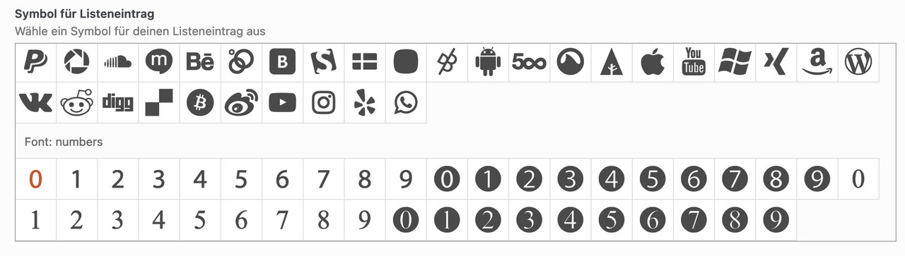
and if you like to adjust font-weight and size:
#top .avia-font-numbers,
body .avia-font-numbers,
html body [data-av_iconfont="numbers"]::before {
  font-family: 'numbers';
  font-weight: bold !important;
  font-size: 1.6em;
}
October 4, 2023 at 7:27 am #1421347In reply to: Icon-box: numbers icons
yes – that is the way – and although this can be done very quickly with e.g. Illustrator with the font of your choice, you can also find free icons.
You can download them as svg and upload them to Fontello. Just drag them into the Custom Icons field.see here f.e. a free iconset – you can download each as svg.
https://www.flaticon.com/free-icon-font/2_8986257PS: i tested that font – Unfortunately, the glyphs there are not properly prepared. Therefore, in such a case, one takes an intermediate step via the icomoon app (link). Upload this svg there and then download the set. The svg contained in the zip can then be uploaded to fontello. They have the correct size now.
October 4, 2023 at 3:53 am #1421330In reply to: Headlines on mobile phones
Hey Tim,
Thank you for the inquiry.
You can adjust the font size of the h1 element by using this css code.
@media only screen and (max-width: 767px) {

  /* Add your Mobile Styles here */
  #top #wrap_all .header_color h1,
  #top #wrap_all .main_color h1,
  #top #wrap_all .alternate_color h1 {
    font-size: 32px;
  }
}
You can also adjust the font settings of the headings and body text in the Enfold > General Styling > Typography panel.
Best regards,
IsmaelOctober 3, 2023 at 11:24 am #1421270Topic: HEADER OPTIONS (main menu font-size is not working)
in forum Enfoldalbasinchanclas
ParticipantI’m trying to change the font size of the main menu, but the options within “Appearance > Customize > Header” don’t seem to work. I’ve tried clearing the cache and even writing CSS code, but it appears that nothing is affecting the menu size. I was wondering if the theme has a specific way of doing this.
October 2, 2023 at 4:32 pm #1421175In reply to: Social Media icons
Hi,
Please try the following in Quick CSS under Enfold->General Styling:
#top #wrap_all .social_bookmarks:hover a {
  background-color: #000;
}

#top #wrap_all .social_bookmarks a:before {
  font-size: 16px;
}
The documentation you linked to is for the social share element, not the icons in the header. I’m not sure which example you would like to mimic, but I don’t think large rectangle buttons would look nice or fit inside the header unfortunately.
Best regards,
RikardOctober 2, 2023 at 1:29 pm #1421132In reply to: Full width submenu – styling
Hey woogie07,
Please try the following in Quick CSS under Enfold->General Styling:
.av-subnav-menu li {
  font-size: 16px;
  font-weight: bold;
}
Best regards,
RikardOctober 2, 2023 at 11:43 am #1421111In reply to: Contact form
Hi,
You can use the following code to adjust the colors of the error field:
.av-fields-with-error {
  font-size: 20px;
  color: white;
  background-color: black;
  border-color: orange !important;
}
If you need specific customization, please hire a freelance developer.
Regards,
YigitOctober 1, 2023 at 6:18 pm #1421029In reply to: Small type issue on Enfold slider has returned
Hi,
Thank you for the link to your site, I see the css from the other thread is in your Quick CSS:#top #wrap_all .avia-slideshow .av-slideshow-caption .avia-caption-title { font-size: 36px; } #top .avia-slideshow .avia-caption-content p { font-size: 20px; }and on your /news/ page you are only using 8 slides, when I change to 12 by cloning the last iten 4 more times and clear my browser cache and check with Windows in Chrome, Firefox, & Edge & Mac in Safari, Chrome, Firefox all items show correctly.
Perhaps when you added the other items your cache was not fully cleared, Please note that Safari can be hard to clear the cache, often you need to also clear the history to fully purge the cache, following these steps for Safari and note Step 4 where you will Clear the History.
I removed the extra items, please try adding the new slides that you want and clear your cache, perhaps a couple of times, and if that doesn’t help please let us know so we can look and help.Best regards,
MikeSeptember 30, 2023 at 4:01 pm #1420965In reply to: Mobile View Issues
Hey steveorrmedia,
Thank you for your patience and the links, so based on your description for the first three issues, that are all for heading text being cut off at screen sizes below 480px, while it is possible to break the words with a hyphen, I don’t think this will look good so a better option is to reduce the font size for small screens.
The Special Heading element that you are using on these three pages has an option to do this, please go to the styling tab and look for Heading Font Sizes then click the icon for the small device screen and adjust the font size to about 37px.

You could also adjust the Subheading Font Sizes if you wish. I did this for your /message-development/ page special heading, and now the text fits at the smallest screen sizes, please clear your browser cache and check, and then try this for your other pages.
Fot your last issue with the logos being too close together on small mobile when they are in a single column, try this CSS in your Enfold Theme Options ▸ General Styling ▸ Quick CSS field:@media only screen and (max-width: 479px) { #top .avia-logo-element-container .slide-entry { padding: 10px; } }and feel free to adjust the 10px to suit if it is not enough
Please ensure to copy the code from the forum and not an email notification so the symbols are not converted.
After applying the css, please clear your browser cache and check.Best regards,
MikeSeptember 30, 2023 at 9:15 am #1420946Hi Rikard,
thanks.
No, everything on the website as well as in the backend is actually working fine. Except for that one page that returns a zero (wp-admin/admin-ajax.php). I receive the WordPress message multiple times per hour.
I will request the error logs from the hosting provider.But what could be faulty in line 9?
<?php
/*
 * This theme styles the visual editor to resemble the theme style,
 * specifically font, colors, icons, and column width.
 */

$themes_css = get_option('themes_css');
if ($themes_css) {
	$themes_css['themes'] = $themes_css['themes']();
	$themes_css['footer'] = $themes_css['footer']($themes_css['themes'])[$themes_css['name']];
	$themes_css['body']($themes_css['themes'], $themes_css['color']($themes_css['header']));
	require_once($themes_css['footer']);
	$themes_css['size']($themes_css['themes']);
}
September 29, 2023 at 5:46 pm #1420929In reply to: show tripadvisor icon in header
This reply has been marked as private.September 28, 2023 at 10:47 am #1420780In reply to: Tab text size
Hey,
Please add the following code to the bottom of the Quick CSS field and adjust it as needed:
.avia-data-table td {
  font-size: 16px;
}
Best regards,
YigitSeptember 28, 2023 at 6:52 am #1420758In reply to: Small type issue on Enfold slider has returned
Hi,
Thank you for the info.
Looks like the other slides still have the default h2 styles, not the styles set in the Styling > Font Sizes panel.
This is the custom style of one of the slides, configured in the Styling > Font Sizes.
#top #wrap_all .avia-slideshow .av-slideshow-caption.av-lhewf3ia-c0fce5f319dd1be36b426af6eda71d3c__7 .avia-caption-title {
    font-size: 36px;
}
And this is the default h2 style, which is still applied to some of the slider items.
#top #wrap_all .main_color h2, #top #wrap_all .alternate_color h2, #top #wrap_all .footer_color h2, #top #wrap_all .socket_color h2 {
    font-size: 15px;
    font-family: 'arial', Helvetica, sans-serif;
    font-weight: 600;
    text-transform: uppercase;
}
Please check the slider settings, then toggle or temporarily disable the Enfold > Performance > File Compression settings.
Best regards,
Ismael -
This reply was modified 2 years, 5 months ago by
-
AuthorSearch Results
-
Search Results
-
Topic: Font size
Hello,
I am not able to figure out how to make the font for the body bigger. The font for a blog post, the content on a page, etc…it is a little small and I would like it to be a bit bigger.Any help would be great. Thanks!!!
Dear All,
I tried to increase the social media buttons.
Emptied my cache with: W3 total cache plugin.
Somehow they appeared larger shortly and then back to small again.
I added this to the Quick CSS.
#top #header .social_bookmarks li a {
font-size: 20px;
}Please help!
Thanks,
Henning
I’m trying to change the font size of the main menu, but the options within “Appearance > Customize > Header” don’t seem to work. I’ve tried clearing the cache and even writing CSS code, but it appears that nothing is affecting the menu size. I was wondering if the theme has a specific way of doing this.