Forum Replies Created
-
AuthorPosts
-
October 17, 2014 at 3:39 pm in reply to: Mobile content width overflows and hidden outside of window #337383October 17, 2014 at 3:30 pm in reply to: How to Add a "Description" or Text within a Contact form on the sidebar? #337377
Hey terrytay!
Please add following code to Quick CSS in Enfodl theme options under General Styling tab and adjust as needed
section#text-2 form h3:after {
content: 'Here goes your text';
float: left;
}
Best regards,
YigitHi jalmz!
Please add following code to Quick CSS
.header_color .header_bg { background-color: transparent; }Cheers!
YigitHey generatrorassociates!
Please go to Enfold/includes and edit error404.php file
Regards,
YigitHey!
you can add following code to Quick CSS to move it lower
.header-scrolled .logo img {
top: 15px;
}
Logo is not cut off when scrolled down, it is just the different logo on pages with transparent headers
Regards,
YigitHey!
You are welcome, glad we could help! Have a nice weekend! :)
Best regards,
YigitHey!
Please try adding following code to Functions.php file in Appearance > Editor
// temporary fix for woocommerce 2.2+ and enfold 3+: woocommerce_product_subcategories() not available in admin mode

add_action('woocommerce_init', function() {
  if ( ! function_exists( 'woocommerce_product_subcategories' ) )
    include_once( __DIR__.'/../../plugins/woocommerce/includes/wc-template-functions.php' );
} );
Cheers!
YigitHi!
Awesome! Let us know if you have any other questions or issues Tom. Have a great weekend!
Best regards,
YigitHey!
Can you please post a screenshot of the issue? I tried resizing the window but your logo is not cut off on my end
Best regards,
YigitHey!
Please review your website now. I added code to English version and it does work fine on my end
Regards,
YigitOctober 17, 2014 at 2:05 pm in reply to: Headeranpassung – keine Transparenz aber 2 verschiedene Logos #337318Hi!
Please add following code to Quick CSS as well
.header-scrolled img.alternate {
opacity: 0;
}
Cheers!
YigitHey Julia!
I tried to login to your website but credentials did not work. Can you please go to WPML options and choose to display language switcher in menu?
Cheers!
YigitHi djsmbd!
Please add following code to first website
@media only screen and (max-width: 480px) {
.responsive .logo a, .responsive .logo img {
height: auto !important; }}
This one to second website
@media only screen and (max-width: 480px) {
.responsive .logo a, .responsive .logo img {
max-width: 95%;
height: auto !important; }}
Can you post screenshots showing the issues? I checked your websites on my iPhone 4 and could not see any issues except for logos and these codes should fix them
Cheers!
YigitHi Effektid!
You can find the file inside Enfold/includes/helper-social-media.php file.
Please also try to increase the allocated memory to 128M: http://codex.wordpress.org/Editing_wp-config.php#Increasing_memory_allocated_to_PHP
You can contact your service provider and they can do it for you.Cheers!
YigitHey!
@odmv91 Josue’s method is the easiest to apply and you can check right away.
@mhafeezmm Thanks :)Cheers!
YigitHi!
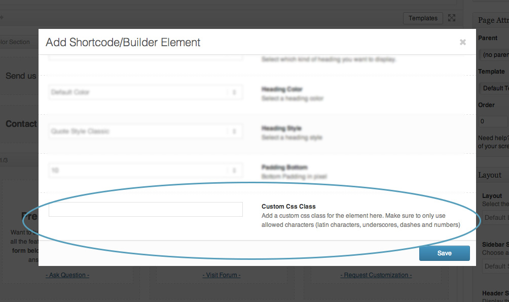
After adding the code to functions.php file you should see custom CSS class field – http://kriesi.at/documentation/enfold/wp-content/uploads/sites/2/2013/12/blur.jpg
You can follow the instructions i posted here – https://kriesi.at/support/topic/iconbox-in-mobile-view/#post-336807
and display different icons on mobileBest regards,
YigitHi!
Can you please try following code as well
.av-main-nav > li > a { -webkit-font-smoothing: antialiased; }which version of OS X and Chrome are you using? I am using Chrome 38.0.2125.104 and OS X 10.9.5 and i could not see a difference between fonts :/
Best regards,
YigitHey!
It should be released later today or in the beginning of the next week
Cheers!
YigitHi mixedmedia99!
Please add following code to Quick CSS in Enfold theme options under General Styling tab
.home nav.main_menu { display: none !important; }If that does not work, please post the link to your website
Regards,
YigitHey!
Please add following code to Quick CSS
@media only screen and (max-width: 480px) {
.responsive .logo a, .responsive .logo img { max-width: 90%!important; height: auto !important; }}
and change header height in Enfold theme options > Header tab. It should make logo smaller automatically
Regards,
YigitOctober 17, 2014 at 1:41 pm in reply to: Remove comments and dates on blog page post slider element #337299Hey!
Sure :) Please add following code to Quick CSS as well
span.news-time {
display: none;
}
Regards,
YigitHi!
It does work fine on my local installation. Please try copying the code from here – http://pastebin.com/22tZg5ar
Cheers!
YigitMerhabalar Orhan!
It does come from social sharing plugin you are using – http://i.imgur.com/FNt8Gwz.png
Cheers!
YigitHey!
Great!
For your information, you can take a look at Enfold documentation here – http://kriesi.at/documentation/enfold/
And if there are features that you wish Enfold had, you can request them and vote the requested ones here – https://kriesi.at/support/enfold-feature-requests/
For any other questions or issues, feel free to post them here on the forum and we will gladly try to help you :)Best regards,
YigitHi!
Please add following code to Quick CSS as well
#top .scroll-down-link:hover {
height: 80px;
transition: height 0.3s ease-in-out;
-webkit-transition: height 0.3s ease-in-out;
-o-transition: height 0.3s ease-in-out;
-moz-transition: height 0.3s ease-in-out;
}
#top .scroll-down-link {
transition: height 0.3s ease-in-out;
-webkit-transition: height 0.3s ease-in-out;
-o-transition: height 0.3s ease-in-out;
-moz-transition: height 0.3s ease-in-out;
}
Best regards,
Yigit -
AuthorPosts