Forum Replies Created
-
AuthorPosts
-
Hi,
To remove the border, please try:#top.home #after_section_2.container_wrap { border-top-style: none!important; }To make the slider 100% wide, Please try:
#top.home #portfolio .avia-content-slider .slide-entry.av_one_fourth {
    width: 25%!important;
}
Best regards,
MikeApril 22, 2018 at 3:11 pm in reply to: Excerpt in magazine not showing up (Enfold child theme) #945045Hi,
Thanks for your feedback, is there anything else we can assist with on this, or shall we close this?Best regards,
MikeHi,
It does seem to work on my Android, but the icon columns are not evenly spaced because “kom-inline1” is a class that is only on two of the icon columns. When I had added the classes I thought you wanted them 2×2
I hope you don’t mind, but since you want them in one line, I changed all 4 of them to “kom-inline” and rewrote the css to add 2% margin to all 4 so they would be evenly spaced:@media only screen and (max-width: 480px) { .kom-inline { display: inline-block!important; width: 72px!important; margin-left: 2%!important; } }Please clear your browser cache and check.
Best regards,
MikeHi,
Glad we were able to help, we will close this now. Thank you for using Enfold.For your information, you can take a look at Enfold documentation here
and the video tutorials here
And if there are features that you wish Enfold had, you can request them and vote the requested ones here
For any other questions or issues, feel free to start new threads under Enfold sub forum and we will gladly try to help you :)Best regards,
MikeHey Perry,
I recommend using a link masking service such as https://goo.gl/
I tested using & to replace the & in your link, but after a couple of edits to was replaced with the other symbol.
I also tested this plugin which seems to work with the default editor, it doesn’t work with the advanced layout builder.
But it’s still not a good solution because the filter that WordPress puts in place it there to protect your site, which is why you won’t find a plugin on the WordPress plugin site that will do this.
I’m sure you could setup a 301 redirect, or write a js script, but in the long run it would just be easier to use a link shorter or masking service.Best regards,
MikeHey norbou,
I have looked at your production site and found no errors on the page. Unless these errors only show on the backend?
For your new demo site, please Try disabling your plugins and include a admin login in the private content area so we can take a closer look.
I was able to FTP in, but I assume that it is the root for your production site, and I couldn’t determine which folder was for your new demo site.
I also assume that as it is a new demo site you have not updated a older version of Enfold to the latest version? I ask to rule this error out.
Which PHP version is your webhost using? Hopefully version 7.x but not 7.2Best regards,
MikeApril 21, 2018 at 8:24 pm in reply to: Random text in footer of enfold construction theme – #ua-117526703-1" #944964Hey lkulube,
This looks like Google Analytics code, I imagine that it was placed in the Enfold Theme Options > Google Services > Google Analytics Tracking Code box incorrectly.
If this is true, please remove the code and replace it with the whole code with the script that you get from Google Analytics, it should look similar to this:<script> (function(i,s,o,g,r,a,m){i['GoogleAnalyticsObject']=r;i[r]=i[r]||function(){ (i[r].q=i[r].q||[]).push(arguments)},i[r].l=1*new Date();a=s.createElement(o), m=s.getElementsByTagName(o)[0];a.async=1;a.src=g;m.parentNode.insertBefore(a,m) })(window,document,'script','https://www.google-analytics.com/analytics.js','ga'); ga('create', 'UA-XXXXX-Y', 'auto'); ga('send', 'pageview'); </script>Best regards,
MikeHey FadingReality,
The first one is a grid row with two halves, on the left is a column and text blocks, on the right is a background image in the grid row.
Please try to Enable Avia Layout Builder Debug and paste this code into the debugger box on a new page on your site and save *please note the images will not show on your site, try adding your own images.:[av_layout_row border='' min_height_percent='' min_height='' color='main_color' mobile='av-flex-cells' id='Best Rated' av_element_hidden_in_editor='0'] [av_cell_one_half vertical_align='middle' padding='150px,0px,150px,150px' background_color='#f8f8f8' src='' attachment='' attachment_size='' background_attachment='scroll' background_position='top left' background_repeat='no-repeat' mobile_display=''] [av_one_full first min_height='' vertical_alignment='av-align-top' space='no_margin' custom_margin='aviaTBcustom_margin' margin='0px' margin_sync='true' padding='0px' padding_sync='true' border='' border_color='' radius='0px' radius_sync='true' background_color='' src='' attachment='' attachment_size='' background_position='top left' background_repeat='no-repeat' animation='left-to-right' mobile_display=''] [av_heading tag='h1' padding='20' heading='More than 100.000 users and the best rating on Themeforest' color='custom-color-heading' style='blockquote modern-quote' custom_font='#000000' size='40' subheading_active='' subheading_size='15' custom_class='' admin_preview_bg=''][/av_heading] [av_hr class='custom' height='50' shadow='no-shadow' position='left' custom_border='av-border-fat' custom_width='50px' custom_border_color='#000000' custom_margin_top='30px' custom_margin_bottom='30px' icon_select='no' custom_icon_color='' icon='ue808' font='entypo-fontello'] [av_textblock size='' font_color='' color='' admin_preview_bg='rgb(255, 255, 255)'] Enfold is the best rated top seller on <a href="https://themeforest.net/?ref=Kriesi" target="_blank">Themeforest</a>. There is no other theme with that many sales that has an average rating of 4.85. Heck, you will be hard pressed to find <strong>ANY</strong> product on the web with that many sales and a rating that good ;) [/av_textblock] [av_hr class='invisible' height='20' shadow='no-shadow' position='left' custom_border='av-border-fat' custom_width='50px' custom_border_color='#000000' custom_margin_top='30px' custom_margin_bottom='30px' icon_select='no' custom_icon_color='' icon='ue808' font='entypo-fontello'] [av_font_icon icon='ue808' font='entypo-fontello' style='' caption='' link='' linktarget='' size='40px' position='left' color='#e2bc12'][/av_font_icon] [av_font_icon icon='ue808' font='entypo-fontello' style='' caption='' link='' linktarget='' size='40px' position='left' color='#e2bc12'][/av_font_icon] [av_font_icon icon='ue808' font='entypo-fontello' style='' caption='' link='' linktarget='' size='40px' position='left' color='#e2bc12'][/av_font_icon] [av_font_icon icon='ue808' font='entypo-fontello' style='' caption='' link='' linktarget='' size='40px' position='left' color='#e2bc12'][/av_font_icon] [av_font_icon icon='ue808' font='entypo-fontello' style='' caption='' link='' linktarget='' size='40px' position='left' color='#e2bc12'][/av_font_icon] [av_hr class='invisible' height='42' shadow='no-shadow' position='left' custom_border='av-border-fat' custom_width='50px' custom_border_color='#000000' custom_margin_top='30px' custom_margin_bottom='30px' icon_select='no' custom_icon_color='' icon='ue808' font='entypo-fontello'] [av_button label='Get it now' link='manually,http://themeforest.net/item/enfold-responsive-multipurpose-theme/4519990?license=regular&open_purchase_for_item_id=4519990&purchasable=source&ref=Kriesi' link_target='' size='large' position='left' icon_select='yes' icon_hover='aviaTBicon_hover' icon='ue859' font='entypo-fontello' color='dark' custom_bg='#444444' custom_font='#ffffff' admin_preview_bg='rgb(255, 255, 255)'] [/av_one_full][/av_cell_one_half][av_cell_one_half vertical_align='middle' padding='500px,0px,500px,0px' background_color='#f8f8f8' src='https://test.kriesi.at/enfold-2017/wp-content/uploads/sites/24/2017/01/mockup.png' attachment='298' attachment_size='full' background_attachment='scroll' background_position='bottom left' background_repeat='no-repeat' mobile_display='av-hide-on-mobile'] [/av_cell_one_half] [/av_layout_row]The second one is a color section with a background image, and two 1/2 columns, the left column is empty, the column on the right has text blocks. Here’s the code for it:
[av_section min_height='' min_height_px='500px' padding='huge' shadow='no-border-styling' bottom_border='border-extra-arrow-down' bottom_border_diagonal_color='#ffffff' bottom_border_diagonal_direction='' bottom_border_style='' id='Demos' color='main_color' custom_bg='' src='https://test.kriesi.at/enfold-2017/wp-content/uploads/sites/24/2015/07/isometric-1.jpg' attachment='447' attachment_size='full' attach='scroll' position='center left' repeat='contain' video='' video_ratio='16:9' overlay_opacity='0.5' overlay_color='' overlay_pattern='' overlay_custom_pattern='' av_element_hidden_in_editor='0']
[av_one_half first min_height='' vertical_alignment='av-align-top' space='no_margin' custom_margin='aviaTBcustom_margin' margin='50px' margin_sync='true' padding='0px' padding_sync='true' border='' border_color='' radius='0px' radius_sync='true' background_color='' src='' attachment='' attachment_size='' background_position='top left' background_repeat='no-repeat' animation='left-to-right' mobile_display='']

[/av_one_half][av_one_half min_height='' vertical_alignment='av-align-top' space='no_margin' custom_margin='aviaTBcustom_margin' margin='0px' margin_sync='true' padding='50px' padding_sync='true' border='' border_color='' radius='0px' radius_sync='true' background_color='rgba(255,255,255,0.85)' src='' attachment='' attachment_size='' background_position='top left' background_repeat='no-repeat' animation='left-to-right' mobile_display='']

[av_heading tag='h1' padding='20' heading='A growing library of more than 2 dozen demos' color='custom-color-heading' style='blockquote modern-quote' custom_font='#000000' size='40' subheading_active='' subheading_size='15' custom_class=''][/av_heading]

[av_hr class='custom' height='50' shadow='no-shadow' position='left' custom_border='av-border-fat' custom_width='50px' custom_border_color='#000000' custom_margin_top='30px' custom_margin_bottom='30px' icon_select='no' custom_icon_color='' icon='ue808' font='entypo-fontello']

[av_textblock size='' font_color='' color='' admin_preview_bg='rgb(255, 255, 255)']
Our demos are one of a kind: we only offer<strong> full concept demos</strong> with multiple pages that show whole projects, unlike others who only include a single page and call that a demo ;)

You can import them with <strong>a single click</strong>, they are easily adaptable to your needs and you can chose from a variety of layouts and niche designs. In addition to that you can also use the <strong>demo images used in our demo for your own project</strong>!
[/av_textblock]

[/av_one_half]
[/av_section]
Best regards,
MikeHey Daniel-88,
Did you happen to update the theme before this occurred? If so did you update via FTP?
After you renamed the theme folder so you could login, did you try disabling your plugins?
Is your webhost using PHP v7? Not v7.2After checking the plugins and PHP version, if this doesn’t help, Can you please include a admin login to one of the sites with FTP access in the private content area so we can take a closer look.
Best regards,
MikeHi,
Is there anything else we can assist with this issue, or shall we close this then?Best regards,
MikeHey werbeagenturlauf,
Please try this code in the General Styling > Quick CSS field:div.av-logo-container { background: url(https://your-site.de/wp-content/uploads/2018/04/Logo-Brodner-full-size-1.png) no-repeat; background-size: contain; background-position: center; } .logo img { display: none !important; }Please see screenshot in Private Content area.
Best regards,
MikeHey francescozerbinato,
Once you have installed a demo, choosing another will overwrite the first.
But you can install Enfold on a localhost and install a different demo on it, then copy the pages using the Avia Layout Builder Debugger to your live site.Best regards,
MikeHey bilgecelik,
Please see this article: Fix: WordPress Memory Exhausted Error – Increase PHP MemoryBest regards,
MikeApril 21, 2018 at 6:45 pm in reply to: Hide social and tel on mobile and change secondary menu from right to left #944945Hi,
Glad we were able to help, we will close this now. Thank you for using Enfold.For your information, you can take a look at Enfold documentation here
and the video tutorials here
And if there are features that you wish Enfold had, you can request them and vote the requested ones here
For any other questions or issues, feel free to start new threads under Enfold sub forum and we will gladly try to help you :)Best regards,
MikeHi,
To make your post slider 100% width, please add your Post Slider inside a Color Section element with a unique ID – http://kriesi.at/documentation/enfold/wp-content/uploads/sites/2/2013/12/color-section-ID.png
and then add following code to Quick CSS in Enfold theme options under General Styling tab#your-unique-id .container { max-width: 100%; margin: 0; padding: 0; }Best regards,
MikeHi,
Odd, I don’t see the round edges, perhaps I’m looking in the wrong place?
Please see screenshot in Private Content area.Best regards,
MikeApril 21, 2018 at 6:30 pm in reply to: Hide social and tel on mobile and change secondary menu from right to left #944940Hi,
Do you mean that you are doing a tiny bit of tweaking on other elements, or that you wanted assistance with a tiny bit of tweaking on other elements?
If so please explain.Best regards,
MikeHi,
I added a new class to the 4 icon columns “kom-inline” & “kom-inline1”
I then added this code in the General Styling > Quick CSS field:@media only screen and (max-width: 480px) { .kom-inline,.kom-inline1 { display: inline-block!important; width: 105px!important; } .kom-inline1 { margin-left: 20%!important; } }This is the result:
Please clear your browser cache and check.Best regards,
MikeHey kellyCraftMedia,
To open the thumbnail of the post slider in a lightbox please try this solution
To remove the margin from the slides please try this css:#top.home .avia-content-slider-inner .slide-entry-wrap .slide-entry.flex_column { margin-left: 0%!important; }Please remove the permissions for viewing your mockup.
Best regards,
MikeHey ExagOne59,
Sorry, this was custom created by Kriesi for his site, and while it has been asked before, this custom code and script is not available at this time.
Please feel free to request – or vote if already requested – such feature on Enfold feature request form.Best regards,
MikeHi,
@apremierdj: Please open a new thread so we can assist, we will want communicate in the Private Content area, such as your URL & admin login, but as this is not your thread your info will not be private.In your new thread Please create one button using this method on a test page, and include a admin login in the private content area so we can take a closer look.
Best regards,
MikeApril 21, 2018 at 5:06 pm in reply to: Excerpt in magazine not showing up (Enfold child theme) #944925Hey wacky32,
To show the excerpt in the magazine element you will need to follow these instructionsBest regards,
MikeHi,
I was able to login and I took a look at your top two color sections that make your “Wachstum – Effizienz – Transparenz” for the different device views.
I see that for phones & tablets they use one of the color sections, that is a sky & ocean, I also see that in both views the position is top & center.
I believe that what you are referring to is that in the tablet view, that you like, it is mostly sky.
And in the phone view, that you don’t like, it is 50% sky & 50% ocean.
Do I understand the issue correctly?
In this case why not edit your image so it will only show what you want to see?
I have created an example, uploaded it, and selected it for the background of your color section, please check.
If it doesn’t suit, please re-select your original image.Best regards,
MikeHey JeffBianchi,
To add more social profiles please follow the instructions here instead of “Houzz” you will be using “IMDB”
I took a quick look on Fontello and found the do have the IMBD icon:
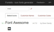
Let us know if you need more assistance with this.Best regards,
MikeHey iedigitaldesign,
It looks as though the links in your menu are formatted like this:/legal-services/#special-needsplease try changing to this:
/legal-services#special-needsBest regards,
MikeHey Ushbot,
Thank you for using Enfold.The portfolio category sort will not be displayed base on the categories’ hierarchy. It will include all categories (parent & sub) in a single list. Creating a dropdown for the sub categories will require a major modification on the theme that we will not be able to provide here. Please contact codeable: http://kriesi.at/contact/customization
Best regards,
MikeApril 21, 2018 at 2:15 pm in reply to: external links are not opened in new tab, even though it is configured correctly #944907Hey ssmgmbh,
I believe that you do want your links to open in a new tab, and I see you are using “target _blank” is this error site wide or just one page?
Can you please include a admin login in the private content area for the site with the error, so we can take a closer look.Best regards,
MikeApril 21, 2018 at 2:04 pm in reply to: SSL-Umstellung, AVIA Java-Script lädt unsicheres Bild nach #944905Hey swelzel,
Es sieht so aus, als ob ein Demo-Image nicht korrekt importiert wurde. Bitte schauen Sie in den Farbbereich mit dem roten Streifen
“Laden Sie sich unseren Flyer herunter” für ein Hintergrundbild und entfernen Sie es. (Haus-Draht-Modell-Fade-White-1500×1085.png)
Wenn Sie es nicht finden können, geben Sie bitte einen Administrator-Login im Bereich für private Inhalte an, damit wir genauer hinsehen können.
Bitte sehen Sie sich den Screenshot im Bereich Privater Inhalt an.
———
It looks as though a demo image didn’t get imported correctly, please look in the color section with the Red Stripe
“Laden Sie sich unseren Flyer herunter” for a background image and remove it. (house-wire-model-fade-white-1500×1085.png)
If you can’t find it, please provide a admin login in the private content area so we can take a closer look.
Please see screenshot in Private Content area.Best regards,
MikeHi,
The email address for the login is not correct, please check.
The removing of the code may have not worked for you due to caching.Best regards,
MikeHi,
I see the form changed a little, I replaced the code with this:p#element_avia_1_1,p#element_avia_4_1,p#element_avia_6_1 { padding-right: 10px; }To remove the gallery boarder, I added this code:
#top div .avia-gallery img {
    border-style: none!important;
    border-width: 0px!important;
    padding: 0px!important;
}
The gallery caption is added when you add gallery items that have a caption typed under the image, I removed the caption for you:
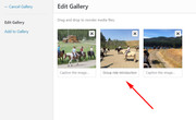
Please review these changes, and list the adjustments we still need to address, I think there’s just one left?Best regards,
Mike -
AuthorPosts