Forum Replies Created
-
AuthorPosts
-
Hi,
@ariadifoto
Please open a new thread so we can assist, we will want communicate in the Private Content area, such as your URL & admin login, but as this is not your thread your info will not be private. Thanks for your patience and understanding.
In your new thread please provide admin login & FTP login info and the demo you would like installed, so it will be clear. Please make the title: “Help with Demo Import” I will look for it later and try to assist. Also please include which webhost you are using.
Please note that you will lose all content, setting, users, etc. You will be given a new admin login based on the login details you give.Best regards,
MikeHey T4Media2,
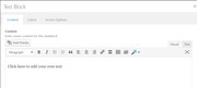
If that is a text block element it should look like this:
It looks like a plugin conflict, what is the “insert image” button in your screenshot?
Try disabling your plugins. If that resolves the issue, reactivate each one individually until you find the cause.Best regards,
MikeHey Neverlands,
I believe the overlays are a percentage of the image size, where the images in the first section are actually much larger with more white space. But I was able to target them with this css, please try this code in the General Styling > Quick CSS field:#top.home #av_section_3 .image-overlay .image-overlay-inside:before { height: 40px !important; width: 40px !important; line-height: 40px !important; margin: -20px 0 0 -20px !important; }Please adjust to suit.
Best regards,
MikeHi,
Glad we were able to help, we will close this now. Thank you for using Enfold.For your information, you can take a look at Enfold documentation here
and the video tutorials here
And if there are features that you wish Enfold had, you can request them and vote the requested ones here
For any other questions or issues, feel free to start new threads under Enfold sub forum and we will gladly try to help you :)Best regards,
MikeHi,
Sorry, I don’t understand “submap” do you mean “sub-domain” ?
The shop url doesn’t work, please see Private Content area.
Have you tried removing your “Shop” menu item and adding a new “custom link” menu item with the link to the page you want?Best regards,
MikeHi,
I did write the code to only remove the breadcrumbs, I didn’t know you wanted the title removed too.
If you want the title & breadcrumbs removed why not make that change in your page Layout > Title Bar Settings?
To check all of your code for errors, copy and paste to WordPress > Customize > Additional CSS
it will provide error checking.Best regards,
MikeMay 8, 2018 at 11:24 am in reply to: 1 Photo upload create in the /wp-content/uploads/* folder a lot of files #953308Hi,
Sorry, I’m not sure I follow.
I understand that you have 10k photos to upload, so all the extra files is no good.
Then I think you are saying you only need two sizes for each image?
If this is true, you can remove some of the sizes in the functions.php look for:/* * Register additional image thumbnail sizes * Those thumbnails are generated on image upload! * * If the size of an array was changed after an image was uploaded you either need to re-upload the image * or use the thumbnail regeneration plugin: http://wordpress.org/extend/plugins/regenerate-thumbnails/ */ $avia_config['imgSize']['widget'] = array('width'=>36, 'height'=>36); // small preview pics eg sidebar news $avia_config['imgSize']['square'] = array('width'=>180, 'height'=>180); // small image for blogs $avia_config['imgSize']['featured'] = array('width'=>1500, 'height'=>430 ); // images for fullsize pages and fullsize slider $avia_config['imgSize']['featured_large'] = array('width'=>1500, 'height'=>630 ); // images for fullsize pages and fullsize slider $avia_config['imgSize']['extra_large'] = array('width'=>1500, 'height'=>1500 , 'crop' => false); // images for fullscrren slider $avia_config['imgSize']['portfolio'] = array('width'=>495, 'height'=>400 ); // images for portfolio entries (2,3 column) $avia_config['imgSize']['portfolio_small'] = array('width'=>260, 'height'=>185 ); // images for portfolio 4 columns $avia_config['imgSize']['gallery'] = array('width'=>845, 'height'=>684 ); // images for portfolio entries (2,3 column) $avia_config['imgSize']['magazine'] = array('width'=>710, 'height'=>375 ); // images for magazines $avia_config['imgSize']['masonry'] = array('width'=>705, 'height'=>705 , 'crop' => false); // images for fullscreen masonry $avia_config['imgSize']['entry_with_sidebar'] = array('width'=>845, 'height'=>321); // big images for blog and page entries $avia_config['imgSize']['entry_without_sidebar']= array('width'=>1210, 'height'=>423 ); // images for fullsize pages and fullsize slider $avia_config['imgSize'] = apply_filters('avf_modify_thumb_size', $avia_config['imgSize']); $avia_config['selectableImgSize'] = array( 'square' => __('Square','avia_framework'), 'featured' => __('Featured Thin','avia_framework'), 'featured_large' => __('Featured Large','avia_framework'), 'portfolio' => __('Portfolio','avia_framework'), 'gallery' => __('Gallery','avia_framework'), 'entry_with_sidebar' => __('Entry with Sidebar','avia_framework'), 'entry_without_sidebar' => __('Entry without Sidebar','avia_framework'), 'extra_large' => __('Fullscreen Sections/Sliders','avia_framework'), ); avia_backend_add_thumbnail_size($avia_config);and remove the ones you don’t want, be sure to save a copy of the original file should you make an error.
Or you can use the plugin above and set the size to zero for the images you don’t want, this might be the best option.
After you remove your sizes please use this plugin: Regenerate Thumbnails
As you remove each size check your site to ensure the size you removed is not used elsewhere.
Best regards,
MikeHi,
Sorry, it looks like I forgot the last } in the code, please try this:@media only screen and (max-width: 767px) { #av_section_1 .flex_column_div.first,#av_section_1 .flex_column.el_after_av_one_half { padding: 0px !important; } }Best regards,
MikeHi,
Thank you for sharing your solution, we will close this now. Thank you for using Enfold.For your information, you can take a look at Enfold documentation here
and the video tutorials here
And if there are features that you wish Enfold had, you can request them and vote the requested ones here
For any other questions or issues, feel free to start new threads under Enfold sub forum and we will gladly try to help you :)Best regards,
MikeHi,
Odd, please try adding to the other end of your css block, that is if you added it to the end last time, try adding to the top this time. If it works, you may have a missing ; or } in your css. If it doesn’t work try adding to WordPress > Customize > Additional CSS.Best regards,
MikeHi,
Typically we try to keep one question per thread so the threads don’t get so long, but go ahead and ask here :)Best regards,
MikeHi,
Glad we were able to help, we will close this now. Thank you for using Enfold.For your information, you can take a look at Enfold documentation here
and the video tutorials here
And if there are features that you wish Enfold had, you can request them and vote the requested ones here
For any other questions or issues, feel free to start new threads under Enfold sub forum and we will gladly try to help you :)Best regards,
MikeHi,
Your not doing anything wrong, it’s just that the template adds some padding around elements by default, and this is one of those rare cases where you don’t want that. Unfortunately if you want to do the same again we will need to help with some code.
I added the code to your Enfold Theme Options > General Styling > Quick CSS field
and gave your separator 10px of height, please adjust to suit.Best regards,
MikeHi,
We would be happy to help, but you could try using this code again, most likely the “#av_section_1” will be a different number like “#av_section_6” using your browser’s inspector tool would show you the number.Best regards,
MikeHi,
Sorry, I see now that I did miss that there is a flex_column_table above.
Please try:#top.page-id-3719 .flex_column_table:nth-child(n+15) { width: 80%!important; margin: auto!important; }Best regards,
MikeHi,
@VSG_DE Please include the url to the page in question so we can take a closer look. If you could add a screenshot of the issue, it would be helpful.Best regards,
MikeHi,
Thanks for making it red, it really helps :)
Please try:#top.home #main #av_section_1.avia-section { min-height: 10px !important; max-height: 10px !important; }Please clear your browser cache and check.
Best regards,
MikeHi,
I looked at your page again, and I’m sure you only have one “flex_column_table” on the page, the “flex_column” below with the images are not affected.
Please see screenshot in Private Content area.
But if you only want to do one row within the flex_column_table, you will need to please give more info, preferably with a screenshot.
We can work on the second issue within this thread, once the code fix for the first is in place.
Thanks for your patience and understanding.Best regards,
MikeHi,
@id8872
Ok, I can understand that.
So to do it yourself, install WordPress & Enfold on a localhost, & then install the demo you wish.
Then upload all of the files in /wp-content/uploads/ from your localhost via FTP to your live site, then push your database from your localhost to your live site using this plugin.
Read the plugin site on how to use it.One other option is to install the demo on a localhost, FTP the files, and use this plugin to save your database, and then use it in PHPmyAdmin to replace your live site database. Mostly the same steps, only the first plugin is easier.
I have found that installing the demo on a localhost works 100% of the time, and using the plugin to push the database work about 95% of the time, of the sites that the user could not install the demo themselves.
I found that some managed WP hosts, have made many changes to permissions, firewalls, & security scripts so that the demo install either throws a false positive or permissions are not allowed or the process times out, such as “Godaddy Managed WP”
Some hosts, such as Strato webhost, refuse to assist in debugging the issue. Although using these steps above have worked on Strato 100% of the time so far.I firmly believe that the issue is with the webhost not allowing the demo import, a localhost import works 100% of the time… with the correct minimum settings.
PHP Version: 5.6.x
PHP Time Limit:	No limit
PHP Memory Limit: 256M
PHP Post Max Size: 50M
PHP Max Upload Size: 20M
Please try this for yourself, I hope this helps, as always are happy to assist.
Best regards,
MikeHi,
@farangsamui
Please open a new thread so we can assist, we will want communicate in the Private Content area, such as your URL & admin login, but as this is not your thread your info will not be private. Thanks for your patience and understanding.
In your new thread please provide admin login & FTP login info and the demo you would like installed.
Please note that you will lose all content, setting, users, etc. You will be given a new admin login based on the login details you give.Best regards,
MikeHey rankbrite,
To change the social icon colors, Try this code in the General Styling > Quick CSS field:#top #wrap_all .av-social-link-twitter a,#top #wrap_all .av-social-link-instagram a,#top #wrap_all .av-social-link-facebook a,#top #wrap_all .social_bookmarks a { background-color: #1B1E2F; color: #8dd733 !important; }Best regards,
MikeMay 7, 2018 at 5:00 am in reply to: 1 Photo upload create in the /wp-content/uploads/* folder a lot of files #952478Hey br50com,
WordPress creates many different image sizes when you upload a image and chooses the appropriate file to show depending on screen size the device viewing the site, and the element showing the image. This is normal and intended. Although you can change these sizes using a plugin such as Simple Image Sizes or writing some code, but both of these options are meant for advanced users, most users will find the built in sizes are the best option.
I hope this helps explain it.Best regards,
MikeHi,
You to add your own choice of icon fonts from fontello.com in to the theme at Enfold Theme Options > Import/Export > Iconfont Manager
Please read more hereBest regards,
MikeMay 7, 2018 at 4:40 am in reply to: Enfold footer theme not displaying correctly on the site #952468Hey woveon,
The footer widgets you were seeing are the defaults when there are no widgets in the footer, I added 3 blank widgets and it removed the defaults, please replace the blank widgets with your own. The footer background color was set to white via Enfold Theme Options > General Styling > Footer
I changed it to the darker color as shown in the demo, “#35383C” Please adjust to suit.Best regards,
MikeMay 7, 2018 at 4:27 am in reply to: Parse error: syntax error, unexpected T_FUNCTION on update #952461Hey Kathleen,
Thank you for the FTP login & password, but can you please include the ftp address.
Also include admin login, so we can investigate by temporary disabling the theme.Best regards,
MikeHey rmatus,
Do you mean the blue strip “She’s the same person”
Try this code in the General Styling > Quick CSS field:#top.home #av_section_1 .container {padding: 0px !important; margin: 0px !important; width: 100% !important; max-width: 1900px !important; }max-width: 1900px works for my screen, but feel free to adjust to suit.
Best regards,
MikeHi,
The WordPress search function is pretty simple / limited, have you considered trying a more advanced search plugin?Best regards,
MikeHi,
Unfortunately, that’s not possible at the moment. Please request for the feature here.
One workaround is to hide the tab section on mobile and then replace it with a different element (ex. tabs or accordion) using the same content. Use the elements’ Screen Options to show or hide per screen size.Best regards,
Mike -
AuthorPosts