Forum Replies Created
-
AuthorPosts
-
Hey dreyerjm,
I’m not sure why this is, try this css:.avia-buttonrow-wrap.avia-builder-el-last { clear: left; }Then clear your cache.
Best regards,
MikeHey Luigi,
When I check the changelog it shows February 20th 2026 – Version 7.1.4
Please refer to this one.Best regards,
MikeFebruary 28, 2026 at 3:47 pm in reply to: Please help! How do I make Button link, open the side Elfsight Form? #1495602Hi,
I see that your button is in a text block, the reason that the text is not centered is because it has a
BR before the text, try viewing in the plain text tab of the element and remove the BR
If you can’t find it try this css:.avia_textblock .avia-slideshow-button br { display: none; }Hi,
There is not a setting, you will need to use css. Since I’m not seeing the same as you I had to guess a little, try the following css and adjust to suit:@media only screen and (max-width: 767px) { #top .logo img { max-height: 140px; } #top .logo img { left: 55%; transform: translateX(-50%); } #top .av-burger-menu-main { transform: translateY(-38%) !important; } .av-hamburger-box { width: 50px!important; } .av-hamburger-inner::before{ top: -15px; } .av-hamburger-inner::after { bottom: -15px; } .av-hamburger-inner, .av-hamburger-inner::before, .av-hamburger-inner::after { height: 6px; } }This is how it looks for me with this css:

Best regards,
MikeHi,
For that page try adding this css:.page-id-4370 .iconbox_left_content.avia-builder-el-9 .avia-icon-pos-left.av_font_icon{ float: none; margin-right: 0; vertical-align: middle; display: inline-block; padding-left: 0.5em; } .page-id-4370 .iconbox_left_content.avia-builder-el-9 .iconbox_content_container strong { font-size: 15px; }Best regards,
MikeHey dreyerjm,
Try this solution: https://kriesi.at/support/reply/1467773/
Note that you will need to have jQuery, check that your cache plugin or the theme performance settings is not loading it in the footer or blocking it.Best regards,
MikeHi,
This is how it looks on my mobile:

The logo & burger menu both look large to me, do you still want them larger?
If you want to show the social icons on mobile, I recommend showing them in the top bar, but this will also show on desktop, probably not what you want.
How about adding the social icons to mobile menu?Best regards,
MikeHi,
I was not able to login as Wordfence blocked me. When you look at the theme settings for the license do you see any errors?
Have you recently updated the token?
Envato limits daily update checks across all tokens on your account. Wait up to 24 hours if you’ve recently updated your token or checked 15 or more times for all tokens on your account.
If not try the Envato Market Plugin, or follow these steps to manually update.To update Enfold manually you can download the latest installable WP version from your Theme Forest account and upload it to your WordPress ▸ Appearance ▸ Themes ▸ Add Themes ▸ Add New
after you choose the zip file and click install, you will see a This theme is already installed message because you are updating, you can continue,
then you will see the Theme updated successfully message.Best regards,
MikeHi,
Glad to hear that you found the issue. We do not recommend using the plugin, the theme settings has the Classic Editor option, please use this setting instead.Best regards,
MikeFebruary 25, 2026 at 10:30 pm in reply to: Lightbox Caption Showing Filename – How do I change that? #1495503Hey theamplifiedagent,
Typically it is the title of the image that is shown, check your image in the media library and check the title field, it is possible that if you didn’t add a title it will fallback to the file name.
If you find that there is no title and you don’t want to edit dozens of images adding titles, you can hide this field with this css:.mfp-content .mfp-title { display: none; }Best regards,
MikeHi,
Your screenshots are not working but I understand. Your issue seems to be related to a cache, when I check your page with Firefox & Edge the accodeon toggles are gray because the mouseover color is set by the main-color-bg set in the theme options #e1e1e1:.main_color .toggler:hover { background: var(--enfold-main-color-bg2); }If you what them to be orange then try changing that color in the theme settings, but note that this color setting changes many elements in the theme. If you don’t want everything to change then try this css:
#top .main_color .toggler:hover {
	background: #db5200;
}
As for your second question, I can’t see the screenshot but I see that the top color section has a background color of white. Try changing the color in the color section, or try this css:
.page-id-9206 #av_section_1.main_color {
	background-color: #d5c58a;
}
After these changes clear all of your caches.
Best regards,
MikeHi,
On your /find-food/ page your column Vertical Alignment was set to middle, I changed it to top
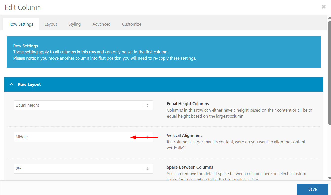
The reason is that the first column has more text which sets the height for the other two columns, but with the Vertical Alignment set to middle the other two columns center the content. In the screenshot notice how the special heading titles and images do not line up:
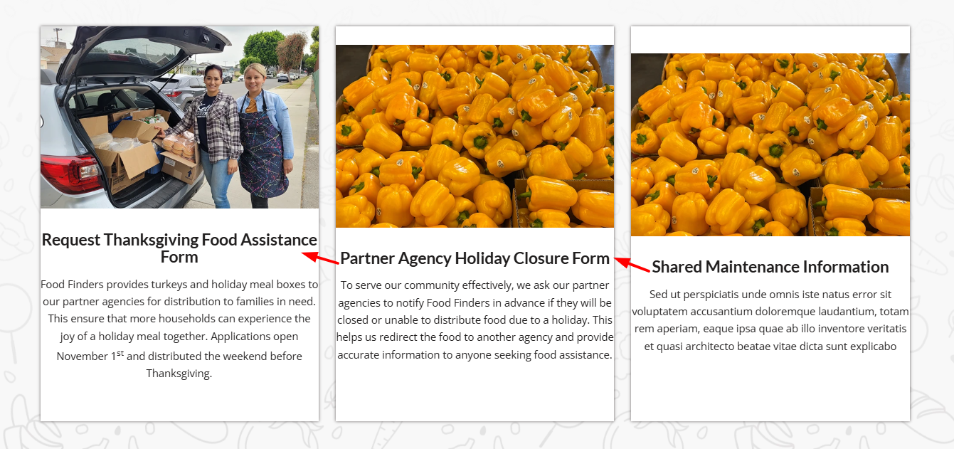
After making the change everything lines up:
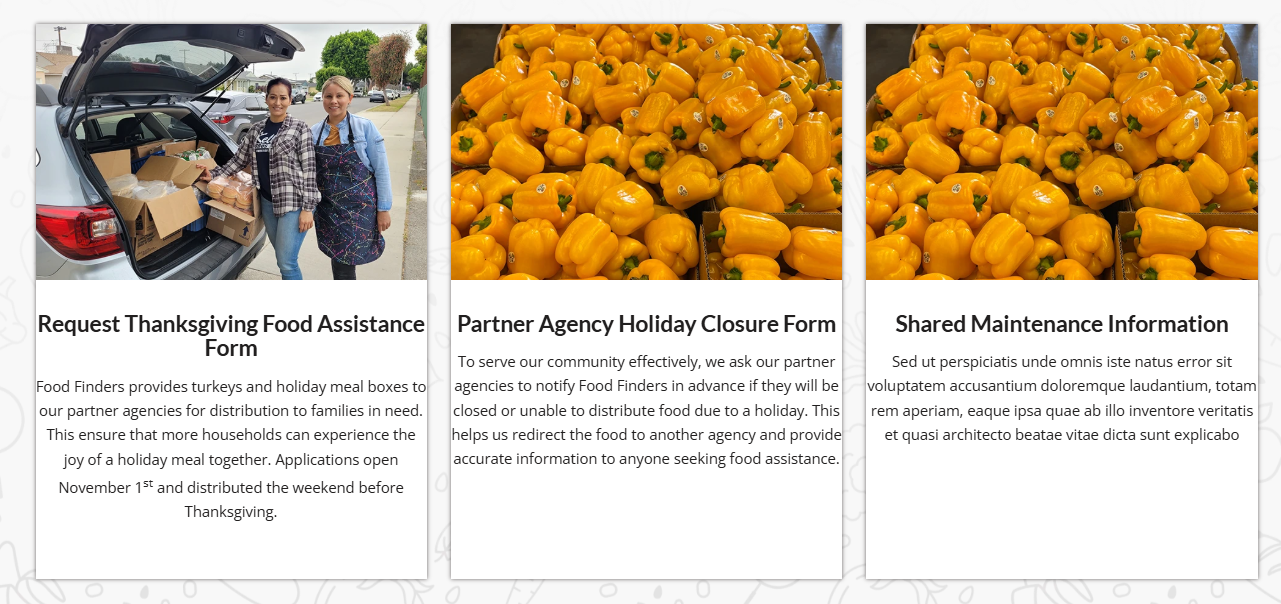
I made this change to the other pages that you listed above and the all work now.
Keep Ismael’s CSS above as it forces the buttons to the bottom of the columns without using extra HR elements.Best regards,
MikeFebruary 25, 2026 at 10:05 am in reply to: Portfolio filter causes loading errors in testimonials #1495481Hi,
Glad that you found a solution, if you have further questions please open a new thread and we will try to help. Thanks for using Enfold.Best regards,
MikeHey dreyerjm,
Try is css:.page-id-3710 .iconbox_left_content.avia-builder-el-4 .avia-icon-pos-left.av_font_icon{ float: none; margin-right: 0; vertical-align: middle; display: inline-block; padding-left: 0.5em; } .page-id-3710 .iconbox_left_content.avia-builder-el-4 .iconbox_content_container strong { font-size: 15px; }Then clear your browser cache.
Best regards,
MikeFebruary 23, 2026 at 9:50 pm in reply to: 2 different logos on one page , depending on active menu item #1495386Hey Tilman,
If you want a different logo on some pages, try this function in your child theme functions.php and change the logo url to yours and change the page IDs to yours and add as many as you like with a comma between each:add_filter('avf_logo','av_change_logo'); function av_change_logo($logo) { if(is_page( array(626, 632) ) ) { $logo = "http://kriesi.at/wp-content/themes/kriesi/images/logo.png"; } return $logo; }If you want all pages except your home page to be different, then I would recommend changing your logo in the theme settings to your other logo and use this function to only change the home page to the red one:
add_filter('avf_logo','av_change_logo');
function av_change_logo($logo)
{
    if(is_page(2) )
    {
    $logo = "http://kriesi.at/wp-content/themes/kriesi/images/logo.png";
    }
    return $logo;
}
Best regards,
MikeFebruary 23, 2026 at 9:14 pm in reply to: Make preview image on top of Gallery element sticky as user scrolls thumbnails? #1495384Hi,
@goldengate415 glad it is working for you, they are white because of the lazy loading and change on scroll. Right now the page with them in the view point so lazy load doesn’t recognize any user action. If they were below some othe content like on your live page scrolling down would trigger them.
@Guenni007 a smaller image is used and padding is added to the column that the gallery is in to reduce the images more. See the screenshot in the post earlier.Best regards,
MikeFebruary 22, 2026 at 10:03 pm in reply to: Make preview image on top of Gallery element sticky as user scrolls thumbnails? #1495348Hi,
You are correct, I wanted to test the login before I headed out for an appointment. I created the test page today for you, linked below, as I had described above.
It seems to work better on your site because you have limited image sizes, most of yours seem to bet set to 0x0.
Nonetheless you can try adjusting the column padding and image sizes to make the large image the size you like.
The css for the page is in a code block element on the page, you could move it to your Quick CSS if you decide to apply this to other pages.
Also note that the page is saved as a draft right now, but you will need to publish it for the css in the code block to work, WordPress doesn’t load everything in preview mode, it’s a known issue that we don’t have control over.Best regards,
MikeHi,
When I check your page I see that your are using equal height columns, so all three columns will adjust to be the same height.
The problem is that in each of the three columns you have an HR element between the text element and the button, and all three are set to different heights.
30px 58px 2px
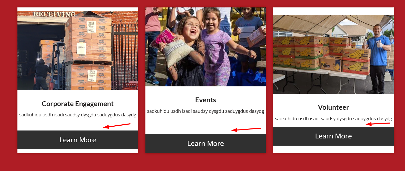
Please check an adjust so all are the same height, then the buttons and images will be correct.
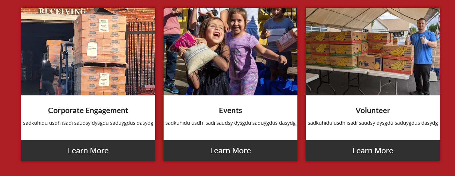
Best regards,
MikeHey Rob Wu,
I searched our system using your email address and it shows that your support is until: 2026-06-19 with the same Purchase Code as your 2014 purchase. So your support has been updated.
Perhaps you forgot your password?
Would you like a Password Reset sent to your email?Best regards,
MikeHi,
As I understood you wanted the grid to be 100% of the page layout area, you would achive this by placing the element on the page outside any columns. If the element is in a column it will be limited by it and the padding that it has. If your max page width in the theme options is smaller that your screen width, like 1310px, then the page has added padding & margin, so this will determine what 100% of the element is.Best regards,
MikeHi,
Glad that we could help, if you have further questions please open a new thread and we will try to help. Thanks for using Enfold.Best regards,
MikeHey amanda-mdllc,
Thank you for your patience, I found that your plugin ClickRank – Ai SEO automation is causing a conflict with the videos causing them to not load. I further found that it is the setting: Image Alt Text Generation causing this conflict, I disabled this one setting and now the videos work.
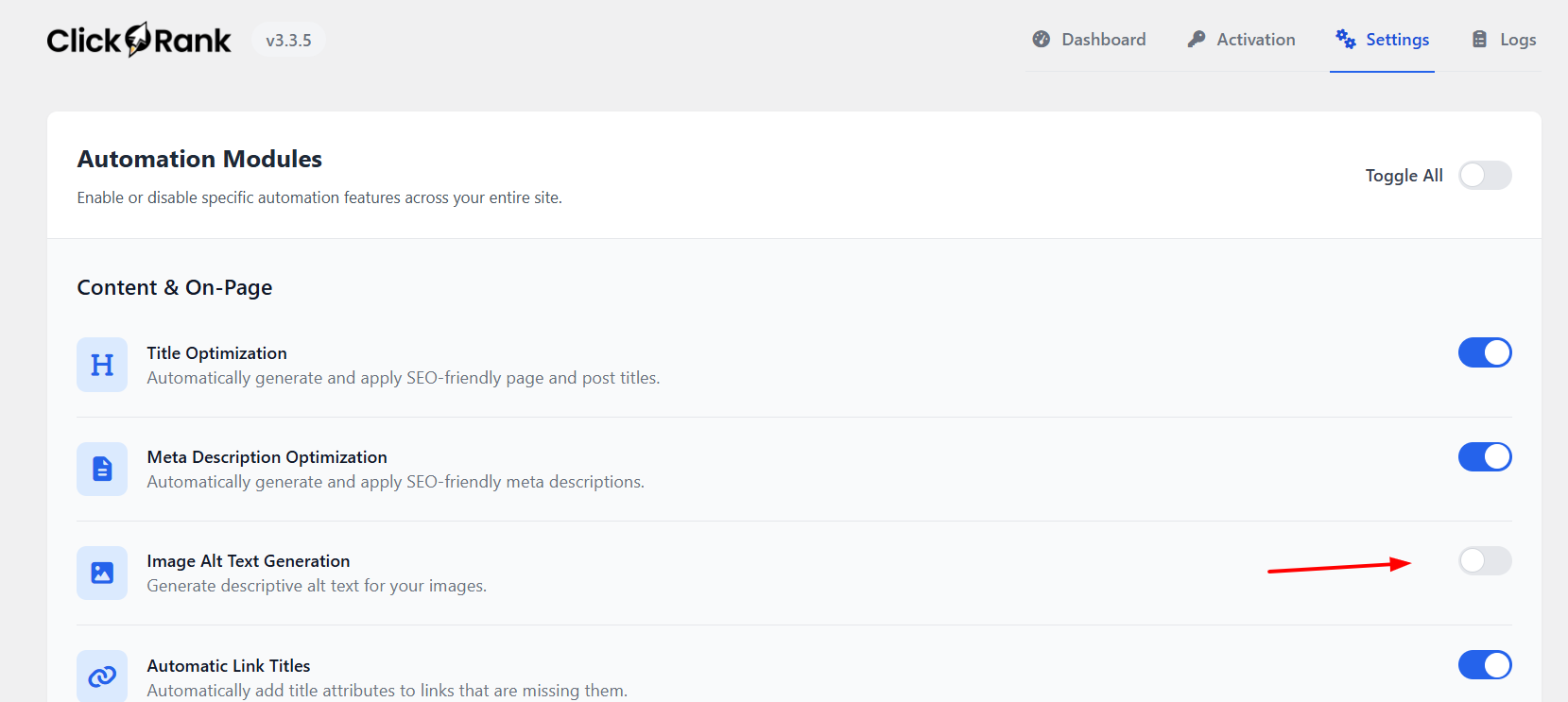
Best regards,
MikeHey Michael F,
To correct #1 & #2 try this css in your Quick CSS field:@media only screen and (min-width: 1024px) { #service-monitor-mobil-trennlinien.avia-section { margin-bottom: 0; height: 200vh; } }#3 is because you have the sidebar enabled on the page, disable this in the settings for the page, or try this css
.home #after_section_9 {
	display: none;
}
then clear your browser cache.
Best regards,
MikeHey Sebastian,
Unfortunately not, the sort & grid are both inside the same container. A margin could be added to the sort links to move them within the container so they look like they are not to the edge of the screen, or they can be centered in the container.Best regards,
MikeHi,
Glad that we could help, if you have further questions please open a new thread and we will try to help. Thanks for using Enfold.Best regards,
MikeHey es.design.ma,
It looks like somewhere you have this css:#top .avia-svg-icon.avia-font-svg_entypo-fontello svg:first-child { stroke: unset !important; } #top .menu-item-search-dropdown>a.avia-svg-icon svg:first-child { width: auto; height: 1em; position: relative; z-index: -1; }The stroke is needed for the color, and the z-index needs to be 1
You can try this css to override this:#top #menu-item-search .avia-svg-icon.avia-font-svg_entypo-fontello svg:first-child { stroke: #515f77 !important; fill: #515f77; z-index: 1; } #top #menu-item-search .avia-svg-icon.avia-font-svg_entypo-fontello { padding-right: 13px; } #top #header .av-main-nav>li:hover>a>svg:first-child { stroke: #d6d6db !important; }Then clear your siteground cache & your browser cache.
Best regards,
MikeFebruary 21, 2026 at 9:06 pm in reply to: Burger Menu is Showing a Different Font than Desktop #1495325Hi,
The “Reset all options” button will reset all, it is not recommended to use unless you want to remove all options & style.
.avia-caption-title {text-transform:none;}
did not work for you because it doesn’t have high enough specificity, the correct css would be:#top .slideshow_caption h2.avia-caption-title { text-transform: none; }!important is not required, just enough classes and/or IDs to override the theme css, nearly no theme css is a single class like in your css: .avia-caption-title
Best regards,
Mike -
AuthorPosts

