Forum Replies Created
-
AuthorPosts
-
October 13, 2018 at 9:01 pm in reply to: Cache and merge not working – not using cache plugin #1021107
Hi,
I tried to login to take a look, but the login isn’t working, please check.Best regards,
MikeHi,
I took a look at your site and found the titles to be quite small, please try clearing your browser cache.
Please see the screenshot in Private Content area.Best regards,
MikeOctober 13, 2018 at 8:23 pm in reply to: Exclude imprint (Impressum) from appearing in search results #1021099Hey zizibe1,
Unfortunately Google views these settings or “rules” as a “suggestion”
Try going to your Google Search Console and use the “Remove URL Tool” you can read more about it hereBest regards,
MikeHey Kathy,
Can you please include a admin login in the private content area so we can take a closer look.Best regards,
MikeHi,
Glad to hear, we will close this now. Thank you for using Enfold.For your information, you can take a look at Enfold documentation here
And if there are features that you wish Enfold had, you can request them and vote the requested ones here
For any other questions or issues, feel free to start new threads under Enfold sub forum and we will gladly try to help you :)Best regards,
MikeHi,
Please try this code in the General Styling > Quick CSS field:#top .yith-wcbk-booking-form #ui-datepicker-div { position: relative !important; }Best regards,
MikeHey june,
There is not a setting to make the mobile header sticky, but if you include the code in the General Styling > Quick CSS field from our documentation it will work: Sticky header on mobileBest regards,
MikeHey june,
I took a look at your page and menu items and found that you had many of each ID that were the anchors for the links, this causes problems for the page because you can only have one unique ID on each page. I see that you have many of each section, and ID, because you wanted to hide some elements on different screen widths. So the challenge is to group sections together to share menu anchors, I achieved this on your page by adding code block elements before each group and including the anchors like this:<a class="anchor" id="about"></a>Your anchors are now working, Please clear your browser cache and check.
Best regards,
MikeHi,
Please try this code in the General Styling > Quick CSS field, or in the WordPress > Customize > Additional CSS field:.inner-container { height: auto !important; }Best regards,
MikeHey slekiz,
I took a look at your page and see that your sticky and shrinking header starts at 768px width, which is the standard width for tablets & iPads so it should work for the iPad. I do notice that at that width your site redirects to a url that starts with “https://m.” (please see url in the Private Content area) which is a mobile version of your site that doesn’t include the sticky and shrinking header.
I believe this is a plugin that is causing this, please try disabling this feature so the built-in responsiveness of the site can manage the elements and the screen widths.
After disabling, please clear your browser cache and check.Best regards,
MikeHey norcalnathan,
I took a look at your page and found this css in your style.css causing most of the issue:/* make footer expand more to bottom */ .entry-content-wrapper { min-height: 1500px; }Please remove and clear your browser cache, then let us know if that solves.
I couldn’t login and test due to “Sucuri Website Firewall” Please see the screenshot in Private Content area.Best regards,
MikeOctober 13, 2018 at 3:44 pm in reply to: Text lines get too mutch spaces between words on mobile #1021058Hi,
I took another look but I was not able to find a post with the justified content, I assume you have already changed many of your posts, do you wish to continue to make the changes, or would you like some css to adjust the remaining posts?
If you would like some css, please link to a couple of posts that has not been changed yet.Best regards,
MikeHi,
Try going to this folder in your theme and replacing the image with your own that is the same size./enfold/images/layout/logo_modern.pngBest regards,
MikeOctober 13, 2018 at 1:49 pm in reply to: Change name of Avia layout builder on page builder #1021048Hey bobfurgo,
We don’t have an official way to do this, and I’m not sure of any issues it may cause, but if you thoroughly test this before trying this on a production site, you may find this works for you:
Try adding this code to the end of your functions.php file in Appearance > Editor:function custom_rename_script(){ ?> <script> jQuery(window).load(function(){ jQuery("#avia_builder h2.hndle.ui-sortable-handle span").text("Enfold Builder"); }); </script> <?php } add_action('admin_head', 'custom_rename_script');Best regards,
MikeHi,
Glad we were able to help, we will close this now. Thank you for using Enfold.For your information, you can take a look at Enfold documentation here
For any other questions or issues, feel free to start new threads under Enfold sub forum and we will gladly try to help you :)Best regards,
MikeHey idaandersenlang,
This is because Theme Forest has changed their API key and we are integrating a new solution, we recommend manually updating for right now. The easiest way is to try using the Update Theme and Plugins from Zip File plugin. It will allow you to upload the enfold.zip file from your Theme Forest account to update. Please be sure to download the “Installable WordPress file only”.
Please use your webhost full backup tool first, as good practice.
Another method is to update via FTP, but you will need to remove the old theme folder “enfold” first then upload the new “enfold” folder at /wp-content/themes/enfold/
Please don’t try to overwrite the theme folder, as this will leave old files behind and cause errors. The plugin above handles this correctly.If this doesn’t help we will be happy to assist with a manual update, if you include a admin login & ftp access, & a link to your updated theme files in the Private Content area.
Best regards,
MikeOctober 13, 2018 at 5:57 am in reply to: Enfold: Different menus, different menu-colors and different logos #1020937Hey Robert,
To change the color of the menu I recommend using your IF statement to assign the css for the menu colors with !important; I also recommend removing any menu colors from your style.css or Quick CSS field and using those colors in your ELSE statement.
Here is an example of adding your menu css in the head conditionally:add_action('wp_head', 'change_menu_color'); function change_menu_color() { if (is_page(array(17, 19, 1, 11))) { ?> <style> /* your css here */ </style> <?php } }just do this for each of your colors.
Best regards,
MikeHey Munford,
Sorry for the late reply, I took a look at your site and found the first rule in your style.css was setting your columns to 100% wide..responsive #top .container .av-content-small, .responsive #top #wrap_all .flex_column, .responsive #top #wrap_all .av-flex-cells .no_margin { margin: 0; margin-bottom: 40px; width: 100%; }I commented this rule out and now your site is working correctly again. Please clear your browser cache and check.
Best regards,
MikeOctober 13, 2018 at 4:37 am in reply to: Error in structure data (Error: SomeProducts is not a known valid target type) #1020929Hey Sovik,
Thank you for your explanation, your code looks valid, Well done on finding your solution.
Unless there is anything else we can assist with on this issue, shall we close this then?Best regards,
MikeHey fumsel,
Jedes Widget war eine ID, die zur css-Regel hinzugefügt werden kann, um auf die gewünschten Änderungen zu verweisen, zum Beispiel:#portfoliobox-2.widget { font-size: 10px !important; }Wenn Sie möchten, dass es in allen Widgets wirksam wird, können Sie Folgendes versuchen:
.widget { font-size: 10px !important; }Wenn Sie einen Link zu Ihrer Seite bereitstellen, können wir ermitteln, wie die ID Ihres Widgets lautet.
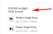
Um einen Zeilenumbruch in Ihren Widget-Titeln hinzuzufügen, fügen Sie diesen Code am Ende Ihrer functions.php-Datei unter Aussehen> Editor hinzu:function widget_title_break( $title ) { $title = str_replace( 'line_break', '<br/>', $title ); return $title; } add_filter( 'widget_title', 'widget_title_break' );und fügen Sie diesen Text dann hinzu, wo die Zeilenumbrüche auftreten sollen:
line_break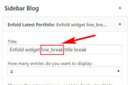
— Translated with Google —
Each widget was a ID that can be added to the css rule to target where you would like the changes, for example:
#portfoliobox-2.widget { font-size: 10px !important; }If you would like it to take effect in all of the widgets, you could try:
.widget { font-size: 10px !important; }If you post a link to your page, we can help determine what the ID of your widget is.
To add a line break in your widget titles, Try adding this code to the end of your functions.php file in Appearance > Editor:function widget_title_break( $title ) { $title = str_replace( 'line_break', '<br/>', $title ); return $title; } add_filter( 'widget_title', 'widget_title_break' );and then add this text where you want the line breaks occur:
line_break
Best regards,
MikeHey Stefan,
Please see this documentation on adding the flags anywhere on your site. One solution is to create a header widget area and using the PolyLang widget.
Another solution is adding this code to the end of your functions.php file in Appearance > Editor:function polylang_shortcode() { ob_start(); pll_the_languages(array('show_flags'=>1,'show_names'=>0)); $flags = ob_get_clean(); return $flags; } add_shortcode( 'polylang', 'polylang_shortcode' );and then put the shortcode [polylang] to display the flags.
Best regards,
MikeHi,
Please try using the Use Any Font plugin, it lists otf as a supported font.Best regards,
MikeOctober 13, 2018 at 2:28 am in reply to: Styling blog post elements – styling by category tag #1020911Hi,
Glad we were able to help, we will close this now. Thank you for using Enfold.For your information, you can take a look at Enfold documentation here
For any other questions or issues, feel free to start new threads under Enfold sub forum and we will gladly try to help you :)Best regards,
MikeOctober 12, 2018 at 6:25 am in reply to: Cache and merge not working – not using cache plugin #1020610Hey GCSkye,
Thanks for the login, I was able to get your merging to work again by enabling “always load all elements” in your performance settings and by enabling jQuery in the header, that is to un-check the “Load jQuery in your footer”.
I tested a combination of these two settings and found that they must be this way to work on your site.
I’m not sure why, because on my localhost this is not the case, the only thing I can’t check is your combination of plugins.Best regards,
MikeHi,
Glad we could help, unless there is anything else we can help with on this issue, shall we close this then?Best regards,
MikeOctober 12, 2018 at 5:40 am in reply to: Styling blog post elements – styling by category tag #1020587 -
AuthorPosts