
-
AuthorPosts
-
August 26, 2018 at 5:50 pm #1001904
Hi Folks,
just easy – as I wrote in the topic – how can I get the burger menu bigger/thicker?
For my current project the “standard icon style” is a little bit to small. I want it a
little bit bigger/thicker. :) So, which css-code-snippet I need?And question 2: is there a possibility to turn off the burger menu in the very small resolution?
Or differently asked, is there a possibility to get the desktop-navigation in the very small
resolution? Like it is in the tablet-portrait-resolution.Thx for your help! Have a nice sunday evening!
Best sunday regards
Carsten HeilAugust 26, 2018 at 7:03 pm #1001923Hey Carsten,
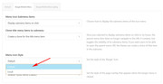
To make the burger icon bigger, please go to Enfold Theme Options > Main Menu > Burger/Mobile Menu > Menu Icon Style
and choose “Default” from the drop down:
If you would like it even larger, Please try this code in the General Styling > Quick CSS field:.av-hamburger-inner, .av-hamburger-inner::before, .av-hamburger-inner::after { width: 50px !important; height: 6px !important; }Please adjust to suit.
To change the mobile menu brake point so the mobile menu never shows, Please try this code in the General Styling > Quick CSS field:
@media only screen and (max-width: 1366px) and (min-width: 200px) {
  .responsive #top .av_mobile_menu_tablet .av-main-nav .menu-item {
    display: block !important;
  }

  .responsive #top .av_mobile_menu_tablet .av-main-nav .menu-item-avia-special {
      display: none !important;
  }
}
Best regards,
MikeAugust 26, 2018 at 10:54 pm #1002039Hi Mike,
thx for your superfast Feedback!
The first code-snippet is that, what I was looking for and it works very well!
The second one I try a little bit later. :) And because of that my feedback also
comes a little bit later. ;) So, you hear from me soon.Until then…good start into the new week.
Best regards
CarstenAugust 26, 2018 at 11:05 pm #1002047August 27, 2018 at 2:53 pm #1002297Hi Mike,
now I tried the second code-snippet, but it doesn’t work, sorry. ;-/
For me it’s important that it works also on very small screens (cell-phone resolution),
not only on tablet-resolution. For me the code looks like that he is only for tablet-resolution,
but maybe I’m wrong. Please take another look, thx!Best regards
CarstenAugust 28, 2018 at 3:14 am #1002496Hi,
Please included a link to your site and a admin login so we can see if there is a conflicting css that keeps the second snippet from working.
This snippet starts working at 200px, the smallest mobile screen is typically 325px, I wrote it like this to try to overcome current css rules and stop working at laptop screen sizes, where your other rules will pick up.
But I’ll be able to better evaluate once I can examine your site.Best regards,
MikeAugust 28, 2018 at 6:12 pm #1002772Hi again Mike,
thx for your feedback! I tried it again, but it’s still not working, sorry.
So, ok…here are the login-data…I deleted of course also your first code-snippet again. So, for the moment
in my “Quick-CSS-Field“ is none of your codes. :)Hopefully you find the conflicting css! I’m looking forward to your new answer.
Best regards
CarstenAugust 30, 2018 at 3:45 am #1003330Hi,
Thank you for the login, I see that my code snippet doesn’t work for what you wanted, completely remove the mobile menu and use the main menu instead.
The best solution I found was to edit the layout.css and change line 2283 to this:@media only screen and (max-width: 77px) {Please clear your browser cache and check.
While this works, I note that for mobile devices your menu creates 3 lines because it is too large for the screen. We can make the menu font smaller and reduce the menu padding, but on the smallest screens there will still be two menu items that start a second line.
This is the css I added to your Quick CSS:@media only screen and (max-width: 767px) { .av_seperator_small_border .av-main-nav > li > a > .avia-menu-text { font-size: 12px !important; padding-left: 10px !important; margin-left: -10px !important; } .av-main-nav > li > a { padding: 0 7px !important; } .av_seperator_small_border .av-main-nav > li:first-child > a > .avia-menu-text { border-left: none; padding-left: 13px !important; } .responsive #top #wrap_all .container { width: 95% !important; max-width: 95% !important; } }Best regards,
MikeAugust 30, 2018 at 3:12 pm #1003657Hi Mike,
thx for your new feedback and your work! Unfortunately it not looks like I thought. ;-/
I apologize, but I think the burger-menu looks better after all. So, I switched back
to your first code-snippet right now. Sorry again, but sometimes you must see some-
thing first to understand, that this is the wrong way, right?Thank you very much again and no offense!
Best regards
CarstenAugust 30, 2018 at 3:16 pm #1003663Hi Carsten,
Glad we could help :)
If you need further assistance please let us know.
Best regards,
VictoriaAugust 31, 2018 at 2:03 am #1003852Good Morning Victoria (and Mike),
thx for your message! And yes, I need further assistance, because the website-desktop-
navigation doesn’t work correctly at the moment. No page is shown up after I clicked
any menu-point. Look by yourself…After I deleted Mikes last code-snippet, I didn’t change back the line 2283 in the layout.css
because I didn’t know what was there before. Please let me know what I have to change
there, that everything is so like before?@ Mike: maybe the best way is, that you change it again, because you did it before and
knows best, what you’ve got change, right?Thank you for your support!
Best regards
CarstenAugust 31, 2018 at 5:02 am #1003900Hi,
I have restored the line 2283 to as it was before, Please clear your browser cache and check.Best regards,
MikeAugust 31, 2018 at 1:43 pm #1004090Hi Mike,
thx for your fast response!
Unfortunately the restore of the line 2283 brought not the result I wished. I cleared the
cache but the navigation is still not working normal. The pages are still not showing up,
at least here in my browser, sorry. ;-/ Where’s the mistake? Does the navigation work
in your browser correctly?I’m glad if I hear from you again…till then…
Best regards
CarstenSeptember 1, 2018 at 3:48 am #1004259Hi,
Yes the navigation works correctly on my mobile and desktop, because I am logged in to your WordPress site.
If I log out of your WordPress site then all of the navigation links are redirected to the homepage.
This is due to your settings at: Enfold Theme Options > Maintenance Mode.
Please un-check this option, or login to your WordPress admin page.Best regards,
MikeSeptember 1, 2018 at 10:22 pm #1004470Hi Mike,
thx a lot for your answer and your information! I’m very happy that it was only
a small thing. If my english were better then I haven’t got such problems any
more. Or if the translations of the “Enfold-Backend“ are completley in german. ;-)
As long as both things takes I’ll be patient…promised ;-)I wish you a nice sunday!
Best regards
CarstenSeptember 1, 2018 at 10:45 pm #1004479Hi,
Thank you, Glad we could help, unless there is anything else we can help with on this issue, shall we close this then?Best regards,
MikeSeptember 1, 2018 at 11:47 pm #1004500Hi Mike,
for the moment everything is fine…you can close the thread, thx! :)
Best regards
CarstenSeptember 2, 2018 at 1:03 am #1004518Hi,
Glad we were able to help, we will close this now. Thank you for using Enfold.For your information, you can take a look at Enfold documentation here
For any other questions or issues, feel free to start new threads under Enfold sub forum and we will gladly try to help you :)Best regards,
Mike -
AuthorPosts
- The topic ‘Burger/Mobile Menu / How can I get it bigger/thicker?’ is closed to new replies.