Forum Replies Created
-
AuthorPosts
-
May 26, 2019 at 7:44 pm in reply to: Mobile transparent menu losing transparency on returning to the top #1104337
Hey BC_mne,
Thanks for the link, when I check your site and scroll back to the top the header changes back to transparent. Which browser are you using?Best regards,
MikeHey Bossburg,
This seems to be a duplicate request, I have responded to your other thread, let’s continue there.
Thanks for your patience and understanding.Best regards,
MikeHey Bossburg,
Which demo are you trying to install? Please include an admin login in the Private Content area so we can be of more assistance.Best regards,
MikeHey DROR,
Please try this code in the General Styling > Quick CSS field or in the WordPress > Customize > Additional CSS field:@media only screen and (max-width: 442px) { .av-large-gap.av-fixed-size .av-masonry-entry .av-inner-masonry { left: 25px !important; } }Best regards,
MikeHi,
Glad we were able to help, we will close this now. Thank you for using Enfold.For your information, you can take a look at Enfold documentation here
For any other questions or issues, feel free to start new threads in the Enfold forum and we will gladly try to help you :)Best regards,
MikeHi,
Entschuldigung für die späte Antwort, ich habe festgestellt, dass das Entfernen dieses Codeblocks die Seite repariert hat:<script id='elopage-script' src='https://elopage.com/assets/badges.js'></script> <div class="elopage-badge-wrap" data-username="malinakorbach" data-bgcolor="rgb(255, 255, 255)" data-fontfamily="Open Sans" data-fontcolor="#fffff" data-btncolor="rgb(246, 52, 116)" data-btnfontfamily="Open Sans" data-btnfontcolor="#fff" data-btntext="Gönn dir einen Abend nur für dich!" data-products="29398" data-locale="de" data-embedcheckout="off" data-badge="ElopageBadgeProductSlide"></div>Ich habe den Code wiederhergestellt, damit Sie versuchen können, ihn selbst zu entfernen
— Translated with Google —
Sorry for the late reply, I found that removing this code block fixed the page:
<script id='elopage-script' src='https://elopage.com/assets/badges.js'></script> <div class="elopage-badge-wrap" data-username="malinakorbach" data-bgcolor="rgb(255, 255, 255)" data-fontfamily="Open Sans" data-fontcolor="#fffff" data-btncolor="rgb(246, 52, 116)" data-btnfontfamily="Open Sans" data-btnfontcolor="#fff" data-btntext="Gönn dir einen Abend nur für dich!" data-products="29398" data-locale="de" data-embedcheckout="off" data-badge="ElopageBadgeProductSlide"></div>I have restored the code so you can try removing it yourself
Best regards,
MikeHi,
Thank you for the feedback, I will let the dev team know, since G+ is shutting down and I will recommend whatsapp for them to review.Best regards,
MikeHi,
Glad we were able to help, we will close this now. Thank you for using Enfold.For your information, you can take a look at Enfold documentation here
For any other questions or issues, feel free to start new threads in the Enfold forum and we will gladly try to help you :)Best regards,
MikeHi,
Glad to hear, we will close this now. Thank you for using Enfold.For your information, you can take a look at Enfold documentation here
For any other questions or issues, feel free to start new threads in the Enfold forum and we will gladly try to help you :)Best regards,
MikeHi,
Thank you, Please try this code in the General Styling > Quick CSS field or in the WordPress > Customize > Additional CSS field:@media only screen and (max-width: 767px) { .responsive #top .slideshow_caption { right: 0 !important; width: 40% !important; left: unset !important; } }Please clear your browser cache and check.
Best regards,
MikeHi,
Thanks for the test site and login, it seems you are not getting the class “header-scrolled” applied to the “#header” ID on your posts nor the correct css.
I have tried to isolate the issue by removing all of your custom css in Quick CSS & custom.css without luck. I also tried examining your custom functions.php code but I didn’t see anything to cause this, but there is quite a lot there, and I could have missed it. Are there any other files that you edited?
I did find that using your post content and creating a new page solves the issue, please see the link in the Private Content area, so it seems something is only targeting posts, I’m stumped.
To further investigate please try removing your custom functions or file customizations and see if the post header action is restored.
Or try installing a clean version without customizations to see if the error still occurs, I couldn’t reproduce this error on my localhost with posts.Best regards,
MikeHi,
Glad we were able to help, we will close this now. Thank you for using Enfold.For your information, you can take a look at Enfold documentation here
For any other questions or issues, feel free to start new threads in the Enfold forum and we will gladly try to help you :)Best regards,
MikeHi,
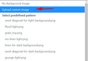
Thank you for the login, I compared your site with the “Church Demo” and found that the floral-dark.png was added with css:.footer_color { background: #658529 url(//kriesi.at/themes/enfold-church/wp-content/themes/enfold/images/background-images/floral-dark.png) top center repeat scroll; }So I uploaded the image to your media library and added it to your color section, Please clear your browser cache and check.
I’m not sure why this is not showing in your list of backgrounds, but in the theme settings you can upload the image again and it should show:
Best regards,
MikeHi,
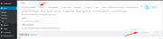
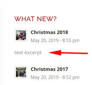
Thank you for the login, I checked one of your widget items (CHRISTMAS 2018) to see why the excerpt was not showing and found that you created the post with the Advanced Layout Builder.
In order to show an excerpt for this post you will need to add a manual excerpt by going to the top of the post page and clicking the “screen options” tab/button and check the excerpt box:
this will show an excerpt field below the post that you can add text to.
I do see that your category choice is not working, but I note that you have a “visibility” option that I don’t:
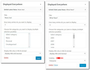
I believe this is from your “Conditional Menus” plugin, please try disabling to test, a similar plugin that does work with Enfold is: Widget OptionsBest regards,
MikeHi,
I activated your “Enfold Child Legacy” and cleared your site cache and my browser cache and the css seems to match, I then switched back. Please try to do the same and check.Best regards,
MikeMay 26, 2019 at 2:47 pm in reply to: General/Advanced Styling Issue With Animations/Rollovers/Counters #1104299Hi,
Thank you I was able to get past the htaccess security today.
I see that you are getting this error: avia_is_mobile is not defined
Please try to disable js & css merging in the Enfold Theme Options > Performance > JS & CSS file merging and compression
and choose “always load all elements” on the same performance setting page under “Disabling of template builder elements” then disable any cache plugins and minifying plugins and clear your browser & server cache. You may need to do this a few times as javascript files can be tricky to clear.Also try disabling your plugins.
You also posted that the error began “after making a change in the Quick CSS section and then saving” this would not cause the error above, but please try checking your Quick CSS for errors by copying all of the css and pasting into the WordPress > Customize > Additional CSS field, and looking for the red error indicators. A missing bracket can have odd effects, if you correct any errors replace the Quick CSS css with the corrected css.
If this doesn’t help, please include an admin login in the private content area so we can be of more assistance.
Best regards,
MikeHi,
@Guenni007 Thank you for helping, I think I understand a little more. This sounds like the language file needs to be edited with Poedit to reflect the grammar that @netztaucher wishes to see.Best regards,
MikeHi,
Very good, we will leave this open for your feedback on the plugin you find that works for you, as it may help others.Best regards,
MikeHey bigwavebusiness,
Sorry for the late reply, when I look at your portfolio items nothing shows, but when I look at your portfolio tags I do see the counts, and I can click “view” from the backend and see the page.
I’m guessing that Avada stores the portfolio items in a way that Enfold doesn’t recognize, unfortunately I don’t have a solution for you to convert them other than reposting them.
Sorry I wish I could have been more help.Best regards,
MikeHey Max,
Sorry for the late reply, I believe this is the default woocommerce action, there may be a plugin available for this but I didn’t find one.Best regards,
MikeHey ditteditte,
Sorry for the late reply, please include an admin login in the Private Content area and a link to your gallery page so we can see what you are seeing now.
Typically, in the case the lightbox option in the theme options is unchecked, but I’m sure you have already looked at this, so we will need to examine this a little closer.Best regards,
MikeHey kmihanet,
Sorry for the late reply and thanks for the link, I tested your page in Chrome, Firefox, & Edge, but I don’t see the flickering.
Which browser are you using?Best regards,
MikeHey Eric,
Sorry for the late reply, please include a link to your site so we can take a closer look at the small box above your menu.Best regards,
MikeHey mailworm,
Sorry for the late reply, thanks for the screenshots, but I couldn’t see your site, perhaps you are blocking some IP addresses.
Your 404 page option looks like it’s an older version than 4.5.7, there were some issues a while back, here is how it should look now:

you will want to choose the “redirect to selected page” option.
If this doesn’t help Please include an admin login in the Private Content area.Best regards,
MikeHey creative,
Sorry for the late reply, The calendar for the bookings requires the “WooCommerce Bookings” plugin, you can see this listed in the demo install options:

Best regards,
MikeHi,
Sorry for the late reply, when I look at your timeline the border is now blue, so I’m not sure if you have already corrected this, but if not please try this css:.avia-timeline .entry-footer { background-color: transparent !important; }please adjust the “transparent” color to the color you wish.
Please see the screenshot in Private Content area to ensure I’m looking at the correct border.Best regards,
MikeHey birgitthaler,
Sorry for the late reply, Please try this code in the General Styling > Quick CSS field or in the WordPress > Customize > Additional CSS field:@media only screen and (max-width: 767px) { #main > div.main_color.container_wrap_first.container_wrap.fullsize > div > main { padding-top: 0px !important; } }Best regards,
MikeHi,
Sorry for the late reply, please include a url to the page so we can assist.Best regards,
Mike -
AuthorPosts