Forum Replies Created
-
AuthorPosts
-
June 15, 2019 at 7:59 am in reply to: Updating WordPress version / Enfold Theme / PHP Questions #1110593
Hey lanikita,
Thank you for the information on your setup, Please first ensure that you are using PHP version v5.6 as a minimum.
Then download the theme from Theme Forest.
Then open it and extract the “enfold.zip” file and then extract it to your desktop as /enfold/
Then rename to /enfold-new/ and upload the folder to your /wp-content/themes/ folder via FTP or your file manager in your webhost cPanel
Then via FTP or your cPanel file manager, at /wp-content/themes/ rename /enfold/ to /enfold-old/ and rename /enfold-new/ to /enfold/Now your new version is installed, please check your site. If all is well then “Good Job!” If not then reverse the last rename step above and your site will be restored.
Then you should be able to update the WordPress core.
Best regards,
MikeHey birgitthaler,
Der Grund, warum die Schriftart “Nunito” manchmal nicht angezeigt wird, ist, dass ein “Mixed Content” -Fehler angezeigt wird. Das heißt, Ihre Seite wird über “https” geladen, nicht jedoch die Schriftart. In der Regel korrigiert ein Plugin wie Really Simple SSL dies.
Ich bin mir nicht sicher, ob ich Ihre zweite Frage verstehe, bitte erklären Sie.— Translated with Google —
The reason the font “Nunito” sometimes doesn’t show is because you are getting a “Mixed Content” error, that is your page is loaded over “https” but not the font. Typically a plugin such as Really Simple SSL will correct this.
I’m not sure that I understand your second question, please explain.Best regards,
MikeHey Lianne,
Thank you for sharing the above filter, I was able to correct the errors by correcting the quotes.
Try adding this code to the end of your functions.php file in Appearance > Editor:function prefix_woocommerce_sale_flash( $text ) { $text = '<span class="onsale">'. __( 'Action!', 'text_domain' ). '</span>'; return $text; } add_filter( 'woocommerce_sale_flash', 'prefix_woocommerce_sale_flash' );I tested this on my localhost and it seems to work, please check.
Best regards,
MikeHi,
Try adding this code to the end of your functions.php file in Appearance > Editor:function jl_remove_post_dates() { add_filter('the_date', '__return_false'); add_filter('the_time', '__return_false'); add_filter('the_modified_date', '__return_false'); add_filter('get_the_date', '__return_false'); add_filter('get_the_time', '__return_false'); add_filter('get_the_modified_date', '__return_false'); } add_action('loop_start', 'jl_remove_post_dates');Best regards,
MikeHi,
Odd, I can’t recreate this. Please see the screenshot in Private Content area. Do you have an iPad to check if the cart issue is really happening?Best regards,
MikeHi,
Sorry for the late reply, To fix the slideshow image, Please try this code in the General Styling > Quick CSS field or in the WordPress > Customize > Additional CSS field:@media only screen and (min-width: 767px) and (max-width: 1023px) { .avia-slideshow-inner > li > div.avia-slide-wrap { max-height: 220px !important; } } @media only screen and (min-width: 1024px) and (max-width: 1438px) { .avia-slideshow-inner > li > div.avia-slide-wrap { max-height: 293px !important; } } @media only screen and (min-width: 1439px) { .avia-slideshow-inner > li > div.avia-slide-wrap { max-height: 430px !important; } }This address the different screen sizes.
Best regards,
MikeHi,
Sorry for the late reply, and thanks for the example code. I was able to reproduce so I wrote a report for the dev team to review your solution.
Thanks for sharing.
I will post here as I learn more.Best regards,
MikeHi,
Thank you, I understand better now. I see that this is a plugin and it doesn’t seem to load any of it’s own css. I also note that with your page caching and merging off your site still reports getting your css from the merged css.
I believe your server is caching also and we will need to clear this cache or turn it off.
Does your plugin come with any css snippets to style the grid? There are also many options, please see if you find any about styling the grid, I didn’t see one.Best regards,
MikeJune 12, 2019 at 4:35 am in reply to: Single Blog Post, Archive and Category doesn't show my fullwidht submenu #1109327Hi,
Sorry for the late reply, to add the lines above and below of the widget title, Please try this code in the General Styling > Quick CSS field or in the WordPress > Customize > Additional CSS field:h3.widgettitle { border-style: solid; border-width: 1px 0 1px 0; padding: 10px 0 10px 0; }Best regards,
MikeHi,
If you are using Yoast please see this post
One issue that you may find is that Google will post any date it finds on the page and use it as the post date. The link above also has some links to some plugins that may work for you.Best regards,
MikeHi,
Yes, a blank file will mess up your site. Please remove it or copy the header.php in your parent theme to your child theme.
You could deactivate Yoast, instead of uninstalling it.Best regards,
MikeJune 10, 2019 at 12:08 pm in reply to: How to change the font color of an error message (contact form 7) #1108794Hi,
Glad we were able to help, we will close this now. Thank you for using Enfold.For your information, you can take a look at Enfold documentation here
For any other questions or issues, feel free to start new threads in the Enfold forum and we will gladly try to help you :)Best regards,
MikeHi,
Glad we were able to help, we will close this now. Thank you for using Enfold.
For your information, you can take a look at Enfold documentation here
For any other questions or issues, feel free to start new threads in the Enfold forum and we will gladly try to help you :)Best regards,
MikeJune 10, 2019 at 12:44 am in reply to: Enfold Safari & Internet Explorer Darstellungsproblem #1108717Hi,
Sorry for the late reply, I’ve been testing gradient text with IE11, and I have found that the css used for this effect doesn’t work in IE11. To see please check out this site
with Chrome or Edge:

with IE11:

Best regards,
MikeJune 10, 2019 at 12:04 am in reply to: How to change the font color of an error message (contact form 7) #1108716Hey bruwa,
Please try this code in the General Styling > Quick CSS field or in the WordPress > Customize > Additional CSS field:span.wpcf7-not-valid-tip { color: #3345f5 !important; }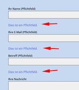
Best regards,
MikeHi,
Thanks for the login I took a look at your header.php in the child theme and see that it an old version that doesn’t include the last lightbox fix.
Please save a copy of your header.php as a backup for yourself and then move or remove the child theme header.php on the server so it’s not in use and see if this helps.Best regards,
MikeJune 9, 2019 at 11:23 pm in reply to: IconFont Manager: Uploading fontello font server error #1108709Hey mightyfrank,
Thanks for the login, I took a look and your settings seem fine as well as your files.
I see the error you are getting is “/wp-admin/admin-ajax.php 500 (Internal Server Error)” please ask your webhost to look into this and let us know what is causing the error.Best regards,
MikeHi,
Please try this code in the General Styling > Quick CSS field or in the WordPress > Customize > Additional CSS field:@media only screen and (max-width: 767px) { #menu-item-shop { margin-right: 50px !important; } }Best regards,
MikeHey jpluedtke,
Thanks for the screenshot and link, Try adding this code to the end of your functions.php file in Appearance > Editor:function ns_custom_script(){ ?> <script> (function ($) { $(window).load(function(){ $( "#menu-item-shop" ).appendTo( ".inner-container" ); $("#menu-item-shop").css({ 'float': 'right' }); $(".cart_dropdown").css({ 'border-width': '0px' }); $("span.logo").css({ 'display': 'none' }); }); })(jQuery); </script> <?php } add_action('wp_footer', 'ns_custom_script');Then clear your browser cache and any cache plugin, and check.
Best regards,
MikeHey kellyCraftMedia,
2: I believe this css will help with your underlines:#main a,#main .sidebar a,#footer a,#socket a, #main p a { text-decoration: underline !important; } a.avia-button,a span.avia_iconbox_title,#top .av_font_icon a.av-icon-char { text-decoration: none!important; }1: Please try this css for your header:
#header.av_header_glassy,#header {
background-color: rgba(71, 70, 67, 0.9) !important;
}

.responsive #top .header_bg {
    opacity: 0 !important;
}

#top .av_header_glassy.av_header_transparency #header_main {
    border-color: transparent !important;
}
I recommend testing the above css in the WordPress > Customize > Additional CSS field and Then clear your browser cache and any cache plugin, and check.
Best regards,
MikeHey Mike,
Please include what you are adding to the code block, I tested on my localhost and couldn’t reproduce this. Here’s what I added to my code block:<p>this is a test</p> <p>new line <br> another line <br> end of lines</p>Best regards,
MikeHi,
Glad we were able to help, we will close this now. Thank you for using Enfold.For your information, you can take a look at Enfold documentation here
For any other questions or issues, feel free to start new threads in the Enfold forum and we will gladly try to help you :)Best regards,
MikeHi,
Thanks for the login, I see that you are getting this error:/wp-admin/admin-ajax.php Failed to load resource: the server responded with a status of 406 ()Typically this is due to an ModSecurity error, please see this article for steps to follow to correct.
or ask your webhost to take a look at the error and take the appropriate steps.Best regards,
MikeHey Tobias,
The reason that your titles were not showing is because you had this function removing them:function remove_title_attr(){ ?> <script> jQuery(window).load(function(){ jQuery('#wrap_all a').removeAttr('title'); jQuery('#wrap_all img').removeAttr('title'); }); </script> <?php } add_action('wp_footer', 'remove_title_attr');So I commented this out so you could see.
Best regards,
MikeHey Julien,
Sorry I was not able to find any other issues like this, so perhaps an easy mistake has been made. Please try to follow these steps to see this corrects the issue.Best regards,
MikeJune 9, 2019 at 1:26 am in reply to: PROBLEMI CON IL CARICAMENTO DEL DEMO ENFLOD IN WORDPRESS LOCALE #1108516Hi,
Thanks for the screenshot, it looks like the menus need to be set, the one showing has to many items.
Please try going to your menus and choose the main menu and location. Then go to Enfold Theme Options > Performance > JS & CSS file merging and compression and disable both and save your theme settings, and Then clear your browser cache, and check.Best regards,
MikeJune 9, 2019 at 1:16 am in reply to: Mobile navigation: only open dropdown with av-submenu-indicator #1108515Hey Roel,
Sorry this is not possible without quite a lot of re-writing. But please let us know if there is anything else we can assist with.Best regards,
Mike -
AuthorPosts