Forum Replies Created
-
AuthorPosts
-
Hey jscarlett,
Thank you for the links, I see that you are using Enfold v4.5.3, I believe the Maintenance Mode issue you are experiencing is a known bug in that version. Please try updating to v4.5.7The easiest and safest way to do this is to download the newest version from Theme Forest and rename your current theme to “enfold-old” via ftp then upload the new “enfold” and check that your site is working correctly.
Once you are happy you can delete the “enfold-old” via ftp, (not the WP theme page)
Should for some reason you wish to roll-back to the old version, it’s easy to do, simply rename the new “enfold” to “enfold-new” via ftp and then rename “enfold-old” to “enfold” then refresh your page.
Please don’t try to overwrite the theme folder, as this will leave old files behind and cause errors.As for your font, I could only see your maintenance page, but you are getting this error:
Access to font at 'http://yoursite.co.uk/sitename.com/wp-content/uploads/avia_fonts/type_fonts/abel/abel-regular.ttf' from origin 'http://sitename.com' has been blocked by CORS policy: No 'Access-Control-Allow-Origin' header is present on the requested resource.Which means your site hosting the font has a No ‘Access-Control-Allow-Origin’ in the header. Since you added the font via the Custom Font Manager, please try deleting the font and then add it again, this should correct the address to the font.
If you find other issues you may wish to use a search and replace plugin to search your database for the old url and replace it with the new url. I recommend backing up your site before trying this.
Best regards,
MikeHey ThomSchu,
Thanks for the link, I would recommend using a plugin for this, there seems to be a few such as: MSRP for WooCommerce
Here is a tutorial on adding this without a plugin if you want to try doing this yourself.Best regards,
MikeHey Angelo_Sule,
Interesting idea, Please try this code in the General Styling > Quick CSS field or in the WordPress > Customize > Additional CSS field:.html_header_top.html_logo_center .header-scrolled .logo { left: 0 !important; transform: none !important; } .header-scrolled span.logo a,.header-scrolled span.logo a img { max-height: 100% !important; }Then clear your browser cache and any cache plugin, and check.
Best regards,
MikeHey MTiffen,
I assume that you mean that you are adding your css to the Enfold Theme Options > General Styling > Quick CSS field.
This sounds like an error in your Quick CSS, such as a missing bracket.
Please include an admin login in the Private Content area with a link to an element that you are trying to apply some css to and what the css is.Best regards,
MikeJuly 6, 2019 at 1:25 am in reply to: Pudding shirt if I try to make Logo in header menu bigger #1116122Hey robertoKM,
Please include the url to the page in question so we can take a closer look.Best regards,
MikeHey Empatica,
Thanks for the link to your site, Please try this code in the General Styling > Quick CSS field or in the WordPress > Customize > Additional CSS field:@media only screen and (max-width: 320px) { #top.page-id-3653 #layerslider_2 .ls-layers .ls-wrapper.ls-in-out { margin-top: -15% !important; } } @media only screen and (min-width: 321px) and (max-width: 380px) { #top.page-id-3653 #layerslider_2 .ls-layers .ls-wrapper.ls-in-out { margin-top: -4% !important; } } @media only screen and (max-width: 770px) { #top.page-id-3653 #footer { border-color: #666666 !important; } #top.page-id-3653 #layer_slider_1 { opacity: 0.8 !important; background-color: #333333 !important; } }Then clear your browser cache and any cache plugin, and check.
Best regards,
MikeJuly 6, 2019 at 12:42 am in reply to: Add custom share link to post page (resp. product detail page) #1116120Hi,
Glad Victoria could help, unless there is anything else we can help with on this issue, shall we close this then?Best regards,
MikeHey ste_thumbs,
Please try this code in the General Styling > Quick CSS field or in the WordPress > Customize > Additional CSS field:#top.single-product .single-product-summary p.price { display: none !important; }Best regards,
MikeHi,
I took a look at your second slide and your css and found that on a desktop the height of the slide needs to be 412px so that all 3 slides are the same height.
I made this adjustment in your css and the change worked. Please clear your browser cache and check.Best regards,
MikeJuly 5, 2019 at 11:54 pm in reply to: Cannot Update Post With .pdf Contained in The Text, Showing 404 Error #1116105Hi,
Thank you for the FTP access, I was able to upload the beta version but it didn’t help even when I activated it over the child theme.
I then set everything back to the way it was.
I also checked your .htaccess which seems fine, and I checked an error log but it didn’t log this event.
Since the error occurs on basically a clean install, this seems to be pointing towards your server, please ask your webhost if your allowed to host pdf downloads, or if it needs to be turned on.Best regards,
MikeHi,
Please ask your webhost to update your PHP to 7.1
I was able to login via ftp but this login doesn’t give us access to your site directory. Please review the options and ensure that the “Directory field” is just a backslash “/” Please read more hereBest regards,
MikeJuly 5, 2019 at 10:42 pm in reply to: Enfold Safari & Internet Explorer Darstellungsproblem #1116098Hi,
To only target the Edge browser:@supports (-ms-ime-align:auto) { your_css { your: rule; } }For IE11:
@media all and (-ms-high-contrast: none), (-ms-high-contrast: active) {
your_css {
    your: rule;
}
}
Best regards,
MikeHi,
Thank you that worked. To hide the portfolio title hover, Please try this code in the General Styling > Quick CSS field or in the WordPress > Customize > Additional CSS field:.grid-entry a:hover:before { display:none !important; }Best regards,
MikeHi,
Sorry, I got an error that the ftp password was incorrect, please check.Best regards,
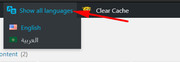
MikeHi,
The reason only 6 showed was because you were looking from within the language AR, when you look from “Show all languages” you will see all of the items
I tested searching for pages in your menu and it seemed to work fine to find a page to add to the menu:
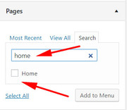
Here I searched for “home” and it was found.
What happens to you when you search?To move your menu, Please try this code in the General Styling > Quick CSS field or in the WordPress > Customize > Additional CSS field:
@media only screen and (max-width: 767px) {
.responsive #top #wrap_all .main_menu {
    right: auto !important;
    float: left !important;
}
.responsive #top .logo {
    width: auto !important;
    float: right !important;
}
}
Please see the screenshot in Private Content area. After applying the css, Please clear your browser cache and check.
Best regards,
MikeHi,
Sorry my misunderstanding, so I downloaded your font “orkney-light” and imported it into localhost and then I applied it to the headings which worked fine.
When I look at your “advanced styling” I see that you have selected “default font family” for your headings and body.
Which headings did you want to have “orkney-light”?Your font will not be available in the “TinyMCE Advanced”, the theme settings doesn’t change the WordPress editor settings. You can try editing TinyMCE Advanced to add custom fonts, but I would recommend not using TinyMCE Advanced as it often causes issues with the Advanced Layout Builder.
To use css to change your font-family, such as the special heading on your homepage “B I E N V E N U E” Please try this code in the General Styling > Quick CSS field or in the WordPress > Customize > Additional CSS field:
h1.av-special-heading-tag {
font-family: 'orkney-light' !important;
}
Please see the screenshot in Private Content area.
Best regards,
MikeHi,
Happy upcoming 4th of July!
I took a look at adding shortcodes there and tried a few different approaches but unfortunately, I couldn’t execute the shortcode in the Shop Description.
I was able to accomplish it by doing this, first I used the “shortcode wand” in a default post to get the “Testimonial Slider” shortcode:[av_testimonials style='slider' columns='2' grid_style='' interval='3' font_color='' custom_title='' custom_content='' av_uid='av-jxovfxx1' custom_class='' admin_preview_bg=''] [av_testimonial_single src='' name='Tom' subtitle='Happy Customer' link='http://' linktext=''] Good Times [/av_testimonial_single] [av_testimonial_single src='' name='Bob' subtitle='Happy Customer' link='http://' linktext=''] This is the best! [/av_testimonial_single] [/av_testimonials]Then I created a “shortcode” in my child theme functions.php:
 function testimonial_sc( ){

	return do_shortcode("[av_testimonials style='slider' columns='2' grid_style='' interval='3' font_color='' custom_title='' custom_content='' av_uid='av-jxovfxx1' custom_class='' admin_preview_bg='']
	[av_testimonial_single src='' name='Tom' subtitle='Happy Customer' link='http://' linktext='']
	Good Times
	[/av_testimonial_single]
	[av_testimonial_single src='' name='Bob' subtitle='Happy Customer' link='http://' linktext='']
	This is the best!
	[/av_testimonial_single]
	[/av_testimonials]");

}
add_shortcode( 'short_code', 'testimonial_sc' );
This will show the Testimonial Slider when the shortcode “[short_code]” is used.
Then I edited: \enfold\config-woocommerce\config.php
on about line 1089, look for:if($description) $output .= "<h1>".$description."</h1>";and change to:
if($description) $output .= "<h1>".do_shortcode("[short_code]")."</h1>";and then you also have to make sure there is something in the Enfold Theme Options > Shop Options > Shop Description for this to work.
 in this screenshot you can see it working, but you mat wish to use some css to adjust the Testimonial Slider colors.
Please try to follow the steps, and let us know if this helps.Best regards,
MikeJuly 4, 2019 at 5:41 pm in reply to: Cannot Update Post With .pdf Contained in The Text, Showing 404 Error #1115852Hi,
Sorry for the late reply, can I try updating your site with a beta version that includes the latest fixes?Best regards,
MikeHey Grant,
Thanks for the link, I see that you are using Enfold v3.6.1 with WordPress v5.2.2. Your version of Enfold is quite old and not WP v5 ready. Please update your site with Enfold v4.5.7
The easiest and safest way to do this is to download the newest version from Theme Forest and rename your current theme to “enfold-old” via ftp then upload the new “enfold” via ftp and check that your site is working correctly.
Once you are happy you can delete the “enfold-old” via ftp, (not the WP theme page)
Should for some reason you wish to roll-back to the old version, it’s easy to do, simply rename the new “enfold” to “enfold-new” via ftp and then rename “enfold-old” to “enfold” then refresh your page.
Please don’t try to overwrite the theme folder, as this will leave old files behind and cause errors.Best regards,
MikeHi,
Thanks, the server-login works good, but the WordPress login doesn’t, please check.Best regards,
MikeHi,
Glad to hear you sorted it out, we will close this now. Thank you for using Enfold.For your information, you can take a look at Enfold documentation here
For any other questions or issues, feel free to start new threads in the Enfold forum and we will gladly try to help you :)Best regards,
MikeJuly 3, 2019 at 2:00 pm in reply to: Different homepage styling when using translation plugin #1115477Hi,
I took another look and see that the css for “page-id-2130” is working, Please see the screenshot in Private Content area.
But this is just one of the many rules that will need to be adjusted, please see the second screenshot.
I hope this makes since.Best regards,
MikeHi,
Glad we were able to help, we will close this now. Thank you for using Enfold.For your information, you can take a look at Enfold documentation here
For any other questions or issues, feel free to start new threads in the Enfold forum and we will gladly try to help you :)Best regards,
MikeHi,
Glad to hear you got it sorted out, I will be looking into this more and report my findings to the dev team.
Unless there is anything else we can assist with on this issue, shall we close this then?Best regards,
MikeHi,
I’m not sure what you mean, Please see the screenshot in Private Content area of what I see with the latest css, is this not correct?Best regards,
MikeHi,
Thanks for the code, after I replaced the curly quotes in the code and placed it in a code block element I was able to save the pages and edit again without losing the code.
Did you use a code block element?<script type="edc8659bdcd9cbf0920840ca-text/javascript" src="https://birdeye.com/embed/v4/155861988228129/7/1234567975183"></script> <div id="bf-revz-widget-1234567975183" > <div class="bf-dv"><span class="bf-spn"> powered by BirdEye</span></div> </div> <iframe src="https://www.google.com/maps/embed?pb=!1m14!1m8!1m3!1d9479.976912075821!2d-113.4686842!3d53.5578705!3m2!1i1024!2i768!4f13.1!3m3!1m2!1s0x0%3A0x53af42792afb84e8!2sNew+Style+Painting+%26+Renovation+Ltd!5e0!3m2!1sen!2sus!4v1561785146082!5m2!1sen!2sus" width="100%" height="300" frameborder="0" style="border:0" allowfullscreen></iframe>Best regards,
MikeHi,
Thanks for the feedback, so you only want the count down to show on your /my-account/ page and the product page, correct?Best regards,
MikeHi,
I assume that you have tried disabling your plugins, correct?
In the Private Content area is a beta version with the latest fixes which has solved many “Edge” issues so perhaps this will help you also.
The easiest and safest way to test the beta version is to rename your current theme to “enfold-old” via ftp then upload the new “enfold” and check that your site is working correctly.
Once you are happy you can delete the “enfold-old” via ftp, (not the WP theme page)
Should for some reason you wish to roll-back to the old version, it’s easy to do, simply rename the new “enfold” to “enfold-new” via ftp and then rename “enfold-old” to “enfold” then refresh your page.
Please don’t try to overwrite the theme folder, as this will leave old files behind and cause errors.Best regards,
MikeHi,
Thanks for the login, I couldn’t find the function either, your functions.php must have been overwritten when you updated.
How did you update?Best regards,
MikeHi,
Thank you for the login, I found that in your child theme functions.php you already had the action “ava_custom_script” so when the new script added it again it caused the crash. I renamed the new script to “ava_custom_search” like this:add_action('wp_footer', 'ava_custom_search'); function ava_custom_search(){ ?> <script type="text/javascript"> (function($) { $(window).load(function() { $("#menu-item-search").detach().appendTo('#header_meta #avia2-menu'); }); })(jQuery); </script> <?php }It now seems to be working correctly, Please clear your browser cache and check.
Best regards,
Mike -
AuthorPosts