Forum Replies Created
-
AuthorPosts
-
Hi,
I took a look at your “sidebar menu” settings in your screenshot and duplicated the “always sticky” setting for the “sidebar menu” which seems to work fine with v4.7.3. I note you are asking about it being sticky for mobile, but the “sidebar menu” doesn’t show below 767px, it changes to the burger menu, this is the “sidebar menu” at 768px:

and this is at 767px and below where it changes to the burger menu:

so I’m not sure what you mean by “on mobile devices it’s still scrollable”
also on the /enfold-band/ demo you linked to there is no “sidebar menu”, it uses the top menu.Best regards,
MikeHi,
Sorry for the late reply, I have checked the column animation tab in v4.7.3 and with a child theme using v4.7.3 and in both cases the animation option shows.

One possibility for your error is if you are using a different language than English there could be an error in the language file, are you using a different language?Best regards,
MikeHey Daniel,
Sorry for the late reply, in this specific case we will add a directory to our child theme /shortcodes/ and then we will copy the “timeline” directory to it. Then we will add this code to the child theme functions.php:function avia_include_shortcode_template( $paths ) { if( ! is_array( $paths ) ) { $paths = array(); } $template_url = get_stylesheet_directory(); array_unshift( $paths, $template_url . '/shortcodes/' ); return $paths; } add_filter( 'avia_load_shortcodes', 'avia_include_shortcode_template', 15, 1 );If you are using the newest child theme included with v4.7.3 then this code is already included.
Now we will edit our “timeline.php” to suit, so the “strong” wrap only shows once in timeline.php in the latest version, on lines 1397-1398, which wraps the timeline date with “strong”, I removed it as a test.
Then we refresh the page and the “strong” has been removed.
That is all there is to it.Best regards,
MikeHi,
Sorry I don’t see a title “OUR CATEGORIES” or the horizontal gallery on the page we are working on /13269/ or any of the other pages, which page can we see this on?Best regards,
MikeHi,
For the masonry gallery border radius please try this css:.av-masonry-entry.av-masonry-item-loaded * { border-radius: 20px; }to move the masonry below the related posts, Try adding this code to the end of your functions.php file in Appearance > Editor:
function masonry_after_related_posts
  <script>
(function($) {
  $(document).ready(function(){
     $('#top.single-post #av-masonry-1').detach().insertAfter('.related_posts');
  });
 })(jQuery);
 </script>
<?php
}
add_action('wp_footer', 'masonry_after_related_posts');
please be sure to remove the other function.
Best regards,
MikeHi,
To solve the error in the buttons try this code in the General Styling > Quick CSS field or in the WordPress > Customize > Additional CSS field:#header_main #av-burger-menu-ul .current-menu-item a { border-bottom-width: 0px !important; }To have gray lines between the menu items except when the burger sub-menus are open, then the border lines should be white, try this css:
.html_av-overlay-side-classic #top .av-burger-overlay li a {
    border-bottom-style: solid;
    border-bottom-width: 1px;
    border-top-style: solid;
    border-top-width: 1px;
}
.html_av-overlay-side-classic #top #wrap_all .av-burger-overlay #av-burger-menu-ul li a {
    border-color: #ddd;
}
.html_av-overlay-side-classic #top #wrap_all .av-burger-overlay #av-burger-menu-ul li.av-show-submenu a {
    border-color: #fff;
}
After applying the css, Please clear your browser cache and check.
Best regards,
MikeHi,
Sorry, this didn’t work, is your login restricted to certain countries?Best regards,
MikeHi,
To correct the burger menu on the cart icon, I added this css:.html_visible_cart .av-burger-menu-main { padding-right: 45px !important; }As for the background image on /curso/ and some of the other pages I added this css:
@media only screen and (min-width: 767px) {
#main > div > div {
	height: 425px;
}
#main > div {
	background-position: center !important;
}
}
please clear your browser cache and check.
Best regards,
MikeHi,
@Guenni007 thanks for letting me know about the popups, I’ll look for a new image host.
Also thanks for the updated css.Best regards,
MikeHi,
Thank you for the video, I made an adjustment to how far down the header shows, please clear your browser cache and check.Best regards,
MikeHi,
I tried to login to check your Social Profiles, but it seems incorrect, please check.
We can’t insert a link with the images via css, this is why creating the new social icons using flags will be better.Best regards,
MikeHi,
For the gallery image links, I found that it is only available in the “masonry gallery” the “standard gallery” doesn’t have this option.
To have a border radius around each image, please try this css:#top div .avia-gallery img { border-radius: 20px; }To move the gallery on your single post to after the related posts and before the comments, Try adding this code to the end of your functions.php file in Appearance > Editor:
function gallery_after_related_posts(){
  ?>
  <script>
(function($) {
  $(document).ready(function(){
     $('#top.single-post .avia-gallery').detach().insertAfter('.related_posts');
  });
 })(jQuery);
 </script>
<?php
}
add_action('wp_footer', 'gallery_after_related_posts');
After adding this please clear your browser cache and check.
Best regards,
MikeHi,
To make the header sticky for mobile I adjusted the css above for hiding the logo on desktop so it would not conflict with the mobile effect, and I then added css to make the mobile header fixed at the top, this is the new css:@media only screen and (min-width: 767px) { #header.header-scrolled .container.av-logo-container { display: none !important; } } @media only screen and (max-width: 766px) { .responsive #top #wrap_all #header { position: fixed; } }Please note that since your site is in maintenance mode when you look at your site you probably are seeing the “WordPress Admin Bar” at the top, so when you scroll in mobile view your new fixed header may look like there is a space above the header where the admin bar was when it scrolls out of view. Your visitors will not see this, if you want to see what they see then go to your profile and disable the admin toolbar.
You can add screenshots by uploading your images to a service such as postimages.org and pasting the html code, or link given in your post or Private Content area.To demonstrate what I meant about the mobile slider, I hope you don’t mind that I added a “full screen slider” to your page under your “easy slider” with the same image, text, and two buttons. Then I set the “easy slider” to not show on mobile:
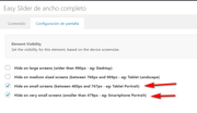
and I set the “full screen slider” to only show on mobile:
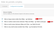
and I added this css so the “full screen slider” would not take the full screen:@media only screen and (max-width: 767px) { #top #main #fullscreen_slider_1.avia-fullscreen-slider .avia-slideshow { height: 70vh !important; max-height: 70vh !important; } }Please see the screenshots in Private Content area.
Best regards,
MikeHi,
Glad this helped, it looks like @Ismael already helped you on the other topic.
Shall we close this thread then?Best regards,
MikeHi,
Glad this helped, for your new effect the layout is different, the code you found and added as a codeblock works with a smooth transition because both images are in the div, where for the element we have worked on the first image is replaced with the second via css. We can get pretty close with “keyframes” but there is a moment that no image shows, unlike your code block example.
If you prefer this effect I recommend creating your layout like your code block, it works well.Best regards,
MikeHi,
Sorry for the late reply and thanks for the login. I added the function and the css to your site and tested mobile and desktop and it seems to be working correct. Please clear your browser cache and check.
Please see the video in Private Content area of what I’m seeing now.Best regards,
MikeHi,
Sorry for the late reply, and thanks for the feedback, I see what you mean, I Enabled the Avia Layout Builder Debugger and checked the layout with the Parser to try to auto correct but it found no errors, I then copied your page to my localhost and the error continued. Yet if I create a similar page from scratch I do not have the error with the grid row.
I’m going to ask the rest of the team for their thoughts.Best regards,
MikeHi,
Sorry for the late reply, to hide the logo when scrolling down, we don’t have a built-in option for this, but you can try this css to achieve this:#header.header-scrolled .container.av-logo-container { display: none !important; }On your mobile page the logo is showing for me, Please see the screenshot in Private Content area.
For mobile to have a bigger slider please try adding a “full screen” slider and select the visibility options to only show on mobile and set your easy slider to show all other times.
For the downgrading and controlling of virtual products you will need to use a woocommerce plugin to add this function, I don’t have experience which woocommerce will be best for you in this case but I recommend first going to the woocommerce site a look at the ones they have available.Best regards,
MikeHi,
Sorry for the late reply, when trying to import your demo I received the errorFailed to load resource: the server responded with a status of 500 () admin-ajax.phpTo work around your server error I uploaded the images to your server and then modified your import file so the images would be installed from your server instead of downgrading from our server, then I uploaded the theme settings file and set your widgets to match the demo and I also set your menu.
Everything seems correct now, please clear your browser cache and check.Best regards,
MikeHi,
Sorry for the late reply, you can try this css:@media only screen and (max-width: 767px) { .avia-table td:before { display: none !important; } }If this doesn’t help then please let us know when we can see your site to target the correct sectors for your site.
Best regards,
MikeHi,
Sorry for the late reply, on Envato the zip file “all files and documentation” also includes files you don’t need, so please extract it on your desktop and look for the folder “enfold” this is the theme files.
You can verify the theme version by opening the “style.css” file inside “enfold” and line 4 will tell you the version number.

Then you can rename your current “enfold” folder to “enfold-old” via ftp and them upload the new “enfold” from your desktop to your site.
If you would like a hand with this then please link to your Envato file via DropBox and include admin login and ftp access in the Private Content area.Best regards,
MikeHi,
Sorry for the late reply, so I added the custom class “three_columns” to your css:.flex_column.av_one_third.three_columns { webkit-transition: -webkit-transform .15s cubic-bezier(.4,0,.2,1); transition: -webkit-transform .15s cubic-bezier(.4,0,.2,1); transition: transform .15s cubic-bezier(.4,0,.2,1); transition: transform .15s cubic-bezier(.4,0,.2,1), -webkit-transform .15s cubic-bezier(.4,0,.2,1); } .flex_column.av_one_third.three_columns:hover { -webkit-transform: scale(1.1); transform: scale(1.1); }then I added the custom class to your columns on your homepage and your portfolio page:
now only the three columns on your homepage and portfolio page grow on hover, please clear your browser cache and check.Best regards,
MikeHi,
Sorry for the late reply, please try going to Enfold Theme Options > Header > Extra Elements > Header Social Icons and choose one of the options to show the social icons in the “top bar”
Then add this css for it to show on mobile:@media only screen and (max-width: 479px) { .responsive #top #wrap_all #header .social_bookmarks, .responsive #top #wrap_all #main .av-logo-container .social_bookmarks { display: block; } }Best regards,
MikeHi,
I added this to your custom.css so the font would load from your site and show:@font-face { font-family: 'entypo-fontello'; src: url('https://your-site.com/wp-content/themes/enfold/config-templatebuilder/avia-template-builder/assets/fonts/entypo-fontello.woff') format('woff2'), url('https://your-site.com/wp-content/themes/enfold/config-templatebuilder/avia-template-builder/assets/fonts/entypo-fontello.woff2') format('woff'), url('https://your-site.com/wp-content/themes/enfold/config-templatebuilder/avia-template-builder/assets/fonts/entypo-fontello.ttf') format('truetype'); font-weight: normal; font-style: normal; }Please clear your browser cache and check.
Best regards,
MikeHi,
Sorry for the late reply, if you want to have this on a few pages you can add a css rule for each page-id with a comma like this:#top.page-id-1038 #layer_slider_1, #top.page-id-154 #layer_slider_1, #top.page-id-138 #layer_slider_1 { z-index: 0; }but if it is for all pages that also have the layerslider then use the class “page” without the “id”
#top.page #layer_slider_1
but if it is more complicated we will need to know when you will have this set up so we can figure out the best way to set up the css rules.
If you don’t want to have the overlap on mobile devices then you can wrap your css in a media query like this:@media only screen and (min-width: 768px) { #top.page-id-1038 #layer_slider_1 { z-index: 0; } #top.page-id-1038 #after_layer_slider_1 > div > div > div > div > div { z-index: 99; position: relative; } }Best regards,
MikeHi,
Thanks for the feedback, please try adding two new social icon profiles by following these steps then go to Fontello and upload SVG icon versions of your flags to be converted into the icon font:
Then these will be next to your other social icons and you will be able to add links in the social profiles in the theme options.Best regards,
MikeHi,
Sorry for the late reply, I adjusted the height of the sub-menu and the icon and menu title so they are all just about on the same line. It may be down just a little but once all of the menu items have the icon they will look the same.
Please clear your browser cache and check.
Here is the css used:#menu-item-115 span.av-icon-char::after { content: "Accueil"; font-size: 15px !important; display: block; line-height: 40px; top: 100px !important; position: absolute; } #menu-item-115 > a { height: 215px; line-height: 215px; } #menu-item-115 > a > span.avia-menu-text > span { line-height: 215px; }Best regards,
MikeHi,
Sorry for the late reply, Please try this code in the General Styling > Quick CSS field or in the WordPress > Customize > Additional CSS field:#main > div.main_color.container_wrap_first.container_wrap.sidebar_left > div { background-color: gray; } #main > div.main_color.container_wrap_first.container_wrap.sidebar_left > div > main { background-color: #fff !important; }After applying the css, Please clear your browser cache and check the url in the Private Content area.
Best regards,
Mike -
AuthorPosts