Forum Replies Created
-
AuthorPosts
-
March 21, 2020 at 6:33 pm in reply to: Resizing space between columns + centering them on the page #1195122
Hi,
Sorry for the late reply, the page doesn’t seem to exist right now, do you still need help with this?Best regards,
MikeHi,
Sorry for the late reply, to remove the white space from your mobile & tablet-sized screens, Please try this code in the General Styling > Quick CSS field or in the WordPress > Customize > Additional CSS field:@media only screen and (max-width: 989px) { .html_header_top.html_header_sticky #top #wrap_all #main { padding-top: 0px !important; } }To have your clients face show in the second section on mobile & tablet, try adding this css like this:
@media only screen and (max-width: 989px) {
.html_header_top.html_header_sticky #top #wrap_all #main {
    padding-top: 0px !important;
}
#av_section_1 {
background-position: -190px center !important;
}
}
Best regards,
MikeHi,
Sorry for the late reply, I have looked at your sidebar menu and found that clicking on the “down arrows” in the menu expands & collapses the menu, is this what you were looking for?Best regards,
MikeHi,
To show the feature image on an archive page please try this css:#top.archive .entry-content { display: block !important; }Best regards,
MikeHi,
Thank you for the login, I believe some javascript is capturing the hashtag click, I see you are using a child theme so I wonder if you have any javascript in your functions.php?
Please enable WordPress > Appearance > Editor by removingdefine( 'DISALLOW_FILE_EDIT', true );from thewp-config.phpfile to enable it unless your web hosting setup another way to manage this option.
I found that changing the hashtag to something else like a question mark allowed the url to work, but it won’t go to the anchor.
By the way you don’t seem to have a “technology” id on your /services/ page.
Anyways, on a new install the hashtags do work correctly.Best regards,
MikeHi,
For the contact form “name” & “email” we will adjust the css to target the contact form, I added this:#top .main_color #commentform input[type="text"] { background-color: #e69d37; }note the added “#commentform”
Best regards,
MikeHi,
Thank you for the login, I added the script to your functions.php for you, and I took screenshots of before and after for you to show it is working.
Here is before, note the “next” & “prev” code<link rel="next"is after the<link rel="https://api.w.org/"and before<meta name="generator" content="WordPress 5.3.2">
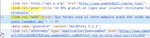
Here is after with the script working, notice there is nothing between<link rel="https://api.w.org/"and<meta name="generator" content="WordPress 5.3.2">
Please note that this removal is preformed in the DOM and can be seen with the DevTools (or inspector), if you try to view with the page “source code” the code will still show because you are viewing the source code pre DOM, which is not what browsers or bots are actually reading.
I hope I have explained this well.Best regards,
MikeHi,
Do you have a custom login url? The normal login “/wp-admin/” is leading to a “404” page.
Or do we need to login from a certain country IP?Best regards,
MikeHi,
Thanks for the login, on the contact form what color do you want the “Nachricht” text? Are the other placeholders colors correct?
The placeholder color for the “Nachricht” text is set by:.responsive #top ::placeholder { color: #ad0e08; opacity: 1; font-family: 'Montserrat Alternates', sans-serif; font-size: 17px!important;; }So what is wrong with this is that it is too general and it sets the color to all placeholders, I recommend setting a custom class for the contact form:

you can add this custom class to all of your contact forms, and then change the css to this:.responsive #top .contact-form ::placeholder { color: blue !important; }Notice I changed the color to blue just for example to show that this doesn’t change the color on the comment forms.
For the other placeholders please try:#top #wrap_all #main .main_color .contact-form input::placeholder,#top #wrap_all #main .main_color .contact-form span.value_verifier_label { color: blue !important; }This will change the color of the input text:
#top .main_color .contact-form input[type="text"]{
	color: blue !important;
}
Best regards,
MikeHi,
Please try this code in the General Styling > Quick CSS field or in the WordPress > Customize > Additional CSS field:a.av-masonry-entry .av-masonry-read-more { display: block; text-align: center; margin: 0px auto 0px auto; clear: both; width: 250px; border-color: #749944 !important; border-style: solid; border-width: 1px; padding: 5px 0; border-radius: 100px; color: #749944; }Best regards,
MikeHi,
The button you linked to at /news/corona-virus-update/ matches the background color and other parameters of your sandbox button.

do you see something different than this?

Best regards,
MikeHi,
I see that you are using a masonry element for your post grid on your “our blog” page, I was able to add a “read more” link after your excerpts with the following function in your child theme functions.php, but I see you would like it to be a button, do you have a button example of how you would like the button to look?/* Add a "read more" link" to masonry elements */ function ava_custom_script_mod(){ ?> <script> (function($){ $(window).on('av-height-change', function() { $('.av-masonry-entry').each(function() { var more = $(this).find('.av-masonry-read-more'); var cont = $(this).find('.av-masonry-entry-content'); if( more.length == 1 ) return; cont.append('<div class="av-masonry-read-more">Read more</div>'); }); }); })(jQuery); </script> <?php } add_action('wp_footer', 'ava_custom_script_mod');Best regards,
MikeHi,
Thanks for the feedback, the columns is the only thing I can find different between your failed post and my working version of the same post.
I will ask the rest of the team to take a look and help with what I’m missing.
Thank you for your patience.Best regards,
MikeHi,
Thank you for the link, when I look at your red button “Find out how to join our online sessions” the only difference seems to be the border-radius which gives the button the round corners, is this what you are seeing too?
to correct the border-radius, please change this in the css:
border-radius: 3px!important;
to this:
border-radius: 23px!important;
I don’t see a version of the black button so I’m not exactly sure what the border-radius is, but feel free to adjust to suit.Best regards,
MikeHi,
For the contact form please remove this part of the css:#top .main_color input[type="text"] { background-color: #e69d37; }so we can see how to adjust it, and also remove the code in the functions.php that I gave you that is causing the error.
It may be easier if we had an admin login so we can adjust these snippets.Best regards,
MikeHi,
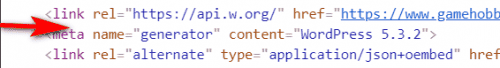
When you check to see if the script is working are you looking at the “page source code” or are you looking at the “Dev Tools Inspector”?
The “page source code” will still show it there, such as in your screenshot, but that is not what the “Google Bot” will see, the Google Bot sees the page after the DOM has been executed, which is what the “Dev Tools” shows when you right-click on the page and choose “inspect” or F12 on a Windows keyboard.Best regards,
MikeHi,
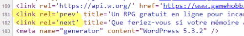
Thank you for the link to your post, to remove the “next” & “prev” on your single posts, Try adding this code to the end of your functions.php file in Appearance > Editor:function custom_script(){ ?> <script> (function($){ $(document).ready(function(){ $("#top.single-post").each(function() { $('link[rel="next"]').remove() $('link[rel="prev"]').remove() }); }); })(jQuery); </script> <?php } add_action('wp_footer', 'custom_script');Best regards,
MikeHey KosmetikAndNails,
Please check your Enfold Theme Options > General Layout > Dimensions > Maximum Container width it may be set to 1310px or 1410px, increasing this will change how the layout on large screens will be.Best regards,
MikeHi,
Sorry, I have installed Enfold v4.7.3 on a new live server but still couldn’t reproduce the alt & title error for the alternative logo.
I have asked the rest of the team to try reproducing the error and offer suggestions to correct, but I have not had any feedback yet.
Thank you for your patience.Best regards,
MikeMarch 18, 2020 at 1:02 pm in reply to: Hello, In wich way i can remove default title h3 on archieve pages? #1194092Hi,
Sorry, I don’t see this error on your site. I recommend disabling the parts of the plugins I wrote about above, other than that I don’t have any customization suggestions for these plugins.
This thread has covered many different topics, so I recommend closing this thread and if you have any other questions please open a new thread so we can focus on one issue per thread.
Thanks for your understanding.Best regards,
MikeMarch 18, 2020 at 12:32 pm in reply to: Conflict with Enfold and Five Star Restaurant Menu plugin. #1194086Hi,
Thank you for the login, I looked at your Events, Pages, & Posts but I don’t see the error from your screenshot. If you continue to see this error I would recommend disabling your plugins to see if that helps. One plugin I question it your “Enfold – Repeatable Content” this third party plugin is about 4 years old now and a lot of changes has been made to the Advanced Layout Builder since then.Best regards,
MikeHi,
I see you have the latest version but in your update options in your theme panel your “Envato private token” field is empty, this is necessary for updates in the theme panel to work, but envato-market should also send you emails, you will have to ask envato-market why you are not getting these.Best regards,
MikeHi,
Please try this code in the General Styling > Quick CSS field or in the WordPress > Customize > Additional CSS field:#respond span.required { display: inline-block !important; } .commentlist #respond #comment { width: 100% !important; }and then add this code to the end of your functions.php file in Appearance > Editor:
function custom_reply_title(){
  ?>
  <script>
(function($){
  $(document).ready(function(){
  $("h3#reply-title").text("Liebes Publikum, schreib mir doch etwas Nettes :-)");
  });
  })(jQuery);
  </script>
<?php
}
add_action('wp_footer', 'custom_reply_title');
Best regards,
MikeMarch 17, 2020 at 1:42 pm in reply to: Conflict with Enfold and Five Star Restaurant Menu plugin. #1193790Hey spidercreations,
Sorry for the late reply, please try setting the “Classic Editor” as your default editor in the theme options at Enfold Theme Options > Select Your Editor > Use WP Classic Editor If you are using another “Classic Editor” plugin, please disable.
So you only see this error with the “Events Calendar” post types?
Please include an admin login in the Private Content area so we can examine closer.Best regards,
MikeHi,
This code:#top #wrap_all .comment-form-url { display: none; }is to hide the “website” field.
To change the color of the text when entered into your form so it is red and not the same orange as the background color, Please try this code in the General Styling > Quick CSS field or in the WordPress > Customize > Additional CSS field:#top .main_color input[type="text"], #top .main_color select { color: #720c10 !important; }Best regards,
MikeHi,
Thank you for the screenshot, I’m asking the rest of the team for thoughts on centering this better.
Thank you for your patience.Best regards,
MikeMarch 17, 2020 at 12:31 pm in reply to: Hello, In wich way i can remove default title h3 on archieve pages? #1193777Hi,
The errors were caused by your “Async JavaScript” & Autoptimize plugins, Async JavaScript needs to be set to “Defer” and Autoptimize needs to have ”
Ottimizzare il codice JavaScript?” and “Minify excluded CSS and JS files?” off, otherwise, the JQuery doesn’t load correctly.
This is common for Autoptimize.
I checked your homepage with a different keyword tool and “Agrave” was not found, so I’m not sure what to make of this.Best regards,
MikeHi,
Glad to help, unless there is anything else we can assist with on this issue, shall we close this then?Best regards,
MikeHi,
Glad to hear, unless there is anything else we can assist with on this issue, shall we close this then?Best regards,
MikeHi,
Thank you, glad we could help and if you have more questions in the future please feel free to open a new thread.
I took a look at your theme options for updating and it seems the token was working correctly, there was a link that said “manually check now” when I clicked it I got the message that an Update is Available.
Please check.

Best regards,
Mike -
AuthorPosts