Forum Replies Created
-
AuthorPosts
-
Hi,
Sorry for the very late reply, please try this code in the General Styling > Quick CSS field or in the WordPress > Customize > Additional CSS field:#top.home #header.av_header_transparency .main_menu ul:first-child >li > ul, #top #header.av_header_transparency .main_menu .avia_mega_div > .sub-menu { top: 181px; } #top.home #header.header-scrolled .main_menu ul:first-child >li > ul, #top #header.header-scrolled .main_menu .avia_mega_div > .sub-menu { top: 91px; }This will only work on your homepage unless you remove “.home”, it will move the sub-menu up before & after scroll.
Please clear your browser cache and check.Best regards,
MikeHi,
Thanks for your feedback, I see you are using a child theme, have you tried activating the parent theme to see if the Events Countdown element works correctly?Best regards,
MikeHi,
Glad to hear, is there anything else we can assist with on this issue, or shall we close this then?Best regards,
MikeHi,
Thanks for the links, the /switch/ page looks correct with the stretched layout, but the /deswichtgids/ page is boxed, please set it to stretched also.
Then I believe we can use css to “box in” the content part of the page and leave the header and footer alone, sorry if I was not clear about that 🙂Best regards,
MikeFebruary 7, 2021 at 6:11 pm in reply to: several items highlighting on mouse over in a mega menu #1278457Hi,
Thank for your feedback, I see that I forgot you wanted this on hover, so if your menu items are in different columns and you want to highlight them all on one hover we will need to use jQuery because css can’t traverse the parent selectors.
Try adding this code to the end of your functions.php file in Appearance > Editor:function custom_script() { ?> <script> (function($){ var same = $('.avia_mega_div .sub-menu li .sub-menu .same a'); $(".same").mouseenter(function () { same.css({'background-color':'#FFA500'}); }); $(".same").mouseleave(function () { same.css({'background-color':''}); }); })(jQuery); </script> <?php } add_action('wp_footer', 'custom_script');you will not need the previous css and adjust the color to suit. If this doesn’t work for you please link to your site so I can examine your mega menu structure.
Best regards,
MikeFebruary 7, 2021 at 2:37 pm in reply to: several items highlighting on mouse over in a mega menu #1278442Hey semiocode,
Sorry for the late reply, for your mega menu items please enable “custom classes” in the “Screen Options” panel in Menus:
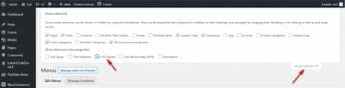
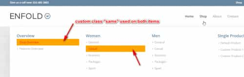
then add a custom class, such as “same” to the menu items that are the same:

then add this code in the General Styling > Quick CSS field or in the WordPress > Customize > Additional CSS field:.same > a { color: red !important; background-color: orange !important; }*EDIT* the css above is not for :hover this css is:
.same:hover > a {
	color: red !important;
    background-color: orange !important;
}
*EDIT BUT* this will not highlight all items when one is on :hover, for this please see the next post.
and adjust the colors to suit.
This is the expected results
Please give this a try, if you have any issues please link to your page so we can examine.Best regards,
MikeFebruary 7, 2021 at 1:45 pm in reply to: YouTube videos showing differently on the same screen #1278437Hi,
Sorry for the late reply and thanks for the login, I examined your video elements and I didn’t see a reason for the error. I used the Avia Layout Builder Debugger to copy your page to my localhost to test without plugins on a clean install and the first video showed the play button correctly, please see the screenshot in the Private Content area.
The main difference, besides your plugins, is your PHP version 7.0.14, where I’m using v7.4.14
If you could try updating your PHP version on your server, and then clear your browser & server cache.
If this doesn’t help, try disabling your plugins and then enable one at a time until the error is identified.Best regards,
MikeHi,
sorry for the very late reply, and thanks for the links. To adjust the space between the “category” and “Read more”, please try this css in your Quick CSS:h3.slide-entry-title.entry-title { padding-bottom: 0 !important; margin-bottom: 0 !important; } .html_modern-blog #top .post-entry .blog-categories { top: 0 !important; }For your #le-conseil-des-sages team names the current css is:
.team-member-name {
    margin-top: 7px;
    font-size: 1.55em;
}
I believe this is in your custom css, please try to adjust to
font-size: 1em;or to suit, and then clear your browser cache and check.Best regards,
MikeFebruary 7, 2021 at 12:23 pm in reply to: Change the header size of the all ecommerce pages #1278426Hi,
Sorry for the very late reply, and thanks for the login and links, I added this css to your Enfold Theme Options > General Styling > Quick CSS field.woocommerce-page #av_product_description { height: 75vh; } .woocommerce-page #av_product_description .av-section-color-overlay-wrap > .container { margin: 0; position: absolute; top: 50%; left: 50%; transform: translate(-50%, -50%); }This matches the product description header of your woo pages to your /chi-siamo/ page.
please clear your browser cache and check.Best regards,
MikeFebruary 7, 2021 at 12:05 pm in reply to: Transparent video on the main menu, in autoplay and ALSO visible on phones #1278425Hey stef93500,
Sorry for the very late reply, unfortunately, browsers such as Safari & Chrome do not allow videos to automatically play on phones.
One way around this is to use the layerslider to play the video on mobile, it seems to be able to bypass this limitation.Best regards,
MikeFebruary 7, 2021 at 12:43 am in reply to: How to add a custom post tag to the Blog Post Grid Layout and ALB Masonry Blog ? #1278397Hi,
Sorry for the late reply and glad you were able to sort out your first issue. For the css please try this:.slide-entry > a > small { display: block !important; }Best regards,
MikeHey jelle,
Sorry for the late reply and thanks for the links, your wix homepage looks to have the same header background as this demo, this is done with a color section and a background image.
For the second page, you could just box the page content with custom css, which will leave the header and menu alone.
Do you have a copy of this site on WordPress that we can see?Best regards,
MikeHi,
Sorry for the very late reply, as I understand you current issue was with the burger menu and the videos on /dip2021/
For me using Chrome, the burger menu is working & the videos & audios play, I randomly checked about 1/3, but there is not image overlay for the videos, is there meant to be? Since both of these seem to be working, I must be missing something.I see that the jQuery Migrate Helper plugin is deactivated right now, I also see that Autoptimize & W3 are both minifying the javascript. I would recommend only having one plugin minify the javascript.
I saw that you were getting a referrer policy error on the browser console, so I set your W3 option at Performance>Browser Cache>Security Headers to no-referrer-when-downgrade (the default option) to correct

you are still getting another errorUncaught ReferenceError: u is not definedbut I’m not sure where this one is coming from.Best regards,
MikeFebruary 6, 2021 at 10:52 pm in reply to: Color Section Background Image Issue on Multilingual Page (WPML) #1278386Hey mirotck,
Sorry for the very late reply, and thanks for the login. I found that on the [EN] site, on mobile, the div container .av-parallax.active-parallax is created for the mobile background image, but on the other languages this is not created, even though the settings look the same.

I see that you are getting a few jQuery errors, please try the jQuery Migrate Helper plugin and set the version to legacy 1.12.4.Best regards,
MikeFebruary 6, 2021 at 9:55 pm in reply to: Changing the style of cookie consent modal window – How? #1278379Hi,
Sorry for the very late reply, glad to hear you were able to sort this out, thank you for using Enfold.Best regards,
MikeFebruary 6, 2021 at 9:47 pm in reply to: How to create search text fields for make, model, year #1278377Hey amester55,
Sorry for the very late reply and thanks for the link to your site. It looks like you are not using woocommerce, so unfortunately Enfold doesn’t have this type of filter built-in. While you could use woocommerce, it seems like it would be a lot of work just for the filter if you are not going to use it as a platform.
I can not think of an effective way to do this without a plugin, I recommend looking for a plugin that will create a custom post type like a “product” that will include the taxonomies you would like and include a sort option.Best regards,
MikeFebruary 6, 2021 at 8:51 pm in reply to: WooCommerce Digital Wallet, Default Store and PayPal Buttons Alignment/Spacing #1278370Hey npmcgrew,
Sorry for the very late reply and thanks for the login. To remove the “digital-wallet” from the single product pages, please try this code in the General Styling > Quick CSS field or in the WordPress > Customize > Additional CSS field:.single-product #wc-square-digital-wallet { display: none; }To adjust your “cart” page, here is one option:

for this the css is:.woocommerce-cart #ppc-button { width: 60%; } .woocommerce-cart #wc-square-digital-wallet { width: 30%; display: inline-block; margin: 0 !important; padding-top: 2em !important; } .woocommerce-cart #wc-square-wallet-divider { display: none; } .woocommerce-cart .cart-collaterals .cart_totals .wc-proceed-to-checkout { text-align: left !important; }Is this what you had in mind?
Best regards,
MikeFebruary 6, 2021 at 7:44 pm in reply to: Blog feature does not work on Enfold Theme with BigCommerce Headless active. #1278337Hi,
Sorry for the very late reply, and thanks for the staging site login, but what is the login page? /wp-admin/ is redirecting.
I have not used the BigCommerce plugin, but perhaps the browser console will give more info about the error once I can login.Best regards,
MikeHey shanhard,
Sorry for the very late reply and thanks for the login, I exported your event to my localhost and installed The Events Calendar plugin and the Events Countdown element worked correctly. I checked that we are using the same WP & Enfold versions and performance settings. The only difference that I see is your layerslider is disabled but I don’t seeadd_theme_support('deactivate_layerslider');in your child theme functions.php, how did you disable the layerslider?
I testedadd_theme_support('deactivate_layerslider');on my localhost to ensure that it didn’t break the Events Countdown element.
Do you have object caching enabled on your server? Please try to disable it for testing.
I’m not sure why it would not be working for you, I don’t see any errors. Typically I would suggest disabling your plugins but I don’t see you have very many, and I’m sure you tried this. Are there any scripts I might have missed on your site?Best regards,
MikeHey Maskenzauber,
Sorry for the very late reply, so I did not know what IPTC-data was, and thanks for the link, but in my research, it seems that IPTC-data is typically exported from a photo editor and then imported via CSV. For WordPress it seems that you will need to use a plugin.
The copyright field for the images is one that we added a few versions ago, to be filled in manually, it doesn’t check for “copyright” data of the images.Best regards,
MikeHi,
Glad this helped, to change the font weight try adding:font-weight: normal !important;
like this:

Typically we request that each thread is focused on a single issue, but since your viewing your dev site requires editing the hosts file, lets continue here.
For your next question, on the akhurst.com/blog/ page I see that clicking on the first post category MACHINERY SOLUTIONS links to akhurst.com/shop/machinery-solutions/

but in your Shop there is no machinery-solutions category, so it leads to a redirect to your frontpage.
But I’m not sure what you are trying to do with your posts & products, your blog post should be pointing to your post categories, not your product categories. If this is the error then it is probably because you are using the same category slugs for posts & products, if you find this to be true then please ensure no two category slugs are the same for any post type.
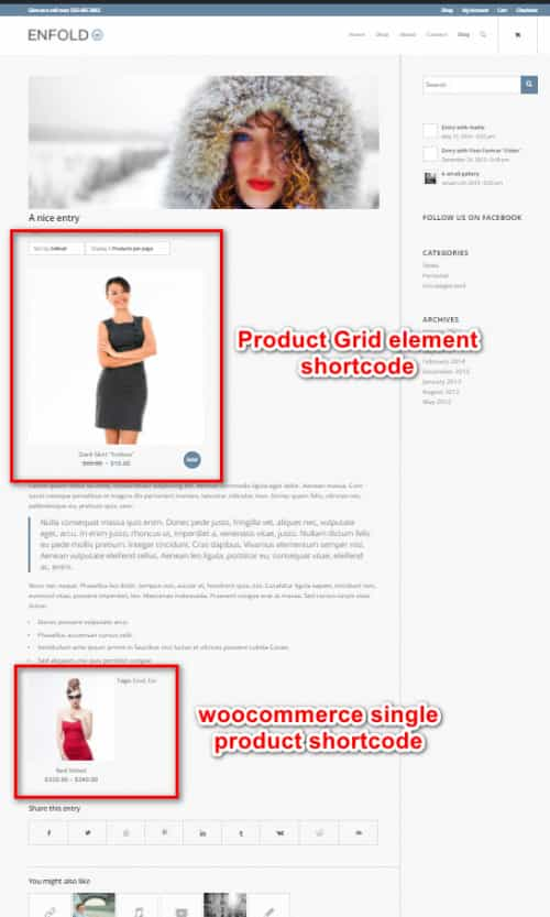
For your question about adding the Product Grid to posts, I assume that you are using the Shortcode Wand to add the Product Grid to your posts and show only one product:

In the Product Grid element you can choose which taxonomy will be shown and how many will be shown, so if you want to only show one product try adding a specific taxonomy such as “dowel-featured-product” to the one product. While the fewest number of columns you can choose is “2” but you could use css like this to make it show as one column:.single-post .shop_columns_2 .products .product { width: 100% !important; } .single-post .avia-product-slider1.shop_columns_2 { width: 50% !important; }But with this method you may end up with many single item taxonomies, depending on how many of these you which to set up.
Another option is to use the woocommerce single product shortcode, for example:
[products limit="1" columns="1" ids="511" class="post-product"]
this shows one product (id 511), one column, this screenshot compares the two shortcodes:
Best regards,
MikeHi,
I recommend disabling, (not remove), all of your plugins to see if this error continues, then you can enable one at a time to find the one causing the error.
Did you recognize the code that was in with the text:<span data-sheets-value="{" data-sheets-userformat="{">do you think any other elements have similar code?Best regards,
MikeHi,
On the /how-we-help-brands/ page, this code is in the testimonial text:<span data-sheets-value="{" data-sheets-userformat="{">

which gives this in the source code:

Since I couldn’t edit the /how-we-help-brands/ page, I added it to the /kriesi-test/ page and seemed to help on the frontend but the backend was not editable. As I researched further I found that adding any element to the 3/5 column seems to break the backend of the page (406), but removing the columns makes the page editable.
When I test the same shortcode on my localhost I don’t get any errors, did you try disabling your plugins?Best regards,
MikeHi,
Thank you for the link, please try this css in the General Styling > Quick CSS field or in the WordPress > Customize > Additional CSS field:#top #header .avia_mega_div > ul.sub-menu.avia_mega_hr { padding: 0 !important; max-height: 0; } #top #header .avia_mega_div > ul.sub-menu { padding: 0; } #top #header .mega_menu_title.av-special-font > a { color: #fff; padding: 0 0 0 20px !important; } #top #header .mega_menu_title.av-special-font > a:hover { color: #b34b4b; text-decoration: none !important; padding: 0 0 0 20px !important; }Then clear your browser cache and check.
The last item “All Machineries” doesn’t have a link so the color did not change, please add a link.
Please see the screenshot of the expected results in the Private Content area.Best regards,
MikeHey lzevon,
Thank you for the link to your site, unfortunately, we don’t have a hook for the location you wish for. But we can move your widget to that location with this script. Try adding this code to the end of your functions.php file in Appearance > Editor:function custom_script() { ?> <script> (function($){ $('#header').each(function() { $(this).find('#header_main .inner-container #text-5').css({'padding':'0','display':'inline-block'}).prependTo( $(this).find('#header_meta > .container')); }); })(jQuery); </script> <?php } add_action('wp_footer', 'custom_script');Please see the expected results in the Private Content area.
Best regards,
MikeHi,
Thank you for the login, I see that your “Latest News” widgets don’t seem to be saving their settings, at least the visual cue is not showing. The widgets are showing items but I’m not sure if they are the correct categories or not because the element doesn’t show the categories in the source code. So I believe you are saying that the incorrect categories are showing?
I tested the “Latest News” widget on my localhost and the correct categories show and the widgets show the visual cue as to which categories are picked.
I’m not seeing any errors from your site in the browser console, have you tried disabling your plugins to see if this behavior continues?Best regards,
MikeFebruary 4, 2021 at 1:33 pm in reply to: What is best way to translate labels in countdown element? #1277695Hey Marcel,
Thank you for the link to your site, I’m not sure I understand your question but I see that your page language is [en-GB] and the content is in English, including the countdown element, please see the screenshot in the Private Content area.
The text for the countdown element is translated by the language files at /enfold/lang/, for example, in this screenshot the countdown element displays the correct text for the correct site language.

If you want to change the text to something else, I recommend changing the text in the translation files with Poedit, and save this in your child theme. You can do this for [EN] & [DE] if you wish.
To setup a child theme language directory, you would add a directory “/lang/” in your child theme and add this to your functions.php:function language_file_child_theme() { $lang = get_stylesheet_directory().'/lang'; return $lang; } add_filter('ava_theme_textdomain_path', 'language_file_child_theme');and place your custom .po & .mo file inside.
Best regards,
MikeHi,
Glad to hear that this helped, unless there is anything else we can help with on this issue, shall we close this then?Best regards,
MikeHi,
Sorry for the very late reply and thanks for the login, I added this css in the WordPress > Customize > Additional CSS field:li.dropdown_ul_available:not(#menu-item-5472):before { content: "▼"; color: white; position: absolute; top: 31px; left: -3px; }Thanks to @cherrmann for the base css, I added a rule to not place the entity next to the “Home” button, please clear your browser cache and check.
Best regards,
MikeFebruary 3, 2021 at 2:25 pm in reply to: Burger menu not displaying on 1024 screens and ipad landscape #1277367Hi,
Sorry for the very late reply, I believe this is a duplicate thread to this one, which seems sorted out, please review, and let’s continue on one of these threads.Best regards,
Mike -
AuthorPosts