Forum Replies Created
-
AuthorPosts
-
August 8, 2022 at 12:10 pm in reply to: The frameborder attribute on the iframe element is obsolete. #1361094
Hi,
Glad to hear that you have this sorted out, if you have any further questions please create a new thread and we will gladly try to help you. Thank you for using Enfold.Best regards,
MikeHey rixi,
We could help with a code snippet to add a link, but I’m not sure where you would want the link placed, please include a screenshot mockup of where you would want the link.
To add a screenshot please try using an Screenshot service and pasting the image URL in your post.Best regards,
MikeAugust 7, 2022 at 10:29 pm in reply to: Desktop Hamburger Menu causing issue with mobile site Hamburger Menu #1361023Hi,
Sorry my mistake, please try this css:@media only screen and (max-width: 767px) { .responsive #top #wrap_all .main_menu { right: -120px; } }After applying the css, please clear your browser cache and check.
Best regards,
MikeHi,
Glad we were able to help, if you have any further questions please create a new thread and we will gladly try to help you. Thank you for using Enfold.Best regards,
MikeHi,
Thanks for your question, since this is still occurring with the default 2022 theme I would say that you will need to manually add the security headers to your htaccess file. Here is a thread on WordPress for your same issue.Best regards,
MikeAugust 7, 2022 at 10:07 pm in reply to: Can you trace email addys of those who submit to contact form? #1361019Hey tonyiatridis,
Thanks for your question, but unfortunately when the email is sent via the contact form on your site it is not going to show their real email address.
I would recommend using a plugin to track IP addresses, such as Banhammer you could then give this to the police to investigate or you could ban the IP address from your site.Best regards,
MikeHi,
Thanks for the screenshot and link to your page, I checked with my Android phone and the fields are black, I don’t have an iPhone.
Try this css:#top .main_color #mainContainer #adultCount, #top .main_color #mainContainer #kidsCount { opacity: 1 !important; color: #000 !important; }Then clear your browser cache and any cache plugin, and check.
Please note that testing with iPads & iPhones can be hard to clear the cache, often you need to also clear the history to fully purge the cache, following these steps for Safari and note Step 4 where you will Clear the History.Best regards,
MikeHey letsrocc15,
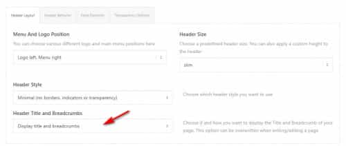
Thanks for your question, I only found one page with the title container and breadcrumbs /privacy-policy/
assuming that all of your other pages have the setting Title Bar Settings ▸ Default Setting then please check Enfold Theme Options ▸ Header ▸ Header Layout ▸ Header Title and Breadcrumbs to ensure it is enabled:
If this doesn’t help please include an admin login in the Private Content area so we can be of more assistance.Best regards,
MikeHey nasi,
Thank you for your patience and for the link to your site. I installed the Simple Image Sizes plugin for you to demonstrate that your woocommerce_gallery_thumbnail size is 100px, yet it is showing at 175px so it is blurry:

Try going to WordPress ▸ Settings ▸ Media ▸ Image sizes and change this to 180px and then regenerate the thumbnails

and then clear your browser cache and check again.Best regards,
MikeHi,
Thank you for your question, I would recommend using “Next Step” as a category rather than a tag.Best regards,
MikeAugust 7, 2022 at 6:55 pm in reply to: The frameborder attribute on the iframe element is obsolete. #1361007Hi,
Thank you for your patience, I have reviewed your page source code and used the validator that you linked to, but found no frameborder attribute.
Please explain further where this can be found, if you have not already solved it.Best regards,
MikeAugust 7, 2022 at 4:25 pm in reply to: Desktop Hamburger Menu causing issue with mobile site Hamburger Menu #1361004Hi,
Glad to hear this helped, the social icons are not designed to be seen on mobile portrait because as you pointed out “it would be too crowded” this is done with css if anyone wants to show them crowded
unless there is anything else we can help with on this issue, shall we close this then?Best regards,
MikeHi,
Thanks for your feedback, for future readers I would point out that in this situation we have two team member elements below the “fold” (out of view) on the page, each team member element has quite a lot of text, so animating the column or the element will not be satisfactory, it will need to be the team member image.
We also want each team member image to animate when it is in the middle of the screen, “each” meaning that not all at the same time.
I add this background because I don’t believe that this user wants any images or links of the solution posted.
Ok, so try adding this code to the end of your child theme functions.php file in Appearance ▸ Editor:function custom_waypoint_animation_script() { ?> <script> window.addEventListener('DOMContentLoaded', function() { (function($){ $('.team-img-container img').each( function(index, element){ $(element).waypoint(function(direction) { if (direction === 'down') { $(element).addClass('waypoint-animation'); } }, { offset: '50%' }); }); })(jQuery); }); </script> <?php } add_action('wp_footer', 'custom_waypoint_animation_script');and this code in the General Styling ▸ Quick CSS field or in the WordPress ▸ Customize ▸ Additional CSS field instead:
.team-img-container img {
	transform: scale(.1)
}
.team-img-container .waypoint-animation {
	animation: growin 2s;
	animation-fill-mode: forwards;
}
@keyframes growin {
  from {transform: scale(.1)}
  to {transform: scale(1)}
}
then check again.
Please see the screenshot in the Private Content area.Best regards,
MikeHi,
Please note that your team image is down the page a bit, so the animation may be happening before you scroll down.
Please try scrolling down to the image and then refreshing the page.Best regards,
MikeAugust 7, 2022 at 12:05 am in reply to: Desktop Hamburger Menu causing issue with mobile site Hamburger Menu #1360961Hi,.
Glad to hear this helped, please include an admin login in the Private Content area so we can help place the burger menu to the right for your mobile device.Best regards,
MikeHi,
Please try this code in the General Styling ▸ Quick CSS field or in the WordPress ▸ Customize ▸ Additional CSS field:.datepick-month{ width: 435px; }After applying the css, please clear your browser cache and check.
Best regards,
MikeAugust 6, 2022 at 2:22 pm in reply to: Desktop Hamburger Menu causing issue with mobile site Hamburger Menu #1360913Hi,
Thanks for the link to your site, for mobile portrait this css is giving the burger menu a white background color:

I linked to the file below, it looks like the cached version of your child theme stylesheet.
Please try removing it or adding this to override it:@media only screen and (max-width: 767px) { #top .header_color .av-hamburger-inner, #top .header_color .av-hamburger-inner::before, #top .header_color .av-hamburger-inner::after { background-color: #808080; } }Another possibility is that this white background color was chosen in the Enfold Theme Options ▸ Advanced Styling or in the Enfold Theme Options ▸ General Styling
but I was not able to reproduce it on my test site, I did test Ismael’s css on your site by injecting it and it does work, please give it a try.Best regards,
MikeHi,
Thanks for your patience, please try this css to make your team member image grow on page load..team-img-container img { animation: growin 4s; animation-fill-mode: forwards; } @keyframes growin { from {transform: scale(.1)} to {transform: scale(1)} }After applying the css, please clear your browser cache and check.
Best regards,
MikeHi,
To add the loop-search.php file to your child theme create a new folder called “includes” in the child theme directory and create a copy of the “loop-search.php” file inside of it.
to hide the pagination please try this css:.template-search .pagination { display: none; }After applying the css, please clear your browser cache and check.
Best regards,
MikeHi,
Thanks for the feedback, assuming that you have added the title to each menu item:

Try adding this code to the end of your functions.php file in Appearance ▸ Editor:function custom_aria_label_script() { ?> <script> window.addEventListener('DOMContentLoaded', function() { (function($){ $('#avia-menu li').each(function() { $(this).find('a').attr('aria-label', $(this).find('a').attr('title')); }); })(jQuery); }); </script> <?php } add_action('wp_footer', 'custom_aria_label_script');and then test with your “Jaws”
Best regards,
MikeHi,
Thanks for the feedback, the css above should have replaced the text “home” with the house icon, this part of the css above makes the text “home” font size zero:.breadcrumb-trail a.trail-begin { font-size: 0 !important; }if you didn’t add this part because you want to see the “home” then add the color to it like this:
.breadcrumb-trail a.trail-begin {
	 color: #fff;
}
if this doesn’t help please link to your page so we can check.
Best regards,
MikeAugust 4, 2022 at 12:11 pm in reply to: WPML Language Switch Header to the left of burger menu #1360601Hi,
Glad to hear that you have this sorted out, if you have any further questions please create a new thread and we will gladly try to help you. Thank you for using Enfold.Best regards,
MikeAugust 3, 2022 at 1:52 pm in reply to: Resize logo at on the top of the page after jumping to an anchor #1360492Hi,
Thank you for your patience, I found that the two sub-menu items #einfamilienhaeuser & #wohnanlage are triggering as the active menu item when the #informationen section is in view, I created a test menu without these two items and the menu works correctly, please try enabling the test menu to test.
I checked your page but couldn’t find duplicates for #einfamilienhaeuser & #wohnanlage, so I’m not sure what could be causing this.
You could try this javascript solution to correct the highlighting based on the scroll, try adding this code to the end of your child theme functions.php file in Appearance ▸ Editor:function custom_script() { ?> <script> (function ($) { setTimeout(function(){ $("#menu-item-762").removeClass('current-menu-item'); },300); $(window).scroll(function() { var scroll = $(window).scrollTop(); if (scroll > 500) { $("#menu-item-783").addClass('current-menu-item'); } else {} if (scroll < 1400) { $("#menu-item-762").removeClass('current-menu-item'); } else {} if (scroll > 1400) { $("#menu-item-783").removeClass('current-menu-item'); } else {} }); })(jQuery); </script> <?php } add_action('wp_footer', 'custom_script');and see if this helps
Best regards,
MikeHi,
Thanks for your patience and screenshot, but unfortunately I can not find the page on your site for it, the link seems to be a 404 error now.
Please link to the current page with the issue and perhaps a new screenshot so we can examine it.Best regards,
MikeHi,
Thanks for the feedback, please try this css:#top .content .flex_column .widget_nav_menu li { border-style: none; }After applying the css, please clear your browser cache and check.
Best regards,
MikeHi,
Glad we were able to help, and we are a part of your team 🙂
If you have any further questions please create a new thread and we will gladly try to help you. Thank you for using Enfold.Best regards,
MikeHi,
Glad to hear that you have this sorted out, if you have any further questions please create a new thread and we will gladly try to help you. Thank you for using Enfold.Best regards,
MikeHey schweg33,
To remove the line above and below the widget you linked to please try this css:#top .content .flex_column .widget_nav_menu li:first-child { border-style: none; }if this doesn’t work for all pages that are intended, please explain further and link to them so we can help adjust.
Best regards,
MikeHi,
Glad we were able to help, if you have any further questions please create a new thread and we will gladly try to help you. Thank you for using Enfold.Best regards,
MikeHi,
Thanks for your question, for the background image on your page /faq/ you can change the background size of it on mobile devices with this css:@media only screen and (max-width: 770px) { #main > .main_color { background-size: 50%; } }After applying the css, please clear your browser cache and check and let us know of any pages this is not working for you, so we can investigate.
Best regards,
Mike -
AuthorPosts