Forum Replies Created
-
AuthorPosts
-
October 21, 2023 at 9:02 pm in reply to: OSM Leaflet Map: only one marker pop-up displaying #1423260
Hey CJGVD,
Thank you for your patience, unfortunately it looks like the Leaflet Map is set to only show one popup at a time, it looks like there maybe a workaround if you modify the Leaflet Map script, but I was not able to make this work in my tests.

I looked for another plugin that offered this option but couldn’t find one.
Perhaps if you would like to request this as a future feature, the Dev Team has opened a new Github Feature Request for users to place requests and follow them as the Dev Team reviews them.
But unfortunately I don’t see an easy way to do this right now. Thank you for your understanding.Best regards,
MikeHi,
Thanks Guenni007, I was having a hard time seeing the change, this makes since now :)Best regards,
MikeHi,
I’m not sure what the issue is, is this the only page that this occurs on?Best regards,
MikeHi,
I believe the new modification is working correctly, please check.
This is the new code:add_action('woocommerce_after_shop_loop_item_title', 'display_custom_attribute_in_product_grid', 5); function display_custom_attribute_in_product_grid() { // define the desired product attributes to be displayed $defined_attributes = array('autore'); global $product; $attributes = $product->get_attributes(); if (! $attributes) { return; } $out = '<span class="product-attributes">'; foreach ($attributes as $attribute) { $attribute_slug = str_replace('pa_', '', $attribute->get_name()); if (! in_array($attribute_slug, $defined_attributes)) { continue; } if ($attribute->get_variation()) { continue; } $name = $attribute->get_name(); if ($attribute->is_taxonomy()) { $terms = wp_get_post_terms($product->get_id(), $name, 'all'); $tax = $terms[0]->taxonomy; $tax_object = get_taxonomy($tax); if (isset($tax_object->labels->singular_name)) { $tax_label = $tax_object->labels->singular_name; } elseif (isset($tax_object->label)) { $tax_label = $tax_object->label; if (0 === strpos($tax_label, 'Product ')) { $tax_label = substr($tax_label, 8); } } $out .= '<span class="' . esc_attr($name) . '" style="width:100%" >'; $tax_terms = array(); foreach ($terms as $term) { $single_term = array('name' => esc_html($term->name), 'url' => get_term_link($term->term_id, $name)); array_push($tax_terms, $single_term); } $author_names = array(); foreach ($tax_terms as $term) { $author_names[] = '<p data-url="' . $term['url'] . '" class="attribute-value" style="margin:0">' . $term['name'] . '</p>'; } // Combine author names into a single string $author_list = implode(', ', $author_names); $out .= $author_list; } else { $value_string = implode(', ', $attribute->get_options()); $out .= '<span class="' . sanitize_title($name) . ' ' . sanitize_title($value_string) . '">'; } } $out .= '</span>'; echo $out; }Best regards,
MikeHi,
Odd, when I disable all of your plugins, except the temp login plugin, the spacebar works correctly:

perhaps you didn’t reload the page after disabling the plugins, please try again.Best regards,
MikeHey sitesme,
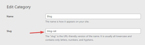
Thanks for the login to your site, I see the your “blog” page has a special heading & a blog element & a magazine element, the reason thease are not showing is because your “blog” post category has the “slug” ▸ “blog”, so the URL for your-site.com/blog/ is the category page and not the “blog” page. I hope that I have explained this well.

So the solution is to change the “slug” for now I changed it to “blog-cat” but you can change it to anything you like.
Best regards,
MikeOctober 21, 2023 at 4:35 pm in reply to: Linking external images within – product grid, product slider or product list #1423240Hey molinesupport,
Thanks for your question, I’m not familiar with “BatchLine”, but if this works with the shopfront WooCommerce theme, try going to Enfold Theme Options ▸ Shop Options ▸ Product gallery and choose WooCommerce 3.0 product gallery, I assume that you are currently using the Default enfold product gallery option now.
On the page that you linked to I see the classes for the products that are showing the placeholder images: member-discount discount-restricted
are you using a “membership” plugin? If you don’t use any restrictions do the images then show correctly?Best regards,
MikeHi,
Glad to hear that you have this sorted out, shall we close this then?Best regards,
MikeHey akbar70j,
Thank you for the link to your site, but when I land on the /wp-admin/ login page I get a “forbidden” error, please check and make your site accessible for us. Thank you.Best regards,
MikeHi,
Thanks for the screenshot, I would like to try but your token link above is not logging me in, please check.
Oh, perhaps that plugin is also disabled, please enable that one plugin :)Best regards,
MikeHi,
There are some plugins that cause this error, unfortunately we are not able to change the theme to work with every plugin, there are just too many.
When you find the plugin causing the issue you can then determine if it is something you really need or use a alternative plugin.Best regards,
MikeOctober 21, 2023 at 3:10 pm in reply to: ENFOLD GDRP / General Data Protection Regulation Cookie Settings Multilang #1423228Hey Steve,
Thank you for your patience, with WPML each language has it’s own theme settings, but I don’t think POLYLANG does this, you could create a class and add your text twice and use css to hide the text based on the language, similar to this thread, but this would not change the links, so for using POLYLANG you may find it more convenient to use a Thirdparty Cookie Plugin.Best regards,
MikeHi,
Thank you Guenni007 for helping, Eleina_Shinn were you able to sort this out with Guenni007’s help?Best regards,
MikeHi,
WordPress doesn’t support PHP v5.6.40 any more, please update to at least PHP v7.4Best regards,
MikeHey schweg33,
Thanks for the link to your pages, I’m not sure what the issue is, is this the only page that this occurs on?
Try this CSS in your Enfold Theme Options ▸ General Styling ▸ Quick CSS field:#top.page-id-15521 #av_section_1 { height: 62vh; }After applying the css, please clear your browser cache and check.
Best regards,
MikeHey daves1997,
Typically this error is caused by a conflict with plugins, try disabling all of your plugins. If that resolves the issue, reactivate each one individually until you find the one causing the conflict.Best regards,
MikeHi,
Thank you for the link to your site, I found that you were getting the error: Uncaught SyntaxError: Unexpected string I believe from this script in a widget:

once I removed it and cleared your cache you site showed correctly.
I added the code into your child theme functions.php:

so now it shows with no errors:

I see that you have an empty avia-style.min.css css file in your child theme, I recommend removing this as it may cause a conflict in the future.

Best regards,
MikeOctober 21, 2023 at 12:42 pm in reply to: Using blog post element with Grid Layout, images on mobile are not lazy-loaded #1423210Hi,
Ok, since I can’t think of anything else to change here, shall we close this thread then?Best regards,
MikeOctober 20, 2023 at 4:48 pm in reply to: Anchor link from header link to a Slider Revolution slider #1423147Hi,
Thanks for your patience, I tested this javascript in your child theme functions.php to slow down the jump to any hash ID, such as your ‘service’ anchor to give the page time to load all of the elements, and then slowly scroll to the ID instead of jumping to it.function custom_slow_scroll_to_anchor_script() { ?> <script> function slowScrollToAnchor() { var urlHash = window.location.hash; if (urlHash) { var target = document.querySelector(urlHash); if (target) { var targetPosition = target.offsetTop; var startPosition = window.pageYOffset; var distance = targetPosition - startPosition; var duration = 2000; var startTime = null; function scrollAnimation(currentTime) { if (startTime === null) startTime = currentTime; var timeElapsed = currentTime - startTime; var scrollY = easeInOutQuad(timeElapsed, startPosition, distance, duration); window.scrollTo(0, scrollY); if (timeElapsed < duration) { requestAnimationFrame(scrollAnimation); } } function easeInOutQuad(t, b, c, d) { t /= d / 2; if (t < 1) return c / 2 * t * t + b; t--; return -c / 2 * (t * (t - 2) - 1) + b; } requestAnimationFrame(scrollAnimation); } } } window.addEventListener('load', slowScrollToAnchor); </script> <?php } add_action('wp_footer', 'custom_slow_scroll_to_anchor_script', 99);This worked in my tests, please clear your browser cache and check.
Best regards,
MikeOctober 20, 2023 at 3:32 pm in reply to: Using blog post element with Grid Layout, images on mobile are not lazy-loaded #1423132Hi,
Thanks for the link to the report, I see the images that are Defer Off-screen Images are blank, so it would seem that the lazy loading is working, the space where the images will be need to have their height & width in the page and thus be blank otherwise you will get dinged on the Cumulative Layout Shift which you have a very good score on right now:

I’m not sure what other option there would be.Best regards,
MikeHi,
I see that your max_execution_time is still zero, did you ask your webhost why you are getting a 500 server error? Unfortunately we can’t solve server errors, but perhaps asking your webhost for assistance will help.
Earlier you wrote that your hosting service it told you that it found 16 files which are infested with malware, did you try using your server backup to roll back a a version before the malware? If your site still has malware, I would recommend hiring a malware removal service, we don’t have any experience with malware removal.Best regards,
MikeHey condonp,
Try this CSS in your Enfold Theme Options ▸ General Styling ▸ Quick CSS field:#top.home .avia-table { width: auto; }After applying the css, please clear your browser cache and check.
Best regards,
MikeHi,
Try opening the icon element and then hover over the icons that you like, as in the screenshots above, the icon code will show as a title popup.Best regards,
MikeOctober 17, 2023 at 7:17 pm in reply to: Import: Agency – Enfold Parallax Demo , I’m getting demo installation error #1422830Hi,
Thanks, please clear your browser cache and check your site now.Best regards,
MikeHi,
It sounds like you have an un-closed bracket in your css, so some other css error, try checking you css in a CSS Validator, this could help you find and fix the error.
Otherwise, include an admin login in the Private Content area so we can check.Best regards,
MikeOctober 17, 2023 at 6:15 pm in reply to: Background image in Color Section not always working #1422824Hi,
Perhaps if you find that this helps and there is a pattern to most of your pages we can make some recommendations, for example, if it is always the first color section on a page you could try this css:
#top.page #av_section_1 .av-parallax-inner.alternate_color {
	background-color: #000;
}
note the #top.page #av_section_1 this might help your team resolve this for most of the pages if not all.
Best regards,
MikeHi,
Thanks for the video, when I test on my site I don’t have any issue with changing the author for the post as you are in your video, but I’m not using a plugin to create a CPT.
Try checking if you cange the author in the “quick edit” author field if the correct author then shows:

If this doesn’t help, try checking with a standard post type, perhaps it is the way that the plugin creates the CPT?Best regards,
MikeHi,
Glad we were able to help, if you have any further questions please create a new thread and we will gladly try to help you. Thank you for using Enfold.Best regards,
MikeHi,
Glad to hear that you have this sorted out, if you have any further questions please create a new thread and we will gladly try to help you. Thank you for using Enfold.Best regards,
Mike -
AuthorPosts

