Forum Replies Created
-
AuthorPosts
-
February 24, 2026 at 6:14 am in reply to: Bug: PHP error when trying to edit image elements in Enfold Avia #1495408
Hi,
Thank you for the update.
The avf_alb_linkpicker_memory_limit filter was added specifically for this purpose. Most sites with a small number of plugins typically work well with around 256MB of memory, although actual requirements may vary depending on site complexity and plugin usage. Most entry-level servers allow between 512MB and 1GB of memory (excluding shared hosting environments), so 512MB is often considered a safe middle-ground. The theme includes this as a safeguard for users or developers who may have created thousands of posts or taxonomies but might not be fully aware of memory limits and how they can affect data retrieval. For experienced developers like yourself, adding the filter as you have should be sufficient to help resolve the issue.
Best regards,
IsmaelHi,
Thank you for the update.
This specific condition is for images that are retrieved only using their ID but still use wp_get_attachment_image() for retrieval — such as element shortcodes. We recommend reaching out to the plugin developers regarding this issue, as we cannot reproduce it on our end. Image elements contain srcset attributes when we tested them in our installation.
Best regards,
IsmaelHey Jason Bolger,
Thank you for the inquiry.
These post meta information is used by the theme and WordPress for page configuration and layout behavior, including elements like the header, footer and sidebar. Removing it is not recommended, as it may break theme or layout functionality. In terms of performance, post meta queries are generally lightweight because they are retrieved only when required and are not normally loaded all at once during page rendering. This would only become a problem if a single post or page contained thousands of meta entries, which is not the case.
Best regards,
IsmaelFebruary 24, 2026 at 5:51 am in reply to: Not registered dependencies for Enfold css and js #1495405Hi,
Thank you for the update.
Would you mind temporarily removing the logs? Then navigate back to the back end and check the error logs again. Do you see any references to avia-layout only, or also to avia-shortcodes?
If you’re only seeing avia-shortcodes, then try to replace the hook with this code:
add_action( 'wp_enqueue_scripts', function() {
  if ( is_admin() ) {

      if ( ! wp_style_is( 'avia-layout', 'registered' ) ) {
          wp_register_style( 'avia-layout', false );
      }

      if ( ! wp_style_is( 'avia-shortcodes', 'registered' ) ) {
          wp_register_style( 'avia-shortcodes', false );
      }

  }
}, 5 );
Let us know the results.
Best regards,
IsmaelHey cktanju,
Thank you for the inquiry.
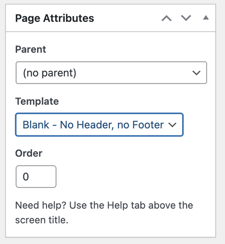
Have you tried setting the page’s Page Attributes > Template to Blank – no header, no footer? This should remove everything from the page, including the header and footer.
Best regards,
IsmaelFebruary 24, 2026 at 5:43 am in reply to: Header menu button match other buttons on site (rounded) #1495403Hi,
Thank you for the inquiry.
You can add this css code to apply rounded corners to the outline and colored menu items in the header.
#top #wrap_all .header_color .av-menu-button-colored > a .avia-menu-text, #top #wrap_all .header_color .av-menu-button-bordered > a .avia-menu-text {
    border-radius: 90px;
}
Please make sure to purge the cache after adding the css. Let us know the result.
Best regards,
IsmaelHey dreyerjm,
Thank you for the inquiry.
Did you add this css code?
.avia-video, .avia-iframe-wrap {
    clear: both;
    position: relative;
    margin-bottom: 20px;
}
This applies a 20px bottom margin, which creates the space below the video. Please remove the css code or override it with the following code.
.avia-video, .avia-iframe-wrap {
    margin-bottom: 0;
}
Best regards,
IsmaelHey dreyerjm,
Thank you for the inquiry.
Are you referring to the white bottom border? Please try to add the following css code to remove it.
#top .av-submenu-container {
    border-bottom: 0;
}
Best regards,
IsmaelHey dreyerjm,
Thank you for the inquiry.
How did you add the widget? The text is wrapped in an H4 heading and placed inside a code block, so it’s styled differently compared to the default footer links or widgets. You’ll need to remove the code block and replace the H4 tag with an anchor (link) tag. Please contact the plugin developers for additional assistance.
Best regards,
IsmaelHi,
Thank you for the update.
This has been the case for some time, even in older versions. You’ll need to be careful with invalid html, as it can break the layout builder. Let us know if you have more questions.
Best regards,
IsmaelHey Maltolomaeus,
Thank you for the inquiry.
What happens when you deactivate css compression or minification? The page is not scrollable because of this css code:
html.responsive, .responsive body {
    overflow-x: hidden;
}
You can temporarily add this css code to override it:
html.responsive, .responsive body {
    overflow-x: visible;
}
Let us know the result.
Best regards,
IsmaelFebruary 24, 2026 at 5:19 am in reply to: Framed Hi, Box around icon box with icon on left side #1495397Hey dreyerjm,
Thank you for the inquiry.
You can add this css code to apply a background, border and padding to the icon box. Simply replace the selector “iconbox” with your own custom css class name.
#top .iconbox {
    background: white;
    padding: 20px;
    border: 1px solid gray;
}
Best regards,
IsmaelHi,
Thank you for the update.
The theme has its own Advanced Layout Builder (ALB), so you can create any type of layout, content or design you need. Also, please note that all demos are available for import once you purchase a single license. Please refer to the documentation for more information.
— https://kriesi.at/documentation/enfold/intro-to-layout-builder/
Best regards,
IsmaelHi,
We couldn’t find a “programcolumn” column anywhere in the elements, so we used the default element ID instead. Please remove the previous css code and use the following code instead.
#top .flex_column_table.av-1bilfvb-acaaf518a56045ca4bfe6b9c9a40283f.sc-av_one_fourth.av-equal-height-column-flextable .avia-button-wrap {
    position: absolute;
    bottom: 0;
    width: 100%;
}

#top .flex_column_table.av-1bilfvb-acaaf518a56045ca4bfe6b9c9a40283f.sc-av_one_fourth.av-equal-height-column-flextable .flex_column {
    padding-bottom: 50px;
}
Best regards,
IsmaelFebruary 23, 2026 at 6:39 am in reply to: Display problem between a computer and a smartphone #1495360Hi,
Please let us know once the site is live so we can properly investigate the issue. Provide the login details in the private field, including SFTP access.
Best regards,
IsmaelFebruary 23, 2026 at 6:35 am in reply to: Not registered dependencies for Enfold css and js #1495359Hi,
Thank you for opening this thread.
We adjusted the code in the functions.php file a bit,
add_action( 'wp_enqueue_scripts', function() {
  if ( is_admin() && ! wp_style_is( 'avia-layout', 'registered' ) ) {
      wp_register_style( 'avia-layout', false );
  }
}, 5 );
Let us know if the issue persists.
Best regards,
IsmaelFebruary 23, 2026 at 6:34 am in reply to: Multiple errors on pages and posts (analysis included) #1495357Hi,
We adjusted the code a bit.
add_action( 'wp_enqueue_scripts', function() {
  if ( is_admin() && ! wp_style_is( 'avia-layout', 'registered' ) ) {
      wp_register_style( 'avia-layout', false );
  }
}, 5 );
Please let us now how it goes.
@elenapoliti: Please continue here: https://kriesi.at/support/topic/not-registered-dependencies-for-enfold-css-and-js/
Best regards,
IsmaelHi,
Thank you for the update.
Would you mind providing a screenshot of the report, or provide the login details so we can check? You can use platforms like FreeImage, ImgBB, PostImages or Dropbox to upload and share the screenshot. Here are the steps to follow:
1.) Visit the website of your chosen platform, such as Savvyify, ImgBB, PostImages or Dropbox.
2.) Locate the option to upload a file or an image.
3.) Select the screenshot file from your computer or device and upload it to the platform.
4.) After the upload is complete, you will be provided with a shareable link or an embed code.
5.) Copy the link or code and include it in your message or response to provide us with the screenshot.Thank you for taking the time to share the screenshot. It will help us better understand the issue you’re facing and provide appropriate assistance.
Best regards,
IsmaelHi,
Thank you for the update.
You can edit this in the Appearance > Menus panel. Make sure to select the “View All” tab to see all pages. We have replaced the menu item “store-2” with the actual “store” page. Please make sure to purge the cache before testing.
Best regards,
IsmaelHi,
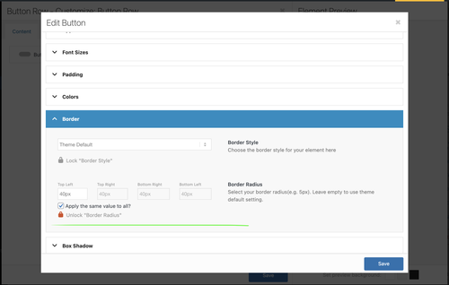
Thank you for the login info.
We edited your custom Button Row element, locked the Styling > Border > Border Radius setting, and set it to 40px. All instances of this Button Row should now have the same border radius.
Best regards,
IsmaelHey Sabi,
Thank you for the inquiry.
Unfortunately, you can only import one demo at a time. Importing another demo will override the previous one, but the new pages should be added and retained. If you’d like to use elements from another demo, you can set up a temporary site, import the specific demo there, and then transfer the elements you like to your development site. Let us know if you need more information.
Best regards,
IsmaelHey lara666,
Thank you for the inquiry.
It’s possible that the cache plugin is conflicting with the default compression options. Have you enabled the Enfold > Performance > File Compression settings? Please try cloning the site to a staging environment, make sure the configurations are identical and then temporarily disable the file compression settings. Let us know if the issue persists.
Best regards,
IsmaelHi,
We have already moved the 1/1 column inside a color section, which should constrain the blog posts to the maximum-width container, also reducing the space between the items. Would you mind providing a screenshot of the changes you’d like to make? You can use platforms like FreeImage, ImgBB, PostImages or Dropbox to upload and share the screenshot. Here are the steps to follow:
1.) Visit the website of your chosen platform, such as Savvyify, ImgBB, PostImages or Dropbox.
2.) Locate the option to upload a file or an image.
3.) Select the screenshot file from your computer or device and upload it to the platform.
4.) After the upload is complete, you will be provided with a shareable link or an embed code.
5.) Copy the link or code and include it in your message or response to provide us with the screenshot.Thank you for taking the time to share the screenshot. It will help us better understand the issue you’re facing and provide appropriate assistance.
Best regards,
IsmaelHi,
Great! Glad we could be of help. Please feel free to open another thread if you have more questions.
Have a nice day.
Best regards,
IsmaelFebruary 20, 2026 at 11:14 am in reply to: Multiple errors on pages and posts (analysis included) #1495273Hi,
@elenapoliti: The login information is also visible to the OP. Please remove the content from the private field and open another thread with the same login details. We’ll let you know once we figure out the issue.Best regards,
IsmaelFebruary 20, 2026 at 11:11 am in reply to: Enfold Cross Site Scripting (XSS) – problem with 10 websites – patch release #1495271Hi,
Thank you for the inquiry.
A fix will be included in the next patch, 7.1.4. We have forwarded this thread to our channel again and you will be notified once the patch is released. Thank you for your patience.
Best regards,
IsmaelHi!
Thank you for the inquiry.
A fix will be included in the next patch, 7.1.4. We have forwarded this thread to our channel again and you will be notified once the patch is released. Thank you for your patience.
Best regards,
IsmaelFebruary 20, 2026 at 11:09 am in reply to: update to 7.1.4 Cross Site Scripting (XSS) vulnerability #1495269Hi!
We have forwarded this thread to our channel again and you will be notified once the patch is released. Thank you all for your patience.
Best regards,
IsmaelFebruary 20, 2026 at 11:09 am in reply to: When is 7.1.4 Available? Enfold: Cross Site Scripting (XSS) vulnerability #1495268Hi!
We have forwarded this thread to our channel again and you will be notified once the patch is released. Thank you all for your patience.
Best regards,
IsmaelFebruary 20, 2026 at 6:53 am in reply to: Burger Menu is Showing a Different Font than Desktop #1495257Hey Brad,
Thank you for the inquiry.
Did you add this css code?
#av-burger-menu-ul li, .av-current-sort-title, h1, h2, h3, h4 {
    font-family: 'playfair display',Helvetica,Arial,sans-serif;
}
Try to override it with this css:
#av-burger-menu-ul li {
    font-family: roboto, Helvetica, Arial, sans-serif;
}
Or configure the Menu Links in overlay/slide out element in the Enfold > Advanced Styling panel. Let us know the result.
Best regards,
Ismael -
AuthorPosts