Forum Replies Created
-
AuthorPosts
-
Hi,
Thank you for the info.
We moved the 1/1 Column element with the Blog Posts inside a Color Section, then set the “Larghezza massima Contenitore” value from 2100px, which is a little wide, to a more normal container width, 1310px. Please make sure to purge the cache before testing.
You can also add this css code if you want to further decrease the space between the blog post items.
div .av_one_fourth {
    margin-left: 2%;
    width: 23.5%;
}
Best regards,
IsmaelHey dreyerjm,
Thank you for the inquiry.
You could create a Custom Element Template (CET), which acts as a global element that can be configured from a single source. Please check the documentation for more information.
— https://kriesi.at/documentation/enfold/custom-element-templates/
Let us know if you have more questions.
Best regards,
IsmaelHey dreyerjm,
Thank you for the inquiry.
Try adding this code in the Quick CSS field.
#top .av-equal-height-column .avia-button-wrap {
    position: absolute;
    bottom: 0;
    width: 100%;
}

#top .av-equal-height-column {
    padding-bottom: 50px;
}
You can also replace av-equal-height-column with a custom css class name if you want this applied only to specific columns.
— https://kriesi.at/documentation/enfold/add-custom-css/#enable-custom-css-class-name-support
Result:

Best regards,
IsmaelHey Suze,
Thank you for the inquiry.
You can try this code in the functions.php file to retrieve the original post excerpt without modification.
add_filter( 'avf_masonry_loop_entry_content', 'avf_masonry_loop_entry_content_mod', 10, 4 );

function avf_masonry_loop_entry_content_mod( $loop_excerpt, $entry, $entries, $key ) {
    if ( ! empty( $entry->post_excerpt ) ) {
        return $entry->post_excerpt;
    }

    return $entry->post_content;
}
— OR —
add_filter( 'avf_masonry_entry_content', 'avf_masonry_entry_content_mod', 10, 3 );

function avf_masonry_entry_content_mod( $content, $entry, $config ) {
    return $entry->post_excerpt;
}
Let us know the result.
Best regards,
IsmaelHi,
Thank you for following up.
Did you try our suggestion above? Please provide the login details in the private field so we can check the elements further.
Best regards,
IsmaelHey Citvej,
Thank you for the inquiry.
Where did you set the option to convert the images to AVIF?
The srcset should be automatically added to the images as long as Enfold > Performance > Responsive Images is enabled, which enables the default WordPress srcset feature. It’s possible that one of the plugins installed on the site is interfering with the default WordPress functionality.
Best regards,
IsmaelHey Audica1,
Thank you for the inquiry.
We’re not seeing the errors or notices in the dashboard. Is this occurring on your error logs? What happens when you add the following code to the functions.php file?
add_action( 'wp_enqueue_scripts', function() {
  if ( ! wp_style_is( 'avia-layout', 'registered' ) ) {
      wp_register_style( 'avia-layout', false );
  }
}, 5 );
Make sure to create a site backup before adding the code. If the issue persists, please provide the SFTP login detail in the private field so we can check the issue further.
Best regards,
IsmaelHi,
Thank you for the inquiry.
We deselected the Start page as the maintenance mode page and temporarily disabled the Under Construction plugin. You should now be able to access the home page.
Best regards,
IsmaelFebruary 19, 2026 at 3:25 pm in reply to: Backend keeps loading after update – Frontend works fine #1495233Hey kraftjungs,
Thank you for the inquiry.
The site is not loading at all on our end. Did you update the theme to version 7.1.3? You may need to switch the installation to debug mode and enable the error logs to find what’s causing the infinite loading. Please check this documentation.
— https://developer.wordpress.org/advanced-administration/debug/debug-wordpress/#wp_debug_log
Best regards,
IsmaelHi,
Thank you for the inquiry.
You can also select a different menu for mobile view in the Enfold > Main Menu > General > Alternate Menu For Mobile settings. Let us know if you need more info.
@orianos: Thank you for the suggestion.Best regards,
IsmaelFebruary 19, 2026 at 3:17 pm in reply to: Again “…vulnerable to Cross Site Scripting (XSS)” 😳 #1495231Hey Oriano,
Thank you for the update.
A fix will be included in the upcoming patch, version 7.1.4. You should be notified when the new version is released.
Best regards,
IsmaelFebruary 19, 2026 at 3:02 pm in reply to: Multiple errors on pages and posts (analysis included) #1495229Hey!
@elenapoliti: Thank you for testing the code. Please open a new thread and share the WP and FTP credentials there so we can test this further on your installation.Regards,
IsmaelFebruary 19, 2026 at 2:56 pm in reply to: accessibility review shows multiple main landmarks #1495228Hi,
We’re not sure what you meant by page source, but the last time we checked the footer page, it was a div element instead of a main container. Please feel free to open another thread if you have more questions.
Have a nice day.
Best regards,
IsmaelFebruary 18, 2026 at 5:46 am in reply to: Multiple errors on pages and posts (analysis included) #1495186Hi,
Thank you for the information.
To get rid of the notices temporarily, you can add the following code to the functions.php file:
add_action( 'wp_enqueue_scripts', function() {
  if ( ! wp_style_is( 'avia-layout', 'registered' ) ) {
      wp_register_style( 'avia-layout', false );
  }
}, 5 );
Let us know the result.
Best regards,
IsmaelHi,
To get rid of the notices temporarily, you can add the following code to the functions.php file:
add_action( 'wp_enqueue_scripts', function() {
  if ( ! wp_style_is( 'avia-layout', 'registered' ) ) {
      wp_register_style( 'avia-layout', false );
  }
}, 5 );
Thank you for your patience.
Best regards,
IsmaelHi,
Thank you for the update.
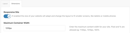
Looks like you didn’t use a Color Section element on the page, which allowed the theme to automatically create one without container constraints. Make sure to move the columns or content inside a Color Section container so they don’t go full width. You can then set the Maximum Container Width value in Enfold > General Layout > Dimensions as shown in the screenshot below.
Best regards,
IsmaelHey daninap,
Thank you for the inquiry.
Looks like this is a custom login page or area. Did you install a plugin to add this? It’s possible that the plugin has its own template that overrides the Advanced Layout Builder. Please contact the plugin developers for further assistance.
Best regards,
IsmaelFebruary 18, 2026 at 5:29 am in reply to: I keep getting “Updating failed. The response is not a valid JSON response.” #1495180Hi,
Thank you for the update.
We checked the other pages, but we’re not seeing any issues with them. Would you mind providing a screenshot of the issue? You can use platforms like FreeImage, ImgBB, PostImages or Dropbox to upload and share the screenshot. Here are the steps to follow:
1.) Visit the website of your chosen platform, such as Savvyify, ImgBB, PostImages or Dropbox.
2.) Locate the option to upload a file or an image.
3.) Select the screenshot file from your computer or device and upload it to the platform.
4.) After the upload is complete, you will be provided with a shareable link or an embed code.
5.) Copy the link or code and include it in your message or response to provide us with the screenshot.Thank you for taking the time to share the screenshot. It will help us better understand the issue you’re facing and provide appropriate assistance.
Best regards,
IsmaelHey Sebastian,
Thank you for the inquiry.
This should be possible, but unfortunately, we do not provide support for third-party plugins. You’ll need to contact the plugin or extension developers to properly adjust the form.
As an alternative, you can try WPForms or Ninja Forms and their respective extensions for multi-step forms.
— https://wpforms.com/how-to-create-a-multi-part-form-in-wordpress/
— https://ninjaforms.com/docs/multi-step-forms/Best regards,
IsmaelFebruary 17, 2026 at 6:26 am in reply to: Display problem between a computer and a smartphone #1495157Hi,
This is working correctly on our end. Please create a test page and provide the login details in the private field so we can check the issue properly.
Best regards,
IsmaelFebruary 17, 2026 at 6:24 am in reply to: Search Box in Main Menu while using Mega Menu Plugin #1495156Hi,
Great! Please don’t hesitate to open another thread if you have more questions.
Have a nice day.
Best regards,
IsmaelHi,
Thank you for the update.
The product grid is duplicated because there is a shortcode block containing a product shortcode on the base Store page, which renders another product grid. We removed the shortcode element. Please make sure to purge the cache before testing.
Best regards,
IsmaelHey ist_int,
Thank you for the inquiry.
This is due to the Woocommerce Coming Soon option. You can toggle this in Woocommerce > Settings > Site Visibility. We’ve set it to Live for now. Let us know if you have more questions.
Best regards,
IsmaelHi,
Glad to know that you’ve figured this out. Regarding your question about accessibility, we’ll forward this thread to our channel for further consideration. Please feel free to open another thread if you have more questions about the theme.
Have a nice day.
Best regards,
IsmaelHi,
Thank you for the inquiry.
We replaced the iframe with the video tag, which should display a thumbnail or video cover by default using the poster attribute and have the video controls enabled automatically.
<video width="100%" height="1000" controls poster="https://www.timm-tiegelkamp.de/wp-content/uploads/2026/02/Danny-Videocover-Foto_Web.jpg">
    <source src="https://2026-02-eins.s3.eu-north-1.amazonaws.com/Ronald-Video.MP4" type="video/mp4">
    Your browser does not support the video tag.
</video>
Best regards,
IsmaelFebruary 17, 2026 at 5:41 am in reply to: Bug Reports – Newsletter Post Type Appearing in Blog Grid Layout #1495151Hi,
Glad to know that you’ve figured out the issue and we appreciate you sharing the solution. Please let us know if you encounter any more issues or have further questions.
Have a nice day.
Best regards,
IsmaelHi,
Glad we could be of help! Please don’t hesitate to open another thread if you have more questions.
Have a nice day.
Best regards,
IsmaelHi,
Thank you for the inquiry.
Are you using the Blog Posts element with the Grid Layout enabled? Please provide a link to the page so we can properly check the issue. In the meantime, try to add a 1/1 Column element, then move the Blog Posts element inside this column. Let us know the result.
Best regards,
IsmaelFebruary 17, 2026 at 5:30 am in reply to: I keep getting “Updating failed. The response is not a valid JSON response.” #1495148Hi,
Thank you for the update.
The site seems to be rendering correctly when we checked. Did you figure out the issue? Would you mind providing a screenshot? You can use platforms like FreeImage, ImgBB, PostImages or Dropbox to upload and share the screenshot.
Best regards,
IsmaelFebruary 16, 2026 at 8:23 am in reply to: Enfold Accordion Toggles Randomly Missing (Preview + Front-End) #1495119Hi,
There was text in the toggle content that used brackets, e.g., [2/7], [3/12], etc, which WordPress interprets as shortcodes. You should avoid using them. You can replace the brackets with parentheses ( ). We applied this change to the toggle content and it fixed the issue, now showing all toggle items.
Best regards,
Ismael -
AuthorPosts