Forum Replies Created
-
AuthorPosts
-
Hi,
Thank you for the update.
We moved the screenshot to the private field. Unfortunately, your screenshot is not accessible. Please try to use freeimage.host or postimages.org and share the screenshot in the private field if you want it to remain private.
Best regards,
IsmaelHey envisageiam,
Thank you for the inquiry.
The footer widgets are center-aligned on mobile view when we checked. Did you figure this out? (see private field)
Best regards,
IsmaelHi,
Thank you for the update.
Please create a test page and provide the page URL — screenshots will also help. You can use platforms like Freeimage, ImgBB, PostImages or Dropbox to upload and share the screenshot.
Best regards,
IsmaelHi,
Thank you for the update.
We can now access the login page, but the account above is invalid. Please check the login info carefully. (see private field)
Best regards,
IsmaelHi,
Thank you for the update.
We can’t find the corresponding css styles for the layout. Did you add the css code? Please try to toggle or temporarily disable the Enfold > Performance > File Compression settings and provide the login details in the private field so we can check further.
Best regards,
IsmaelHi,
Thank you for the screenshot.
To adjust the color of the active language menu item and the hover state of the default menu items, add this css code.
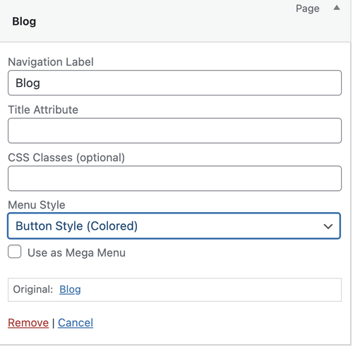
.header_color .main_menu ul:first-child > li a:hover {
    color: #ffffff;
}

.menu-item-language-current a:after {
    color: #ffffff;
}

.header-scrolled .menu-item-language-current a:after {
    color: #0e3c63;
}
For the Kontakt menu item, go to Appearance > Menus and set the Menu Style to Button Style (colored).
Let us know the result.
Best regards,
IsmaelHi,
Thank you for the inquiry.
You can set them as follows:
Background Attachment: Fixed ( this won’t matter on mobile view because it will default to scroll )
Background Image Position: Center Center ( adjust depending on which part of the image you want to focus on )
Background Repeat: Stretch to fit ( set to Stretch to fit (cover) to make sure the image fills the entire container, or Scale to fit (contain) if you want the entire image to remain fully visible )Hope this helps.
Best regards,
IsmaelDecember 10, 2025 at 7:48 am in reply to: Top image height doesn’t load immediately on mobile #1492321Hey Tanja,
Thank you for the inquiry.
The image in the first section seems to be displaying correctly in full on mobile view — screenshot below.
We tried checking your screenshot above, but it’s private. Please make the screenshot accessible or use other platforms like FreeImage, PostImages or Imgur.
Best regards,
IsmaelDecember 10, 2025 at 7:42 am in reply to: Fullwidth Sub Menu, div sticky_placeholder problem on mobile #1492320Hey Oriano,
Thank you for the inquiry.
Adding this css code should remove the sticky placeholder in the mobile view.
@media only screen and (max-width: 767px) {

  /* Add your Mobile Styles here */
  #top .sticky_placeholder {
    display: none;
  }
}
Best regards,
IsmaelHey mdeboli,
Thank you for the inquiry.
This option is not available by default, unfortunately. We recommend installing a plugin like Contact Form 7 or WPForms if you need more advanced form input fields. Hope this helps.
Best regards,
IsmaelHi,
Thank you for the info.
You can also try this code — it’s the same, just slightly modified.
add_filter( 'avia_masonry_entries_query', 'avia_masonry_entries_query_mod', 10, 2 );
function avia_masonry_entries_query_mod( $query, $params ) {

    if ( empty( $params['taxonomy'] ) ) {
        return $query;
    }

    $sticky = get_option( 'sticky_posts', array() );

    $posts = get_posts( array(
        'post_type'      => 'any',
        'posts_per_page' => -1,
        'tax_query'      => array(
            array(
                'taxonomy' => $params['taxonomy'],
                'field'    => 'term_id',
                'terms'    => $params['terms'] ?? array(),
            )
        ),
        'post__not_in'   => $sticky,
        'fields'         => 'ids',
    ) );

    $include = array_unique(
        array_map( 'intval', array_merge( $sticky, $posts ) )
    );

    $query['post__in']       = $include;
    $query['posts_per_page'] = 6;
    $query['orderby']        = 'post__in';

    return $query;
}
Best regards,
IsmaelHi,
Thank you for the update.
It seems to be working correctly on our end. Please provide the site URL in the private field so we can check this further –screenshots would also be helpful.
Best regards,
IsmaelHey rixi,
Thank you for the inquiry.
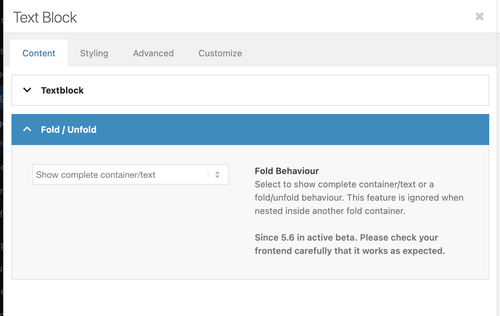
The Text Block element has an option called Fold/Unfold, which can be enabled in the Content > Fold/Unfold panel, just below the text editor. You can use this to hide part of the text, display only a portion and add a “read more” link. Let us know if this works for you.
Best regards,
IsmaelHi,
Thank you for the info.
We get the following error when we try to access the wp-admin or wp-login page. Did you change the login URL? Please include it in the private field.
Du bist leider nicht berechtigt, auf diese Seite zuzugreifen.
Would you mind posting the screenshot again using freeimage.host? The one above is not loading on our end.
Best regards,
IsmaelHey schweg33,
Thank you for the inquiry.
Please add this css code to reduce the height of the submenu and apply a border to it.
#top .sticky_placeholder {
    height: 30px !important;
    max-height: 30px !important;
}

#top .av-submenu-container {
    min-height: 30px;
    line-height: 1em;
    border-color: #b1b1b1;
}

#top .av-subnav-menu > li {
    padding: 8px 0;
    display: inline-block;
}
Best regards,
IsmaelHey agentur2c,
Thank you for the inquiry.
We tried logging in to the site but received a 403 Forbidden error. Are you restricting access to the site based on certain countries or IP addresses? Please remove the restriction and provide a screenshot of the issue so we can investigate it properly.
Best regards,
IsmaelHey invulon,
Thank you for the inquiry.
This is possible with a custom script and a few styling changes. Please add the following code to your functions.php file:
add_action('wp_footer', function() {
?>
<script>
jQuery(function($){

    $('.avia-heading-row th').each(function(){
        var text = $(this).text();
        $(this).html('<span class="av-
rotated-text">' + text + '</span>');
    });

});
</script>
<?php
Then add this css code to rotate the text inside the heading row.
#top .avia-table th {
    height: 200px;
}

#top .avia-table th .av-rotated-text {
    display: inline-block;
    transform: rotate(90deg);
    transform-origin: left bottom;
    white-space: nowrap;
}
Best regards,
IsmaelHi,
Thank you for the inquiry.
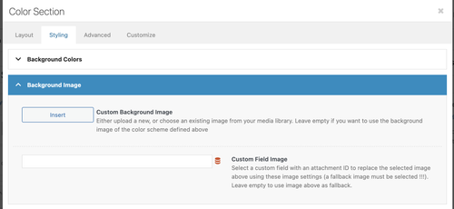
Yes, you can use the Color Section element instead of the slider if you need to include additional content inside. The image can be applied as a background in the Styling > Background Image panel.
Hope this helps.
Best regards,
IsmaelHey James Halk,
Thank you for the inquiry.
You will have to register an account using your purchase code on the following page.
— https://kriesi.at/support/register/
Once registered, you can open an inquiry in the forum using the form below.
— https://kriesi.at/support/forum/enfold/#new-post
Let us know if you have more questions.
Best regards,
IsmaelDecember 9, 2025 at 7:05 am in reply to: Unable to use wp (the cli tool) due to errors coming from Enfold #1492273Hey Krotona_Institute777,
Thank you for the inquiry.
This seems to be an issue with the LayerSlider plugin. Are you using any sliders from this plugin? If not, you can disable it under Enfold > Layout Builder > Integrated (Bundled) LayerSlider Plugin. Please let us know the result.
Best regards,
IsmaelHey Tanja,
Thank you for the inquiry.
The font displays normally on our end when tested on mobile devices.
Would you mind providing a screenshot of the issue? You can use platforms like Savvyify, ImgBB, PostImages or Dropbox to upload and share the screenshot.
Best regards,
IsmaelHey SimplifiedIdeas,
Thank you for the inquiry.
Looks like there’s a custom Enfold plugin called “enfold-wp-plugin” installed in the site, which is where the error is generated from. You may need to disable this plugin temporarily either by renaming the folder in the wp-content > plugins folder or completely deleting it. Please make sure to create a site backup before proceeding.
Best regards,
IsmaelHey lara666,
Thank you for the inquiry.
You may have forgotten to include the link in the private field. Please provide the site URL so we can check the page. If you need to adjust the position of the default breadcrumb in the title container, try this css code:
.title_container .breadcrumb {
    left: 50%;
    transform: translateX(-50%);
    right: auto;
}
Best regards,
IsmaelHi,
Thank you for the screenshot.
Have you tried removing this css code?
#top #header.header-scrolled a {
    color: #ffffff !important;
}
If you can provide the login details in the private field, we’ll take a closer look.
Best regards,
IsmaelHi,
Thank you for the info.
Are you referring to the search icon in the header? If so, please replace the previous code with the following filter:
function ava_avf_ajax_search_query_mod( $query_string ) {
    parse_str( $query_string, $query_args );

    if ( class_exists( 'WooCommerce' ) && ( isset( $query_args['post_type'] ) && $query_args['post_type'] === 'product' ) ) {
        $meta_query = isset( $query_args['meta_query'] ) ? (array) $query_args['meta_query'] : array();

        $meta_query[] = array(
            'key'     => 'catalog_visibility',
            'value'   => array( 'hidden', 'exclude-from-search' ),
            'compare' => 'NOT IN',
        );

        $query_args['meta_query'] = $meta_query;
        $query_string = http_build_query( $query_args );
    }

    return $query_string;
}
add_filter( 'avf_ajax_search_query', 'ava_avf_ajax_search_query_mod' );
Best regards,
IsmaelHi,
Thank you for the inquiry.
Please try this css code:
#top .av-custom-form-color * {
    color: #333;
}
Result:

Best regards,
IsmaelHey condonp,
Thank you for the inquiry.
This is possible but it will require some custom html and some css modifications. You can start with the following code:
<div class="av-custom-testimonial">
  <div class="av-testimonial-card">

    <div class="av-testimonial-left">
      <h3 class="av-testimonial-heading">What our clients say</h3>
      <div class="av-testimonial-stars"></div>
      <p class="av-testimonial-text">“Your testimonial text goes here.”</p>
      <div class="av-testimonial-client">Client Name</div>
      <div class="av-testimonial-client-meta">Client Title</div>
    </div>

    <div class="av-testimonial-right">
      <div class="av-image-wrap">
        <img src="image.jpg" alt="">
      </div>
    </div>
  </div>
</div>
Then add this code in the Quick CSS field:
.av-custom-testimonial .av-testimonial-card {
  display: grid;
  grid-template-columns: 1fr 220px;
  gap: 24px;
  background: #fff;
  padding: 20px;
  border-radius: 16px;
  box-shadow: 0 6px 20px rgba(16, 24, 40, 0.08);
  max-width: 880px;
  align-items: stretch;
}

.av-custom-testimonial .av-testimonial-left {
  display: flex;
  flex-direction: column;
  justify-content: center;
  padding: 6px 0;
}

.av-custom-testimonial .av-testimonial-heading {
  font-size: 1.25rem;
  line-height: 1.1;
  font-weight: 700;
  color: #0f172a;
  margin: 0 0 10px 0;
  display: inline-block;
  width: 50%;
}

.av-custom-testimonial .av-testimonial-stars {
  display: inline-flex;
  gap: 6px;
  align-items: center;
  margin-bottom: 12px;
}

.av-custom-testimonial .av-testimonial-text {
  font-size: 0.98rem;
  color: #6b7280;
  margin-bottom: 14px;
}

.av-custom-testimonial .av-testimonial-client {
  font-weight: 600;
  font-size: 0.95rem;
  color: #08121a;
}

.av-custom-testimonial .av-testimonial-client-meta {
  font-size: 0.85rem;
  color: #6b7280;
  margin-top: 4px;
}

.av-custom-testimonial .av-testimonial-right {
  position: relative;
  min-height: 220px;
  overflow: visible;
}

.av-custom-testimonial .av-image-wrap {
  position: absolute;
  bottom: 0;
  right: 0;
  width: 160px;
  height: 280px;
  overflow: hidden;
  border-top-left-radius: 140px 72px;
  border-bottom-left-radius: 24px;
  border-bottom-right-radius: 12px;
  border-top-right-radius: 12px;
  background: #f3f4f6;
}

.av-custom-testimonial .av-image-wrap img {
  width: 100%;
  height: 100%;
  object-fit: cover;
  display: block;
}

@media (max-width: 760px) {
  .av-custom-testimonial .av-testimonial-card {
    grid-template-columns: 1fr;
  }

  .av-custom-testimonial .av-image-wrap {
    position: relative;
    width: 100%;
    height: 220px;
    border-top-left-radius: 48px 26px;
  }

  .av-custom-testimonial .av-testimonial-right {
    min-height: auto;
  }

  .av-custom-testimonial .av-testimonial-heading {
    width: 70%;
  }
}
Best regards,
IsmaelHi,
Thank you for the screenshot.
Adding this css code should help adjust the heading fonts.
[lang="ar"] #top #wrap_all .all_colors h1,
[lang="ar"] #top #wrap_all .all_colors h2,
[lang="ar"] #top #wrap_all .all_colors h3,
[lang="ar"] #top #wrap_all .all_colors h4,
[lang="ar"] #top #wrap_all .all_colors h5,
[lang="ar"] #top #wrap_all .all_colors h6 {
    font-family: 'Cairo', sans-serif;
}
Best regards,
IsmaelHey viannay,
Thank you for the inquiry.
Would you mind providing a screenshot of the issue? You can use platforms like Savvyify, ImgBB, PostImages or Dropbox to upload and share the screenshot. Here are the steps to follow:
1.) Visit the website of your chosen platform, such as Savvyify, ImgBB, PostImages or Dropbox.
2.) Locate the option to upload a file or an image.
3.) Select the screenshot file from your computer or device and upload it to the platform.
4.) After the upload is complete, you will be provided with a shareable link or an embed code.
5.) Copy the link or code and include it in your message or response to provide us with the screenshot.Thank you for taking the time to share the screenshot. It will help us better understand the issue you’re facing and provide appropriate assistance.
Best regards,
Ismael -
AuthorPosts
