Forum Replies Created
-
AuthorPosts
-
Hi,
Thank you for the inquiry.
Have you tried moving the ID or anchors (zo, bc, hs etc.) to the Color Section element that contains the content instead of the horizontal separator element? The theme includes a built-in script that recognizes IDs applied to the Color Section when they correspond to an existing menu item. This functionality won’t work if the ID is applied to an hr element.
Best regards,
IsmaelHey jimmiemoreland,
Thank you for the inquiry.
Have you tried setting up an SMTP plugin or adjusting the “from” address? Please check the link below for more information on troubleshooting issues with the contact form.
— https://kriesi.at/documentation/enfold/contact-form/#my-contact-form-is-not-sending-emails-
Best regards,
IsmaelDecember 30, 2025 at 3:39 am in reply to: Polylang / Enfold incompatibility inserts custom_class= #1493580Hi,
Thank you for sharing the actual fix! We’ve tagged @Guenter so he can review it. Happy holidays.
Best regards,
IsmaelDecember 30, 2025 at 3:34 am in reply to: blank screen when editing buttons and other elements #1493579Hi,
We modified config-templatebuilder/avia-template-builder/php/base-classes/class-modal-elements.php and temporarily deactivated the block of code related to the icon fonts, and this seems to have fixed the issue. We’ll keep this modification in place for now so the site remains editable.
We’ll let you know once we figure out the issue.
Best regards,
IsmaelHey Matt,
Thank you for the inquiry.
The current version on your site is quite outdated, so you won’t be able to update it from the dashboard. You will have to log in to your Themeforest account, download the theme and then manually upload it to your server via S/FTP.
— https://kriesi.at/documentation/enfold/theme-update/#update-via-ftp
Once the theme is updated to the latest version (7.1.3), you need to create a private token and use that token to update the theme in the future. Please check the documentation for more information.
— https://kriesi.at/documentation/enfold/theme-registration/
In order to complete these steps, you either need access to the Themeforest account or you must have the purchase code in your possession.
Let us know if you need more info.
Best regards,
IsmaelHey Akhurst,
Thank you for the inquiry.
To display a sidebar on the product category pages, make sure the Enfold > Sidebar Settings > Sidebar on Archive Pages is enabled. You can then place the widgets in the Displayed Everywhere widget area. If you need to further control the visibility of these widgets, try to use any of these plugins.
— https://wordpress.org/plugins/widget-options/
— https://wordpress.com/plugins/if-widgetLet us know if you need more info.
Best regards,
IsmaelDecember 30, 2025 at 2:24 am in reply to: Subject: Favicon not showing in Google SERP despite following all forum recommen #1493576Hi,
Have you tried removing the wp_head code and use the allocated field for the Favicon in Enfold > Theme Options? Then make sure to wait for a while because changes in the SERPs take days to reflect.
Thank you for your patience.
Happy holidays.
Best regards,
IsmaelDecember 29, 2025 at 6:29 am in reply to: blank screen when editing buttons and other elements #1493550Hi,
Thank you for the update.
We have checked the site for a while but haven’t been able to identify the cause of the issue yet. We’ll review it again and let you know as soon as we find anything. In the meantime, please try to move the site to another staging environment so you can continue building it.
Thank you for your patience.
Happy holidays.
Best regards,
IsmaelDecember 29, 2025 at 6:17 am in reply to: LayerSlider translation into German does not work #1493549Hi,
Thank you for the inquiry.
Have you tried completely removing the Layer Slider plugin from the theme via Enfold > Layout Builder > Integrated (Bundled) LayerSlider Plugin settings instead of using the deactivate_layerslider hook? If you can provide the login details in the private field, we’ll try to check this further.
Best regards,
IsmaelDecember 23, 2025 at 4:53 am in reply to: Subject: Favicon not showing in Google SERP despite following all forum recommen #1492762Hey jodys1976,
Thank you for the inquiry.
We can see the favicon correctly when we checked and according to these sites, the site contains a favicon.
— https://realfavicongenerator.net/favicon-checker
— https://practicalprogrammatic.com/tools/favicon-checker
Best regards,
IsmaelHey dotsystem,
Thank you for the inquiry.
Try to add this css code to adjust the order of the sidebar and product content in the mobile view.
.responsive #top #main .container_wrap.container_wrap_first.main_color.sidebar_left.template-shop .container {
    display: flex;
    flex-direction: column;
}

.responsive #top #main .sidebar.smartphones_sidebar_active {
    order: 1;
}

.responsive #top #main main.template-shop.content.av-content-small.units {
    order: 3;
    padding-left: 0;
    padding-top: 0;
}
Best regards,
IsmaelHi,
Is the plugin working? We’re not able to view the screenshot for some reason. Please try to use freeimage.host instead. If you can provide the login details in the private field, we’ll check the widgets further.
Best regards,
IsmaelHey MariskaHoffland,
Thank you for the inquiry.
Please make sure that the main menu is still set as Enfold Main Menu in the Appearance > Menus > Theme Locations panel. If you can provide the login details, we’ll take a closer look.
Best regards,
IsmaelDecember 19, 2025 at 7:18 am in reply to: blank screen when editing buttons and other elements #1492666Hi,
Thank you for the update.
The login token link just redirects to the wp login page. Is there an actual account we can use to log in to the site? When we try to edit a button in the builder, we receive an internal server error, which is likely due to exhausted memory mentioned above. Unfortunately, we are not yet sure why this error still occurs even though the memory limit has already been increased.
Best regards,
IsmaelHi,
Good to know this is now working! Thanks for sharing the final solution. Have a nice day.
Best regards,
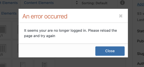
IsmaelDecember 18, 2025 at 8:49 am in reply to: blank screen when editing buttons and other elements #1492644Hi,
Thank you for the details.
We reset the WP_MEMORY_LIMIT and WP_MAX_MEMORY_LIMIT to 1024M and it seems to have worked as expected. But when we try to edit an element in the builder, we now receive a “not logged in” error. We are not sure whether the login token has expired or if this is a different issue. Please generate a new login or wtlwp token.
We are still seeing the same error in the logs.
PHP Fatal error: Allowed memory size of 536870912 bytes exhausted
We recommend reaching out to your hosting provider for additional assistance.
Best regards,
IsmaelHey emilconsor,
Thank you for the inquiry.
Since the masonry gallery sorting works correctly on our installation, this indicates that something in your setup is causing the issue, possibly a plugin conflict or custom modifications. Unfortunately, we can’t test this properly on the live site because we may unintentionally break something. Please create a clone of the site in a staging environment and provide the login details so we can investigate the issue properly.
Best regards,
IsmaelDecember 18, 2025 at 8:12 am in reply to: blank screen when editing buttons and other elements #1492639Hi,
Thank you for the info.
According to the logs and as mentioned above, the installation is running out of memory even though the WP_MEMORY_LIMIT is already set to 512M. If you can provide the S/FTP details, we’ll try to investigate the issue further.
Best regards,
IsmaelHi,
Thank you for the info.
On the home page, did you switch from the Advanced Layout Builder to the Block Editor? What were the type of elements in recovery mode? We tried creating a new page, but we couldn’t reproduce the same issue. Please check the link in the private field.
Best regards,
IsmaelHi,
Glad to know that this has been resolved! Please don’t hesitate to open another thread if you have more questions.
Have a nice day.
Best regards,
IsmaelDecember 17, 2025 at 8:25 am in reply to: Polylang / Enfold incompatibility inserts custom_class= #1492596Hi,
Thanks for following up.
The filter was working correctly on the staging site the last time we checked and removes the custom_class from the ID attribute. Is it possible to access the live site? We tried the same login info but it is not working in the live site.
Best regards,
IsmaelHey Stephan_H,
Thank you for the inquiry.
The font file can be downloaded directly from the demo site. Please check the link in the private field.
Best regards,
IsmaelDecember 17, 2025 at 8:18 am in reply to: blank screen when editing buttons and other elements #1492593Hi,
Thank you for the info.
The logs above don’t provide much information about the editor issue. Please set the installation to debug mode and enable the error logs so we can see the actual WP or PHP errors.
Best regards,
IsmaelHi,
Thank you for the update.
You can apply a custom css class (e.g “av-tab-section-title-limit”) to the tab sections where you need the modifications, then adjust the selectors in the css rules accordingly. Please check this documentation for more information on how to apply custom css class names to the elements.
— https://kriesi.at/documentation/enfold/add-custom-css/
#top .av-tab-section-title-limit .av-tab-section-tab-title-container {
    display: flex;
    flex-wrap: wrap;
    justify-content: center;
    gap: 10px;
}

#top .av-tab-section-title-limit .av-tab-section-tab-title-container > * {
    flex: 0 0 calc((100% / 6) - (10px * 5 / 6));
    max-width: calc((1310px - (10px * 5)) / 6);
    box-sizing: border-box;
}
Best regards,
IsmaelHey Luckyredsun,
Thank you for the inquiry.
We tried logging in, but the account above is invalid. Please check the info carefully. Which editor are you using, the classic editor or the block editor? Please try to reselect the editor in Enfold > Theme Options > Select Your Editor, located at the very bottom.
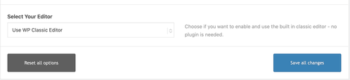
Let us know the result.
Best regards,
IsmaelHey!
Thank you for the update.
Please add this to the style block or style element:
.ava-go-back-wrapper {
    position: absolute;
    z-index: 99;
    left: 55%;
    right: auto;
    top: 5px;
}
Best regards,
IsmaelHi,
Thank you for the update.
We updated the script in the functions.php file — the page should now be scrollable.
function remove_slideshow_swipe_script() { ?>
<script>
document.addEventListener('DOMContentLoaded', function() {
    if (window.innerWidth <= 768) {
        var slideshow = document.querySelector('.avia-slideshow');
        if (!slideshow) return;

        slideshow.style.touchAction = 'pan-y';

        let startX = 0;
        let startY = 0;

        slideshow.addEventListener('touchstart', function(e) {
            startX = e.touches[0].clientX;
            startY = e.touches[0].clientY;
        }, {passive: true, capture: true});

        slideshow.addEventListener('touchmove', function(e) {
            const dx = Math.abs(e.touches[0].clientX - startX);
            const dy = Math.abs(e.touches[0].clientY - startY);

            if (dx > dy) {
                e.preventDefault();
                e.stopImmediatePropagation();
            }
        }, {passive: false, capture: true});
    }
});
</script>
<?php
}
add_action( 'wp_footer', 'remove_slideshow_swipe_script', 99 );
Best regards,
IsmaelHey Angelo,
Thank you for the inquiry.
Try to add this code to the functions.php file to insert a go back button inside the header container.
add_action( 'ava_main_header', 'ava_main_header_mod' );
function ava_main_header_mod() {
    ?>
    <div class="ava-go-back-wrapper">
        <a href="javascript:history.back();" class="ava-go-back-button">Go Back</a>
    </div>

    <style>
        .ava-go-back-wrapper {
            display: none;
            justify-content: center;
            align-items: center;
            padding: 10px 0;
        }
        .ava-go-back-button {
            display: inline-block;
            padding: 8px 16px;
            background-color: #333;
            color: #fff;
            text-decoration: none;
            border-radius: 4px;
            font-size: 14px;
        }
        @media (max-width: 768px) {
            .ava-go-back-wrapper {
                display: flex;
            }
        }
    </style>

    <script>
        function closeBurgerMenu() {
            const burgerBtn = document.querySelector('.av-burger-menu-main .av-hamburger.av-js-hamburger');
            const overlay = document.querySelector('.av-burger-overlay');
            if (burgerBtn && burgerBtn.classList.contains('is-active')) {
                burgerBtn.classList.remove('is-active');
            }
            if (overlay) {
                overlay.style.display = 'none';
                overlay.style.opacity = '0';
            }
        }

        document.addEventListener('DOMContentLoaded', function() {
            closeBurgerMenu();

            const goBackBtn = document.querySelector('.ava-go-back-button');
            if (goBackBtn) {
                goBackBtn.addEventListener('click', function(e) {
                    e.stopPropagation();
                    closeBurgerMenu();
                    setTimeout(function() {
                        history.back();
                    }, 50);
                });
            }
        });

        window.addEventListener('pageshow', function(event) {
            if (event.persisted) {
                closeBurgerMenu();
            }
        });
    </script>
    <?php
}
Best regards,
IsmaelHi,
Thank you for the info.
Have you tried installing the plugin we suggested above so you can select a category to display instead of using the default Recent Posts widget?
— https://wordpress.org/plugins/category-posts/
Please provide the login details in the private field so we can check this further.
Best regards,
Ismael -
AuthorPosts