Forum Replies Created
-
AuthorPosts
-
Hi,
Thank you for the update.
Yes, you’re correct. The code from the previous thread should activate the ALB for a specific post type, but you need to import all entries first. After that, add the code to the functions.php file, make sure to replace the post type slug with your own and then refresh the WordPress dashboard or visit the front end. This will execute the hook and create the required post meta info or custom fields for the custom posts. You can remove the code afterward.
Best regards,
IsmaelHi,
Have you tried including the scss file as described in the following documentation? If you can provide the login details, we’ll try to check this further.
— https://woocommerce.com/document/utilising-the-woocommerce-icon-font-in-your-extensions/
Best regards,
IsmaelJanuary 27, 2026 at 5:11 am in reply to: Code Block with CSS Animation Only Works on One Specific Page #1494354Hi,
Thank you for the update.
Try to add this css code to push the content further below the header.
.html_header_top.html_header_sticky #top #wrap_all #main .template-page.content {
    padding-top: 150px;
}
Let us know the result.
Best regards,
IsmaelJanuary 27, 2026 at 4:56 am in reply to: Need columns with different width oder table without frame (in text block) #1494352Hi,
Thank you for the inquiry.
Instead of using paragraph tags in a text block, you can use this html to create an actual table element with your required format.
<table class="av-custom-table">
<tr>
<td class="av-custom-year">2005 – 2010</td>
<td>Influencer in Austria with a lot of followers</td>
</tr>
<tr>
<td class="av-custom-year">2011 – 2018</td>
<td>Physiotherapist specializing in sports rehabilitation</td>
</tr>
</table>
Then add this code in the Quick CSS field to adjust the style of table.
.av-custom-table {
  width: 100%;
  border-collapse: collapse;
}

.av-custom-table td {
  padding: 0.3em 0;
  vertical-align: top;
}

.av-custom-year {
  white-space: nowrap;
  padding-right: 1em;
  font-weight: 600;
}

@media (max-width: 600px) {
  .av-custom-table tr {
    display: block;
    margin-bottom: 1em;
  }

  .av-custom-table td {
    display: block;
  }

  .av-custom-year {
    padding-right: 0;
  }
}
Best regards,
IsmaelJanuary 27, 2026 at 4:41 am in reply to: update to 7.1.4 Cross Site Scripting (XSS) vulnerability #1494351Hi!
Rest assured that a fix will be included in the next version (7.1.4), which should be released soon. Thank you for your patience.
Regards,
IsmaelHey sky19er,
Thank you for the inquiry.
The sorting buttons are indeed defined as links, but you can modify them in the
enfold/config-templatebuilder/avia-shortcode-helpers/class-avia-masonry.php file. Look for the following block of code around line 494:$sort_loop .= "<span class='text-sep {$term->slug}_sort_sep {$show_item}'>/</span>"; $sort_loop .= '<a href="#" data-filter="' . $term->slug . '_sort" class="'.$term->slug.'_sort_button ' . $show_item . '" >'; $sort_loop .= '<span class="inner_sort_button">'; $sort_loop .= '<span>' . esc_html( trim( $term->name ) ) . '</span>'; $sort_loop .= "<small class='avia-term-count'> " . $term_count[ $term->term_id ] . ' </small>'; $sort_loop .= '</span>'; $sort_loop .= '</a>';Best regards,
IsmaelJanuary 23, 2026 at 11:31 am in reply to: Why is this Destructive Theme Option In The Worst Place Possible? #1494226Hey Andrew McMullen,
Sorry to hear about the trouble. We will forward this issue to our channel and look into moving the reset button away from the save button. There is an alert before the reset proceeds, but we agree that it can be accidentally overlooked or missed, especially when you’ve been working on configurations for a long time.
In the future, we recommend installing a backup plugin such as Duplicator, UpdraftPlus or All-in-One WP Migration and Backup, which can create scheduled backups (for example, every 24 hours). This way, you won’t lose your progress if accidents like this happen.
Thank you for your patience.
Best regards,
IsmaelJanuary 23, 2026 at 11:31 am in reply to: Why is this Destructive Theme Option In The Worst Place Possible? #1494225Hey Andrew McMullen,
Sorry to hear about the trouble. We will forward this issue to our channel and look into moving the reset button away from the save button. There is an alert before the reset proceeds, but we agree that it can be accidentally overlooked or missed, especially when you’ve been working on configurations for a long time.
In the future, we recommend installing a backup plugin such as Duplicator, UpdraftPlus or All-in-One WP Migration and Backup, which can create scheduled backups (for example, every 24 hours). This way, you won’t lose your progress if accidents like this happen.
Thank you for your patience.
Best regards,
IsmaelHi,
Thank you for the update.
We may have misunderstood the inquiry slightly — for posts imported from another site, unfortunately, there is no way to automatically activate the Advanced Layout Builder or apply custom layouts. You’ll need to do this manually by editing the post, switching to the Advanced Layout Builder and then applying the custom layout. There is no option to activate the ALB for imported posts automatically.
Best regards,
IsmaelHey PACO ORTEGA,
Thank you for your interest in the theme.
To answer your questions:
1. All of the demos you see in the preview are included with Enfold. You are not purchasing just one demo. After installing the theme, you can import any of them from Enfold > Import/Export. More details here: Import Demos
2. By default, Enfold installs with a clean, blank layout and no demo styling. You can then either build your site from scratch or import a demo and customize it to your liking. The demo import process is explained in the link above.
3. Yes. Enfold has extensive documentation covering all aspects of configuration and usage. You can get started here: https://kriesi.at/documentation/enfold/
4. Enfold does not use Elementor or WPBakery. It comes with its own native Advanced Layout Builder (ALB), which is tightly integrated with the theme. You can learn more about it here: https://kriesi.at/documentation/enfold/intro-to-layout-builder/
5. Yes, a single license includes 6 months of support, with the option to extend it afterward. Average response times are typically within one business day, depending on ticket volume.
6. Enfold is actively maintained and has been in continuous development for over 13 years. Support and compatibility updates will continue, ensuring the theme works with current and future versions of WordPress and PHP.
Let us know if you need more information.
Best regards,
IsmaelHey Sonno,
Thank you for the inquiry.
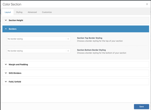
Did you place another element outside a Color Section element? The theme will create a section for this element with default styling, including a border. Try to move the element inside a Color Section so you can control the style, such as the border, in Layout > Borders options.
Let us know if the issue persists.
Best regards,
IsmaelHey Munford,
Thank you for the inquiry.
The title is not displaying because of this css code.
.mfp-title { display: none; }You can override it with this code:
.mfp-title { display: block; }
Best regards,
IsmaelJanuary 23, 2026 at 6:41 am in reply to: Burger and Social Media icons position on Mobile view #1494208Hey bemodesign,
Thank you for the inquiry.
This css code should help — make sure to add it at the very bottom of the previous modifications.
@media only screen and (max-width: 767px) {

  /* Add your Mobile Styles here */
  .responsive #top #wrap_all .main_menu {
    display: flex;
    position: absolute;
    flex-direction: row-reverse;
    justify-items: center;
    align-items: center;
  }
}
Best regards,
IsmaelJanuary 23, 2026 at 6:37 am in reply to: When is 7.1.4 Available? Enfold: Cross Site Scripting (XSS) vulnerability #1494207Hey Jody,
Thank you for hte inquiry.
This has been fixed in the latest version of the theme (7.1.3). Please make sure to upgrade to the latest version.
Patchstack team XSS vulnerability report: column and cell link fixed
Best regards,
IsmaelHi,
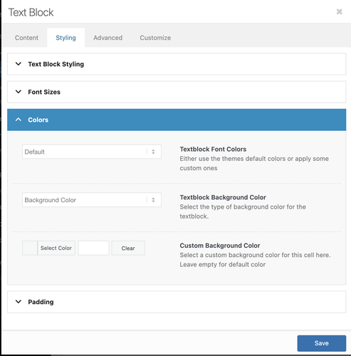
There is no color picker in the text editor by default. If you need to change the color of specific text, you’ll either have to switch to the Code editor and use inline styling, or configure the Styling > Colors options.
Best regards,
IsmaelHey ricedean,
Thank you for the inquiry.
You can try this filter in the functions.php file:
add_filter( 'avf_masonry_loop_entry_content', 'avf_masonry_loop_entry_content_mod', 10, 4 );

function avf_masonry_loop_entry_content_mod( $content, $entry, $entries, $key ) {
    $is_sold = get_post_meta( $entry->ID, 'sold', true );

    if ( $is_sold ) {
        $content .= '<span class="av-masonry-sold-overlay">SOLD</span>';
    }

    return $content;
}
Then add this css code:
.av-masonry-entry {
    position: relative;
}

.av-masonry-sold-overlay {
    position: absolute;
    top: 50%;
    left: 50%;
    transform: translate(-50%, -50%);
    font-size: 48px;
    font-weight: 900;
    letter-spacing: 2px;
    text-transform: uppercase;
    color: #ff0000;
    background: none;
    z-index: 10;
    pointer-events: none;
}
You’ll need to add a custom field named “sold” to each entry.
Best regards,
IsmaelHi,
Thank you for the info.
The Advanced Layout Builder (ALB) is loading correctly based on our check (see private field). Is this happening on a specific page? Please provide the page URL in the private field.
Best regards,
IsmaelHi,
Yes, you can place the code in the Enfold > General Styling > Quick CSS field or in the style.css file. Let us know the result.
Best regards,
IsmaelJanuary 22, 2026 at 6:09 am in reply to: Code Block with CSS Animation Only Works on One Specific Page #1494158Hi,
Thank you for the update.
It displays the same in Safari, but we noticed that the words are not wrapping. Please edit the inline style and set the white-space property to wrap. You may also need to adjust the line-height if the sentence wraps onto a second line.
Best regards,
IsmaelHey Anne,
Thank you for the inquiry.
For the home page, you can use this css code.
.home .flex_cell {
    border-width: 24px !important;
    border-right-width: 0 !important;
    border-bottom-width: 0 !important;
    border-style: solid !important;
    border-color: #fff !important;
}

.home .flex_cell:last-child {
    border-right-width: 24px !important;
}
Let us know the result.
Best regards,
IsmaelHi,
Thank you for the inquiry.
The notice above is not critical and should not affect how the site works, but we’re not yet sure why it’s there. As a temporary workaround, you can set WP_DEBUG_DISPLAY to false to hide the warning.
To update the theme to the latest version, go to your Themeforest account, download the theme package manually and then upload it to your server via FTP. Please refer to the following documentation for more information.
— https://kriesi.at/documentation/enfold/theme-update/#update-via-ftp
Let us know the result.
Best regards,
IsmaelHi,
Thank you for the update.
The Advanced Layout Builder (ALB) is loading correctly based on our check. We also created a test page using the ALB — links are provided in the private field.
Best regards,
IsmaelHey ariane1001,
Thank you for the inquiry.
Custom layouts are a separate post type, so you’ll need to import those as well. The builder also relies on specific custom fields, so please make sure all custom fields or meta info attached to the posts are transferred too. Let us know the result.
Best regards,
IsmaelHey Sonno,
Thank you for the inquiry.
You can use this css code to control the height of the slider.
#top .avia-fullwidth-slider, #top .avia-fullwidth-slider ul li {
    height: 50vh;
}
We recommend adding a Custom CSS Class name to the slider element and adjust the css rule accordingly so it applies only to this specific slider.
— https://kriesi.at/documentation/enfold/add-custom-css/
Make sure the size of the selected thumbnail is appropriate to the size and aspect ratio of the modified slider.
Best regards,
IsmaelJanuary 22, 2026 at 5:40 am in reply to: accessibility review shows multiple main landmarks #1494152Hi,
We checked it again today, and the footer page now contains a div element instead of main. Please try to connect to a different network and then check it again.
Best regards,
IsmaelHi,
Thank you for the inquiry.
Would you mind providing a screenshot of the issue? You can share the solution here in this thread. Did you use the Advanced > Responsive > Element Visibility settings?
Best regards,
IsmaelHi,
Yes, you’ll need to minify the file only when compression is enabled in the theme. We’ll forward this to our channel. For now, please keep the modification in the file.
Best regards,
IsmaelHi,
Thank you for the update.
You’ve interchanged “i” with “e” in the username. We’re able to log in, but the account doesn’t have admin rights, so we’re not able to edit the page or access the dashboard. Please set the user role to admin or provide another admin account.
Best regards,
IsmaelHi,
Thank you for the update.
In icon_circles.js file, you’ll find event listeners for mouseenter and mouseleave. You can duplicate those and change the events to mouse clicks. If you need help implementing this, we recommend hiring a freelance developer or contact our partner, Codeable.
— https://kriesi.at/contact/customization
Hope this helps.
Best regards,
Ismael -
AuthorPosts